


Over 2.2 billion people live with visual impairments – and for many, poor color contrast creates real barriers to accessing content. When contrast between text and background is too low, content becomes difficult or impossible to read.
For creative and marketing teams delivering content at scale, maintaining visual clarity while meeting accessibility standards isn’t just important – it’s essential. This guide shows you how to test and optimize color contrast using tools like WebAIM Contrast Checker, PageProof, and Stark to ensure your designs are beautiful, on-brand, and fully accessible.
Why color contrast matters
Color contrast directly affects how easily users can read content – especially those with visual impairments like color blindness, low vision, or age-related eye conditions. When contrast is insufficient, content becomes inaccessible to roughly one quarter of the global population.
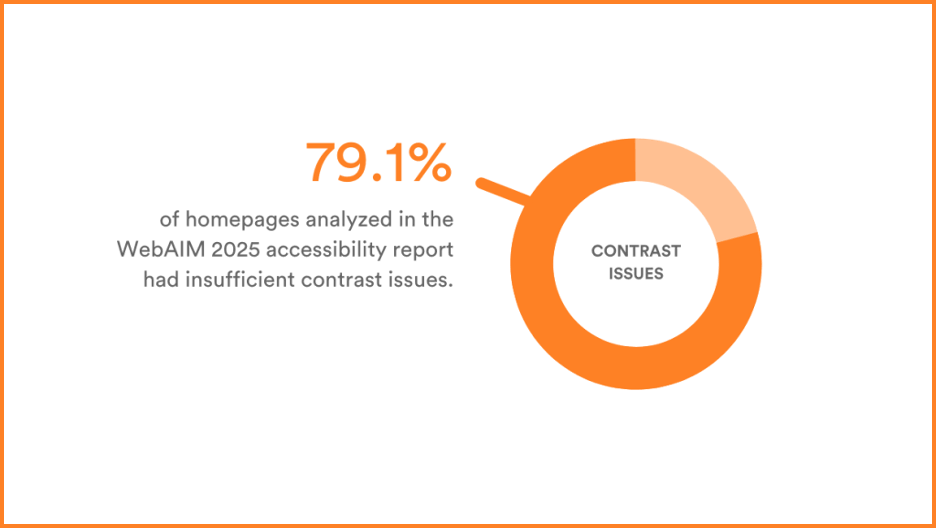
According to WebAIM’s 2025 accessibility report, over 79.1% of analyzed homepages had insufficient contrast issues – making it one of the most common accessibility failures.
Good contrast also enhances user experience for everyone, improving readability in bright environments, on small screens, or when users are quickly scanning content. Beyond accessibility, it impacts engagement and performance – if call-to-action buttons are hard to see, people won’t click. If body text is difficult to read, users will bounce.
Understanding WCAG standards
The Web Content Accessibility Guidelines (WCAG) 2.1 set global standards for digital accessibility, defining two compliance levels:
AA compliance:
- Minimum 4.5:1 contrast ratio for normal text
- 3:1 for large text (above 18pt or 14pt bold)
AAA compliance:
- 7:1 for normal text
- 4.5:1 for large text
AA compliance suits users with mild vision loss (common in those 45+), while AAA better serves those with severe vision loss or eye diseases (typically 70+).
What contrast ratios mean
Contrast ratios measure luminance difference between text and background colors, ranging from 1:1 (no contrast) to 21:1 (maximum contrast). Higher ratios mean greater contrast, helping users with visual impairments distinguish text more easily. WCAG doesn’t require ratios higher than 7:1 because that level ensures readability for almost all users with low vision or color blindness.
How to test color contrast
Testing color contrast is straightforward with the right tools:
Step-by-step process
- Choose your colors: Identify foreground (text) and background colors
- Use a contrast checker: Enter color codes or use eyedropper tools to select colors
- Review results: Tools display contrast ratios and WCAG pass/fail status
- Adjust if needed: Modify brightness, hue, or saturation for insufficient contrast
Popular testing tools
- WebAIM Contrast Checker: Simple input with clear results
- PageProof color check: Integrated proofing software with contrast verification
- Coolors Contrast Checker: Visual tool ideal for UI designers
- Stark: Comprehensive accessibility testing tools
Real-world examples
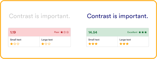
Insufficient Contrast: Light gray text (#cccccc) on white background (#ffffff) – fails both AA and AAA standards.
Good Contrast: Navy text (#1a1a80) on white background – passes AA and AAA for all text sizes.
Where contrast matters most
Contrast issues frequently appear in:
- Landing pages with key messaging and CTAs
- Email campaigns where low contrast reduces engagement
- Social media graphics that may not meet accessibility standards
- Digital ads requiring careful consideration for small text
- Presentation decks needing high contrast for distance viewing
- Form submissions where buttons and fields must be extremely legible
- Infographics presenting multiple data points
PageProof’s Color check tool
For teams creating content at scale, PageProof’s color check feature streamlines accessibility verification:
- Use the eyedropper tool to select colors directly from work
- Instantly compare colors to check contrast ratios
- Receive clear pass/fail messages like “Meets AA for all text sizes”
- Built into the proofing screen for seamless workflow integration
This is especially valuable for government, education, finance, and healthcare industries where WCAG compliance is non-negotiable. By catching issues before sign-off, teams ensure every creative piece is on-brand, accessible, and confidently approved.
Final thoughts
Ensuring strong color contrast isn’t just about avoiding legal issues – it’s about creating content that connects with everyone. With tools like PageProof’s color check, designing with accessibility becomes a seamless part of your creative review process, helping you build inclusive, effective, and WCAG-compliant designs that show your audience you care about delivering content they can actually use.
This article was last modified on October 3, 2025
This article was first published on October 3, 2025
Commenting is easier and faster when you're logged in!

Recommended for you

LinkrUI Now Offers DAM Syncing for Microsoft Word, Microsoft Powerpoint and Microsoft Excel
LinkrUI with Microsoft Office Compatibility Now Available via Resellers and Reta...

10 Requested Features for Illustrator and InDesign to Boost Your Productivity
Optimize your workflow with these 10 user-driven features
Key Steps in the Graphic Design Process for a Smooth Workflow
Following a well-defined set of graphic design steps helps designers transform c...