Change Balanced Ragged Lines to Pyramid Shaped
Change the way InDesign balances ragged lines in a paragraph with the help of a free script.

This headline is ridiculous, right? This first line is way too long and the second line is too short.

But we can fix this in various ways. One option is to insert a forced line break (Shift-Return/Enter) where we want the line to break, but that’s kind of drastic… if we had to edit the line later, or we need it to reflow differently, that would get in the way. We could also adjust the right margin or the width of the text frame, but I want to show you a different method: Balance Ragged Lines, which you can find in the Control panel menu, or when defining a paragraph style:

When you turn on Balance Ragged Lines, InDesign tries to make the line lengths more even:

It works pretty well, but note that it has a bias toward making the first line slightly longer. Some people prefer that, I guess, but I like having a shorter first line and a longer second line. Sometimes you can’t help it, depending on the text, but in general, I want it to be more like a pyramid.
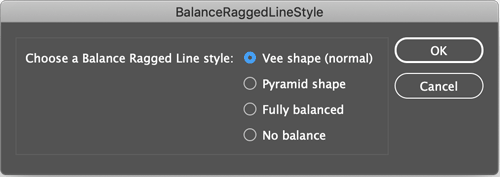
So it turns out that InDesign lets you change that… but there is no UI — no customer-facing interface! There is, however, a way for scripts to change it, and Keith Gilbert took advantage of that with a freebie script he wrote and posted on his site. After you install the script (click here for instructions on installing scripts) you can place your cursor inside a paragraph and run the script in the Scripts panel. You get this dialog box:

You can see the options in there! I’ll choose Pyramid and click OK:

That’s better! And you can see that the paragraph style has a + symbol, meaning that this now has some local formatting on it:

But I can choose Redefine Style from the Paragraph Styles panel menu, and now all paragraphs with this heading style will update to pyramid shape!
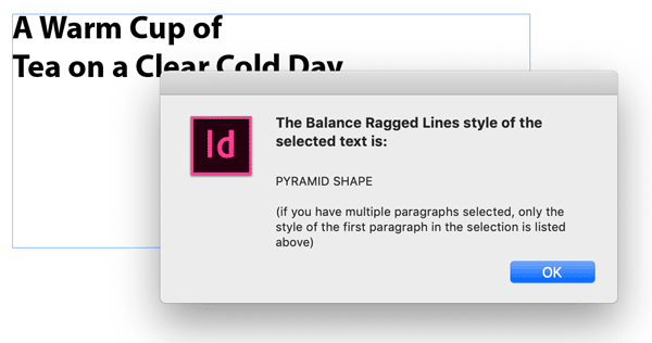
By the way, because there’s no way to see what the current balance shape is in InDesign, Keith wrote another script with the word View at the end. Double-click that and it gives you a peek at what’s going on under the hood:

Thank you Keith!
This article was last modified on July 7, 2021
This article was first published on February 18, 2019
Commenting is easier and faster when you're logged in!
Recommended for you

PageProof launches FinalFile.com, a Free Tool to Add and Verify Content Credentials for Creative Files
FinalFile.com lets creatives and enterprises add or verify Content Credentials i...

InDesign Template: Price List & Order Form
Suitable for a wide range of businesses, these stylish documents can be easily a...

20 Obscure Features
David Blatner shares his favorite 20 obscure features that every InDesign users...


