
Building Email Templates
Rise to the top of your customers’ overflowing inboxes with effective and efficient emails.

This article appears in Issue 20 of CreativePro Magazine.
Whether you’re just starting out in the world of email design or you’ve been at it for a while, the basic principles for a successful workflow are the same: You need a system of branded, repeatable, efficient templates to run your campaigns from. Having a library of correctly configured starter emails allows you to focus on the ultimate goal of email marketing: nurturing and engaging your target audience. Unfortunately, there is no one-size-fits-all guide to building templates because every email service provider (ESP) has a different menu of offerings and a unique interface for building emails. While there’s no way to provide specific how-tos for every email platform and scenario, I can offer some guidance on general best practices. You can use these tips to help you decide where to start or to spark some ideas for improving your workflow.
Define Your Design
Having a set of visual guidelines will help keep you centered and ensure that the style of your emails remains consistent. Your style guide should include color values, fonts, a hierarchy of type treatment for your headings, and examples of styled components (Figure 1). This documentation will also give you something to share with stakeholders or teammates to ensure everyone is working from the same playbook.
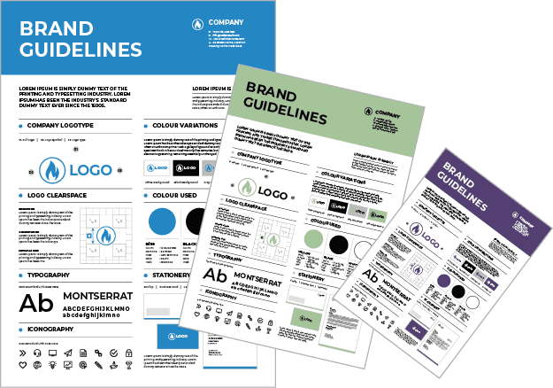
Figure 1. The comprehensiveness of brand style guides can vary from one company to the next, ranging from dozens of pages to a single cheat sheet.
Setting Up Your First Template
Setting
your email templates up correctly is a crucial first step, because everything will be built up from the foundation you create. Many ESPs offer a helpful library of email templates that you can use as-is or customize to fit your needs (Figure 2). You probably wouldn’t use such templates without some customization, so let’s assume that is your starting point.

Figure 2. Pre-designed email templates can be a huge time-saver. Some ESPs offer a variety of layouts to get you started.
One template or many?
There are a couple of ways you can approach the initial set-up process. One option is to start by building a single template that includes every possible element and style you’ll ever need, including sections for vastly different emails such as event promotions and newsletters. This template, which I call the MOAT (or Mother of all Templates), will function as a single source of truth that you can always refer back to—a living version of your email brand guidelines, so to speak. The goal with this approach is to apply all your settings and design standards in this parent file to ensure they all look and work together as a cohesive family. The child templates you create from it will carry forward every setting, right or wrong. It’s much easier to change your mind at this stage when everything is in one file, rather than making the same change across multiple files. Another option is to skip the MOAT and go straight to building the individual templates for each mailing type. Whether this approach will be a good fit will depend on how many types of layouts you will need and how your email platform is configured. For example, if your email builder uses a drag-and-drop system that allows you to individually configure each component (e.g., header, text module, call-to-action button, full-width image, multi-column section), you might decide you don’t need one long master template because you can style and save the settings for individual components (Figure 3). The component library itself becomes your single source of truth.

Figure 3. An example of a drag-and-drop interface before the design is applied. Add the elements you want to your email canvas and move them up or down in the order to create the layout you want. Selecting an element opens a panel where you can edit the design options for that item.
The building blocks
Let’s start with the basics that just about every email uses. Obviously you can add, remove, or rearrange these elements to fit your specific needs. Keep in mind that the available design options may vary depending on the ESP you are using. The following list is merely an example to get you started thinking about the types of settings you’ll need to configure for each component. Header area: Determine the size and position of your company logo and define the amount of space around it. Set the background color (if you use one) behind your logo, or choose none or transparent if your logo has a transparent background. Hero image: It’s customary to have an eye-catching graphic at the top of your email. If your guidelines call for a standard size for your hero image, using those dimensions for the placeholder makes it quicker to swap out later since you won’t have to edit those settings. Main headline/H1: Set the properties for font, color, size, and line spacing. For placeholder text, instead of the typical Headline Goes Here add enough text to create a two-line title; this helps in validating the line spacing. It can be as simple as This is a really, really, really long headline that spans multiple lines, or you can write out the style specifications: H1 Headline in Roboto Slab Regular #990099 with 32px over 36px in Title Case. Spelling out the attributes isn’t strictly necessary because you can find them in the text editor, but it saves you a click if they are right there in the title. Additionally, if you work with a team, it adds an extra modicum of clarity. Subhead/H2: Repeat the same steps as the main headline. Your H2 will be a few points smaller and possibly a different color or weight. Don’t forget to set the space between your H1 and H2, and between the H2 and body copy. If you are using HTML this will be defined in the code; in drag-and-drop editors, you can add spacing to the top and/or bottom of the component. Body copy: Besides font, color, size, and line spacing, you should consider a few other styles for this section. Add a text hyperlink somewhere and set the styles for color, underline, and hover state. If you have any special style guidelines for other elements that might appear in your emails like bullet lists, customer testimonials, or callouts, include samples of those in this block as well. Bullet lists sometimes generate inconsistent spacing above and below the list; if your ESP’s editing environment doesn’t give you a setting to adjust this spacing, you can override it by editing the HTML code. Include two paragraphs of body copy to make sure the spacing between them is ample. Call-to-action (CTA) section: Keeping the CTA button in a section by itself makes it easy to move it up or down in the email if needed. Set the button color, spacing (both inside and around the button), corner radius, border values, font, text size, color, and capitalization. If you have different styles for different kinds of buttons (primary, secondary, ghost), duplicate the CTA section and customize it for each button type. Save these new buttons so they are ready to use in future emails. Multi-column: If your ESP offers premade components for multicolumn sections, include one of each in your MOAT. Two-column layouts usually have an image paired with a corresponding text block to the left, right, or below the image. You might be able to use your standard body copy style for a two-column section, but for three columns you’ll need to scale down the text size (and line spacing), so you don’t end up with just one or two words per line. Footer: Typically, the footer section is distinct from the rest of the email. You may want to have a different background color here to visually separate it from your main message, or perhaps add just a border above if you’re using a minimalist design. Set those values, along with font, color, size, line spacing, and hyperlink style—these will likely be quite different from your body text and link styles. TEAMWORK TIP: Consider using instructional copy instead of placeholder lorem ipsum text. This can be anything from design guidance to where certain images are filed—anything you want to spell out for your team, or remind your future self of. This comes in especially handy when you’re out on vacation and someone not familiar with the tool is filling in for you!
In footers we trust
By the time you near the end of the email template, you might feel as if you’re done designing. Hold that thought! Footers are an extremely important part of the email experience for building and maintaining trust. If there is ever a question in a user’s mind about why they are receiving the email, or if they want to learn more about who it’s from, the footer is the first place they will go. So this is where you should include as much information about your company as makes sense for your audience and brand. Some good trust-building elements include the full official name, parent company if applicable, physical address, and contact information (including phone number if someone handles calls). From a delivery standpoint, the following items also build trust, and you might be required by law to include them. Listed in order of priority:
- Unsubscribe link: This is the bare-minimum legal requirement that every marketing email must have. If yours is a one-click opt out (meaning it happens immediately and does not give users a chance to change their mind), add some clear language to indicate that.
- Link to your privacy policy: Build trust by informing recipients how your company collects, uses, and protects personal information.
- Manage preferences link: When you can offer a preference center landing page as an alternative to an all-or-nothing opt out, that is a win-win for both you and your audience. Giving your email recipient more control over what they receive will make them more receptive to your emails in the long run.
- Why they are receiving the email: Including the phrase you signed up for our newsletter will help reduce indignant unsubscribes from people who forgot they requested your emails and think you’re spamming them!
Even though these are all informational elements, you don’t have to downplay the design. The footer is yet another opportunity to reinforce your brand style and personality! (Figures 4 and 5)

Figure 4. The Goldilocks approach to footers—which one is just right for your company? These examples show the range of information and styles you can include in your footers in keeping with your company’s standards and marketing strategies.
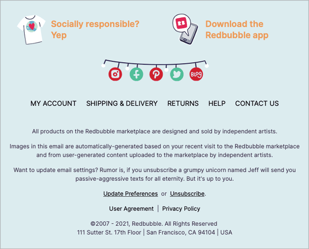
Figure 5. This footer from Redbubble not only includes all the trust-building elements but some on-brand personality as well, with a humorous unsubscribe note and a whimsical holiday treatment of social media icons.
Time for a Test Drive
Once you have a full master template built out with all the components, this is a great time to send yourself a test, just as you would do before sending a real email to subscribers. If you have access to an email preview tool, now is the best time to use it. These tools run your layout through a series of tests and show you how your layout will display on different devices and mail providers. If you don’t have this functionality built into your service plan, consider looking into a separate service provider—like Litmus or Email on Acid—which offer plans to fit both basic and advanced needs. A good portion of your audience is reading email on their phones, so pay close attention to how your layout is displaying on mobile. Several ESPs, such as MailChimp, allow you to set the styles for mobile viewing, which may have a slightly different spacing or font size than the “desktop” version. A validation service like the ones mentioned above will give you the widest array of device previews, but if you don’t have access to one you can still send tests to your own device. Although it won’t reveal every scenario, this step can help you quickly spot obvious problems so you can fix them. After you’ve tested, refined, and finalized the master template and are happy with the result, you can feel confident moving to the next step of creating your individual use templates. This is the part where you decide what types of layouts you’ll need for various uses and then create a starter file for each by making a copy of your master template. Give each one a simple, logical name like Newsletter, Promotion, Webinar, Informational, or whatever makes sense for your purposes. Start building each email by going into its newly named template and deleting the sections you don’t need for that layout. Then you can adapt each one to accommodate its specific design needs. Event invitations lend themselves to a repeatable format since the information is generally consistent: name and date of the event, description, and a Register button. If you frequently feature speakers in your event emails, include a placeholder for the headshot and styled text for their bio information. One speaker section may be sufficient for your event template since you can easily duplicate or delete sections as needed. Newsletters require the most components: header image, title, issue date, various levels of headings, multi-column sections, and links to read more. Whereas a big sale promotion might be the simplest layout of all—a splashy image with CTA, plus a short description and link below the graphic (for redundancy, in case the user has images turned off). (Figure 6)

Figure 6. Different email types call for different layouts. A modular approach allows for more flexibility.
Non-graphical Elements
Now let’s consider the non-graphical elements of an email. Just as the visual aspects convey your brand, the structure of your email contains important components that tell people who you are and encourage them to trust you.
The envelope, please
Like traditional letters, the envelope of an email contains information about the sender and addressee. The message part of the email is like a letter on company letterhead with the full address at the top (From Name, From Address, and Reply-To Address). If you are a small business or independent, your From info might be the same for all your emails. That makes your job easier; just set it once in your template and forget it. If you have multiple brand personas in the marketplace, you will likely have different From Names and Addresses. Keep an eye on these fields as you go so you don’t replicate the wrong one when cloning emails or making templates from your MOAT.
Reply recommendations
Consider your reply address carefully—people will use it! Even if you try to point them to a specific contact link in your email, hitting Reply is just faster. Make sure the address is one your team is monitoring closely so someone can reroute or respond to anything that comes in. Hopefully you aren’t using an address like no*****@*****ny.com for your marketing emails. Such an address creates the impression that you don’t want to connect with the people you are emailing… so, then, why are you emailing them?
Be authentic
It’s important to use logical and consistent From Names and Addresses if you want to create a trusted brand. At a time when email spoofing and phishing have become commonplace, brand trust and reputation are more important than ever. Spoofers have gotten much better at mimicking well-known companies with emails that look authentic. Everything about your emails should be consistent and reinforce your brand: headers and footers, imagery style, tone of voice, calls to action, and so on. Eliminate anything out of the ordinary that would make people question whether the email is really from you. You can still exercise creativity and flexibility within your layouts—just make sure the overall result feels genuine and on-brand.
You’ve Got Mail (to Design)
Congratulations! You’ve just completed one of the most difficult parts of a successful email workflow: building a complete library of starter templates. Now that you have the proper tools, you are ready to start using them to create and send new emails. Effective email design is a key component of your email marketing campaign. Taking the time to set up your email templates correctly will ensure that your emails have a consistent visual style and will speed up your workflow in the long run, giving you more time to fill your emails with compelling content. Most importantly, remember that email marketing is an ongoing process and that you will need to continually test and refine your templates as your business evolves, as technology improves, and as new demands and challenges affect how your customers and subscribers respond to new messages in their inboxes.
Commenting is easier and faster when you're logged in!

Recommended for you
Should You Use Photoshop CC, Elements, or Lightroom?
It can be a bit intimidating trying to decide which image-editing software you n...

Scanning Around With Gene: The Apple Brand You May Not Recognize
Last week I was interviewed on Inside Mac Radio and asked to comment on Apple be...
How to Choose Colors for Design and Marketing Success
Learn how to choose color thoughtfully for your designs and marketing campaigns,...