
Book Design Basics in InDesign
For book designers, let this article be your guide to getting the most from InDesign.


This article appears in Issue 42 of InDesign Magazine.
Despite the perennial predictions of their impending demise, books as we know them (bound sheets of printed paper, remember?) are not dead—and won’t be in our lifetimes. This fact is good news for people like me who appreciate a well-made and well-designed book. In this article I’ll discuss what makes a book well made and well designed, and its relation to the current de facto software for designing books, InDesign.
Form Follows Content
Before any designing can begin, the book designer must address the issue of size. Known professionally as trim size, or just trim, the choice of size is usually out of the designer’s control. If you’re lucky enough to have some say in this critical decision, I suggest looking at other books for inspiration. Beyond the pure economics or aesthetics of book size (important factors themselves), the designer must bear in mind the practical side of choosing a trim. Consider how frustrating it would be to cook from a narrow cookbook, bound tightly, that won’t lay flat while open. What about a guidebook that’s short and wide? Try fitting that into your back pocket. In other words, use common sense when deciding on the size or dimensions of your book. It shouldn’t come as a surprise that big books cost more to manufacture and ship than small books. Discuss your book’s size with your client and printer, and become comfortable with its dimensions before you start designing. Retooling your design after having laid out 96 pages takes time you can ill-afford to waste. Look to a book’s content to help with decisions of form. Chances are a book about Zen gardens would use more white space than one on the history of jazz. How a book is bound is also a key factor when beginning a design.
Books that are perfect-bound or saddle-stitched need wider inside margins than those that are spiral- or ring-bound. Wide books open and lay flat more easily than those that are tall and narrow. When designing narrow books, allow extra room for inside margins so readers aren’t forced to crack a book’s spine to read text that abuts the inner margins.
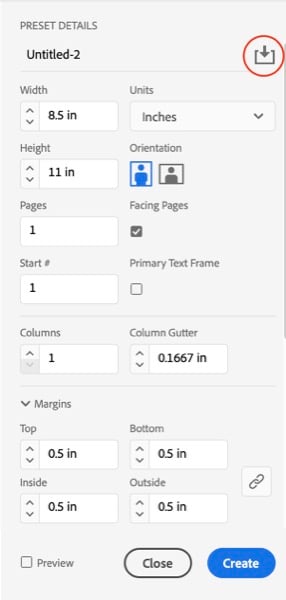
Figure 1. Don’t forget these are just numbers. You can make them be anything you want. Save your presets by clicking the icon (highlighted).
Your Book’s Foundation
Thinking through your book leads to one of the most important structural components in book design: parent pages. Like the foundation of a house, parent pages provide a foundation for your book upon which all document pages are based. Working with parent pages serves two important functions. Because they are a kind of a template, using them saves you from having to build each new page from scratch. Instead, you simply create document pages that are pre-built and pre-structured (Figure 2). Margins are there, columns are there, grids and guides are there.
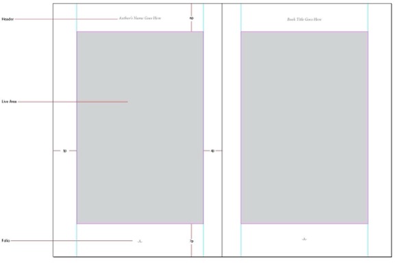
Figure 2. Take the time when starting a project to develop your parent pages. Doing so will free your left brain from your right brain.
Multiple page parents
Multiple page parents are parent pages that are based on other parent pages. Let’s say you’re designing a book of fiction. The main document parent page includes a header for the author’s name on the verso (left-hand page) and the chapter title on the recto (right-hand page). The folio (page number) is in the footer. This parent works great for most pages, but what happens when you begin a new chapter? Chapter openers are generally formatted differently than standard document pages, as seen in Figure 3. Notice how the text begins lower down on the page (a design technique called a sink) and how the page lacks a header, with just the folio in the footer. Although you could achieve this format change with the A-Parent by manually changing the margin and overriding and removing the header, a more efficient approach is to create a B-Parent that’s based on the A-Parent.
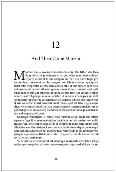
Figure 3. A conventional chapter opener for a work of fiction. Book trim is 6 × 9 inches. Note the deep bottom margin and ample room on the outside margin to hold the book. Notice also how the inside margin is large enough so as not to hide text that’s close to the spine.
![Screen shot of dialog box for New Parent. Prefix: BName: ParentBased on Parent: [None]Number of Pages: 1 Page Size: Letter Width: 612 pt Orientation: Height: 792 pt.](https://creativepro.com/wp-content/uploads/2025/02/book_design-fig04.600px.jpg)
Figure 4. Basing the B-Parent (child) on the A-Parent (parent) means that the B-Parent will inherit any and all attributes of its parent. In this example I’ve deleted the A-Parent header and sunk the top margin 11 picas.
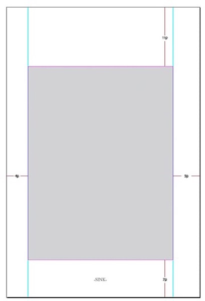
Figure 5. Here are the actual settings used for the B-Parent. Note that this is only the right-hand page of the spread.
Structural Basics: Margins & Columns
Once trim size is final, it’s time to begin laying out a book’s structural basics. Like an architect who draws a home’s foundation before thinking about the finials on a staircase, the book designer must first give careful attention to the two most important structural components of a book: its margins and columns. It’s not always easy to choose the right margin and column settings. Historically, novels are laid out differently than magazines. Bottom margins are often deep, as are outside margins, to allow room for readers’ thumbs. Paperback reprints of hard-bound books often defy this convention to save paper and lower production costs. Magazines, conversely, often get away with narrow margins to maximize space. But exceptions abound.
Live area
The term live area refers to the area of a book or publication that’s inside the top, bottom, left, and right margins. Floating content within a publication’s live area, rather than placing it carefully within a document grid, opens the door to a flimsy grip on visual structure and order. In Figure 6, the page content floats inside the default margin area.
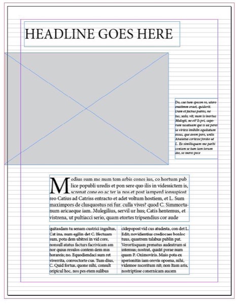
Figure 6. In this example, notice how the content floats within the live area. Anchoring your elements to margins, columns, or grids will make the job easier and improve the overall look of your page.
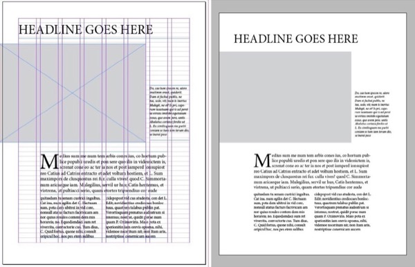
Figure 7. The eight-column layout provides structure with flexibility for infinite variations over the length of the book.
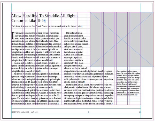
Figure 8. This ten-column layout could be used in a variety of ways. Here it’s used to structure two simple columns and a photo caption.
Structural Basics: Units and Measurements
Here’s a fun game for old timers. Ask a group of designers how to pronounce “P-I-C-A-S.” Those who answer “peek-uhs” are under 30. Then ask those who answered correctly: “Who among you actually use picas?” Those who answer “yes” are over 40. Finally, ask those who answered correctly how many points equal a pica (12)? And how many picas equal an inch (6)? Those who answer correctly are over 50. Or 60. Despite the unpopularity of the pica as a unit of measure, it’s darn handy when design- ing books. This is because points (and there- fore picas) are still how we measure type. Almost any measurement system is better than inches. When using inches, the smallest increment that you can nudge a drop shadow, bevel, or any object effects without the need to type in an absolute value is one sixteenth of an inch. Compare that amount with the small- est increment available when using picas and points: 1 point. One inch equals 16 sixteenths. It also equals 72 points. That makes points almost one-fifth the size of one-sixteenth. Points afford greater control than inches. Yes, you can type in any value when nudging drop shadows or bevel amounts. But it’s better to arrive at values like this by trial and error. When students tell me they don’t feel comfortable with points and picas, I point out that once the basic document is created, you never think about the dimension of page items again. After all, who cares if a placed photo measures 4 × 5 inches or 4 × 5 picas?
| Preference | Description | Setting | Value | Why |
| Type | Apply Leading to Entire Paragraphs | Selected | Inserting text cursor in paragraph allows user to adjust leading with Option/Alt+Up/Down arrow. | |
| Type | Drag & Drop Text Editing | Enable in Layout View | Convenient way to move text. | |
| Units & Increments | Ruler Units | Picas (V and H Rulers) | Small increment makes nudging effects more precise. | |
| Units & Increments | Keyboard Increments | Size/Leading | 0.5 | Gives you more control over type. |
| Units & Increments | Keyboard Increments | Kerning/ Tracking | 5 | Gives you more control over type. |
Structural Basics: Grids
Everyone likes to hear a good story well told. As a book designer, your job is to tell a clear story that moves logically from page to page, top to bottom, from left to right. Grids help service this journey by providing a consistent and reliable structure. I love grids because I love structure. The grid ultimately frees us to create a visual syntax based on familiar patterns and rhythms. To explain what I mean, let’s look at some examples. In Figure 9, the grid is very obvious that gives the page a controlled balance and rhythm. When viewers know where and how to read a page, they experience comfort; they can relax and turn their attention to the content. A similar phenomenon occurs when watching movies. Think about the experience of watching a sure-footed film with a strong story that immediately captures your attention from its opening frames. The way the narrative pulls you along from scene to scene. Compare that experience with the way you feel when a movie rambles aimlessly for the first thirty or forty minutes.
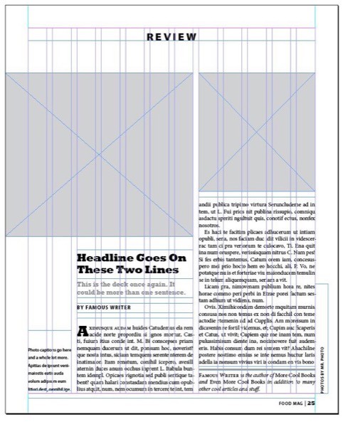
Figure 9. Just because a grid is obvious doesn’t mean it has to look boring. I created this twelve-column structure to hang the page’s two photos and two main text blocks.
Love Layers, But Not Too Much
Before the introduction of InDesign, many of us spent years designing documents without the benefit of layers. When InDesign came on the scene, some designers continued to work on only one layer. Others who were more familiar with Photoshop adopted its one-object-per-layer workflow. I remember an InDesign class I taught years ago where a student built a simple document with over fifty layers. When I asked her why she’d used so many, she told me that she learned to do so in Photoshop. Somewhere between the everything-on-one-layer approach and the one-item-per-layer method lies the optimal way to use layers in InDesign. I limit the number of layers I use to the essentials; generally, that’s between one and three layers. Don’t confuse multiple layers with multiple parents. When structure is needed, parent pages with well-defined columns and ruler guides are always preferable to asking the same thing of layers. Text won’t autoflow through faux columns on layers using ruler guides the way it will on parent pages built with column guides. You’ll do yourself a favor by understanding how layers work. Become familiar with how to copy objects from layer to layer using Option/Alt-drag and drop. Need to move a layer object onto a hidden or locked layer? Hold the Command/Control key while dragging the little color square onto the new layer. Use Paste Remembers Layers, a handy feature when you need it. Take note that if you flip the disclosure triangle for a layer, it will display each page item individually on its own sub-layer.
Use Styles
If I had to choose the one thing InDesign users could do to improve their efficiency as designers, it would be to understand and parent the art of using styles. This particularly applies to books and other long documents. But creating styles in InDesign is so easy and fast that it’s worth it even for shorter documents. Instead of listening to me prattle on about styles, I’d rather direct you to my friend and colleague Michael Murphy’s outstanding (and not too thick) book, Adobe InDesign CS4 Styles: How to Create Better, Faster Text and Layouts. Michael is not only an expert in using styles but of explaining how they work. And ignore the “CS4” part of the title; his advice is still very relevant. If time is of the essence, read only chapters one, two, and four. You can read an excerpt on CreativePro.com.
Placing Text
One of the most potentially hazardous operations when designing a book is placing text. Not because placing text is technically difficult. It’s not. Instead, it’s because the possibility of losing critical formatting like italics and bolding is so great. InDesign offers two methods for getting text into a document. The first is via copy and paste: Select your text in the original document, copy it, move to the InDesign document, and paste. The problem with this method is that, depending on your Preferences settings, your text may come in fully formatted as it was in the original word-processing document (which might be exactly what you want, but I doubt it), or your text will be pasted in with no formatting. This means all formatted text will be converted to plain text. All bold and italics will be gone, gone, gone! Also, you may lose special characters and other important formatting and content. The second method for importing text is File > Place. You navigate to your text document file in the dialog box, choose it, and click the little place cursor, which then drops text on your page. The next thing that usually happens is you discover that your placed text is highlighted in pink, which is InDesign’s way of telling you that your text uses fonts you need to activate. Sound familiar? Replacing missing fonts is actually a minor problem with an easy remedy. Simply load the missing fonts and the pink highlighting disappears. Just to be sure, view your page in Normal mode instead of Preview mode (View > Screen Mode > Normal). Preview mode hides the pink highlighting, though InDesign does still place square brackets around the names of missing fonts to help identify them. The more serious problem when bringing in text by either copy/paste or File > Place is complete loss of formatting. You have several ways to either mitigate or eliminate this problem. Some are easier than others. Good: Make sure your Word document is properly formatted with its own paragraph and character styles before placing the file in InDesign. The styles needn’t be named or even defined the same way as in InDesign, as long as they’re consistent. This also means there should be no local formatting (i.e., highlighting a word or line and clicking the little i button for italic or the b button for bold) because it’s easily overridden when you apply InDesign styles. Better: Use the Style Mapping feature of the InDesign Word Import Filter when placing text from Word. To invoke the Import Filter, turn on Show Import Options in the Place dialog box. With the Word Import Options dialog open, activate Customize Style Import to make the Style Mapping button available. In the Style Mapping dialog box, match styles coming from Word with styles you’ve already established in InDesign. Unfortunately, style mapping doesn’t always work as expected, due to what Word calls underlying styles. The workaround involves importing the Word doc into a dummy InDesign file, selecting the text, exporting it to RTF (Rich Text Format) and re-importing the RTF into InDesign. For step-by-step details, refer to Anne-Marie Concepción’s classic CreativePro post “Strip the Crud from Word Files Before You Map Styles.” Best: Install InCopy (a part of your Creative Cloud subscription). Create an InCopy document with all the paragraph and character styles you intend to use in InDesign. Give it to the writer of your book or publication. Instruct the writer on how easy it is to use and apply styles while writing. Finally, explain how sad it is to see a full-grown designer cry like a newborn when trying to format a Word document. Here’s my last text tip. Thomas Silkjær is a Danish graphic designer and scripting hobbyist. Thomas has written a wonderful script, Auto Create Paragraph and Character Styles.
Working with Images
After dealing with the headaches of text and text import, working with images is one of the most joyful parts of book design. My most important advice when it comes to placing images in InDesign: Stick with RGB images the whole way through. CMYK images are big, bloated, look like hell, and often uneditable in Photoshop. To get a feel for what RGB images look like when printed in CMYK, go to View > Proof Setup and then View > Proof Colors. When your publication is ready to send for printing, go to File > Export > PDF and use the Press Ready profile preset or any other setting that will convert RGB to CMYK. I’ve been following this workflow for years with no problem. Let’s talk briefly about file formats. PSDs are my favorite format. They can do it all (well, almost all) and InDesign has access to all embedded layers and layer comps (Object > Object Layer Options). TIFFs are excellent and can be built with layers, although InDesign can’t access those layers. Even JPEGs are fine. Just be careful not to update the same JPEG multiple times, which reduces the quality. The EPS format has long been dead and should be avoided when possible. If a client hands you an EPS, use it. It won’t kill you. But if you’re creating an image from scratch, whether vector or pixel-based, do not save it as EPS. Try PDF, which is much more modern, compatible, and versatile. And if someone tries to tell you that you have to use EPS files because your printer insists on them, tell your printer to take a hike since they’ve obviously been living in a cave.
End Paper
Designing books and publications is one of the most exciting and rewarding jobs for graphic designers. I love it. Can it be tedious? Mind-numbing? Exacting? Yes, for sure. But the satisfaction you get out of walking into a bookstore and seeing a book you designed on the shelf is worth the effort.
Commenting is easier and faster when you're logged in!

Recommended for you

Tip of the Week: Adding Files to a Book
This tip was sent to Tip of the Week email subscribers on September 4, 2014. Sig...

InDesign 101: Saving Your Work
Sandee Cohen covers all the the basics of creating and saving InDesign documents...
Premium Member Benefit: Perfect Bound Cover
It’s time for templates again! This time it’s a perfect bound...