

One of the courses I teach at California Polytechnic State University (also known as Cal Poly) is Advanced Typography, an upper-division course for students in our Graphic Communication program.
The class consists of a two-hour lecture and a three-hour lab each week. This past quarter was my second time teaching the class, a course that had languished for a couple of years after another professor left our department. This gave me the perfect opportunity to redesign the curriculum to make it relevant, and to add some interesting new projects to the course. This second offering was also improved by the addition of my colleague, Professor Lorraine Donegan, as the lab instructor.
Last year I invited type designer Jim Parkinson to make a presentation to the class. Parkinson gave a great lecture, talking about his career as a type designer, and his work with Adobe and other type foundries. The students were awed by his portfolio and by the examples he showed of his hand-lettering and computer-based designs.
Getting the Lead Out
This year, in addition to lab sessions on electronic publication design and type usage, Prof. Donegan and I added a new twist: handset type and letterpress printing. Young designers use the terminology and measurement systems of old usually without any practical idea of their roots and meanings. At Cal Poly we have an unparalleled opportunity in that we operate a functional 19th century printing museum on campus, complete with hundreds of fonts of foundry type and dozens of printing presses, most of them in working condition.
So, for two weeks this quarter, our typography labs were held in the Shakespeare Press Museum, with students assigned to learn about handset type, compose a small form, lock it up, and then print on a hand-press to turn in a complete printed project. For the first time in their careers my students had to learn the use of a composing stick, a line gauge, to learn the meaning of “Mind your p’s and q’s” and the importance of the point and pica system. They learned firsthand what leading means — using actual strips of lead cast by an Elrod machine.
Watching them work was amusing to me as I remembered my days as a teenager setting type by hand and printing on my hand-fed letterpress (that press is now part of the museum’s collection). They were laughing, getting ink on their hands, and learning the drudgery of putting type away when a job is complete (See Figure 1). It was a highly successful lab experience, and I am sure they will never think of the word “leading” without remembering their work in the museum.
 Figure 1: Laura Piper, a student of my Advanced Typography class, distributes type into a California Job Case in the Shakespeare Press Museum at Cal Poly University, San Luis Obispo, Calif.
I also required they become intimate with a type font, choosing one that we have in our extensive library on campus. They were required to research the designer, the foundry, and then prepare a tabloid-size sampler displaying the beauty of the font and the related research they did on the person who made the font (see Figure 2).
 Figure 2: An homage to Bruce Rogers and his Centaur type that I produced as an example for my advanced typography students.
Most of the students chose classics — Garamond, Bodoni, and others. Some chose works by living type designers — Licko, Carol Twombly, Kris Holmes. In every case they learned a lot about the people who make their living at the design of letters, a profession most of my students probably had never considered before. Their type samplers were very nice, showing respect for the letterforms and the designers who made them. They learned about the process of font design, the markets for fonts, and the business of font sales. They learned that there is much more about type than selecting a name from a menu on the computer screen.
Stalking the Wily Ampersand
Another project I assigned this quarter was that the students go out into the world, armed with digital cameras, and find the letters of the alphabet in unconventional places. The assignment was simple: each student was given a letter (there were some duplicates). They could photograph anything that represented their letter in life that was not a man-made letter (no signs, for example). The students had three weeks in which to submit their photos. Then we assembled the letters into a poster that we printed on the university’s Xeikon digital press.
The work done by the students was imaginative and extraordinary. I received images of buildings, insects, benches, light poles, bugs, and dirt. Some made wonderful examples of confused figure-ground relationships, others were bold statements where a letter stood out from its natural surroundings. The images surprised me in every way, and we assembled a delightful poster that shows the students’ work (see Figure 3).


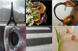
Figure 3: The Natural Type poster produced by students of my Advanced Typography course (top). Each image represents a letter of the alphabet (plus the ampersand), as shown in detail below.
The poster was constructed in Adobe InDesign with 27 photos arranged in three rows of nine (A-Z plus &). Part of the assignment was to deliver the assignment as a print with an accompanying CD with the image cropped to a square at a set resolution. All of the images were left in their original RGB color space with appropriate embedded ICC profiles (most were from consumer digital cameras, so most images were embedded with sRGB).
We printed on glossy paper on the Xeikon DCP 50 digital press, which has two RIPs. We chose the Harlequin RIP, as it supports the conversion of RGB images with embedded profiles to CMYK on the fly. Prior to printing the job, I sent a moderately high-resolution PDF image of the poster to all the students, and required them to “approve” it by e-mail response (part of the lesson). We caught two misspelled words and one other dumb mistake. Next, I printed one copy as a final prepress proof on the university’s Epson 9500 ink-jet printer.
Once everyone involved had a chance to pass judgment, we printed 50 copies and distributed them to the students, the faculty, and a few select others. The features of the Xeikon press that benefited us included modest cost for a short run (each poster cost just a few dollars to print, covered in part by student fees), no plates or additional make-ready were necessary, and we got nearly instantaneous results. (To purchase a limited edition of this poster, see the box to the left.)
The students of Advanced Typography had a great experience this quarter; Lorraine Donegan and I will be teaching it again next year. I don’t plan to repeat the alphabet poster (I want that to remain special), but I will definitely have the students learn about handset type, letterpress printing, and the origins of their favorite type fonts. I find the experience of teaching the course a thrill, and I feel that I am graduating students who will really know about type, rather than those who might choose a font because (as one beginning student once told me regarding the selection of Aachen), “I chose it because it was at the top of the list.”
This article was last modified on June 17, 2023
This article was first published on April 20, 2004
Commenting is easier and faster when you're logged in!

Recommended for you
Turning Grayscale to Color in Photoshop
When it comes to creating multitone images, it’s common to think of using the Du...

Organizing Illustrator Files With Layers
We’ve all done it. We’ve all been so involved in the creative process that we do...

Better Tools for Tones: Why I Don’t Look at the Histogram
The histogram—the graph of tonal levels you see in photo-editing software—helps...