

An official from the Federal Aviation Administration grounded my friend Bert’s airplane. It seems that the registration number lettering on the tail of the plane didn’t fit the fancy of this FAA official, and he has the authority to red-tag any aircraft that doesn’t meet the strict guidelines of the FAA.
Normally this kind of problem doesn’t come to my attention, but in this case it did: Bert is a good friend, and the exterior of the airplane and the lettering in question were designed by me.
From A to Zed
The FAA publishes guidelines for the size, and general rules for contrast and color of registration numbers, known by pilots by the nickname “N-numbers.” I had followed these guidelines two years ago when I designed the plane, and was exceedingly careful to ensure that the letters met the criteria that I obtained from the agency. But, I was wrong on one account: I put a crossbar through the Z in an effort to make it look “more international,” and to help to differentiate the letter from the numeral two (see Figure 1). It was that silly crossbar that caused my friend Bert’s plane to be grounded.
 Figure 1: This rendition of the letter “z” offended the FAA and caused my friend’s plane to be grounded.
The lettering is based on ITC Officina Sans, with the modifications mentioned. I also simplified the letters a bit, removing ink traps from the acute angles of the N and the Z. These letters were then painted 18 inches tall on the tail of the plane.
Designing for Flight
Designing the paint scheme for an airplane is quite similar to designing for print, except that there are a few special considerations. The horizon line of the plane is different in flight than on the ground, and planes are typically designed to look good in flight (ironically that’s where they are almost never seen). To compensate for this, you must design an airplane with its horizon slightly tilted.
Most airplanes have a set of stripes that run from nose to tail, and that is pretty uninspiring. My idea with this plane was to have lines that run from nose to tail, but winding through each other, and then not quite running off the tail. In addition to the stripes, I wanted to use a gradient on the underside of the fuselage. The gradient on this plane was done by two workers spray painting with two spray guns of the solid colors, carefully blending the colors together.
After testing several design ideas, my friend chose one of my designs, and gave me the go-ahead to complete the job. This involved sending digital files to a company called Cheyenne Airmotive in Cheyenne, Wyoming. The plane was delivered to the Cheyenne airport shortly after its arrival in the United States (it’s a Swiss-made plane). In Cheyenne the files were cut in vinyl on a Gerber sign plotter. When you’re working with paint, you use the outside of the vinyl as a mask, and then spray inside. The digital files were created in Adobe Illustrator — strictly two-D — and then converted to DXF format (see Figure 2).
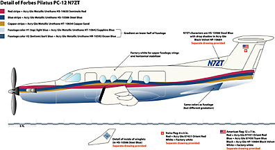 Figure 2: The drawing of the plane, precisely to scale, was sent to the painters with color call-outs from aircraft paint samples.
DXF plays an important role here. DXF (Drawing Interchange Format), one of the file formats from the powerful AutoCAD engineering application from Autodesk of San Rafael, California, is a file format common to building and architecture as well as Numerically Controlled (NC) milling and machining. NC milling is the means by which machine parts are cut. The Gerber plotter used for this job follows the same kind of DXF instructions as those used by computer numerically encoded milling machines, but it cuts vinyl with a diamond-tipped cutter. For several versions, Illustrator for Macintosh lacked this file format while it was available in the Windows versions. That inconsistency was corrected recently, and now both Macintosh and Windows versions can export in DXF.
I followed the files to Cheyenne a few days later, arriving in Wyoming to supervise the cutting and application of the stencils (see Figure 3). I learned that surfaces don’t behave exactly like drawings (I had designed large truck graphics before, but those were applied to nearly-flat surfaces); airplanes have all sorts of curves and bends. And, I learned that the two sides of the plane are not exactly the same size. Engine torque pulls the plane slightly differently on one side than the other, and the manufacturer compensates for this by making the right side slightly shorter than the left. We modified my design on-the-fly (if you’ll excuse the pun) to compensate for the differences.
 Figure 3: The plain plane, with its stripes delineated with tape, begins to take shape in Cheyenne, Wyoming.
The skill of the workers at Cheyenne Airmotive made up for a lot of the details that I hadn’t considered. One was that the wing-tip stripes must be positioned with a good eye. No measurements work here because of perspective differences. One of the workers and I stood back about 35 feet from the wing tip, and he held a string out with his arm. He visually sighted this line along the horizon of the airplane while giving instructions to another worker who raised the stripe pattern, or lowered it a little to get the pattern to appear to flow from our distance.
From File to Flight
Masking the stripes takes days, and each stripe requires separate masking to cover the parts not yet painted, and the parts not intended for paint. And, painting a plane is not like painting a car. There are all sorts of delicate — and untouchable — openings and tubes. The rudder, which has just the tips of stripes on it, was removed, painted off of the plane, then balanced and mounted by an FAA-certified airframe-and-powerplant mechanic. The weight of the paint changed the balance of the rudder very slightly, and the mechanic reset the rudder accordingly.
At one point the plane was covered in blue masking material, making it look like a mysterious blue animal with a propeller on the front (see Figure 4). From the masking hangar it was taken to the largest spray booth I had ever seen, where master painters attacked it with spray guns. The spray booth was first washed-down with water to suppress any dust that might have been present. The seriousness with which these specialists work was impressive.
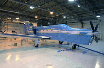 Figure 4: Covered with masking materials, the plane is prepared for its first coat of paint in the nearby spray booth.
After each coat, the plane was baked to set the paint, then the masking was changed, and the painting process was repeated. In all, it took three days of preparation and four more days of masking and painting.
After the paint was completed, the plane spent another month in Denver having its interior installed and being fitted with electronics , and was then delivered to my friend Bert (see Figure 5). Since then it has served as his personal magic carpet for trips around the U.S. and Mexico.
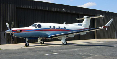 Figure 5: After emerging from the paint booth, the plane looked just like the drawing.
Grounded!
That was until the officious FAA man grounded the plane because he didn’t like the crossbar in the Z. He argues that the letter Z shouldn’t have a crossbar. I argue that the crossbar is “international.” An appeal is before the FAA now, and while the appeal is being considered, small pieces of tape are covering the offending crossbar, allowing the plane to be operated once again.
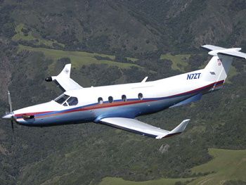 Figure 6: The aircraft flies again — but only with pieces of white tape covering the Z’s crossbar.
If the FAA decides that the crossbar must go, then the plane will have to be repainted to change the Z. That’s not a huge problem, but it is a relatively expensive one. I hope that cooler heads in the FAA headquarters in Oklahoma City see the wisdom in having a Z look like a Z, and not like a numeral two.
This article was last modified on December 13, 2022
This article was first published on May 6, 2003
Commenting is easier and faster when you're logged in!

Recommended for you

Before&After Design Tip: From Silhouette to Logo
Neither fancy typography nor a painstakingly crafted graphic would be as effecti...

Indic and InDesign
A primer on Indic scripts and how to create stunning documents with them in InDe...

CreativePro Conversations: Type Tech Trends You Need to Know
In this CreativePro Conversation, David Blatner chats with type designer Charles...