


![]()

Version: 4
Operating systems: Macintosh, Windows
In the old days, typographers put themselves through a lot of agony in their quest for perfectly spaced type. They’d laboriously insert metal shims between letters or use power saws to cut mitered edges on handset type characters, all to get a better fit between letters that we can now achieve easily with the click of a button. In this article, we’ll show you how to take your typographic quality up a few notches without expending a lot of time and effort in the process. You’re probably aware that most fonts you use include a certain amount of pre-programmed kerning. And you’ve probably already used QuarkXPress’ manually applied tracking and kerning features, as shown in Figure A. Nevertheless, by the end of this article, you’ll know how to automate these features for faster and even finer control of your character spacing.
Figure A: The kerning for this font is a mess, but you can fix it so you’ll never have to kern it manually again.

A Little History
Highly skilled typographers had always strived for perfectly spaced type at all costs, until finally most were forced out of business by the advent of inexpensive desktop publishing systems. Running first on Macintosh computers, and later on PCs, these new applications, such as QuarkXPress and PageMaker, integrated the setting of type with graphics. It didn’t take long to figure out that even an unskilled operator could quickly learn to produce type that was good enough. Of course, the practitioners of this new wave of typesetting were unconcerned with kerning or other aesthetics, and so typographic quality took a nose dive for a few years. But, as the excitement of just being able to set type on a computer has worn off, graphic designers are starting to pay more attention to typographic niceties, and typographic quality is once again heading upward.
Tracking Down the Kern
We’re going to assume that you already understand the basics of kerning and tracking and why it’s important to adjust your character spacing. We’ll give you a quick overview of standard tracking and kerning methods to make sure you’re on the same page. Kerning refers to adjusting space between two adjacent characters, while tracking refers to adjusting space between more than two characters. The spacing adjustment can be positive (adding space between characters), but it’s more often negative (tightening the space between characters). There are two different ways to track and kern within QuarkXPress. You can adjust the kerning by clicking between two letters with the Content tool, choosing Style > Kern, and then entering a unit value in the Kern Amount text box. You can also click between the two characters and adjust the kerning with keyboard commands or with the controls on the Measurements palette, as shown in Figure A. Similarly, you can adjust tracking by selecting a range of text with the Content tool and choosing Style > Track, and then change the value in the Track Amount text box. Or you can use the Measurements palette.
AutoClown vs. AutoKern
As recently as fifteen years ago, typographers paid small fortunes for add-on devices that were supposed to help their systems produce nicely kerned type. One device in particular worked so poorly that its disgruntled users never called it by its real name, AutoKern, but instead referred to it as AutoClown. Even though this device had a price tag of around $5,000, it didn’t even come close to the smooth operation and precise kerning you can get by taking advantage of the kerning pairs built into your fonts these days. Nor was it as useful as the built-in kerning and tracking abilities of QuarkXPress and the Kern/Track Editor XTensions that come free with QuarkXPress. Now that you understand manual character adjustments, let’s take a look at how to preset the kerning pairs for an individual font so you won’t have to make these manual adjustments over and over again. Again, look at the less-than-desirable spacing between the letter W and the letter A in the headline shown in Figure A. If you were using this font for a number of headlines, you’d soon grow tired of manually adjusting this particular kerning pair everywhere it appeared throughout your jobs. As mentioned earlier, most fonts come with preset kerning pairs, and fortunately you can alter those kerning pairs.
To do so, in a new QuarkXPress document, set the word Warts in 96-point LaBamba or some other serif font. Note the poor kerning between the W and the a. (If necessary, try different fonts until you find one that has poor spacing.) Next, access the font’s kerning information by choosing Utilities > Kerning Table Edit, and scrolling through the list of fonts until you find LaBamba <<Plain>> (or the name of the font you chose), as shown in Figure B. Click the Edit button, and then enter Wa in the Pair text box of the resulting Edit Kerning Table dialog box. You can also scroll through the Kerning Pairs list, but typing the kerning pair is faster. Immediately, the Preview section of the dialog box shows the two letters, and the Value text box shows the amount of preset kerning in units, in this case -20. Enter -60 and notice the letters in the preview move closer together, as shown in Figure C.
Figure B: Be careful to pick the right version of the font.
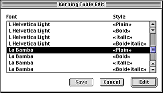
Figure C: The Edit Kerning Table dialog box provides a preview, but it’s not always accurate.

Next, click the Replace button to replace the kerning pair value, click OK, and in the Kerning Table Edit dialog box, click Save to see the results in your actual type. Oops. If you thought it might have been too tight in the preview, now you can see that it definitely is. But don’t worry, you can easily fix it. Repeat the steps shown above, but this time set the kerning value to -40 and the result should be a nicely kerned heading, as shown in Figure D.
Figure D: Correctly kerned type makes for better readability without subtle distractions.

If you’re interested in the maximum readability you’ll get from nicely kerned type, take a few minutes now to adjust some of the other kerning pairs that you know cause problems. Now those few minutes a day you used to spend manually kerning your most frequently used fonts are eliminated. These changes won’t affect your actual fonts, but QuarkXPress will save the adjusted kerning values in this and any future documents, and will also save the kerning values as part of the XPress Preferences file, so you’ll never have to manually kern these letters again. And, because these settings are saved as part of your document, you won’t have to worry about someone else opening your file without the correct kerning values. As long as she chooses the Keep Document Settings button while opening your file, as shown in Figure E, there won’t be a problem.
Figure E: Now you know what this sometimes-annoying dialog box is really for.

Don’t forget that kerning works both ways. In most cases, you’ll probably want to move letters closer together, but now you’ll also be able to make permanent fixes for those pesky character combinations that are always too tight, as shown in Figure F, by increasing the positive kerning value.
Figure F: Sometimes you need a little bit of positive kerning.

Hack That Track
You can always adjust the tracking of a selected paragraph or a headline for overall tighter or looser spacing, but wouldn’t it be nice if you could make this adjustment just once and be done with it? There’s a way to set this up, and once again, it involves the free Kern/Track Editor XTensions. Assume that you’re going to use ITC Officina Sans Book throughout a big job you’re working on. In some cases, you’re using this font for callouts at 14-point size, but you’re also using the font in 24-point, 72-point, and even 120-point headlines. At 14 point, the tracking looks okay, but as the size increases, the font seems to fall apart as the intercharacter spacing gets looser and looser. Of course, you could set tracking values in your style sheets, but it will be better to make a permanent adjustment to the way QuarkXPress tracks this font at varying sizes. Open a new QuarkXPress document and set a line of type in 120-point ITC Officina Sans Book or a similar font you have available. Access the controls for the font’s tracking values by choosing Utilities > Tracking Edit. In the Tracking Edit dialog box, scroll through the list of fonts until you find your font, and then click the Edit button. The resulting Edit Tracking dialog box shows a graph with the vertical axis representing positive and negative tracking values, and the horizontal axis representing font sizes. If no one has ever changed the tracking settings for this font, you’ll see the default setting, which is a straight horizontal line running along the zero point. By experimenting with manual track settings, you’ve determined that you’d like this font to set with no tracking up to 14 points, you’d like a -3 tracking at 24 points, a -10 setting at 72 points, and a -13 setting at 120 points. So, with these figures in mind, click on the horizontal line at the 14-point size, to place a point at exactly 0 units. You can judge the approximate unit value and point size by gauging the movement of the point against the vertical and horizontal axes of the graph, but when you hold down the mouse button, you can also see the exact values in the upper-right-hand area of the dialog box.
Click again on the horizontal line at the 24-point size, and move the point down to a value of -3 units. Click on the horizontal line at the 72-point size, and move the point down to a value of -10 units. Finally, click on the horizontal line at the 120-point size, and move the point down to a value of -13 units. At this point, your Edit Tracking dialog box should look like the one shown in Figure G. Click OK, and in the Tracking Edit dialog box click Save, and then check the results on your document page. From now on, any type set in this font will automatically have the tracking values you just set up, as shown in Figure H.
Figure G: You’ll need to make larger or smaller adjustments of this curve with different fonts.
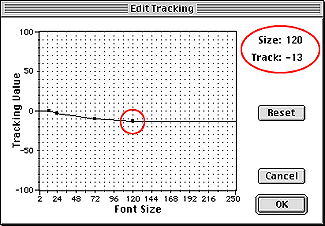
Figure H: Big type that’s loosely spaced is hard to read. Adjust the tracking and make life easier for your readers.

As with kerning, these changes won’t affect your actual fonts, but QuarkXPress will save the adjusted tracking values in this and any future documents. And it will also save the tracking values as part of the XPress Preferences file, so you’ll never have to manually apply tracking to this font again. And, because these settings are saved as part of your document, you won’t have to worry about someone else opening your file without the correct tracking values. Again, as long as he chooses Keep Document Settings while opening your file, as shown in Figure E, there won’t be a problem.
On Track and Ready to Kern
It’s a wonderful irony that the very technology that displaced the typesetters of old–that was berated for its lack of even the rudiments of typographic quality–now affords users with typographic refinements that the old typesetters could only dream about. So take advantage of this power. If you’re not already refining the character fit of your QuarkXPress type by adjusting kerning and tracking, start doing it today. QuarkXPress makes it easy for you, and this little bit of extra effort will give you a big edge over those who aren’t in the know. Kerning and tracking aren’t just about having things look nice or about following old, outdated rules. Kerning and tracking are about readability and professionalism, and it’s small details like this that will keep you flying high above your competition.
Tips for Tracking and Kerning
- You’re not restricted to editing kerning pairs that are already built into the font. Enter any two-letter combination, apply a value, and save.
- The Auto Kern Above option in the Character tab of the Document Preferences dialog box must be checked, and you must be in a point size larger than the point size indicated, in order for QuarkXPress to apply the information in a font’s kerning table and before applying your custom tracking values.
- The Kern/Track Editor XTensions have to be loaded in order to edit tracking and kerning values.
- You can export a kerning table as an ASCII file and then import that kerning table to be used with a different font.
- You can generate your own kerning table with a word processing program and import it for use with any font.
- Regardless of how many times you’ve edited a font’s kerning table or its tracking values, you can reset these values to their defaults by clicking the Reset button.
- If you’ve had to make several changes to the kerning table for a font, try exporting that table and then importing it to use with the bold font of that same family. Sometimes just a few adjustments in the new bold kerning table will be all that’s necessary, saving a lot of repetitive work.
- Values applied from the kerning table don’t show up in the Measurements palette if you click between two characters; only kerning you add manually will show here.
- In the Edit Tracking dialog box, you can delete a point by clicking on it while holding down the [option] key ([Alt] key in Windows).
- If you alter a font’s kerning and tracking in ways that you’ll only want in effect for one particular document, it’s no problem. Just save and close the document, and then with no documents open, reset the kerning and tracking values to their defaults. Now QuarkXPress will use default values for that font until you open the original document and click the Keep Document Settings to force QuarkXPress to use the kerning and tracking values that were saved with the document.

Copyright © 2000, Element K Content LLC. All rights reserved. Reproduction in whole or in part in any form or medium without express written permission of Element K Content LLC is prohibited. Element K is a service mark of Element K LLC.
This article was last modified on March 12, 2022
This article was first published on July 6, 2000
Commenting is easier and faster when you're logged in!

Recommended for you

Converting CMYK to RGB with InDesign
What's the best way to extract an InDesign page as an RGB image to use in PowerP...
