
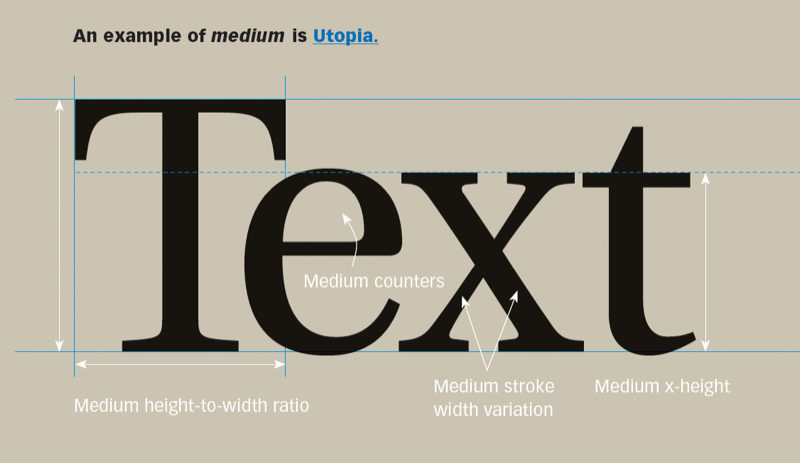
When evaluating the choices, the operative word is medium. The x-height of a typestyle is the height of its lowercase characters. The larger the x-height, the denser the type will appear. You want medium; unusually tall or short x-heights are better suited for specialty projects. This 8-page article from issue of Before&After Magazine shows you how the hallmarks of good text type are legibility (how readily one letter can be distinguished from all others) and readability (how well letters interact to compose words, sentences and paragraphs).
The x-height of a typestyle is the height of its lowercase characters. The larger the x-height, the denser the type will appear. You want medium; unusually tall or short x-heights are better suited for specialty projects.
© John McWade/Before&After Magazine, courtesy of Gaye Anne McWade.
Commenting is easier and faster when you're logged in!

Recommended for you

TypeTalk: Top Fonts of 2008
Q. What typefaces have been hot recently? A. The past year was a great one for t...

Can You Read Me Now? Testing the Limits of Readability in Design
I’ve long been obsessed with how things work. Sometimes I think maybe desi...

Confusing Type Terms, Part 2
Within the world of typography, there are a variety of terms that are either con...