
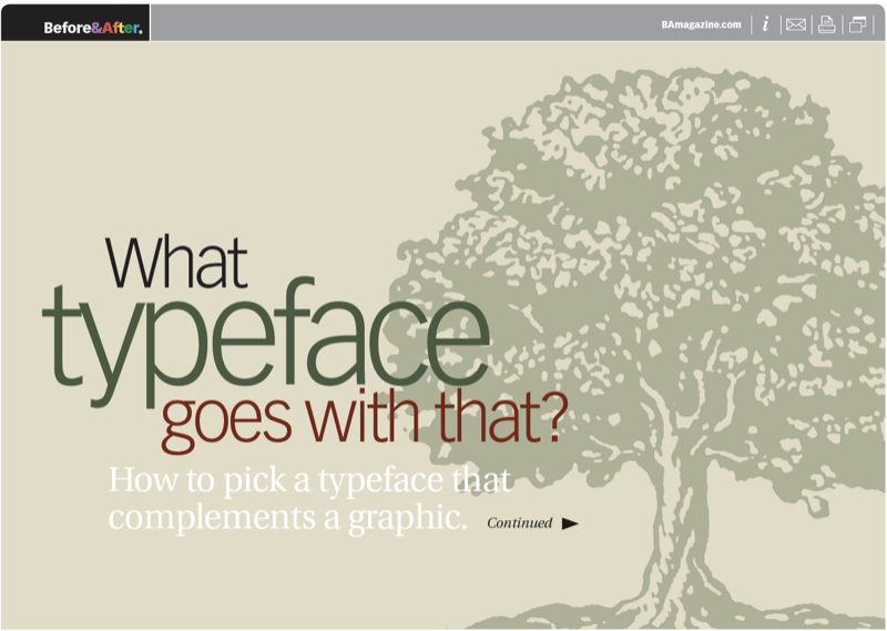
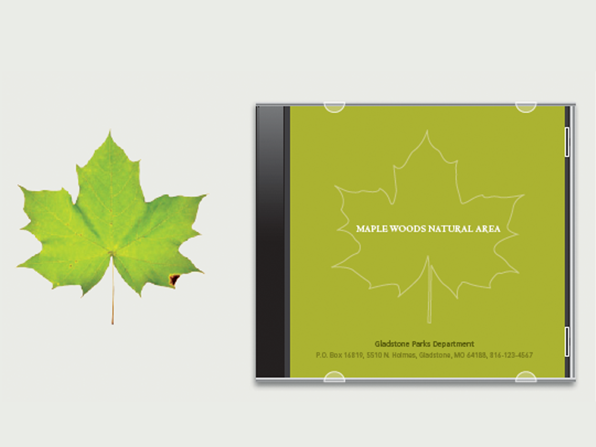
You’ve found the graphic you want and need a typeface to go with it. How do you choose? We think of type as something to read, but type is actually artwork to which we’ve assigned sound and meaning. Since type and graphics are, visually speaking, the same thing, the thing to do is to coordinate their visual properties—the key to selecting just the right typeface. This 21-page article from issue 40 of Before&After Magazine shows you how to pick a typeface that complements a graphic.
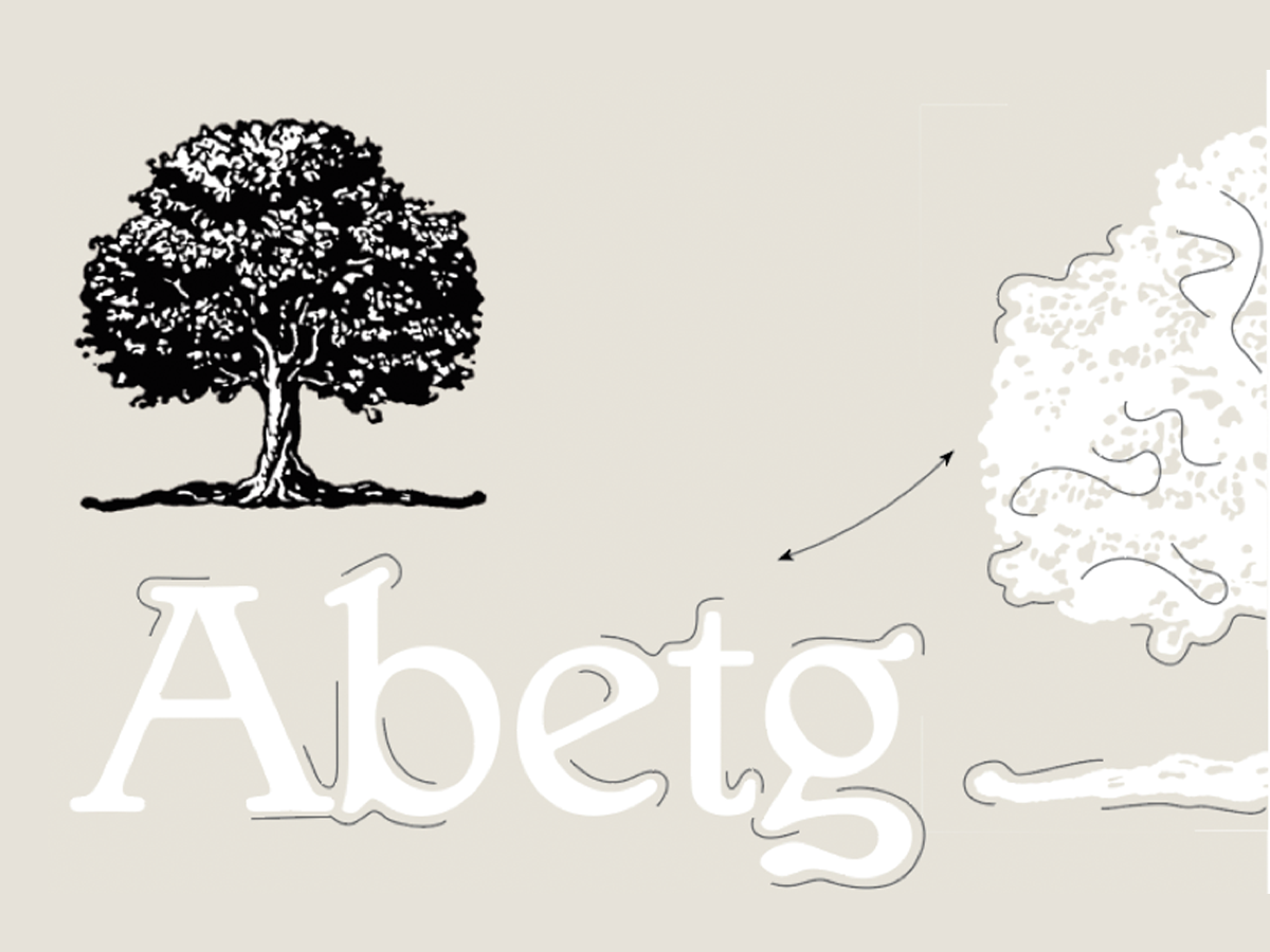
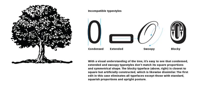
To coordinate type and image, we must first find their common visual properties. Start with the graphic, and evaluate it for proportion, shape, line and texture.
© John McWade/Before&After Magazine, courtesy of Gaye Anne McWade.
Commenting is easier and faster when you're logged in!

Recommended for you
Before&After: How to Find the Perfect Color
Hidden in your photo is the color palette you need. Here’s how to get it out.
Before&After: One-Line Design
How to make expressive designs easily and quickly with just a line.
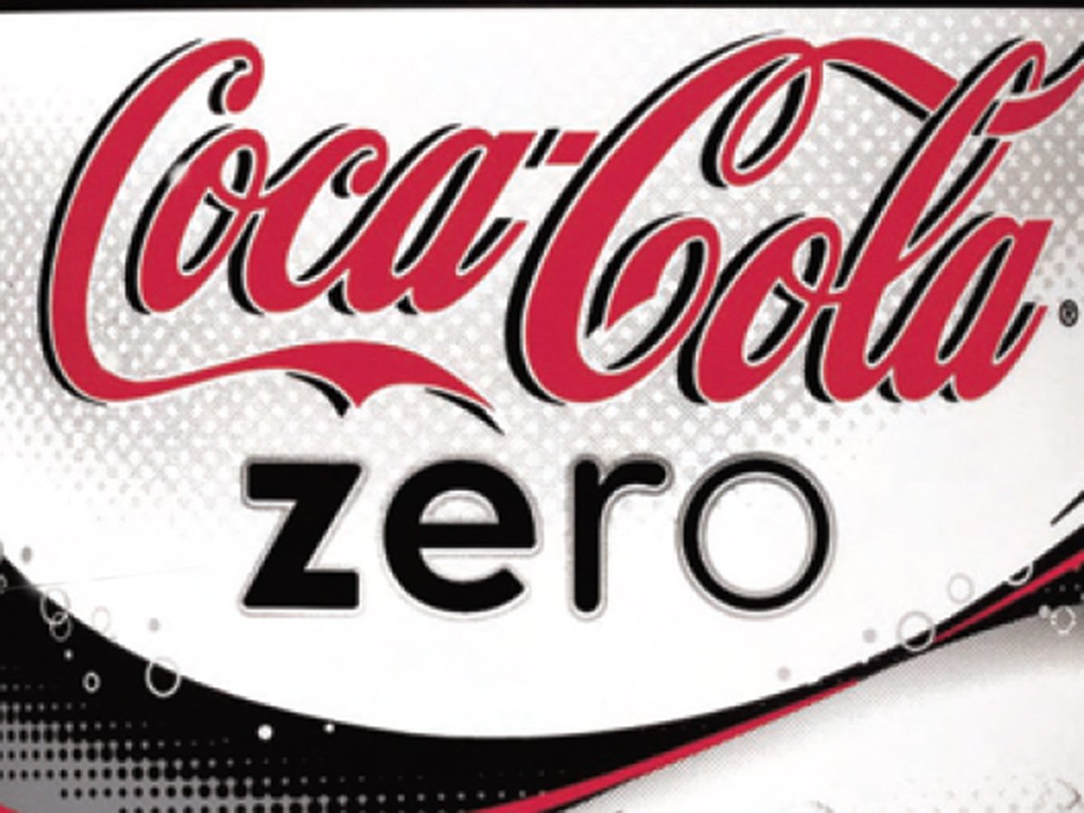
Before&After Design Tip: A Logotype That Looks Like What It Says!
Look how Coca-Cola created this simple typographic device—four letters, each ski...