

A good text-only logo is bold, clear, and attractive, and it conveys an appropriate sense of the company. These qualities can be difficult to combine in one word. The place to start is with the natural pattern of its letters. This 23-page article from issue 46 of Before&After Magazine shows you how to work with the natural pattern of your letters to select fonts effectively.
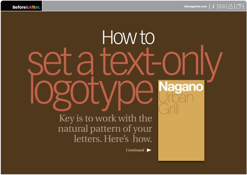
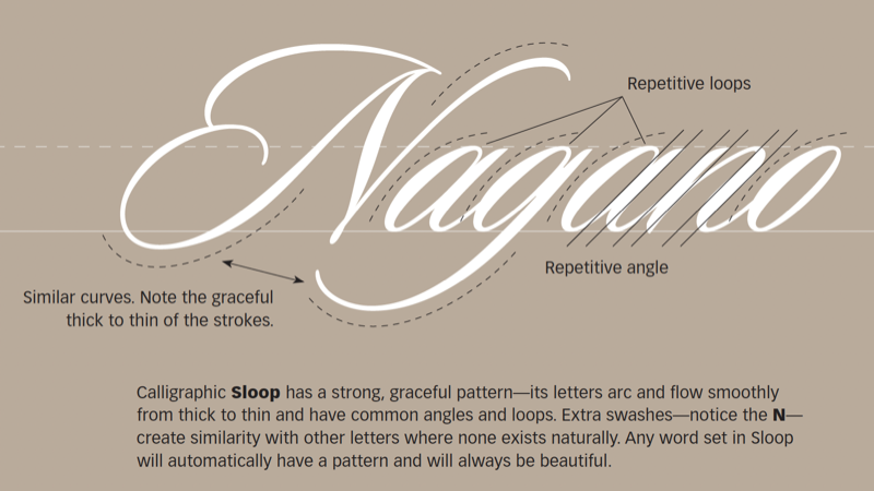
The typeface can make or break the pattern. The typeface can impose a pattern of its own. In every case, the typeface also adds meaning. The key to a great logotype is to find a typeface that makes the name look good and conveys the appropriate meaning.
© John McWade/Before&After Magazine, courtesy of Gaye Anne McWade.
Commenting is easier and faster when you're logged in!

Recommended for you

Before&After: How to Cool a Hot Photo
How do we cool this photo? The answer is found on the color wheel.
Before&After Design Tip: Narrow Page Makes a Revealing Cover
Give your next report cover a bit of intrigue

Before&After Design Tip: Using Many Photos? Display Them in a Grid!
A beautifully simple way to display a group of photos