
Here’s a quick design tip on typography from issue 44 of Before&After Magazine.
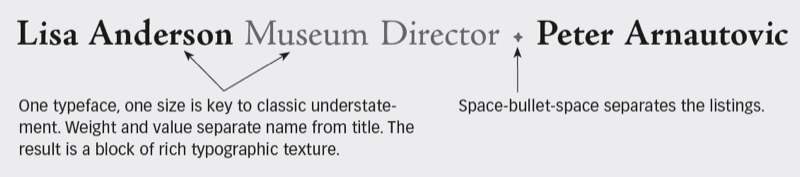
A beautifully typeset list of names and titles—staff, donors, sponsors, participants, so on—will bestow visible stature to those on the list. The key to this is understatement: Use one classic typeface, small size, center stage.
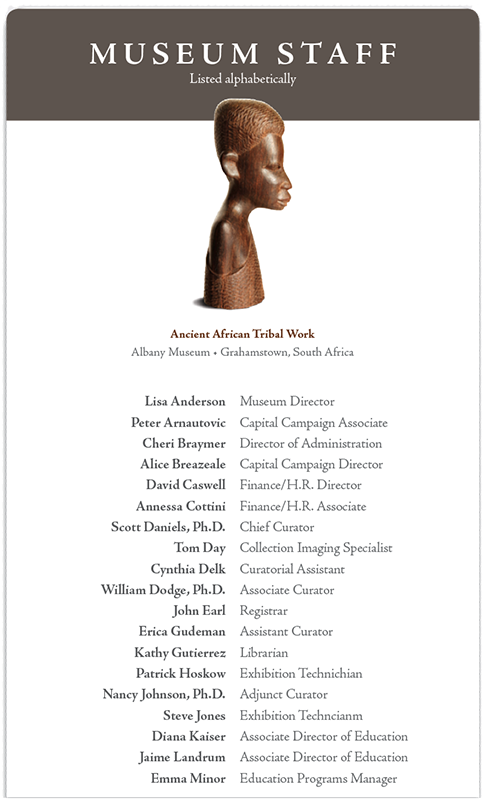
1. Like the movies: Countless movie credits roll just like this—name and title aligned outward from a centerline. Bold type separates names from titles; its tint gives the two sides more similar value.
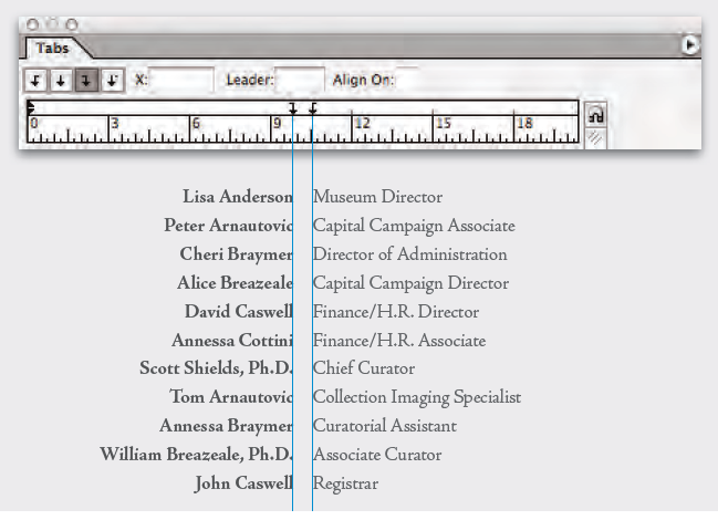
Simply use right and left tabs.
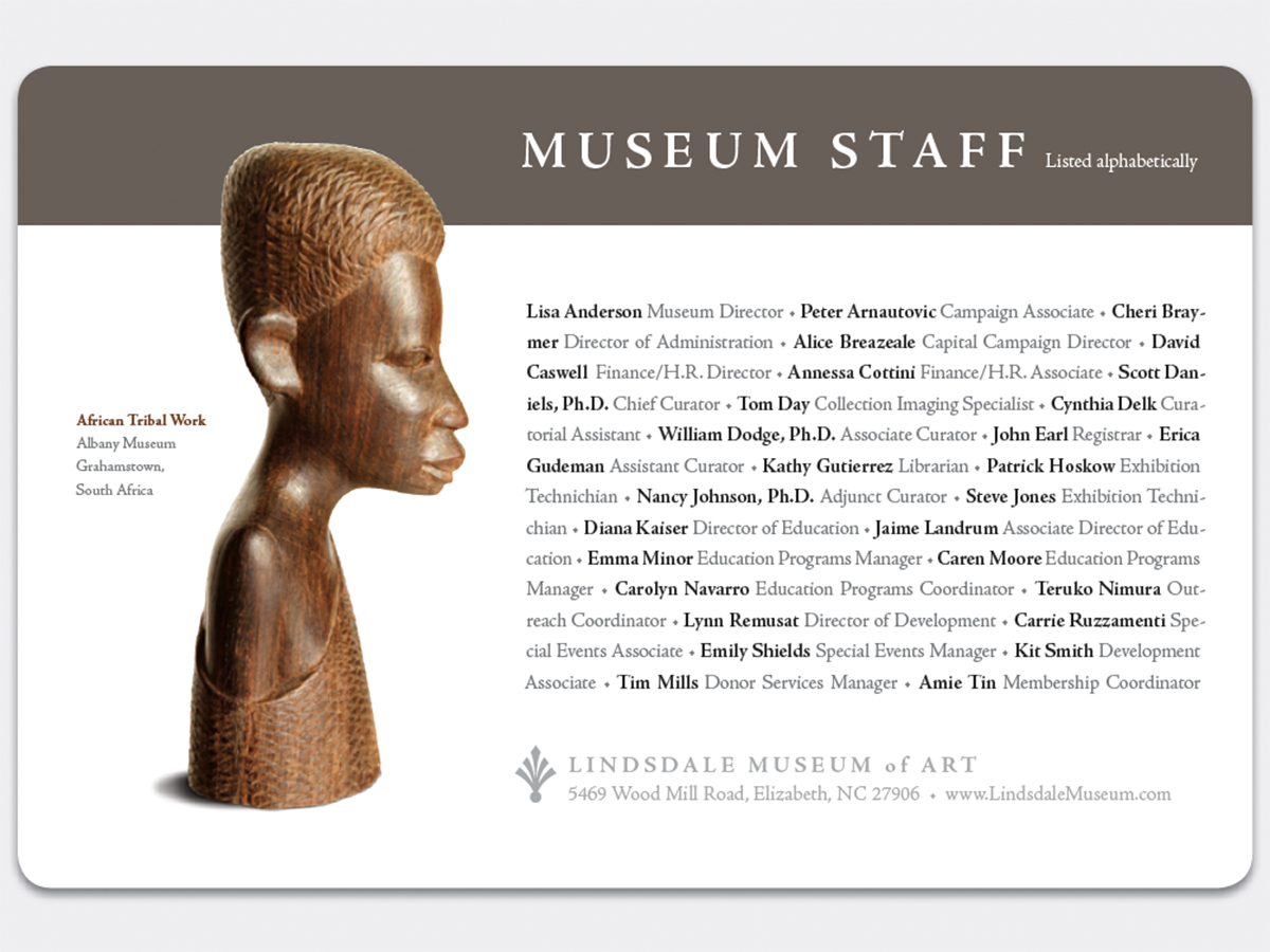
2. Set a word block: Slower to read but artistically more engaging, run all names and titles together separated by bullets. To square the block (red corner), click “Justify all lines” in InDesign’s Paragraph dialog box.
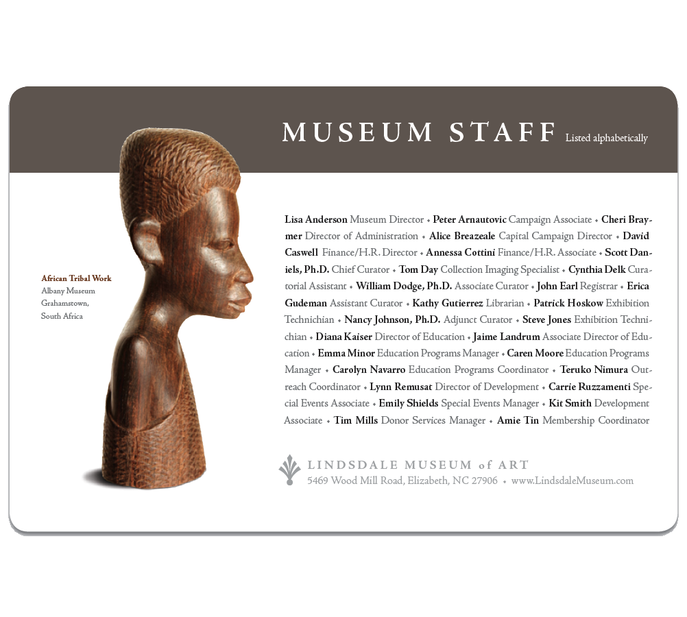
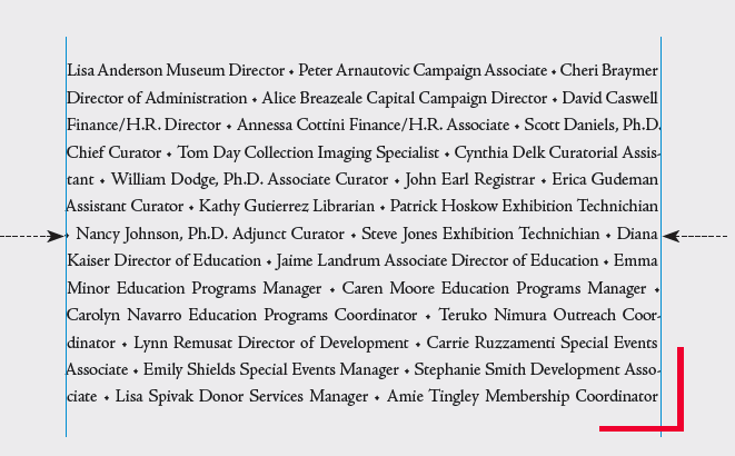
For a perfect fit, you may need to slightly adjust width or size.
CreativePro members can download original content from Before&After Magazine, a beloved resource that taught a generation of newly minted digital designers how to design and communicate effectively with the written word. See our archive here.
© John McWade/Before&After Magazine, courtesy of Gaye Anne McWade.
This article was last modified on January 4, 2026
This article was first published on August 9, 2024
Commenting is easier and faster when you're logged in!

Recommended for you
Fonts to Help the Homeless
Good things often spring from the union of commerce, art, and charity, as these...

TypeTalk: To Hang or not to Hang…
TypeTalk is a regular blog on typography. Post your questions and comments by cl...

TypeTalk: Timesaving Tips for Designing with Type, Part 2
Most design projects are done on a tight deadline. That fact, coupled with many...