

Here’s a quick design tip on layout from issue 42 of Before&After Magazine.
Designing a whole page can seem daunting—there’s so much space to fill! It’s tempting to scale everything up, up, up and fill it all in. But that’s not design.

Here’s a better way to get good results easily. Think small and focused. Reduce your work area to the middle of the page and design that.

It’s much easier, and you’ll get a built-in focal point, too.
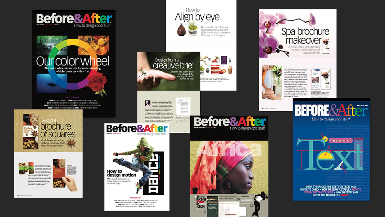
CreativePro members can download original content from Before&After Magazine, a beloved resource that taught a generation of newly minted digital designers how to design and communicate effectively with the written word. See our archive here.
© John McWade/Before&After Magazine, courtesy of Gaye Anne McWade.
This article was last modified on January 3, 2026
This article was first published on February 21, 2025
Commenting is easier and faster when you're logged in!

Recommended for you

Before&After: Design a Flier That Sells
The key to an advertisement that sells is simple: Keep all eyes on the product.
The Before & After Collection
John McWade’s treasury of design instruction finds a new home at CreativePro.

Before&After: Logo Makeover
To create a new logo for a high-end custom-framing business, we turn abstract at...