Jim Felici
About
James Felici has worked in the publishing industry for over 30 years. He is the former managing editor of Publish magazine, and written for PC World, Macworld, and The Seybold Report. A renowned type expert, he is the author of The Complete Manual of Typography.
Articles
See all articlesThe Path to Beautiful Tables, Part III: Working With Numbers
Don’t miss part 1 and part 2 of this series on how to create beautiful tables! In the final installment of this three-part series, we’ll look at the most common form of table content: numbers. Text entries in tables follow most of the same conventions as text in other contexts, although hanging indents are used […]
The Path to Beautiful Tables: Working With Table Rules
In this installment of our series on creating beautiful tables (see Part 1 here), we’ll look at a couple more aspects of table setting that relate to form rather than, strictly speaking, content. The grid structure that programs use to delineate tables seems to call out for rules to separate rows and columns. Using them […]
Drop Cap Tips: Kerning and Sizing
InDesign can make decent-looking drop caps at the push of a button, but I always seem to find myself battling to make them look better. After spending much time in the trenches, I have a few insights and undocumented techniques. You can control the basic aspects of drop caps—how many characters to enlarge and how […]
How to Create Beautiful Tables: Controlling Row and Column Spacing
In this new series of articles we’ll be looking at several key techniques for making tables look good and work well. Tables rise and fall on details of execution—the nitty-gritty of typesetting—more than on overarching design, because when all is said and done, all we’re doing here is manipulating rows and columns to present data […]
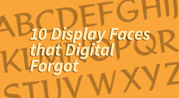
10 Display Faces that Digital Forgot
Because of your enthusiastic response to my last column, I’ve moved up its sequel. In this installment, I’ll be looking at display and decorative faces that were somehow left in the archives when the winds of digital technology swept through the dusty vaults of yesteryear’s metal type foundries. Of all the thousands of typefaces that […]
Ten Great “Lost” Text Faces
History is cruel to typefaces—especially text faces—and very few stand the test of time. For every Caslon or Garamond there are a hundred also-rans left along the road for reasons of taste, economics, or technology. The craving—and craze—for new faces has led to the revival of scores of old metal typefaces, but many deserving faces […]
A Celebration of Hand Lettering
The last time I wrote about signage in the developing world (Go on a Type Safari, 4/1/10), I was roasted by some readers for failing to distinguish between setting type and hand lettering. I think that was a case of splitting hairs, because I was talking about layout more than how the letters got there, […]
To Bold and Back: Shortcut to Trouble
Certain keyboard shortcuts are universal across programs (and often platforms), and many of these have become second nature, just tripping off our fingers without a thought: Command/Ctrl-s to save, Command/Ctrl-c to copy, or Shift-Command-b (Mac) or Ctrl-b (Windows) to shift between bold and regular-weight faces. But while that automatic finger twitch produces predictable results for […]
Ligatures: Is This Trip Really Necessary?
It’s normally taken as an article of faith that you should use ligatures in text whenever you can. Like most articles of faith, though, this one too comes with an asterisk. In practice, the importance of ligatures is measured on a sliding scale from mandatory down to undesirable. Ligatures—those fused combinations of characters that set […]


