


We are living in an “at-a-glance” society. People no longer expect information to be succinct and clear—they REQUIRE it. We see proof of this reality in our everyday interactions with social media, advertising, books, television, emails, signs, software, and websites. If we fail to embrace at-a-glance communication, our designs will fall short of our goals by not grasping and holding our audience’s attention.
How the Brain Works
For the benefit of this discussion, let’s divide the brain into two parts: analytical (the manual, slow part of the brain) and emotional (the automatic, fast part of our brain). Research shows that most of our thinking is done with our emotional mind. Based on our current understanding of how we think, all decisions are made emotionally and justified intellectually (analytically). Unless there is a brain anomaly, we can’t turn off or ignore our emotions; therefore, all at-a-glance communication must focus on emotional engagement first and then provide the supporting information. This is why aesthetics, messaging, media, and context play a major role in all forms of communication.
How to Design At-a-Glance Content
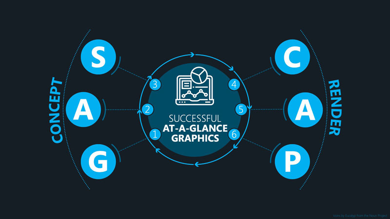
Whether you are creating presentations, whitepapers, books, learning materials, infographics, commercials, tutorials, or any other form of communication, use the following (GAS CAP) process and guidelines to make it successful.
Define your GOAL. Your goal is what happens after the audience has digested and applied your content. (HINT: Your content is a conversation between two people—the author and the audience.)
ANNOUNCE your message. To develop a compelling announcement, use M&M: Motivator and Means. The motivator gives your audience a reason to care. The means tells them how they will get the motivator.
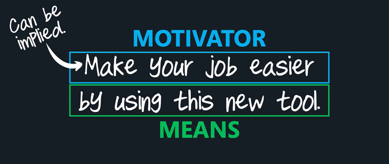
The only things that motivate us are pain, gain, or fear. I like showing gain in my messaging because it is positive, so I use benefits as my motivator. You can have up to three benefits in your motivator since your target audience may consist of many different people with different perspectives. (HINT: Less is best. The more benefits you have, the less powerful each one becomes.)
This sample announcement applies the M&M concept: “Make your job easier using this new tool.” “Make your job easier…” is a benefit (a motivator) for the target audience. Because it gives them a reason to care, they will be more engaged and more likely to absorb the content faster. The second part of the announcement—“using this new tool”— is the means by which they get the benefit.
SPELL IT OUT. Explain or prove your announcement. Connect the dots between what you are sharing and the benefit(s) your audience will get. (HINT: Imagine you personally met with your audience to make the announcement. What questions would they ask? Answer those questions clearly and succinctly.)
CHUNK your content. Using a highlighter, sticky notes, a whiteboard, or whatever device you choose, pull out the most important concepts from answers to your audience’s possible questions.
ASSEMBLE your content. Organize/order the remaining content to tell a story.
PICTURE it. There are three methodologies to turn anything into a visual:
- Literal Method. It is the “show me” method. Literally show what you are describing.
- Quantitative Method. Use quantitative charts (e.g., bar, area, and pie charts; Gantt charts; timelines) to show amount, value, or time. The data can be notional.
- Substitution Method. Use a visual simile, analogy, or metaphor to share complex or abstract ideas. For example, use a bridge metaphor to communicate the concept of “transition.”
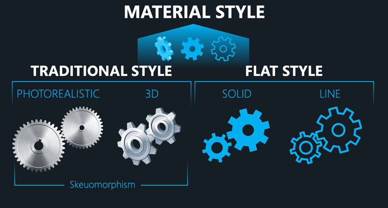
Sensory choices (e.g., color, fonts, music, sounds, resolution, brightness, accessibility, style/look and feel) are critical when designing your at-a-glance content. For example, colors evoke an emotional reaction. Color is culturally and situationally dependent. When choosing a style, keep in mind that the “Traditional Style” usually applies to an older audience, “Flat Style” a younger audience, and the “Material Style” to the broadest audience.
When designing my content, there are four resources I often use for graphics, icons, symbols, photographs, and inspiration:
Pexels.com (free photos and videos)
Pixabay.com (free photos, videos, and vectors)
TheNounProject.com (icons and symbols for $39.99/year)
Build-a-Graphic.com (PowerPoint add-in to help turn words into professional graphics and animations for $99/year)
This article was last modified on March 22, 2021
This article was first published on March 22, 2021
Commenting is easier and faster when you're logged in!

Recommended for you

Paper Tips: Going Against the Grain
This story courtesy of PaperSpecs.com. “It feels like my car is hopping al...
TypeTalk: Metrics Versus Optical Kerning
When is it better to use Optical kerning and when should you choose Metrics? Ile...

Chalk Lettering, a Return to Low Tech
One of the most charming trends to hit graphic design and typographic solutions...