


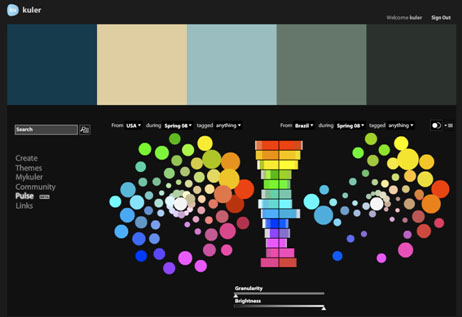
John Nack, principal product manager, Adobe Photoshop, reports on his blog that the Kuler team has added a new feature to the color harmony creation and sharing site: Community Pulse.
Described as a “big-picture view of color usage,” Community Pulse is a “beta feature, using data visualization to show the relative popularity of colors across a sampling of countries, time periods, and tags.”
Once you’ve signed into Kuler using your Adobe ID, you can mouse over the histogram to see the hues on the color wheel. Nack suggests that you play with the granularity slider to see more/less color detail, and use the comparison icon to compare and contrast.
This article was last modified on January 4, 2022
This article was first published on January 12, 2009
Commenting is easier and faster when you're logged in!

Recommended for you

Is Mac or PC Better for Graphic Designers?
The reason many designers gravitate to Macs is mostly a matter of tradition, not...

Publish Online Spotlight: American Craft Council Emerging Voices Awards Catalog
The American Craft Council highlights thinkers and makers in contemporary craft...
Automate Text Formatting with Tagged Text
You can export data directly from Excel or a database, ready to flow as preforma...