Around the World in ePublishing with Pariah Burke: 4.27 Day of Devastation

Welcome to the first installment of my new monthly column, “Around the World in ePublishing with Pariah Burke.” Each month we’ll look at a different digital publication—sometimes an ebook, sometimes an e-textbook, sometimes a digital magazine or catalog. With each publication we’ll examine the techniques and technologies used, the good and bad choices the designer and publisher made, and sometimes even how to incorporate the same features and effects into your own publications.
For this inaugural issue of “Around the World in ePublishing” I chose 4.27 Day of Devastation: A Multimedia Look at Alabama’s Deadly Tornado Outbreak, a one-off, interactive magazine-format ebook reporting on the devastation to people and property wrought by the worst natural disaster in the history of Alabama. Unfortunately, as of this writing, you can no longer download the publication from iTunes.
Of course we’ll get to the design and technology of the publication, but before we get into its construction let’s talk about its purpose, one rare among digital publications.
Non-Profit Publication
4.27 Day of Devastation is a social-awareness and charity publication. It was available for free from the App Store but asks, politely and discreetly, for donations to help the victims of the Alabama tornadoes rebuild their lives. Throughout its 45 pages/screens—which contain at least twice that amount of content—4.27 Day of Devastation depicts in editorial, photography, and multimedia the effects of the more than 50 tornadoes that touched-down in Alabama on 27 April, 2011. The bizarre and dangerous weather that day took the lives of more than 230 people and displaced thousands. The three local newspapers, The Birmingham News, The Huntsville Times, and Press Register, along with AL.com, covered the news as it happened; afterward they teamed up to combine and organize their coverage into the 4.27 Day of Devastation iPad publication.
The Publication System
Although most people in or considering getting into interactive tablet publishing know about Adobe Digital Publishing Suite (DPS) tools, few realize that DPS is not the only such system available; it’s just the most publicized. There are numerous other excellent systems—nearly all of which also run within InDesign, like Adobe DPS. One such alternative is PressRun, the system 4.27 Day of Devastation chose. Like any competing technologies, PressRun can do some things DPS can’t, and vice versa, which is why some of the interactivity features in 4.27 Day of Devastation might take you by surprise.
The Good
As digital publications go, 4.27 Day of Devastation isn’t the most feature-rich by any means. You won’t find every interactive feature of which PressRun is capable, but that’s good—the content of the publication doesn’t need 360-degree product rotations, embedded Twitter feeds, or the ability to geolocate the reader’s position. This publication instead uses touch-interactivity and multimedia as they are meant to be used—as tools to aid communication. The numerous slideshows, scrolling text stories, videos and audio clips, hotspot maps, and content popups are used judiciously, where appropriate, as tools to help tell the story; they aren’t used for flash or to show off.
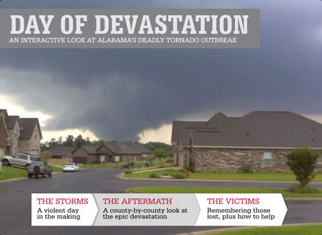
The cover of the publication (see Figure 1) indoctrinates the reader into the multimedia presentation by using a fixed masthead and coverlines atop a looping video of news photos animated with a Ken Burns effect and set to a subtle soundtrack of emergency vehicle sirens and radio chatter.
Figure 1: The cover uses a video background.
Slideshows used throughout the publication are well done in several ways. Rather than enable horizontal swiping to change images, which wouldn’t have been bad, but would have required arrows or some other iconography, the designers of this publication created a gallery of thumbnails. To move between images, the reader taps the thumbnails. The best feature of the galleries, though, is a very subtle thing: the presence of additional images—quite a few in the example of Figure 2—is communicated without the need for iconography.
Figure 2: The thumbnail-navigated slideshow.
Look to the right of the thumbnails in the figure. See that narrow, sliver-like image? It’s out of place, isn’t it? All the other images are the same dimensions, yet that one is barely over a third of the width of the others. That kind of makes you want to touch the picture, doesn’t it? In touching it you’ll likely notice that the entire row of thumbnails can be moved, thus revealing even more thumbnails (see Figure 3.)
Figure 3: Swiping horizontally reveals more thumbnails that may be viewed.
Moreover, when the thumbnail strip advances its ends aren’t clean—the thumbnails on either end are also narrower than they should be, communicating to the reader that there are yet more thumbnails in either direction. By establishing a convention of equally-sized thumbnails and then showing a thumbnail that doesn’t fit the convention the designers have brilliantly found a system to prompt readers’ actions. For readers, whether they consciously notice the difference in width, their subconscious minds will know something is out of place and motivate them to investigate the difference, leading to the discovery of additional imagery.
The before and after maps are excellent communication tools (see Figure 4). With them you can view satellite photography of Tuscaloosa and Jefferson County before the events of 27 April, 2011 and after to get a real (and quite saddening) feel for the effect of the tornadoes.
Figure 4: The after imagery in Tuscaloosa.
Using a slick panel-revolving animation the images switch between pre- and post-devastation with the tap of the circular, double-headed arrow button. Some maps even include detail imagery popups like the one in Figure 5. Unfortunately neither the full images nor the popup images may be zoomed for a closer look.
Figure 5: Popups offer closer looks at certain areas.
Although the designers of 4.27 Day of Devastation could have asked for donations on every page I’m glad they didn’t; it would have been overkill bordering on crass. Instead, they tastefully present a single page after all the content (see Figure 6).
Figure 6: Toward the end of the publication the donation page asks tastefully for help.
Each of the three items—the Governor’s Emergency Relief Fund, the American Red Cross, and the Salvation Army—are links that spawn an embedded Web browser that opens directly to the donation page for this catastrophe on the specific organization’s site. (Note that, now, more than a year later, the links to the Red Cross and Salvation Army pages forward to more general organization donation pages while the Governor’s Emergency Relief Fund link refers to a page no longer available online.)
In the “Tuscaloosa County” feature the designers included an audio track (see Figure 7).
Figure 7: An unobtrusive audio track and caption.
Not only is it well-designed into the page, it also doesn’t spawn the intrusive audio player controls common among DPS-authored digital publications. The audio track—President Obama’s speech upon visiting the site—plays while the reader continues to navigate the rest of the publication. Unfortunately, the implementation of this audio is both a good and bad about the design, which gets us into…
The Bad
The audio track, while well-designed and unobtrusive, is too unobtrusive. Once activated it will continue to play until the recording runs out, regardless of where the reader goes in the rest of the publication. Moreover, there’s no obvious way to stop the audio once it has begun. To stop it, the reader must counterintuitively tap the play button again in the original location, though no device, intuitive or counter, exists on subsequent pages; the reader would have to return to the original page to stop the audio. Fortunately the audio track does stop playing when the reader activates playback on any other audio or video object.
The packaging of the publication should have been better (see Figure 8). Upon launching from the icon the reader is presented with a branded newsstand, which is superfluous for this one-off publication. The publication should have been packaged with the content and viewer integrated, such that launching the app activates the viewer and moves straight into the publication, without letting readers ever see the viewer interface itself.
Figure 8: Launching the publication shows first a newsstand populated by but a single publication.
The third page of the publication (counting the cover as page one) is the much needed how to use this publication instructions (see Figure 9).
Figure 9: The publication’s obligatory but surprisingly unhelpful reader education page.
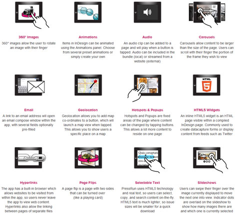
I’m very glad to see the inclusion of this page because interactive-magazine format publications are not so commonplace yet that everyone knows how to use them. However, 4.27 Day of Devastation’s “The app basics” page relies far too much on text. The lineart illustrations are overly complicated and bland to the point that they’ll likely be ignored by many readers. Of course, if the illustrations are off-putting, the paragraphs of text explaining them are even more so. I would much rather have seen PressRun incorporate the far better and easier to interpret graphics from its website (see Figure 10). Even without textual descriptions most of these icons immediately convey their purpose and expected reader action, unlike those actually used within the 4.27 Day of Devastation publication.
Figure 10: The iconography on the PressRun Website is much more intuitive.
Another thing that bugged me was the way multi-screen stories were broken up. If you look at Figure 11 you’ll see a story with a large amount of white space beneath it. It looks like a short piece, doesn’t it?
Figure 11: One screen in a multi-screen story.
If that screen is part of a multi-screen story—it is—it’s pretty obvious that this is the end of the story, right? Well, it isn’t. That screen is the fourth in an eight-screen, horizontally scrolling story. Figure 12 shows them together, halfway through a transition from screen four to screen five.
Figure 12: Midway through the transition between screens the problem of the extra whitespace becomes apparent.
After the line “‘He died saving his family,’ Maurice McGaha said,” there is space for an additional fourteen lines of copy—the entire next screen’s story… Well, the entire next screen’s story if the runts were handled. Breaking the eight-screen story at every heading left huge gaps at the end of shorter passages, and those gaps make readers think the copy has ended. If they don’t notice that there are still grey dots to the right of the white dot indicating the current screen, readers will advance past this section into the next, never realizing they’ve missed several screens of content.
In all, 4.27 Day of Devastation: A Multimedia Look At Alabama’s Deadly Tornado Outbreak is an excellent use of tablet publishing technology. It’s well-designed, well-written, and judiciously uses interactivity to help communicate and convey information.
Let Me Feature Your ePublication
Do you produce electronic publications? If so, I’d really like to see them for possible profiling in “Around the World in ePublishing with Pariah Burke.” I’m interested in any type of modern electronic publication built as EPUB, KF8, MOBI, PDF, digital replica, or interactive tablet publication. Please send one or more examples of your publication—or URLs thereto—to ep*******@*******ah.com?subject=”ePublishing%20World%20Example%20Submission””> ep*******@*******ah.com .
This article was last modified on December 13, 2022
This article was first published on August 28, 2012
Commenting is easier and faster when you're logged in!
Recommended for you

GREP Find/Change on Formatted Text (solution to a big problem)
Daivd Blatner shows how InDesign's GREP Find/Change can mangle text formatting,...

The Art of Business: In Praise of the Fine Print
I’ve yet to meet a creative professional who said “hey, I love negot...

From web to Web
It’s a tough time to be in the newspaper business these days, but not nece...


