
Affinity V2: What’s New in Photo, Designer, and Publisher
The latest version of the Affinity suite is a remarkable upgrade with compelling new features.

This article appears in Issue 14 of CreativePro Magazine.
A major new version of any design software is always worth a look, but Affinity V2 offers a truly remarkable upgrade with some compelling new features.
The entire Affinity suite comprising Photo, Designer, and Publisher – the equivalents of Adobe’s Photoshop, Illustrator, and InDesign – is now available for a one-time purchase of $169.99, reduced to just $99.99 until December 14, 2022. No monthly subscription, no ongoing charges.
That’s enough in itself to tempt many designers, but there’s an additional bonus in that all these apps are licensed for Mac, Windows, and iPad. You read that right: all three apps, including, for the first time, Publisher, run on iPad just like their desktop counterparts. These are not cut-down versions of the desktop apps, but fully featured apps intelligently remastered to a mouseless, mobile environment.
The Affinity Experience: Seamless Switching
One of the biggest features of Affinity’s apps is that, unlike their Adobe equivalents, they were all created using the same core architecture. Only the toolset changes for each app, or persona, as Affinity calls them. This means that if you’re designing a page in Publisher, you can switch instantly to the Photo persona just by clicking or tapping a button. You’ll see exactly the same view of the document as appeared in Publisher, except that you now have access to all the Photo editing tools.
Here’s a page I’ve put together in Publisher on the iPad, with an image behind the headline. I want to move the image in front of the headline, but of course the black background of the image will obscure the text:
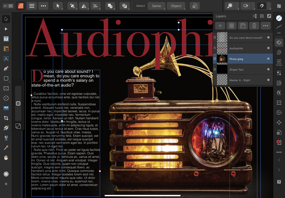
Switching to the Photo persona allows me to apply a Luminosity Mask to the image, hiding the black background. But notice the Layers panel: it’s identical to the one in the Publisher persona. Not only can I see the Publisher page while in Photo, I can also use the Layers panel to rearrange the elements, in this case moving the newly-masked image in front of the headline.

The ability to switch between personas while staying in a single document is more than just a convenience: it’s a game changer, and possibly the single most compelling reason to switch to Affinity. The fact that it works as well on iPad as it does on desktop means mobile design is now a very real possibility.
Version 2 of the Affinity suite offers a range of cross-app improvements, from minor interface enhancements such as identifying icons in the Layers panel to a new Style Picker. This works in a similar way to the standard Eyedropper tool, except that there’s an Attributes bar that lets you choose what you want to copy – stroke, fill, opacity, effects, character and paragraph settings. Here it is in Designer:

The Style Picker works in all three personas. You can apply a copied style to an entire text block, or to a single word by clicking on it, or to a range of characters by dragging over them. You can even copy styles between the different personas: so if you’re designing a page in Publisher and then switch to Photo to add some filter-distorted text, you can sample the style from the text created in Publisher and apply it to the Photo text.
Photo
Here’s a rundown of what’s new and improved in Affinity Photo
A Better RAW workflow
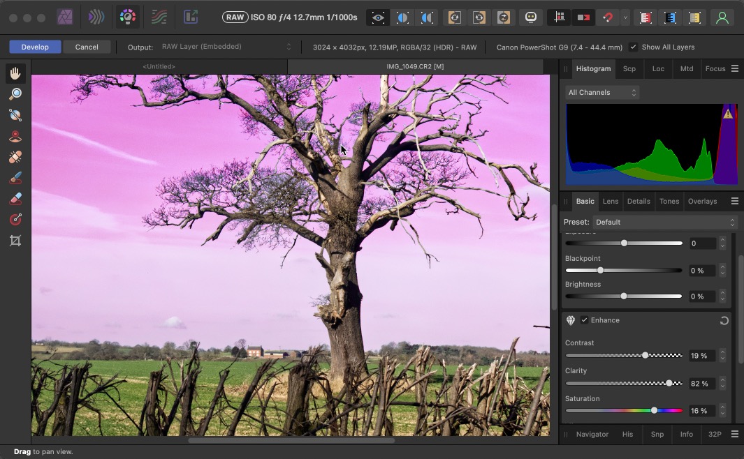
The Photo persona now has a non-destructive RAW processor, which allows you to either embed a RAW image into a composition or to link it to the version on disk. Best of all, when you “develop” a placed RAW image you can choose to see it within the composition, including any other layers that may be above or below it. Here’s the RAW persona in action on the tree layer, while still allowing me to see the Luminosity-based Hue adjustment applied to the sky:
A New Mesh Warp approach
The Mesh Warp feature in Photo now has the novel approach of being able to set control handles on either the Destination or the Source. Here, for instance, is the Mesh Warp being applied to a view of a wall, set to Source mode. I’ve added control handles to the top and bottom of the wall, adjusting the Bézier curves to run along the wall:
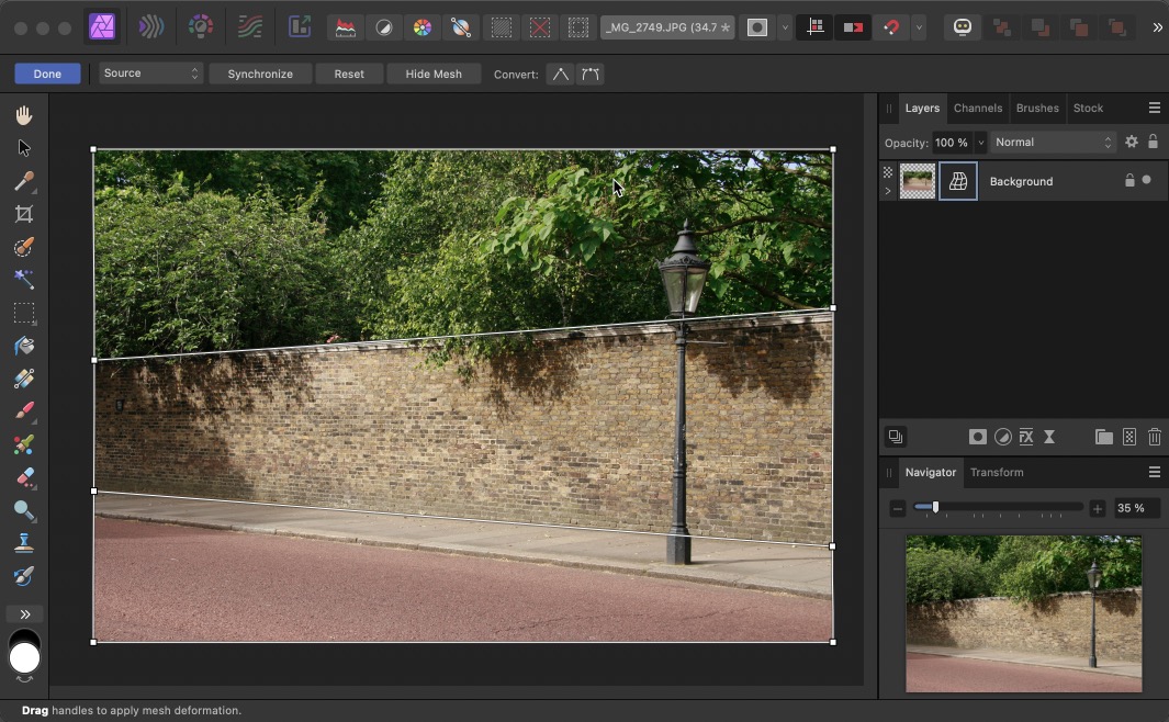
When I switch from Source to Destination, those control handles are automatically squared up, turning the oblique view of the wall into a head-on view:

It’s a radical reworking of the Warp approach, and one which is so intuitive it’s surprising no one thought of it before.
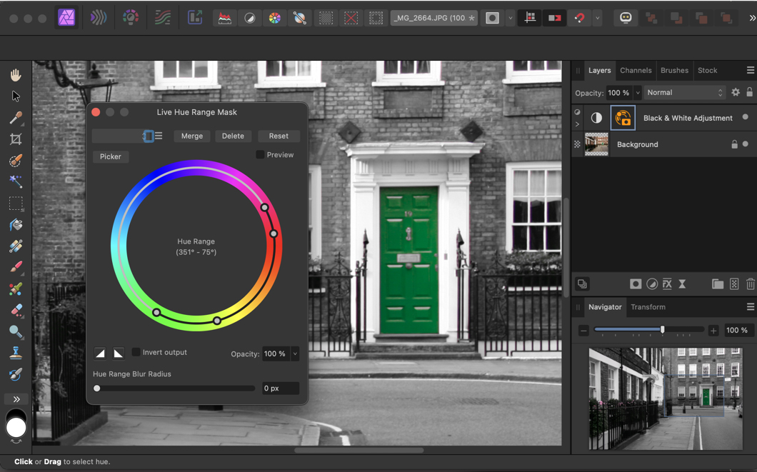
Live Hue Mask
Photo includes a number of automated masking methods, such as a Luminosity Mask that can be applied to Adjustment Layers as well as regular layers. Here, I’ve added a Black & White Adjustment to an image, then applied a Live Hue Range Mask to that adjustment so that the green door is masked, allowing it to be seen in full color.
Better image displacement
Photoshop includes a Displace filter, which can distort an image based on the luminosity of any other image. But it’s a complex and fiddly process, with no previews, and it usually involves a lot of trial and error. In the Affinity Photo persona, you can apply a displacement map either from an external file or from underlying layers in the same document, with a slider to set the strength and direction of the displacement. Here’s an example of the Live Displace filter applied to text on a brick background:
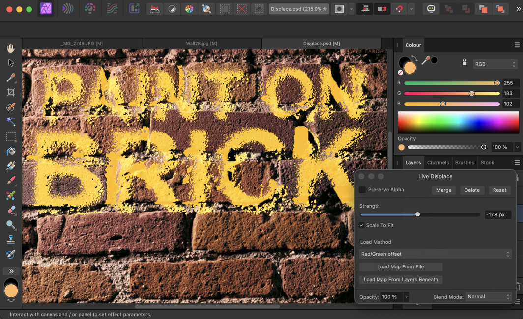
Because it’s a live filter, the effect can be adjusted at any time – and the text remains fully editable.
Other enhancements
There isn’t room to discuss all the improvements to the Photo persona, but a few of the more notable ones include the ability to export both WebP and JPEG XL files, both formats that are likely to grow in popularity as more browsers are updated to implement them. There’s also a new Stock panel, which allows you to import free images from the open source Pixabay library directly into your compositions.
Photo layers can now include multiple masks, rather than just one; and you can choose whether the masks will add, subtract, or intersect with each other. This provides great flexibility, especially when adding custom borders to images.
Designer
Now, let’s take a look at what’s new in Affinity Designer.
Shape Builder enhancements
The Shape Builder in the Designer persona is the equivalent of Illustrator’s Pathfinder tools. It’s spectacularly easy to use, giving you the ability to drag either a straight line, a marquee selection or a freehand trace over elements you want to merge. There are also options to clean up the curves, both simplifying selected shapes and removing those you don’t want.
Here, I’ve created two yellow rings, with two red rectangles behind them. Using the Freehand drag method, dragging over the top left and bottom right semicircles shows the selection area highlighted. The result is the S shape shown on the right.

Tastier donuts
The Donut tool lets you create circular shapes with a hole in the middle. It’s quick and easy to use, with simple controls for setting the size of the hole, the start angle and the end angle. All of these can be set numerically, or by dragging the control handles on the donut while you’re drawing it (or at any time afterwards).

Better Mesh Warp
The Warp tool can be used to distort any selected objects, including live text. You can choose from a range of presets, or use a blank mesh and add as many additional control points as you like to the grid. A handy feature here when editing the content of the warp afterwards is a Mute Mesh button, which temporarily hides the effect.

Slice and dice
The Knife tool allows you to cut any selected object, either using straight lines or with a path drawn freehand. It makes the business of fragmenting objects vastly easier, although of course live text is converted to regular paths in the process.

Affinity Publisher
Now, let’s turn our attention to Publisher, Affinity’s answer to InDesign.
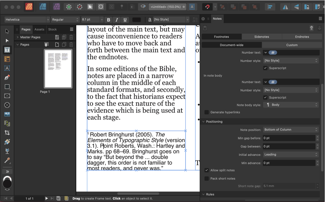
Footnotes, endnotes, and sidenotes
One of the most-requested features in the Publisher persona was the addition of footnotes, and it has been implemented in this release. You can choose not only footnotes, which appear at the bottom of the current page, but also endnotes, which appear at the end of the chapter or document. You can also opt for sidenotes, which can be placed more freely on the page.
Of notable interest here is the fact that each footnote can be styled individually, and even placed individually: so you could, for example, place one footnote beneath a column of text, and space the subsequent footnotes so they appear beneath an image.
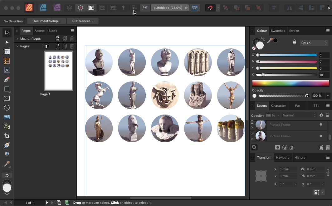
Placing multiple images
The Publisher persona uses a neat method for creating quick grids of images. Draw your initial shape, then tap the right cursor key to add more instances of that shape to the right of the first one. Tapping your Down Arrow key will replicate the entire row to multiple columns. Holding your Right and Left Arrow keys will increase or decrease the horizontal space between the shapes. Holding the Down and Up keys will adjust the vertical spacing between rows.
Once your grid is set up, you can place images into the entire grid automatically. First, select the images from disk that you want to place, and all the images will appear in a scrollable panel on the side of your document. Select those you want to place, and as you hover over any of the shapes you’ll see a ghosted version of the first image appear there:
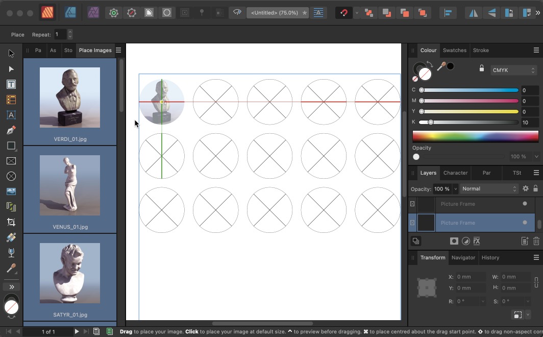
Click at the first location to automatically place all the selected images. You can choose whether the placed images are fully enclosed within the shapes, or sized to cover them; and of course each placed image can easily be adjusted for size and position afterwards.
Placing external files
Publisher works well with placing complex external documents. You can place a multi-page PDF by simply selecting the range of pages you want to include, and Publisher will automatically place one per page within your document. A seriously useful extra here is that if you open a PDF file in Publisher, it will be fully editable. Can’t do that in InDesign!
Publisher includes a range of additional enhancements, including the ability to place architectural DWG files and then to turn layers within those files on and off after embedding them. There’s also a new Books tool, which allows you to combine multiple chapters in a single sequentially-numbered document. You can also choose which of the placed chapters to use as the source for paragraph and character styles.
Affinity V2: Onward and Upward
There’s no doubt that the Affinity suite offers tremendous value for money, and the fact that it’s a one-off purchase will no doubt appeal to designers tired of paying Adobe’s monthly subscription fees.
The switch from Photoshop, Illustrator and InDesign to Photo, Designer and Publisher isn’t a straightforward one, though. The interface is very different, and it takes time and dedication to locate the tools and controls you need, as well as mastering their use. For example, the Undo and Redo buttons on the iPad apps are hidden by default. You can turn them on in Preferences, or you can use the History panel in all three apps to step back through your workflow. Or you can Google it (or watch one of the many Affinity training videos at the Serif website) to discover that a two-finger tap on the screen performs an Undo, and a three-finger tap performs a Redo. It’s unlikely you’d stumble upon these shortcuts through trial and error.
Photo replicates many of the features of Photoshop, although there’s no equivalent of Photoshop’s Sensei technology, which powers automated selection of people and objects, as well as the innovative Neural Filters. But conversely, Photo’s filters are in most instances vastly more powerful than those in Photoshop, with many more variations and live previews of all the effects.
The Affinity apps are also much more forgiving than their Adobe equivalents. To take a simple example, if you use apply Eraser tool to a block of text in Photo, the app will automatically create a Mask for the text layer and hide the painted area accordingly. Photoshop, on the other hand, will tell you that the text has to be rasterized first, not mentioning that you could simply add a Layer Mask to it instead.
Affinity V2 is a huge upgrade, and it’s well worth checking out the free 30-day trial to see how you get on with this innovative and powerful set of design tools. But expect to have to put some effort into learning the interface.
Commenting is easier and faster when you're logged in!

Recommended for you

Making a Magazine Cover with Affinity Photo and Designer
Get to know this state-of-the-art design and production workflow
Review: Affinity Publisher
In August 2018 Affinity took the unusual decision to launch its page layout prog...

Working with Strokes in Affinity Designer
Learn how to use the Stroke panel in Affinity Designer to control attributes suc...