
Acrobat Tips: Fonts Can Make or Break PDFs


Editor’s Note: The following article was written with Acrobat 5 in mind and does not specifically discuss the recently released Acrobat 6, although it has been reviewed for accuracy and relevance to the new software.
A prime reason for using PDF as a format has to do with its ability to retain graphic appearance and layout; Acrobat’s font handling mechanisms are a key aspect of the portability of PDF files.
When fonts used in the source file PDF are embedded in the PDF, Acrobat has the original font information at its disposal. If fonts are not embedded, Acrobat uses the partial font information saved in the PDF (name, width of different letters, and style characteristics) to locate the required fonts in the system where the PDF is viewed or (if no fonts are found) to simulate its appearance using substitution fonts.
When graphic fidelity is important, a PDF file should be produced so that all fonts used in it are embedded. While font substitution may be reasonably successful in conveying the general appearance of many fonts, it is a design compromise at best as it will never result in a precise match, and with some fonts it may be unacceptable.
To reduce file size when fonts are embedded, font subsetting can be employed so that only the characters actually used in the PDF will be embedded. As typically only a small portion of the characters included in a font is actually used in a specific document, the result is a significant reduction of font data. This is especially the case with fonts that store many hundreds or even thousands of characters (Far Eastern, Unicode, or OpenType fonts).
Subsetting will limit or prevent editing operations (text editing or insert/replace page operations). This is generally not an issue with PDFs distributed as final documents to be viewed or printed elsewhere. If these editing operations are anticipated as part of the specific PDF life cycle, don’t use subsetting. Take into account, however, that subsetting may take place by default already at the PostScript driver level.
Fonts that cannot be reasonably substituted by Acrobat must be embedded, regardless of file size issues. This applies to special symbol/logo fonts, or to fonts with special styles (such as script fonts). Depending on the specific font characteristics, this may take place automatically, even when embedding is turned off, when Acrobat identifies such a font.
To further reduce file size related to font storage, you can specify that the Base-14 fonts will not be embedded. These include the Helvetica, Times, Courier standard font families (regular, italic, bold, bold italic), Symbol, and Dingbats. Acrobat Reader installations include fonts that fully match these fonts’ functionally (identical character widths, but a slightly different design). When you decide not to embed fonts, inspect the results of font substitution, which will equally apply to viewing and printing. This can be done with View> Use Local Fonts. When this setting is disabled, fonts that are not embedded in the PDF will be simulated, even if they are installed in the computer where the PDF is viewed. Notice that in some cases, font substitution results in serious spacing problems or highly distorted letter shapes (see Figures 1 and 2).
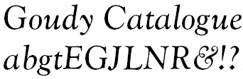
Figure 1a: Actual Fonts
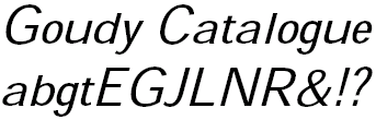
Figure 1b: Substituted Fonts
Example 2a: Century Schoolbook – Actual Fonts
Example 2b: Century Schoolbook – Substituted Fonts

Example 3a: Frutiger Ultra Black and Myriad – Actual Fonts
Example 3b: Frutiger Ultra Black and Myriad – Substituted Fonts
Font Formats
Acrobat Distiller 5 works equally well with all common font formats:
- PostScript (Type 1)
- TrueType
- OpenType
PostScript Type 3 fonts, in use by some TeX installations, are to be avoided — as display of resulting text in PDFs will be slow and poor, file size will be larger than it should, and text may not be searchable. Bitmapped Type 3 fonts are sometimes encountered in the PDF even though the original fonts used are valid PostScript or TrueType fonts — this is usually a result of a malfunctioning PostScript driver (especially on Windows NT).
When purchasing new fonts for use with your authoring applications, make sure that there are no embedding restrictions per the font license.
To view a list of fonts used in a PDF file, choose File> Document Properties> Fonts. When first opened, this displays a list of fonts used in the specific page being viewed (including font format and embedding/subsetting status). Click the “List All Fonts” button to view a list of all fonts used in the document.
Typographic Settings
Be aware that some advanced typographic features (such as ligatures, old-style figures, and small caps), if supported by your authoring program and fonts used, may impair Acrobat’s text interpretation and affect text-related functions: Find and Search, Copy/Paste, bookmark created from selected text, and automatic Web link creation. Increased letter spacing can add extra spaces and will also adversely affect text.
Use Only Fonts That Are Fully Installed
Make sure that you only use fonts or styles that are available as standard installed fonts. Acrobat Distiller cannot embed font information in a PDF if the font data is resident on a printer; the printer driver enabling these fonts provides partial data only (font name and metrics).
Likewise, when using bold variations with fonts that do not have a bold version installed, some authoring applications (including Word and FrameMaker) will “simulate” the missing weight, together with the PostScript driver, through duplication of the text instance to be “bolded” a number of times, using very small offsets — resulting in a bolder appearance. This is not recommended aesthetically, as a bold font uses a different design; it also results in display and text-related problems at the PDF level, where the bolded text resides as multiple instances of the word.
Which Font Styles Should Be Used?
This relates to aesthetics, and may be highly subjective. When PDFs are designed primarily or even solely for print purposes, there are no display-related limitations. However, when a PDF is to be displayed on screen, text set in a small size using fonts with delicate serifs or curves may be distorted due to the low resolution of the screen, to the extent of disappearing. Many italic fonts will not survive the screen’s low resolution. Black (heavy) font weights — serif or sans serif — will also be distorted (some shapes clogged). However, some of these fonts may work well if used in a larger font size (such as in headings). Given the screen characteristics, extra attention should be paid to the combination of factors affecting readability: font, size, line spacing, and line length.
Font-Related Aspects in PDFs on the Acrobat 5 CD
If you have access to the Acorbat 5 CD that comes with the program, you’ll find many useful instances of PDF font settings in action:
- The vast majority of PDFs in the Acrobat 5 CD use only base-14 fonts. With a few exceptions, these fonts are not embedded — which is fine for general- purpose use, as Acrobat Reader has font-matching built-in. The custom logo font is embedded — this could have been the case even if no fonts were selected for embedding (as Acrobat Distiller will automatically embed fonts it identifies as special fonts).
- Running text in most documents is set in 11-pt Helvetica; a few documents use 12-pt Times. Code fragments are set in 10-pt Courier (sometimes in larger sizes). This combination of fonts is probably the safest you can have (but this should not be construed as a recommendation for all PDF producers to solely rely on fonts from this minimum set).
- The Acrobat Help and PDFMaker Help files use a different design, based on 11-pt Myriad for regular text (embedded).
- In a few PDFs, larger-size fonts used for main headings were transformed into bitmaps. In the BatchSequences.pdf file, for example, the “Batch Sequences” heading cannot be selected as text, and will not be located by the Find or Search functions. This may be the result of an inadvertent setting in the PostScript driver used (or a bug).
- The PDF Reference (version 1.3) Manual, second edition, is also included in the Acrobat 5 CD (this specific PDF was reviewed separately in terms of its online use). Fonts used in the title page (Myriad and Caecilia Heavy) are not embedded, and are simulated using Acrobat’s built-in Adobe Serif/Sans MM “chameleon” fonts (see Figure 4). Apparently the same PDF was used for the book production. As the fonts were not available on the production system, the simulated fonts can be identified in the title page of the printed book (first printing, July 2000).

Figure 4a: PDF Reference – Actual Fonts

Figure 4b: PDF Reference – Substituted Fonts
Shlomo Perets is founder of Microtype, which specializes in FrameMaker and PDF training and resources.
Copyright © 2002-2003 BinaryThing Pty. Ltd. All Rights Reserved. Used with Permission.
This article was last modified on January 11, 2022
This article was first published on August 26, 2003
Commenting is easier and faster when you're logged in!

Recommended for you


How to Insert a Schwa (or other phonetic) Character in InDesign
How to find special little-used characters when working in InDesign

Digital Asset Management for InDesign Users
Theresa Regli demystifies digital asset management services and offers advice on...