
Accessible Typography Essentials
Learn how to use styling, spacing, color, and contrast to make your designs more inclusive.

This article appears in Issue 149 of InDesign Magazine.
When you think of making a document accessible, you probably think of things like adding alternative text to photos or graphics for screen readers. But accessibility isn’t just about screen reader users. It’s about ensuring as many people as possible can understand what you’re communicating!
Unfortunately, when you’re building accessible typography, it can be a bit overwhelming to think of all the elements you have to consider, such as typeface, styling, color contrast, layout, and spacing. However, if you follow the guidelines in this article, you’ll be well on your way towards making your design more inclusive—and hopefully reaching your readers on their own terms.
Typeface
Okay, let’s start with the most obvious factor that can affect accessibility: typeface. Your choice of typeface can make or break any page design, especially from an accessibility point of view. People with low vision, reading, learning, and attention disorders like dyslexia and ADHD can benefit when you choose accessible typefaces.
Find common ground
The quickest way to create an accessible design is to choose a common typeface. Many typeface studies testing people with disabilities show that common typefaces lead to faster reading speeds and a deeper comprehension level when compared to uncommon typefaces. While these common typefaces are not inherently more accessible than other typefaces, people with disabilities have an easier time reading them because they have learned how to work with (or around) these typefaces since they encounter them more.
What do I mean by “common” typefaces? You could probably name many of them off the top of your head because they’re default fonts in many programs and operating systems. They include:
- Arial, Calibri, Futura, Gotham, Helvetica, Montserrat, Open Sans, Roboto, Tahoma, and Verdana (sans serifs)
- Times New Roman and Georgia (serifs)
- Arvo, Museo Slab, and Rockwell (slab serifs)
In addition to choosing a common typeface, be sure to avoid ornate or handwritten typefaces, as well as ones that have only one character case available (e.g., only uppercase characters). These specialty typefaces with cursive designs, quirky shapes, or artistic features like thin lines may look nice design-wise, but they are much harder for some people with disabilities to read than common typefaces (Figure 1).
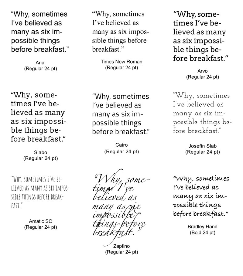
Figure 1. The first row illustrates common typefaces that are recommended for most cases. The second row contains less common typefaces with unique characteristics that make them more accessible. The third row offers examples of typefaces that are not accessible. Accessible typeface collections, such as the Google Foundry on Adobe Fonts, can aid you in making the most inclusive typeface decision for your next design.
Likewise, don’t use typefaces that claim to be accessible or help a specific disability type, such as the Dyslexie or Atkinson Hyperlegible typefaces—or Comic Sans, for that matter. It’s not that these typefaces are problematic; there is just no clear evidence they help readers either. Right now, you are better off picking a common typeface that the majority of your readers are already familiar with rather than taking the chance that a specialty typeface will work.
Readability of serif versus sans serif
Research on accessible typefaces has not conclusively shown whether serif or sans serif typefaces are easier to read. But for the 20% of the population with language-based learning and cognitive disabilities, it is clear that specific numbers, letters, or combinations thereof can be confusing. It is important for people with these types of disabilities that every letter and number has clearly defined characters, so one is not confused with another.
Common readability offenders are the uppercase I (India), lowercase l (lettuce), and the number 1. Likewise, letter pairs like b/d, p/q, f/t, i/j, m/w, and n/u can sometimes flip either left-right or up-down for some readers, transforming a word such as band into a nonsensical word like danp or sometimes into a real word, such as damp, which would change the meaning of the sentence. This flipping can also extend to numbers such as 5/2 and 6/9, but also number/letter pairs like 0/O, 6/b, 8/b, 9/p, 9/q, and many more.
When you are choosing your next typeface, be sure that:
- The uppercase I (India), lowercase l (lettuce), and the number 1 are easily distinguishable.
- Prominent ascenders (the vertical line in d) and prominent descenders (the down-pointing line in y) are unique.
- Certain letters are not a mirror images of one another or could not be easily swapped for another number or letter in the typeface. (This is especially important for the b/d and p/q letter pairs.)
When you pick common typefaces or typefaces with strong and unique characters, you will be making a more inclusive choice for your readers.
Of course, you can also extend that inclusivity by providing alternative options whenever possible, such as supplying Braille or large print versions of your designs.
Typographic Styling
After choosing your typeface, the next step is to consider the typographic styling of your design. Styling can include anything from the size and variations of the typeface to the color palette of your copy and text-based images. Poor styling choices are especially troublesome for the estimated 15–20% of the world’s population with dyslexia.
Maximize typeface sizes and limit variations
Sometimes the typeface is not an issue for people with disabilities, but the size and variations of the typeface are. For example, people with low vision may not see the copy if it is too small, and people with cognitive disorders might not understand that all caps indicate importance, while some people with dyslexia struggle to read italic text. No matter how you look at it, typographic styling has a significant impact on your readers.
Use the following guidelines for typeface size and variations to increase the readability of your copy:
- Increase the body typeface size to at least 14 pt (preferably larger).
- Limit the use of typeface variations such as italic, bold, ALL CAPS, or other styling methods that may make the copy difficult to read.
- When emphasizing a word, use asterisks, dashes, double bolding, or underlining instead of color or italics.
As with many things in design, less is often more: Limit the number of typeface sizes and variations when you can.
Meet and measure color contrast
The heart of most designs is color and contrast. Without good color contrast levels in place, words, icons, and other graphical elements are hard to discern, and a design can quickly become inaccessible (Figure 2).

Figure 2. This flyer’s inaccessible design needs help. Among its many accessibility issues are poor typographic styling and color contrast.
But what happens when your readers perceive color and contrast in different ways? As designers, how can we reach people with color-sensing issues, such as the estimated 300 million people who have a color deficiency or the 253 million people with low vision? Combined, those two populations equal roughly 7% of the global population, which means color and contrast is an extensive area where designers can have a direct and immediate impact on a page’s accessibility.
If you are an accessibility veteran, you will likely already know a bit about color contrast ratios and tools. But if you’re newer to the field, you should become familiar with the international set of color contrast ratio guidelines created by the W3C. After years of testing people with various disabilities, the researchers suggest using a color contrast ratio of at least 4.5:1 for normal-size text (14 pt regular), 3:1 for large text (14 pt bold or 18 pt regular and larger), and 3:1 for essential icons and images. Thankfully, we have tools like the Colour Contrast Analyser, A11y Color Palette, and the Adobe Color Palette Generator to help us make accessible color pairs and full palettes.
A quick way to view your design from the perspective of a person with color blindness in Adobe Illustrator is to navigate to View > Proof Setup and choose one of the color blindness filters. The two filter options are “Color blindness – Protanopia type” and “Color blindness – Deuteranopia type” (Figure 3). These two types of color blindness account for most of people with this disability; however, there are additional types of color blindness, including tritanopia and monochromatism.

Figure 3. When you apply Illustrator’s “Color blindness – Protanopia type” filter to the example flyer, the salmon colors turn to a muted gray, the teals become various shades of purple, and some colors do not change as much. Overall, this flyer’s poor color contrast becomes more apparent and challenging to read.
Adobe InDesign does not have color blindness filters built into the product, but one workaround is to export your design to a format Adobe Illustrator can open. Alternatively, you can use the accessibility tools on the Adobe Color site to check the ratios (Figure 4).
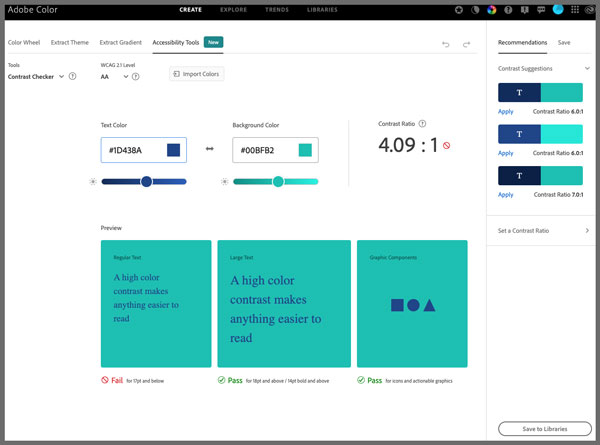
Figure 4. The Adobe Color site’s Contrast Checker tool
One advantage of using these tools is that you have even more options for modifying colors in real time, and it includes tritanopia in the color blindness simulators. Also included is Color Blind Safe, a “potential color conflict” tool that clearly lets you know when your palette swatches are problematic to people with color blindness and low vision (Figure 5).
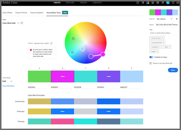
Figure 5. The Adobe color blindness simulator and “potential color conflict” accessibility tool
To learn more about why and how to use this tool in your designs, check out these two great resources from Adobe Creative Cloud and CreativePro.
In addition to strong color contrast ratios, it is essential to make use of solid color backgrounds behind text in your design. Text on top of busy backgrounds, overlays, textures, or gradients is difficult to read for many people, not just people with disabilities.
To improve your design for accessibility even more, avoid using color alone or only sensory characteristics (shape, size, visual location, orientation, or sound) to convey information. For example, if you said, “Please see the section with the green crescent icon for more information about our night hours,” a person with color blindness might not be able to discern the color green. At the same time, someone with a cognitive disorder might not understand what shape a crescent is. By including both cues in the sentence, however, you increase clarity for a broader range of readers.
When making your typography accessible from a color and contrast perspective, be sure to do the following:
- Check the color contrast ratio of small text (14 pt regular) against its background (at least 4.5:1).
- Check the color contrast ratio of large text (14 pt bold or 18 pt regular and larger) and essential icons/images against their background (at least 3:1).
- Use solid color backgrounds. Reading copy on busy backgrounds, overlays, or gradients is difficult, especially if it does not have enough contrast.
- Do not rely on color alone to convey info to your readers (e.g., “check out the sign-up information in the red square at the bottom of the page”).
Of course, this is just the very tip of the color and contrast iceberg. There are many additional resources, including the ones listed in Colleen Gratzer’s article in this issue, to help you make the most inclusive choice when it comes to this critical design element.
Structure and Layout
While your choice of colors, typeface, and typographic styling can make or break a design from an accessibility point of view, there are more things to consider. You should not ignore the importance of structure and layout, as complex layouts can be a barrier for people with low vision, those with reading/learning disabilities, and the 6.1 million people in the U.S. with ADHD.
Clear, simple layouts
Two significant aspects of designing an accessible layout are making critical elements distinct and grouping like elements together. If the elements are too close in proximity to each other, readers may struggle to discern where one element begins and another ends, especially if they have similar styling. Likewise, a lack of clear linear pathways, missing headings, and ungrouped elements make following the copy flow difficult (Figure 6). A clear layout is especially vital for people who have difficulty keeping their place while reading.

Figure 6. Although its type styling and color contrast have improved, the flyer design still has spacing and layout issues, including copy that is related but not grouped together, non-bulleted lists, and justified text that creates “rivers of space.”
To help you plan out your overall page structure and keep your layouts concise, think about your copy as a collection of individual bullet points in an outline. Use headings and subheadings to communicate the hierarchy of the copy on the page, and then add lists, numbers, quote blocks, and other visual grouping elements to give more structure to the page design.
From a digital accessibility point of view, there are not many hard-and-fast rules on what constitutes a clear, simple layout. There may even be more than one order that is “correct.” In cases like these, err on the side of caution and be open to feedback from your readers.
Copy spacing
Paragraph, sentence, and word spacing is also important as it helps readers retain their focus on the copy and adds to the overall visual understanding of the page. Long lines of text can especially be barriers for readers with disabilities, who have trouble keeping their place and following the flow of the copy. Having a narrow block of copy makes it easier for them to continue to the next line in a block.
Another pain point for many people with disabilities is reading justified copy. The uneven spacing between words in justified copy can cause “rivers of space” to form down the page, making the copy difficult to read. Text justification can also cause words to be either bunched together or stretched in unnatural ways, so readers can find it challenging to locate word boundaries.
The same basic bunching issues also apply to letter spacing and kerning. When the letter spacing or kerning is too tight, the readability of the copy decreases. Pay special attention to kerning, especially between the problematic letter pair r/n. Otherwise, words like yarn could change to yam or stern to stem, entirely changing the meaning of the copy.
Thankfully, there are several guidelines on spacing you can follow to make your copy more accessible:
- Don’t exceed 80 characters per line in any paragraph. For Chinese, Japanese, or Korean characters (logograms), you should limit each line width to 40 to help with focus and readability.
- Confirm the line height (line spacing) is at least 1.5 times the size of the typeface, the spacing following paragraphs is at least two times the size of the typeface, and the word spacing (space between words) is at least 0.16 times the size of the typeface.
- Avoid justified paragraph alignment, which can create rivers of space within the copy.
- Measure the letter spacing (space between letters) to check it is at least 0.12 times the typeface size.
- Check the kerning and increase it if necessary to ensure clear delineation between characters, especially between the r/n letter pair.
Incorporating these guidelines will help people with attention-deficit disorders, reading, and vision-based challenges focus more on the copy and less on the layout (Figure 7).

Figure 7. To improve accessibility, this version of the flyer design removed justification of text, added bullets to group list items, and added a visual element to help group the text in the middle.
Accessible Type Takeaways
Accessible typography can be boiled down to making common-sense design choices based on your knowledge of your reader’s needs. Here are some key take- away items to build into your design workflow:
- Choose a common typeface that most readers have encountered before or select a typeface with unique characters and avoid specialty display typefaces.
- Limit the total number of typefaces on your design and provide alternative options whenever possible (for example, Braille or large print versions).
- Set the body typeface at a minimum size of 14 pt. (Ideally, it should be even larger.)
- Limit the use of typeface variations, such as italic, bold, ALL CAPS, or other styling methods that may make the copy difficult to read.
- Use methods other than color or italics to emphasize words in your copy, such as asterisks, dashes, double bolding, or underlining an individual word.
- Pay attention to color and contrast. Use tools to check the ratio between the text and background and be wary of gray and certain color combinations, such as red/green.
- Never rely on color or sensory characteristics alone to convey information.
- Keep the layout simple and clear by using headings, subheadings, lists, numbers, quote blocks, and other visual groupings.
- Build columns of copy that do not exceed 80 characters in width (reduce to 40 characters for logograms) and avoid justified paragraph alignment, which creates rivers of space within the copy.
- Clearly define paragraph, sentence, word, and letter spacing, and be sure to check the kerning, especially between the r/n letter pair.
Although you can’t always implement all these suggestions for every design, keeping these points in mind as you build your layouts, and making a good faith effort to follow through, will go a long way towards helping you communicate clearly with the greatest number of readers (Figure 8).
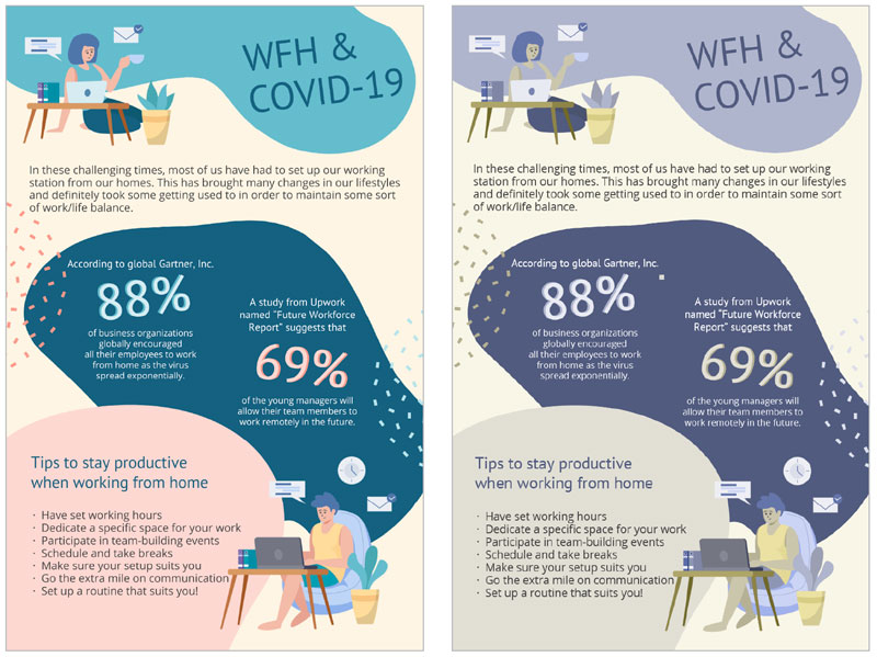
Figure 8. From messy design to conveying the message: the final accessible flyer as designed (left) and with Illustrator’s “Color blindness – Protanopia type” filter applied (right). Although the colors change due to the color blindness filter, you can see how addressing the color contrast, typeface, styles, spacing, and layout makes the flyer easy to read in both forms.
Commenting is easier and faster when you're logged in!

Recommended for you

How to Edit Shapes in PowerPoint with the Edit Points Command
When you’ve got a shape on your PowerPoint slide but it’s not quite right, there...
The Burns Effect: Using Anchored Objects in Nonintuitive Ways
Here's a trick from Diane Burns that lets you make a text frame expand (or shrin...
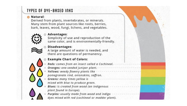
The Chemistry of Color
Quick, what do pomegranate rinds, letterpress, and light waves have in comm...