
Showing results for 123471 14401299 com 90º but18 14401299 com chicagoan but2020 2016 123471 14401299 com both18th 14401299 com 800 326 2124 123471 2022 90o com ( com ( 2016-12-02 2016-12-02 1-800-326-2124 123471 14401299 but18 14401299 but2020 2016 02 123471 both18th 14401299 com 1 2124 123471 123471 14401299 14401299 2016 123471 14401299 14401299 800 326 2124 123471 2022
A bewitching bouquet of InDesign-related goodies, just in time for spring
Spring is once again blooming as the seasons continue their cycle. It’s a time for new growth and new beginnings. For some people, it’s a time to get back to the garden. For me, it means new projects, new skills I need to learn, and new ways of getting my job done better or faster. I’ve put together an InDesign-related bouquet of goodies, gathering up a mix of tender new blossoms as well as improved versions of perennial favorites.
Multi-Find/Change
Multi-Find/Change (MFC, from Automatication) is an extension for InDesign that automates the find/change process. This powerhouse add-on can perform multiple searches at one time (well, in a set order, but so quickly it feels like it’s all at once). Those searches are arranged into sets that you create, based on your needs. For instance, perhaps you know that every time Jerry in editorial sends you a Word file, it’s going to have the same old problems that need to get cleaned up. With MFC, you can create a set of queries (Figure 1) just for Jerry’s messy files. The latest version of MFC (v.3) has been rewritten to work with InDesign CC 2017 (and InCopy, too).

Figure 1: With Multi-Find/Change query sets, you can customize and automate Find/Change operations.
A single query set might include a simple text search for all double hyphens to convert them to a single em dash, followed by some GREP searches to strip out multiple spaces after punctuation and multiple returns between paragraphs, replacing them with a single occurrence of each. Even better, those sets can be shared with other users, with those users being able to execute, but not make changes to, the sets. Multi-Find/Change also sports an undo feature that is often a lifesaver. You can undo a Change All command across the entire set, or by individual queries within the set.
Blendmaze
When it comes to learning tough subjects, I’m not above using a game to achieve my goals. I count color theory as one of those subjects that I know just enough of to be dangerous, or at least sound semi-intelligent about. Fortunately, I recently stumbled upon Blendmaze for the iPad (Figure 2), which teaches the basics of color theory with a visually captivating gameplay.
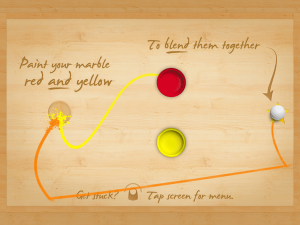
Figure 2: Blendmaze makes learning color into a fun iPad game.
The app features the fun—as well as the frustration—of the old rolling marble game of Labyrinth through simple colorful graphics and sounds, using the interactivity of the iPad. The goal is simple, on the surface: Drop the white marble in the correct paint tubs to end up with a marble coated in the requested color. For instance, roll the marble into the red paint, then the yellow to achieve orange.
The game starts out in the primary colors, moving on to secondary and tertiary colors only once you’ve completed each previous level. There are even full spectrum levels that are dubbed near-impossible by the creators. One of the aspects of the game that makes it so much fun is the trails of paint colors that get left behind as you run the marble between paint tubs. So even if you end up making a mistake, you have some visual clues of where you might have gone wrong! Blendmaze features more than 100 levels and even has a timed mode that hooks in with Apple’s Game Center if you take your play time seriously.
Type Meetups
“Hey there, what’s your type?!” That old line has almost certainly been uttered at a Type Thursday. While it’s not a speed-dating event to find your perfect type, Type Thursdays are—in their own words—events for “people who love letterforms.” Meeting monthly, the type-focused events bring together typophiles for networking, learning, and critique sessions. Creatives are encouraged to bring their works-in-progress, with the critique sessions being led by industry pros, such as type designer James Edmondson. The meetups have a small cost of $25, with free early bird registration if you sign up at least two weeks prior to the event. Los Angeles just launched their inaugural event, and the varied sponsors include MOO.com and Typekit.
In addition to the monthly type meetups, Typekit is working with Type@CooperWest to present a series of type talks and workshops in San Francisco. Most recently, type master Jessica Hische gave a talk titled “Art as Therapy,” and Jim Parkinson spoke on “Highlights of a Lifelong Obsession with Letterforms.” If lecture series and meetups aren’t your thing, and you’d like to indulge your type-loving side, maybe one of Type@CooperWest’s 10-week workshops is for you. Topics include an intro to hand lettering and learning the principles of typeface design. Whether you’re a type designer, a designer working on a logo or UI design, or just a lover of type, these type-centric events are the place to learn about type with like-minded folk.
Adobe InDesign Interactive Digital Publishing
Adobe InDesign Interactive Digital Publishing by Ted Padova takes you from start to finish in creating and deploying interactive and digital publications from InDesign. Starting with some of the core skills needed for any documents—such as working with text, styles, and graphics—Padova walks the reader through the layout process before tackling the specific needs of the digital document. The author covers interactive elements from animations to hyperlinks to creating multistate objects for the full digital experience.
The 500+ page book (Figure 3) is peppered with tips and tricks for navigating the ever-changing digital publishing landscape. But the book doesn’t stop there. It goes on to discuss the output and distribution issues you may encounter on your digital publishing journey. The author discusses hosting interactive documents on social media platforms as well as how to create digital products for consumption across social media, computers, and mobile devices.

Figure 3: Going into digital publishing? Take this book with you.
Extract Pages
How many times have you been knee-deep in an InDesign document before realizing it would have made much more sense to break that document into smaller chunks? Maybe your short story grew into a novel and you suddenly want each chapter as its own file. Or that one client (you know the one) admitted that maybe it was better to have the training modules as separate documents for printing, updating, and exporting. Well, there is most definitely a script for that, courtesy of the brains over at ID-Extras.
The script, called Extract Pages ($49 for a single license) lets you choose a range of pages and which criteria to use for the split (Figure 4).

Figure 4: The Extract Pages dialog box
It gives you the option of creating new documents based on paragraph styles or by ranges of pages. When splitting documents, the script allows for extracting as pages, spreads, or sections, and you even have the option of creating an InDesign book file to organize the individual documents. But by far, my favorite trick the script performs is being able to break a document’s individual alternate layouts into separate InDesign files. The latest version includes several new file-naming choices, so those new documents’ names make sense.
Proxima Soft
Born from Proxima Nova, the Proxima Soft Collection from Mark Simonson Studio is a super-collection of 48 fonts. The mega-collection includes three 16-font families (Proxima Soft, Proxima Soft Condensed, and Proxima Soft Extra Condensed). Not simply a rounded version of Proxima Nova, Proxima Soft is a fully-fleshed-out font with many alternate forms. And I’m not talking about a simple extra ampersand here and there. Nope. I’m talking alternate characters, arbitrary fraction support, and proportional and tabular figures. Unlike many rounded fonts that have a limited range of uses, Proxima Soft is a high-functioning text sans that contains full character sets to meet whatever challenge you throw at it (Figure 5).

Figure 5: The many faces of Proxima Soft.
With the entire super-collection at your fingertips, you’ll have enough weights to choose from for all your text variations, from blocks of text, to pull quotes, to anything you’d need a rounded display font for. The entire desktop collection will set you back $734, or you can purchase each family individually for $254. There is also the option to buy the single fonts for $29 a piece, but why break up such a happy family?
Rotating Spreads
A long time ago, in a galaxy far, far away, Adobe saved many a designer’s neck by introducing the Rotate Spreads command. Since then, that little gem has let generations (I may exaggerate slightly) look at a rotated text frame right-side-up by rotating the spread, simply for viewing onscreen. Of course the execution of this little gift isn’t perfect, as it lies buried deep within the Pages panel menu’s submenu hierarchy (Page Attributes > Rotate Spread View). I wish I could get to that feature faster!
Fortunately, Peter Kahrel’s magic scripting comes to the rescue. His PagesContextAdditions script (Figure 6) unburies that command and makes it readily accessible.

Figure 6: New rotation options in the contextual menu, courtesy of the PagesContextAdditions script
After running the script once, the rotation values—at least 90º and -90º—are in the top level of the contextual menu. Be sure to click within the gray area of the Pages panel, and not on a page itself, and remember these options affect only the view of the current page.
The ability to rotate each spread is certainly handy, but what if you have several pages that need rotating? You know the answer: another script! Kahrel’s RotateSpreads script lets you batch rotate those spreads. The super simple script rotates all spreads with a rotated text frame in one go. But it’s an all-or-nothing operation—no chance to fill in a page range or other criteria. If there’s a rotated frame, the spread gets rotated. However, when it’s time to put everything right again, run the script once more, and choose Undo Spread Rotation. As written, the script works on frames rotated at 90º, though it could likely be modified to accommodate InDesign’s -90º and 180º angles, as well. No more individually rotating spreads, and no more stiff necks due to viewing documents at an angle.
Flightcheck
Markzware is one of those companies that jumps in to pick up where InDesign’s built-in capabilities leave off. When it comes to preflighting, InDesign’s included functionality is decent. But Markzware’s standalone Flightcheck goes further and more in-depth. The latest release (version 7.8) now handles CC 2017 files. And because the software is standalone, it can actually preflight files from Illustrator, Photoshop, and Acrobat, as well as other non-Adobe apps. Flightcheck can even postflight PDF files to make sure they are set up to produce the results you need.
Flightcheck performs a robust set of checks to ensure that the output you create meets—or exceeds—your chosen qualifications for each facet of your document. In addition to checking for resolution and link issues, Flightcheck’s ground controls (preflight items) can check for color mismatches, oddities with gradients and patterns, ink percentages, and other issues that can crop up, whether you’re going to print or digital (Figure 7).

Figure 7: Flightcheck’s Ground Control interface.
Flightcheck can be purchased as a subscription for $199/year or as a perpetual license (i.e., “the old-fashioned way”) for $399.
Junk Type
What is it about vintage signs that make us yearn for a simpler time? I get hit with an unexplained nostalgia when I come across beat-up old signs, as they are often from way before my time. It’s like beautifully-lettered signage from the 1950s and ’60s are somehow a part of our collective DNA and we are instantly drawn to them.
Photographer Bill Rose set out to capture the nostalgic beauty in the typography and signage of that bygone era in his forthcoming book, Junk Type: Typography – Lettering – Badges – Logos (Figure 8).
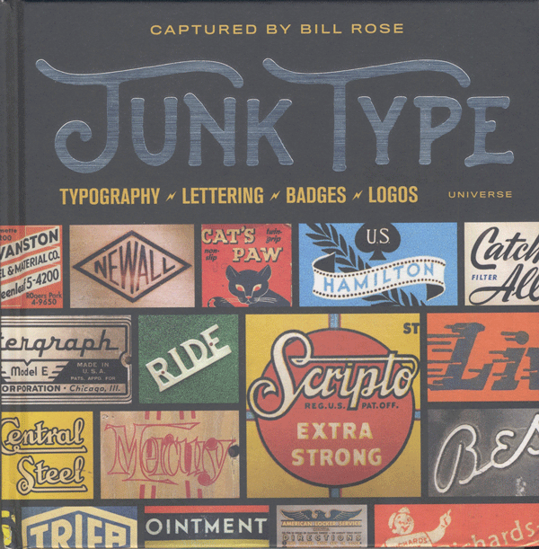
Figure 8: One man’s junk type is another’s type treasure.
The book’s nearly 200 pages showcase the art and beauty of postwar America via typography and lettering in close-up fashion. If you’re looking to nostalgia for project inspiration, the “Junk Type” book just might speak to your nostalgic core.
Spring Forward
I hope you take the time to stop and smell the roses when you’re out and about this spring. And while you’re at it, be sure to check out some of the blossoms mentioned here to keep your InDesign garden thriving and growing.
Erica Gamet is a speaker, writer, and trainer, focusing on Adobe InDesign and Illustrator, Apple Keynote and iBooks Author, and other production-related topics. With over 25 years experience in the graphics industry, she is a regular contributor to CreativePro.com. After living as a nomad, she recently put down roots in El Paso, Texas, where she hikes and bikes every chance she gets.
Photoshop 6 gives you an easy way to warp, wrap, and bend text using the aptly named Warp Text feature. But you’re not limited to bending text in Photoshop. Anything can be warped if you know which tool to use.
A recent question from Michael Standlee (of Michael Standlee Design) inspired me to experiment more and more with bending and warping objects. It seems that we’ve had the near-perfect tool for the job all along, right there under our noses. (Or under the Filter menu, to be more precise.) Let’s take a look at using the Shear filter (Filter > Distort > Shear). To start, let’s explore the filter’s dialog box.

To the left is the meat of the dialog box, the control line. Much like using the Curves adjustment dialog box, you place and move points on the line. In this case, however, the bends in the line represent warping of the image.
To the right at the top are the OK and Cancel buttons, along with a button to reset the dialog box to its default values, which are shown and which have no effect on the image. (Shear will remember the last-used settings.) At the bottom of the dialog box is a preview window. The preview is restricted to this window and is not shown on the image itself.
The center of the dialog box is where you’ll find the only tricky part of the Shear filter, the choice of options for Undefined Areas. Parts of the image are considered “undefined” when the original pixels are moved away from an edge and there are no neighboring pixels to replace them. As you warp an image, pixels move past the edge of the selection and can be wrapped around to the other side of the selection:
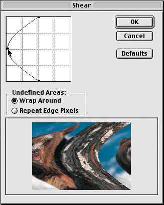
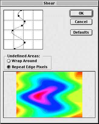
As a point is added, the control line becomes a curve and the image is curved to match. The side of the bear’s face moves off the screen to the left and, with the Wrap Around option selected, it reappears on the right. If the option is changed to Repeat Edge Pixels, the effect is substantially different at the edges of the selection:

Notice how the right-most column of pixels are “stretched” as the image is warped to the left.
When working with photographs, neither option is particularly attractive. Avoid the problem of repeating or stretching edge pixels by making a selection that includes an adequate area of transparency on either side of the image. How much is enough? When warping in only one direction, as shown so far, you need enough transparent area to accommodate the pixels being warped (to the left, in these examples) and a minimum of a single column of pixels to the right (with Repeat Edge Pixels selected). You can, of course, expand your selection (or canvas) to include a large area of transparency on either side and then crop the sheared image afterward. Here, the image was expanded to accommodate the anticipated warp:

Because of the transparency, the Undefined Areas option is insignificant – wrapping and repeating transparency results in the same thing: transparency.
When working with shapes or patterns, the choice of wrapping or repeating might be very important. In this example, the middle portion of the image was selected and the Shear command applied. Wrapping the edge pixels from the left side back around to the right side of the image maintains the pattern.

Multiple points can be added to the Shear filter’s control line and the filter can be applied with great effect to gradients.

Now, for a practical application, let’s look at how the Shear filter can be used to simulate applying an image to a curved surface. The challenge in this example will be to create a curvature for the text to match that of rim of the cup.

We need a couple of steps of preparation before we try to apply the Shear filter:
- The Shear filter cannot be applied to text. Therefore the type layer must be rasterized (rendered) first. The command in Photoshop 6 is Layer > Rasterize > Type.
- The entire image must be rotated sideways so that we can apply the filter. (Image > Rotate Canvas > 90º CW in this case.)
- Make sure that the layer which contains the type (or other pixels to be warped) is active.
- Use the Commands Edit > Preferences > Guides & Grid and View > Show > Grid to provide a reference for the amount of shearing required.
- Make a selection that is centered on the type vertically, and extends past to the left and right to accommodate the effect.
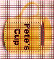
Using the grid as reference, we can see that in the width of the text (in this case, since it’s rotated, the height of the text from the “P” to the “s”), the cup’s rim dips approximately one-third the height of the letter P. In the Shear dialog box’s preview window, we can use the transparency grid to help us guess-timate the approximate curve.

After applying the filter, we reverse the rotation (in this case, using Image > Rotate Canvas > 90º CCW), and position the text where it looks best.
Then, of course, you’ll want to add some finishing touches:
- In images that simulate long distances, application of a slight blur to the outer edges can be effective.
- If you’re adding a colored logo or colorful text, work with the layer blending modes to get the highlights and shadows to match. (This won’t work with black or white text.)
- You can use the toning tools (Dodge and Burn) to simulate highlights and shadows (again, with the exception of black and white).
- If you’ve used black or white text, you can simulate reflections and highlights using the Eraser tool set to a very low opacity and with a soft-edged brush, as we’ve done here.

While Photoshop 6’s new Warp Text capability is fun (and handy) you do have a tremendous amount of control for warping rendered type and other images with the Shear filter. Remember that the text must be rendered first (unlike the Warp Text feature), and keep in mind that the Shear filter works left-&-right, not up-&-down. The command Image > Rotate Canvas > 90º CW and the command Image > Rotate Canvas > 90º CCW can come in very handy.
NOTE: Those having trouble with the Warp Text feature should remember that the Character palette’s menu can be used to remove Faux Bold from selected text or from a type layer.
This story brought to you by the National Association of Photoshop Professionals (NAPP).
Copyright 2001 KW Media Group. Photoshop is a registered trademark of Adobe Systems, Inc.
Editor’s note: This shortcoming was fixed in InDesign CC 2018 version 13.1
I’m a big fan of InDesign’s Publish Online feature. But if you create multiple Publish Online documents, particularly for multiple clients, there is one big limitation to the analytics feature that you should be aware of.
When you choose File > Publish Online Dashboard, you are brought to a Web page that looks like this:
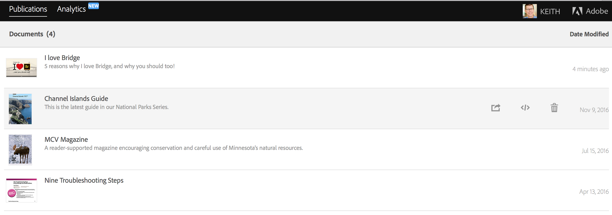
The Publish Online “Publications” screen
If you click on Analytics in the upper-left corner, you will be brought to either an Overview or Document Trends screen, depending on which you visited last.
The Document Trends screen shows you simple analytics, with separate data for each document, which is great. (Views and Readers can be different, because Views is the number of times the document has been viewed, but readers is how many unique readers have viewed the document. So, for example, a document may be viewed 100 times, but by only 4 unique readers.)

The Publish Online “Document Trends” screen
But when you visit the Overview screen, things are different. This screen provides additional, useful data, such as what types of devices visitors are using, average read time, etc. But this is aggregate data for all the documents currently published. There is no way to separate this data out per document. So, if you’ve published documents for multiple clients, there is no way to provide each client with their own analytics data beyond what displays on the Document Trends screen.

The Publish Online “Overview” screen. Hover over a tile to read a description of the data.
This is unfortunate. I hope that Adobe sees fit to beef up these basic analytics capabilities in the future.
 This article appeared in Issue 71 of InDesign Magazine.
The digital revolution may be in full swing, but a visit to any museum store provides ample evidence that for fine art catalogues, print is alive and well. How does working on fine art books differ from other print documents? What makes a great art book stand out?
One of a Kind
Unlike a digital file, a book has a physical presence. No matter how many millions are printed, the second it is touched by humans, each copy becomes unique (as the Seinfeld character, George, found out when he couldn’t return a book because, somehow, everyone could tell that “this book has been in the bathroom, hasn’t it?”). Book signings turn mass-produced objects into one-of-a-kind collectibles. For better or worse, a printed book will always be more than the content it conveys. It can become anything from a doorstop to an objet d’art.
It Takes a Team
Fine art catalogues are made to be kept. Forever. Like miniature museums, they seek to preserve and illuminate the highest forms of expression in a given medium, so it’s critical that everything about the book, from the design to the print quality to the paper stock and binding, be of sufficient quality to honor its content.
Creating a work of such quality requires a partnership of experts. There may be a Leonardo or two out there who could master every aspect of the process, but for the rest of us, assembling a top-notch team is essential.
This article covers only the design through printing phases of a book’s creation, but all of the other aspects of the process, including writing, editing, marketing, etc., need to be up to the same level. The books absolutely must arrive in the museum store—often from overseas—before the exhibit opens. It only takes one aspect of the job done poorly—whether it’s bad photography, the wrong typeface, or poor scheduling—to ruin a fine art book.
Design
The book designer has to consider every aspect of the book and how it will work with the content. If the book is part of a series, the size and format may be predetermined; conversely, some projects may cry out for the invention of a wholly unique format.
I asked book designer Susan Marsh, with whom I have worked on several books, how her approach to the fine art catalogue compares to designing other print work. As Susan puts it, “For most art books, the designer must create a design that is elegant without calling attention to itself; it has to provide a framework for the art and the scholarship of the text without upstaging them (Figures 1–4).

Figure 1: This book, Picasso Looks at Degas, appeared simultaneously in three editions: English, Spanish, and Catalan. The art is in the same place in each edition, but the bottom text margin is variable because the text runs different lengths in each language, and the text discussion must appear on the same page as the art. This way, all three editions could be printed with only a black plate change on press. ©2010 Sterling & Francine Clark Art Institute. Design: Susan Marsh.
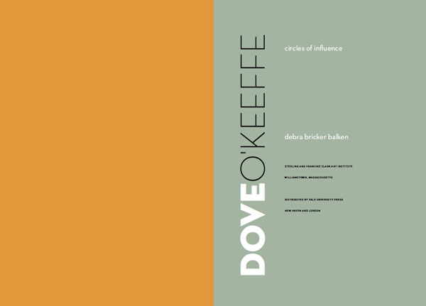
Figure 2: The justified serif type, with its centered swash headlines, evokes the typography of the 1700s. Adobe Cason Pro is based on the same Caslon types that were so popular with Benjamin Franklin when he was a printer in Philadelphia. The ornamental drop cap is Monotype Castellar. The spread is from Knowing Nature: Art and Science in Philadephia, 1740–1840. ©2011 Yale University Press. Design: Susan Marsh.

Figure 3: Title page from Dove/O’Keeffe: Circles of Influence. The designer chose Neutraface Light and Bold for the title because the letterforms are both beautiful and eccentric, as are the artists, Arthur Dove and Georgia O’Keeffe. The extreme weight diffference implies the differences between the two artists, while the circular shape of the letter O echoes the subtitle. ©2009 Sterling and Francine Clark Art Institute. Design: Susan Marsh.

Figure 4: Most of the photographs in this book show tall, thin fashion models, so it made sense to use a more vertical trim size than usual—8 × 11.5 inches—and a narrow text width and vertical display type. The display is Linotype Didot, the text is Fournier, and the captions are Meta. Pages from Fashion Show: Paris Style. ©2006 Museum of Fine Arts, Boston. Design: Susan Marsh.
But in certain cases, the graphic design can be freer and more inventive, grabbing the reader’s attention and becoming part of the content (Figure 5).
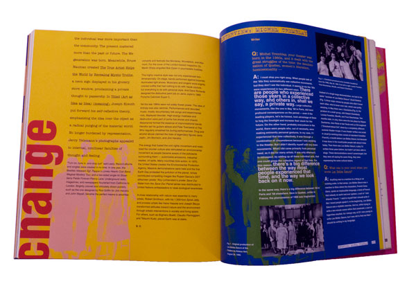
Figure 5: Some books call for a more attention-grabbing graphic design. Spread from Global Village: The 1960s, ©2003 Montreal Museum of Fine Arts. Design: Susan Marsh.
“Unlike magazine writers, who write to fit a layout or are edited to fit,” says Susan, “curators write whatever length expresses their thoughts. They visualize the paintings they discuss as hanging on a museum wall, not cramped in a book. My job is to use typography and a flexible layout to bring their ideas to life in a varied flow of two-page book spreads.
“A book is more like a film than like a website,” she continues. “It follows a linear progression. Not only does each spread need to be balanced, but there should be a rhythm to how the spreads flow through the book.”
A well-designed spread looks inevitable—you think, “of course they did it that way; it’s the only way that makes sense.” What you don’t see are the five or six drafts of that spread the designer threw away.
Type Composition
Great type design can make an ordinary book look better than it is; bad type design can make a great book unreadable. A good designer will read the entire manuscript and select a typeface that reinforces the book’s identity. This can be tricky, because with so many typefaces available, there is a temptation to use new, cutting-edge typefaces. But if the book has 500 pages and lots of small type in the end matter, you have to make sure it will be legible. In addition, the typeface will need to have a robust OpenType character set. Ideally, this includes separate sets of numerals for superior figures, numerators, denominators, old style and lining figures, plus glyphs for any composite characters for the foreign words that will occur regularly in the manuscript. You may get by with a poorly kerned typeface in a shorter document, but for a long book, you don’t want to be manually adjusting thousands of character pairs.
Once you’ve chosen the typefaces, it takes a great eye for proportion to establish design specs for every kind of text that will appear, from heads and body text to captions, lists, and the extensive end matter such as endnotes and chronologies of exhibits (Figure 6).

Figure 6: Typesetting and layout for the detailed “end matter” in fine art catalogues is often as much work as the main essays. Detail of page from French Art Deco, ©2014 The Metropolitan Museum of Art. Design: Susan Marsh.
There are a lot of interrelated parts, including type size, justification settings, margins, figure styles, indents, leading, baseline grids… getting just one of these wrong can throw everything else off. This is why, although many designers do their own typesetting, the amount of text and the level of detail in fine art books justify bringing in an expert.
Exhibit catalogs can be very lengthy. I have composed some that were multi-volume sets, and even single-volume books over 600 pages. As a professional typesetter, I use quite a few JavaScripts and plug-ins—some of which cost hundreds of dollars each—that allow me to set type with far greater speed and consistency than most designers. On a book that’s under 100 pages, a designer may not mind manually applying paragraph and character styles and cleaning up the manuscript, but on a large book, the sheer volume of text can be overwhelming.
In general, typesetting a fine art book begins with the same process I use for any long document. Working from the designer’s sample file, I may re-create all of the style sheets, or at least check every dialog box in every style, to make sure all of the settings are optimized. For instance, a lot of designers are less experienced with things like GREP styles and nested styles (Figure 7), both of which can speed up the work and ensure greater consistency.
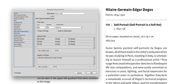
Figure 7: Using nested styles to automate formatting for the figure number, the vertical rule, and the title.
One of my essential tools is the Multi-Find/ Change plug-in (Figure 8), which I use to set up a batch of find-change queries that I can run all at once.

Figure 8: Using Automatication’s Multi-Find Change plug-in to set up a batch of find-change queries, and the result.
Some publishers, such as the Metropolitan Museum of Art, have their own house style dictating which text strings cannot be broken at the end of a line, such as “pp. xx” or “fig. xx.” Once I set up a batch of queries to cover all of these rules, I can re-use that batch for each of their books.
Other plug-ins and scripts that I use on a regular basis include Teacup’s Typefitter Pro for fine-tuning paragraph spacing, In-Tools’ Style Utilities and Power Headers, the entire DTP Tools suite, Peter Kahrel’s PlaceMultipleDocs.jsx, custom JavaScripts from Rorohiko, and several others.
For me, the fact that every detail is critically important is one of the main things I love about typesetting fine art books. The book designers who hire me care deeply about how much space to use around the em dashes—they may each like a different amount, but they all care—and how to set the fractions, superscripts, etc. On art books, I’m asked to build custom composite characters, or change the size of the dashes, or adjust the kerning between particular letter pairs. Prior to the advent of OpenType, part of my job often included customizing typefaces, combining old-style figures with roman text. We may run several tests of the type with different justification settings until we find the one that looks best. We push InDesign to its limits in order to make the text as beautiful as possible. Every line ending is scrutinized; in fact, some of my designer clients join me in bemoaning the fact that we can’t customize the Adobe Paragraph Composer and H&Js even further to match each designer’s individual preferences.
Print Production
When it comes to fine art books, I compose the type, make all the editorial corrections, and hand the baton off to a specialist, like Sue Medlicott, who runs The Production Department (TPD). The range of tasks that Sue takes on varies from book to book, but basically, once the layout is done and the final type corrections are in, Sue takes over the files, and then she gets to wear all the production hats. And even more than with other kinds of books, with fine art books this is likely to mean coordinating information from a lot of vendors.
It’s typical for book designers to work with low-resolution image files or with uncorrected versions of the high-res images. And since many fine art books are printed overseas, synchronizing the images for final output is an important step. TPD coordinates this process, handling all file transfers, checking proofs, and communicating with the printers. On many books, TPD will do the color correction and send final PDFs to the printers. On other jobs, their printer does the color work.
“Typically,” says Sue, “we coordinate with the museum’s production manager at the start of the project. Some museums have a print production coordinator on staff, but many don’t. So we will select the printers, the binders, figure out the shipping schedules. We also consult with the editors and designers and source the paper based on their ideas of what is best suited to the project.”
In addition to expertise in prepress work, this part of the job requires keeping up with a network of vendors around the world. A change in currency exhange rates can dictate where a book gets printed. It’s important to know each vendor’s strengths and weaknesses.
“For example,” says Sue, “Chinese binderies employ many skilled handworkers that make some of the more unusual binding formats and techniques more affordable than working in the United States.”
This part of the job also involves going on overseas press approvals, and requires a critical eye for color. The printer who is right for a large print run of books about painting may be completely wrong for a short-run book of etchings. The most important thing is to select the right printer for the kind of book you’re making, within your budget.
Prepress and Printing
One domestic printer that does a lot of fine art work is Meridian Printing in Rhode Island. I spoke with project director Danny Frank, and asked him what he sees as unique about working on fine art books, and what separates the best from the rest. Do they see a lot of books trying to be more “bookish” and use unorthodox trim sizes, special bindings, or tricks with paper such as die cuts, foldouts, and pop-ups?
“Mostly on digital print runs,” he replied. “On an Indigo press, you can do a small print run of 10 to 100 books. Fancy bindings are very expensive, so you rarely see them on the offset print jobs.
“The availability of digital color printing means that a lot more people are doing these very short-run books, which is great for independent publishers. Unfortunately, many of these books don’t have the level of writing, editing, design, and typography that went into a book that was more expensive to print. So the overall quality of the books out there in the public is being degraded.” In other words, the key characteristic that makes a book stand out from the crowd—quality—hasn’t changed.
One thing that has changed, though, says Frank, “is that the size of our print runs has gotten dramatically smaller. The number of titles hasn’t really gone down, but 18 years ago, a typical print run was 3,000 to 15,000 books. Now, a typical run is 1,000 to 5,000.”
How have improvements in press technology changed the way books are being done? “For one thing,” says Frank, “the presses are much greener. There is far less waste. New presses use far fewer sheets for makeready, so that makes a shorter print run affordable. In addition, Indigo presses are getting faster and the formats are getting bigger, so you’ll see a lot more digital printing and presses where plates are imaged right on the press, so they don’t have to be taken on and off.”
I mentioned to Danny that on a lot of publications, designers or production artists like myself do all of our own prepress work and deliver final press PDFs to the printer. In fact, a lot of magazine printers use a Kodak InSite proofing system, in which the client uploads hi-res PDFs and the proofs are available online within a few minutes, with preflight errors flagged, awaiting approval. There is no human prepress operator involved.
At Meridian, they use InSite proofing, but only as a preliminary tool. “It’s mostly for the designer to check things like the cropping,” says Frank. “We don’t use it for color, and it doesn’t replace the bluelines.” He adds, “We always ask for native application files. We have proprietary tables for color conversions, whether it’s using GCR (gray-component replacement) or hybrid conversions, and it’s all based on the type of image. You use a different process for a landscape photo than you do for a charcoal drawing.”
According to Frank, a typical line screen will be around 200 to 250 for color work, and often 300 for black and white. But it really depends on the type of image, not just the color space.
For instance, I asked whether they use stochastic screening (Figure 9) at Meridian.

Figure 9: Stochastic screening (left) more closely approximates continuous tone by using a smaller dot in a randomized pattern. Traditional screening (right) uses larger dots in a linear pattern, with each color at a different angle, which creates rosette patterns.
Again, it depends on the image. “A lot of commercial printers do stochastic with a 20-micron dot, which isn’t very fine. We find that a 250- to 300-line screen looks better than a 20-micron stochastic. A smaller, 10-micron stochastic dot is more like a 400-line screen. But it’s much more touchy. Solid areas can cause banding, and other problems arise. The plates may not be compatible with it. We do use it, but sparingly, on those images where we feel it will help.”
In terms of color space, they definitely prefer to start with RGB images, since they have a larger color space to work with when correcting the color. With the recent improvements in computer processing power and storage space, it’s misguided to downsample your files before sending them to the printer. The more information they have to start with, the better.
“It’s even true for bit depth,” says Frank. “Technically, the plates are imaged using 8-bit color, but we would always rather have 16-bit images to start with. It just gives you more to work with.”
A Science, but Also an Art
I mentioned to Danny that many designers still believe that the Italian printers have the best eye for reproducing color paintings. With the technical sophistication of printing presses, is there still a need for such a thing as “an eye for color?” At some point, won’t it just be a matter of matching a specific set of measurements?
“The eye is still critical,” says Frank, “You have to deal with so many variables, such as the metamerism of a particular paper under different lighting conditions. Newer proofing systems have helped a lot, but the main thing the measurements do is get you to the point where you can look at it sooner.
“Thanks to more accurate measurements, the first sheet is 85% of the way there. The last 15% is up to the the pressman; and even if his numbers are right, the client still needs to see it. Once they see it on press, they may not even want it to look 100% like the proof.”
So, no matter how much of a science it becomes, there will always be a role in printing for the human eye.
Standing the Test
Despite increased competition from digital presses and ebooks, you don’t have to reinvent the wheel in order to create an extraordinary book. The printed book has been evolving for a thousand years, and most of the sizes and shapes we use now are those that have worked best. They’ve stood the test of time; and if you apply top-quality craftsmanship at every step along the way, there’s a good chance that the book you create will do the same.
Press release
HOW Design Live (@HOWbrand – #HOWLive), the biggest, most inspiring, educational and talked-about design event anywhere in the world, is gearing up for its 25th anniversary conference and expo, May 4-8 at the Hyatt Regency Chicago.
HOW Design Live is where creative professionals in all disciplines come to learn from the brightest minds in the creative industry — and beyond. It’s where creatives can discover new ideas, new sources of inspiration, new skills, new connections with other creative professionals and come face-to-face with brand leaders, big thinkers, design heroes and innovative companies. Conference details and registration are at howdesignlive.com (early bird rates expire Feb. 3).
Gary Lynch, vice president/group publisher, design and publishing communities, F+W, A Content + eCommerce Company, says, “HOW Design Live can be a life and career changing experience. It is an opportunity for creative professionals to immerse themselves for five days in creative inspiration, creative learning and be among other creative professionals. People wait years for the opportunity to attend and emerge with life-long friendships and new ways of thinking about their career and their work. I think the best way to describe the HOW Design Live experience is magical.”
Over the course of five days at HOW Design Live, industry icons distill the most important lessons they’ve learned in their careers into concrete advice and inspiration. HOW Design Live 2015 keynote presenters include:
—Philippe Apeioig, graphic designer, Studio Philippe Apeloig
—Michael Bierut (@michaelbierut), partner, Pentagram
—Matteo Bologna (@mrmucca), founder and creative director, Mucca Design
—Dr. Brené Brown (@BreneBrown), research professor, The University of Houston
—Aaron Draplin (@Draplin), sole proprietor, Draplin Design Co. / Field Notes
—Jessica Helfand (@jessicahelfand), partner, Winterhouse Studios
—Michael Hendrix (@rmichael), partner, IDEO
—Tom Peters (@tom_peters), author
—Karim Rashid (@karim_design), president, Karim Rashid, Inc.
—Tina Roth Eisenberg (@swissmiss), founder, swissmiss
—Paula Scher, partner, Pentagram (@pentagram)
—Adrian Shaughnessy, designer, writer, educator and publisher, Unit Editions (@uniteditions)
—Simon Sinek (@simonsinek), author
—Jessica Walsh (@jessicawalsh), partner, Sagmeister & Walsh
HOW Conference Program
HOW Design Live offers both the inspiration to rekindle one’s passion for creative work, plus the tactical, take-home information needed to achieve and advance a career. HOW has its finger on the pulse of the creative industry and delivers practical sessions that address current challenges. The event is divided into five programs, each with a specific focus. Attendees can customize their personal agenda by picking the sessions, workshops and social events that help fulfill their goals. The five programs include:
—HOW Design – covering everything from working with clients to choosing type to staying creative on demand. Attendees will discover new skills and processes to supercharge creativity.
—Dieline Package Design – packed with best practices and case studies from top brands, designed to develop strategic skills, taking attendees’ branding expertise to the next level.
—HOW Leadership – bursting with effective leaders, creatives, authors and business folks – those who are shaping the future of design. These sessions will build attendees’ personal leadership mantras.
—In-House Management – led by long-time in-house team managers, this program offers insights on business, communication, creative and leadership skills, to help attendees produce their best work.
—Creative Business – offering expert guidance on creating a business action plan, pricing work, cultivating a strong client base, and finding all the resources needed to run a successful business.
Visit howdesignlive.com to sign-up for HOW Design Live (early bird rates expire Feb. 3), or e-mail howdesignlive@fwmedia.com to inquire about attending, sponsoring or exhibiting.
About F+W, A Content + eCommerce Company
F+W, the company behind HOW Design Live, is an enthusiast-focused Content and eCommerce company. F+W serves 20 Million consumers annually via the Company’s print portfolio, ecommerce stores, extensive online education programs, trade and consumer events, popular consumer catalog brands, nationally-broadcast TV programs and more — all in service of passionate niche communities of professionals. (fwcommunity.com)
You may never have seen the Microsoft Word Import Options dialog box. It doesn’t open by default when you import Word files. So it’s entirely possible to place thousands of files without ever seeing it. That’s not to say you’ll never need to change its options. You may save yourself some time and grief, if you understand what the options mean.
Opening the Dialog Box
The first thing you need to do is look at the Word options dialog box (Figure 1). There’s no way to get there without actually placing a Word file. Choose File > Place, and then navigate to the Word file you want to use. But don’t click OK just yet.
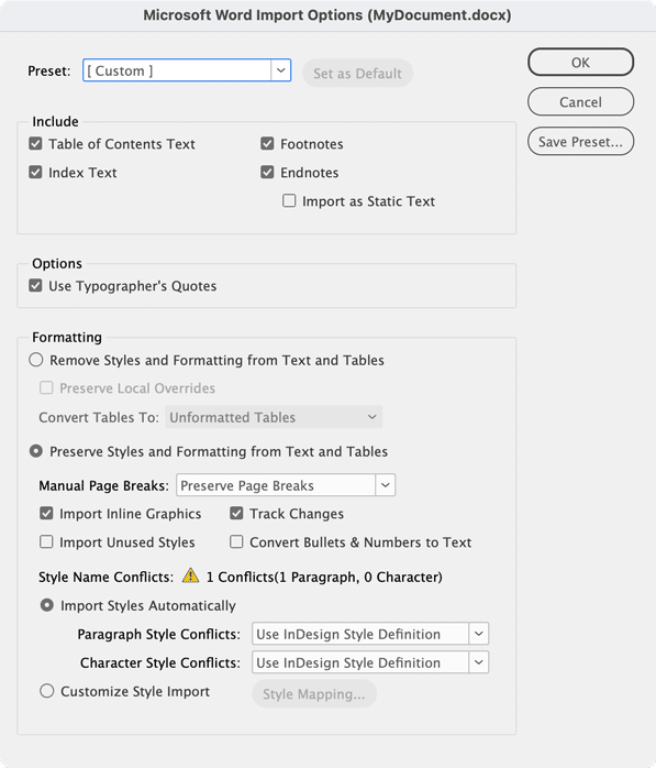
Figure 1: The Microsoft Word Import Options dialog box
Look at the three options for the text file. See the checkbox for Show Import Options? You want to turn that on to see the dialog box before you actually place the file. Once it’s on, click OK, and the dialog box appears.
Warning! This option is “sticky.” Once you’ve turned it on, it will stay on for both text and images until you turn it off. If the next thing you import is a slew of image files, you’re going to have to deal with the Import dialog box over and over. So you need to remember to turn off the option for the next import.
Hot Tip: If you hold the Shift key as you click OK in the Place dialog box, you’ll toggle the Show Import Options on or off. So if it is not selected, hold the Shift key to see the dialog box for just that one time. If it is selected, hold the Shift key to bypass the dialog box for just that one time. Most InDesign power users keep Show Options turned off and hold the Shift key just for those times they need to adjust the options for a specific file.
Include Settings
Now you need to decide which elements of the Word document will be included in the placed content. Obviously the main body of the text will always be included, but there are other options you can control. Look for them in the Include section (Figure 2).
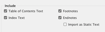
Figure 2: The options for what text to include from the file
Table of contents text
It seems a shame to throw away work that others have done, but including a Table of Contents from a Microsoft Word document isn’t necessary. Nine times out of ten you’re just going to have to throw the text out if you need a TOC in your InDesign file.
The primary reason is that most likely the page numbers generated when the text was in Word will no longer be correct when the document is laid out in InDesign. So what was on page 3 in Word could wind up as page 2 in InDesign. Importing the Table of Contents from Word won’t adjust those numbers, and your TOC will be wrong.
Not only that, but even if the page numbering was correct, the Table of Contents that comes from Word isn’t dynamic. It won’t update to reflect the actual numbers in the InDesign document. Nor will it create hyperlinks if the document is exported as an interactive PDF. In order to get a table of contents that updates automatically and exports with hyperlinks in a PDF, you’ll have to use the Layout > Table of Contents feature in InDesign.
However, including the Table of Contents created by Microsoft Word won’t hurt your InDesign file. It gives you a very good idea of the outline structure that your author or editor wants for the table of contents. You can then delete that TOC and use InDesign’s TOC feature instead.
Still, you might want to thank your authors and editors for taking the time to create the TOC, as it forced them to style paragraphs with the proper styles that you can use in the InDesign document. (Actually, it might be a good idea not to tell them that you had to totally recreate the TOC. That way, they’ll continue to generate the TOC paragraph styles for you.)
Index text
The Word index is similar to the Word TOC. In this case, the words to be included in the index are tagged with the index entry symbol. However, the page numbers in the index created by Word won’t necessarily correspond to the correct pages in the InDesign document. In addition, the page numbers won’t be hyperlinked to the pages when the document is exported as a PDF.
However, it’s rather simple to create an index in InDesign once the text is imported from Microsoft Word. All the tags from the Word index translate to InDesign index markers. From that point, it’s rather simple to create a dynamic, interactive index. So don’t discourage your authors or editors from creating an index in Word, either. You may not be able to use the actual index text, but the tags are worth a fortune. After you import the file, just delete the index and use InDesign’s Index panel to generate a new one based on the tags in the story.
Another practical yet often overlooked use of small caps is when the look of all caps is desired in small text. Consider using all small caps instead, set to the desired cap height, rather than all full caps. Why? Because they often have a higher degree of legibility at smaller sizes than full caps, due to their wider letterforms, more open spacing, and heavier appearance at the same cap height (Figure 5).
Footnotes
Happily, footnotes import exactly the way you want them to. The footnotes are retained. They are dynamic and they update if new footnotes are added using InDesign’s Type > Insert Footnote command. This is great, as most designers rely on authors and editors to insert footnotes.
Endnotes
InDesign doesn’t have an endnote feature. So any endnotes created in Word are imported under the heading (Endnotes) at the end of the text, but they aren’t dynamic (they won’t update automatically or link back to the original note location). In addition, a number format such as letters gets converted into Arabic numerals.
There has been quite a bit of discussion about this topic at CreativePro as well as the user-to-user forums. Peter Kahrel has written what is probably the most comprehensive article on handling footnotes and endnotes, and he’s posted a slew of scripts to fix the import options.
The bottom line is that you can decide to import endnotes, but they won’t behave as they did in Microsoft Word.
Typographer’s Quotes
This looks like it should be a no-brainer. When wouldn’t you want to convert any dumb quotes into proper typographer or “curly” quotes (“) and (‘)?
But what if you are working on a book on basketball players, and the author has used dumb quotes to designate feet and inches for their heights? In that case, you want to turn off importing typographic quotes (Figure 3) so that the dumb quotes which are used to designate feet and inches aren’t converted into curly quotes.

Figure 3: The control to convert dumb quotes to typographer’s quotes
Note: There are more sophisticated ways to write feet and inches characters. I wrote an article for CreativePro on creating the look for these prime characters.

Figure 6: The differences between all caps and small caps set at the same height (here set in Classic Grotesque™) can make for a more legible treatment for cap text at small sizes.
Formatting
Formatting is the most complex area of the Word import options—and the area where you can save yourself hours of work cleaning up text. There are three categories in this area: removing styles and formatting from text, preserving styles and formatting, and handling style name conflicts. Let’s look at each one separately.
Removing Styles and Formatting
It’s very unlikely you will want to strip all styles and formatting out of a Word document, but if you do, there are options you will want to modify.
First, click the Remove Styles and Formatting from Text and Tables radio button. When you do, the rest of the options in this category become available (Figure 4).

Figure 4: The control to remove styles and formatting from text and tables
Removing style from text
When you opt to remove the styles in a Word document, you are telling InDesign to discard any paragraph and character styles that were applied in Word. It’s unlikely you’ll want to do that; if an author/editor has taken the time to tag paragraphs and text with styles, they are trying to tell you the desired look for the text. So even though you may not use the appearance that they set for the style, you generally still want the name of the style applied to the text. That way you can redefine the style to something more desirable in InDesign.
However, sometimes the word styles have been completely botched and you might want to just strip them all out. For example, let’s say your author/editor has created a Word document with all sorts of bizarre paragraph styles that you don’t want to import. But if they used bold or italic formatting for emphasis, you probably would not want to lose that styling. If you select Preserve Local Overrides, InDesign keeps the formatting applied to the text while throwing out all the actual paragraph and character styles (Figure 5). You can then use InDesign’s Find/Change function to convert that formatting (italic, bold, etc.) into the character styles you define in InDesign.

Figure 5: The local formatting in Word (above) is maintained in InDesign (below) when Preserve Local Overrides is checked for imported text.
Removing styles from tables
While it’s admirable that authors/editors want to make their tables pretty using the automatic table styles in Word and Excel, the results are a nightmare for designers who have to strip out all that crud. That’s when the option to remove styles in text and tables becomes a lifesaver. The option for how to convert tables (Figure 6) lets you convert the formatted table into tabbed text or a plain table (Figure 7). From there, you can apply more tasteful designs to the information. And for those who are wondering, yes, there is a similar option for importing Excel files.

Figure 6: The two choices as to how styled tables will be converted when styles are removed from text and tables.

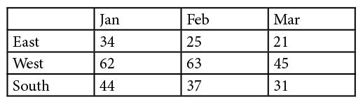
Figure 7: The formatting in the Word table (top) is converted into InDesign’s basic table style (bottom).
Preserving Styles and Formatting
The next radio button turns on the Preserve Styles and Formatting from Text and Tables option (Figure 8). This is most likely the option you will want to use. Even if you’re placing Word files that have no styles, the rest of the options are too important not to control.

Figure 8: The controls for Preserve Styles and Formatting from Text and Tables
Handling break characters
Word authors/editors often want to indicate that the text should start on a new page or column. They can do this by inserting a page break or section break character.
Designers most often use a Keep Options setting in the paragraph style. Therefore, you need to choose an option from the Manual Page Breaks menu (Figure 9).

Figure 9: The menu for how manual page breaks in Word are handled
- Preserve Page Breaks maintains the breaks for both pages and columns. However, InDesign doesn’t honor all of Word’s break commands. Here are the Word characters and the replacement characters InDesign creates:
Figure 10: This chart shows which characters InDesign uses to replace Word’s break commands.
- Convert to Column Breaks changes all of Word’s page, column, and section break characters into column breaks.
- No Breaks discards any page or section break characters. This option should be used when InDesign files are laid out with new page or column settings.
Importing Inline Graphics
Many writers and editors assume that all photos and graphics should simply be inserted into their Word documents as inline graphics. However, to get professional results, you probably will want to replace graphics with something better or at a higher resolution.
Images placed into Word files come into InDesign as embedded RGB graphics with generic names (Figure 11). PSD and TIFF files are converted to PNG files; AI and PDF files are converted to EPS files. While they may print correctly, the graphics may change in the conversion.

Figure 11: An inline graphic from Word (above) is imported into InDesign (below) as an embedded PNG image.
It’s relatively easy to unembed the graphics, but I think it’s just not worth it to use the Word art. If there’s any way to use the original PSD and AI art, you should.
My own personal choice is to include the inline graphics in the placed text so I know where they’re supposed to be located. Then I swap them out for the original high-resolution Photoshop and Illustrator files.
Or, if you want to just strip out the images entirely, you can deselect the Import Inline Graphics checkbox.
Track Changes
As a designer, you really should be getting final-approved text. All the changes tracked in Word should have been approved and cleaned up in your imported text. That said, it is possible to import text with Word’s tracked changes still in the text (Figure 12).
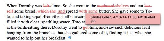
Figure 12: The changes tracked in the Word document are identified by the user.
When you import the text, if you choose to include tracked changes, you won’t see anything in your layout view. This is deceptive. Those changes are only seen in the Story Editor (Figure 13) and can be made part of an InDesign review. They are also included if the InDesign story is exported as an InCopy document.

Figure 13: The same changes imported into the InDesign document are indicated by a black line and are not identified by the user.
Import Unused Styles
You’d be amazed at how many styles are hanging around inside a Word document without being applied to any text. Obviously, choosing to import those unused styles can greatly increase the number of styles in your document.
If you need to keep those styles, select the Import Unused Styles option. But most likely you won’t want to clutter up your Paragraph and Character Styles panels with all those extra styles.
Convert Bullets & Numbers
Word does an excellent job of applying automatic bullets and numbers to text. Authors and editors have three choices: plain bullets, numbered lists, or outlines.
When these items are imported into InDesign, they come in almost exactly as they were in the Word document. The bullets and numbers are electronically created and the numbers are automatically updated as elements are added or deleted. They even honor the same numbering formats, such as Roman numerals or alphabetical entries.
You may, however, find some bullets come in as unidentified characters. This is because Word uses bullets that don’t get translated correctly in the InDesign document. Fortunately, it is simple to redefine the style for the numbers as long as the text has been formatted with paragraph styles.
Import Styles Automatically
When you decide to preserve the styles and formatting from the Word document, you need to decide how styles with the same names are handled when they reach InDesign. This is the most complex part of placing Word documents into InDesign. It’s also the place where you can gain the most control over how the text is formatted in InDesign.
Style name conflicts
If the author/editor has applied styles, you should have coordinated the workflow so that the names of the styles they use in Word are the same as the names of the styles you have defined in InDesign.
For example, they may have styles named a_head, b_head, body, body_first, and so on. You should have the same names for the styles in your InDesign template. But here’s the part that most Word author/editors don’t know: The styles in the Word document do NOT have to have the same style definition as the ones in the InDesign document. This is vital information, as some authors and editors want to work in very large point sizes, with double or triple line spacing, and typewriter fonts such as Courier. Let them have those style definitions—all you need to do is make sure they “tag” their text with the correct style names.
When you import a Word document that shares the same style names as the InDesign styles, a yellow alert indicates that styles in the Word document have the same name as the styles in the InDesign file. You need to resolve those style name conflicts (Figure 14).

Figure 14: The yellow alert signals that the styles in the InDesign document have the same name as the styles in the placed Word document.
Control the style definitions
You have several options for resolving style name conflicts. Use the Paragraph Style Conflicts and Character Style Conflicts menus to choose one of the following (Figure 15):

Figure 15: Select choices from the Style Conflict menus to determine which actual style definitions will affect the incoming text.
- Use InDesign Style Definition applies the definition of the InDesign style instead of the definition in the original Word document. 99.99% of the time, you will want to apply this option.
- Redefine InDesign Style changes the definition of the InDesign style to match the definition of the incoming Word document. Unless your Word author/editors have perfect design sensibilities, you really don’t want to use this option.
- Auto Rename imports the text with the Word styles with a suffix so that you know that the style came from the Word document (Figure 16). There’s also a little disk icon that indicates the style came from an outside source.
Figure 16: The suffix appended to the paragraph and character styles indicates that the style definition came from the original Word document.
Customize Style Import
So let’s say you and your Word author/editors haven’t coordinated your style names. Perhaps they used H1 and H2 for the styles that you call a_head and b_head. Maybe they used uppercase for the style names such as Body instead of body. Perhaps they used spaces between words such as a head and b head instead of a_head and b_head. All of these differences mean you have to map the Word styles to their equivalents in InDesign.
You do this by clicking the Customize Style Import radio button. Then click the Style Mapping button (Figure 17). This opens the Style Mapping dialog box (Figure 18).

Figure 17: The Customize Style Import radio button allows you to map the Word to InDesign styles.
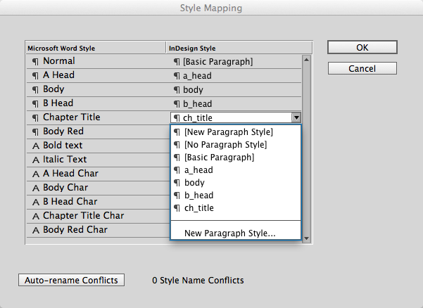
Figure 18: The menu under the InDesign Style column allows you to map each Word style to an InDesign style that has a different name.
Don’t let this dialog box overwhelm you; it’s not as complicated as it seems. The first column contains the list of all the styles in the Microsoft Word document. The second column contains menus that let you choose which InDesign styles should be applied instead of the Word style.
Click the name of each style, and choose the correct InDesign style. You may see that the Microsoft Word Style column contains styles that weren’t applied to text. For instance, Word’s ubiquitous Normal is included, as well as character styles (designated as Char) that come from the paragraph styles.
Map Normal to your body text style or InDesign’s [Basic Paragraph] style. This keeps the style from creeping into your own paragraph style definitions.
Setting Presets
As I mentioned at the beginning of this article, the Word Import Options are sticky. Once set, they are applied to future Word imports until you disable them. However, the settings for custom style mapping aren’t sticky. Once you place the text, the custom mapping option is inactive.
If you need to import the same type of Word styles into several InDesign documents, you can save the custom style mapping in a preset. Click the Save Preset button in the Word Import Options dialog box. This opens the Style Mapping Custom dialog box (Figure 19). Give the preset a name, and click OK. The preset will be available for all InDesign documents.

Figure 19: This little dialog box lets you save your custom settings as a preset, to speed the process of later repetitive imports.
Coordinate!
As you can tell, the most important part of setting the Word Import Options is coordinating the styles and elements between Word and InDesign.
If you can, take the authors/editors who create your Word files out for lunch. Discuss their use of styles. Send them an RTF file that contains the names of the styles they should use. Meet with them to show how they should apply paragraph and character styles to their text.
Coordinating will make it much easier for you to import and style Microsoft Word files.
Press release
Adobe has announced the availability of Camera Raw 8.4 Release Candidate on Adobe Labs. The release candidate adds support for 14 cameras, including Nikon D4s, Canon EOS Rebel t5 and Fujifilm X-TI; the full list includes:
• Canon EOS 1200D (REBEL T5, KISS X70)
• Casio EX-100
• DJI Phantom
• Fujifilm X-T1
• Hasselblad H5D-50c
• Hasselblad HV
• Nikon D3300
• Nikon D4S
• Olympus OM-D E-M10 (*)
• Panasonic LUMIX DMC-ZS40 (DMC-TZ60, DMC-TZ61)
• Phase One IQ250
• Samsung NX30
• Sony Alpha a5000 (ILCE-5000)
• Sony Alpha a6000 (ILCE-6000)
(*) Denotes preliminary support.
The release candidate also includes a new preview mechanism for better before/after image comparisons and an improved set of color matching profiles for Fujifilm X-Trans cameras; it also corrects issues reported from the CameraRaw 8.3 release. The Camera Raw team would like to thank customers who helped track down the details of these issues.
Adobe encourages the community to provide feedback so it can ensure the highest quality experience for customers working on diverse hardware and software configurations. Thanks to all who provide feedback via the community-powered site: feedback.photoshop.com.
Pricing and Availability
Camera Raw 8.4 is available as a free update for both Photoshop CC and Photoshop CS6*. Please note that CameraRaw 8.4 for CS6 only includes updated camera and lens profile support as part of the recent camera raw policy change. For more information, visit https://labs.adobe.com (available for both Mac and Windows).
November 6, 2013
Barcode! It’s a clock! It’s a barcode clock!
October 30, 2013
Peer into the mind of Jim Carrey…if you dare.
October 23, 2013
Holy bouncing cats, Batman!
October 16, 2013
Draw with text
October 9, 2013
Finally get the answer to that all-important question: “How much is my cat worth?”
October 2, 2013
Placeholder text will never be the same.
September 25, 2013
No need to explain. You’ll quickly get the point.
September 18, 2013
There’s always room for Jellotime (Flash required).
***
March 14, 2012
What do sheep need? Sweaters, of course.
https://www.bestweekever.tv/2012-03-09/19-photos-of-sheeps-wearing-sweaters/
March 7, 2012
Displays the findings of a laboratory conducting tests on Marshmallow Peeps, the odd little chick-shaped candy that’s hatched around the Easter season. The operation to separate conjoined quintuplets was especially powerful.
February 29, 2012
Bid on doodles drawn by celebrities such as last year’s participants Frank Marino (Las Vegas’ longest running headliner), Michael Dukakis (Democratic presidential nominee in 1988; ex-governor of MA), and Russell Johnson (The Professor on Gilligan’s Island; WW2 Purple Heart Veteran). Like rorschach tests, the doodles are very revealing.
February 22, 2012
See the Minibooks of Jozsef Tari, a collector of books that are no more than 3 inches long (the smallest being 2.9 x 3.2 millimeters (0.11 x 0.125 inches).
February 14, 2012
This site relives the 1970s one catalog page at a time, with a special emphasis on fashions and toys.
https://www.plaidstallions.com/
February 7, 2012
At some point, everyone needs to know how to paint a mammoth on a cave wall.
https://www.primitiveways.com/paint_a_mammoth.html
January 31, 2012
The Nietzsche Family Circus pairs a random Family Circus cartoon with a random Friedrich Nietzsche quote.
https://www.losanjealous.com/nfc/
January 24, 2012
Oh, Tumblr. The Web would be so much less wacky without your many bizarre blogs — like this one, which has language that is NSFW and pictures that may offend those who consider Renaissance Art 101 too randy for college freshmen.
https://uglyrenaissancebabies.tumblr.com
January 17, 2012
Early photography meets extreme hotness on the “My Daguerreotype Boyfriend” website.
https://mydaguerreotype
boyfriend.tumblr.com
January 10, 2012
Does anyone else think that going on a Titanic memorial cruise is just asking for it?
https://titanicmemorialcruise.co.uk/
January 3, 2012
If you’re not quite ready to be productive after the December holidays, waste time with The Amazing Fact Generator.
https://mentalfloss.com/amazingfactgenerator/
December 28, 2011
See skateboarders become human paintbrushes.
https://www.designboom.com/weblog/cat/10/view/15616/d-face-spraypaint-skateboarding-at-ridiculous.html
December 19, 2011
This blog juxtaposes images—photos, illustrations, book endpapers, and more—and writing that is sometimes a quotation, sometimes a seemingly random phrase. The results are… interesting.
December 13, 2011
Do you know what a florilegium is? Do you know who performed Tchaikovsky on wine glasses? Visit the site that answers all these questions and more.
December 6, 2011
Yes, there is a blog devoted to haunted film decor.
https://obscurehollow.blogspot.com
November 29, 2011
The Urban Resources site explores forgotten spaces in gritty cities around the world.
https://www.urban-resources.net/gallery/gallery_index.html
November 22, 2011
If your humor is a little offbeat, you’ll enjoy these imagined conversations between photographed animals.
https://animalstalkinginallcaps.tumblr.com
November 15, 2011
See photobooth shots from decades past.
https://vintagephoto.tumblr.com
November 8, 2011
See famous record album covers recreated using kittens instead of people.
https://thekittencovers.tumblr.com
November 1, 2011
This site collects signs from all over the world that are odd in some way (or in many ways). Not all signs are safe for work, so choose your viewing time accordingly.
October 24, 2011
You can help the University of Oxford translate an ancient Egyptian papyrus. While that may not be “wacky,” exactly, it’s definitely cool.
October 17, 2011
It’s the Internet. Of COURSE there’s a collection of vintage snapshots of people acting strangely.
https://www.flickr.com/photos/peopleofplatt/sets/609/
October 10, 2011
This wacky yet wonderful site is full of vintage illustrations and photos, all of which relate to… donkeys. Yep. Donkeys.
https://equusasinus.blogspot.com
October 3, 2011
There’s a theater. There are silhouettes. The results might be masterpieces. Tip o’ the hat to Mike Rankin for the discovery.
https://silhouettemasterpiecetheatre.com/
September 27, 2011
The complete archive of Rock Scene magazine (1973-1982) is stuffed with unintentionally hilarious material, such as a full-page ad for a book entitled “HOW TO PICK UP GIRLS!”
September 20, 2011
The Museum of Bad Art
delivers on the promise of its name. And how!
September 13, 2011
This would be WAY better than a Transformers lunch box. (Tip o’ the hat to John Nack for the link.)
https://lunchbagart.tumblr.com
September 6, 2011
Are these crazy photos real or fake? Take the quiz and find out.
https://students-adobe.com/NA/Interactive/RealOrFake/
August 30, 2011
Our favorite section of a website dedicated to doodles focuses on altered Netflix envelopes.
https://www.doodlersanonymous.com/entry.php?entryID=1678
August 23, 2011
Take classic paintings. Replace select figures with ginormous orange cats. Laugh your a** off at the results.
https://thefrogman.me/post/8091911994/art-is-better-with-cats
August 16, 2011
This site relies on awesome dust. We could all use more awesome dust.
August 9, 2011
Now you can indulge your love of puppies without the pain of inappropriate chewing and middle-of-the-night walks.
August 2, 2011
This site delivers a new hand-drawn “swear word” every day. Some days are decidedly not safe for work viewing; in fact, the more sheltered of you may learn some new vocabulary. Don’t say we didn’t warn you.
https://beautifulswearwords.com
July 26, 2011
This tumblr blog is a collection of oddities that exist in Google’s digitized books. You’ll find electronic artifacts, accidental scans of the operators’ fingers, quirky margin notes, and more.
https://theartofgooglebooks.tumblr.com/
July 19, 2011
Ten animals you may not have considered as pets. Spoiler: Anteaters look good in denim jackets.
https://www.buzzfeed.com/anteater/ten-awesome-and-unique-pets-1g8a
July 13, 2011
Amusement park physics, or how to design a roller coaster.
https://www.learner.org/interactives/parkphysics/coaster
July 6, 2011
This site “explores the intersection of art, design, and physical craft,” except when it doesn’t.
June 28, 2011
If you don’t follow “This Week in Ridiculous Stock Photos,” you should.
June 21, 2011
Simone de Beauvoir and Jean Paul Sartre with Ernesto “Che” Guevara. Bob Marley and Mick Jagger with Peter Tosh. Tina Fey, Amy Poehler, and Rashida Jones with Kelly Ripa. It must be…
https://awesomepeoplehangingouttogether.tumblr.com/
June 14, 2011
Visit the future that never was.
June 7, 2011
How big is the universe? Really, really big.
May 31, 2011
Mac versus PC? That’s a schoolyard tussle next to the “pop” versus “soda” wars.
May 24, 2011
If you have a Facebook account and a talented yet evil friend, beware! This could happen to you.
https://www.oliandalex.com/james-face/
May 17, 2011
“Black and WTF” is a Tumblr site devoted to black-and-white photos that make you say, “What the…”
https://blackandwtf.tumblr.com/
May 10, 2011
The 2011 Guide to Making People Feel Old Using Movie Release Dates.
May 3, 2011
If you’re old enough to remember flipping through record bins, you know the thrill you felt when you came across a new find or an old favorite. This website lets you relive that experience.
April 26, 2011
The creator of this site believes that “there exists nothing in this world that is too pure, too beautiful, too perfect that it won’t be ruined the moment nerds get their hands on it.” Er, maybe you have to see the site to get it.
https://nerdsruineverything.tumblr.com/
April 19, 2011
There are some odd jobs out there. How would you like to sniff paper towels for a living?
https://www.womansday.com/Articles/Life/15-Jobs-You-Never-Knew-Existed.html
April 12, 2011
You know that thing where you insert an album cover into a scene to make a real-life collage? This is like that, only with books.
https://corpuslibris.blogspot.com/
April 5, 2011
Photographer Irina Werning finds old snapshots and asks the people in them to recreate the scenes decades later.
https://irinawerning.com/back-to-the-fut/back-to-the-future/
March 29, 2011
These things look like other things. Simple. Simple and weird.
https://thingsthatlooklike
otherthings.tumblr.com
March 22, 2011
Can you name the classic movies that featured these famous objects?
https://famousobjectsfromclassicmovies.com
March 15, 2011
Some say these pictures are bad; this website says they’re beautiful.
https://blurrypicturesofmyfriends.
tumblr.com/
March 7, 2011
On this site, designers, artists, and inventors will find aluminum foam, bendable wood, and other materials that push the boundaries of what’s possible.
February 28, 2011
This portfolio site for sound artist Elise Baldwin is an eerie delight.
February 21, 2011
Hundreds of casual snapshots combine to make art. It’s the power of abstraction. Tip o’ the hat to Ben Long for the suggestion.
https://www.mymodernmet.com/profiles/blogs/hundreds-of-tourist-photos
February 14, 2011
Exploring this deliciously minimalistic site will keep you entertained. (Just don’t try it on iOs devices.)
https://lab.mathieu-badimon.com
February 7, 2011
If the Zombie Choir from last week’s wacky website gets hungry, you’ll want this information handy.
https://ww2.zombieinitiative.org
January 31, 2011
Click each monster in the Zombie Tabernacle Choir to make it sing.
https://www.quality-schnallity.com/zombiechoir.html
January 24, 2011
The unusual images in the Foodscapes section of this portfolio website will blow your mind. Tip o’ the hat to Kort Kramer for the suggestion.
https://www.carlwarner.com/warner.html
January 17, 2011
Are you sick of cheesy advertising images and copywriting? Browse this site for relief.
January 10, 2011
This artist, who uses his own face as a canvas, comes up with amazing artwork day after day after day.
https://www.thisblogrules.com/2009/12/everyday-day-new-incredible-face-paint.html
January 3, 2011
This site, despite being nothing but list after list, can be addictive to browse.
https://www.listafterlist.com/
December 28, 2010
Be kind to your parents and send them a tech support package.
https://www.teachparentstech.org/
December 21, 2010
If this year’s holiday gatherings find you around friends or family who are not exactly computer-savvy, show them this site.
https://www.turnofftheinternet.com
December 14, 2010
You can find gifts for even the most difficult people at the Unemployed Philosophers Guild.
https://www.philosophersguild.com
December 7, 2010
It’s not nice to make fun of other people! Unless those people are mega-rich with stylists and yet still make highly questionable clothing choices. You can make fun of them.
November 30, 2010
You don’t think Amazon.com is wacky? Just you wait.
https://www.amazon.com/gp/product/B000796XXM?t=slickdeals&tag=slickdeals
November 23, 2010
Thank goodness someone created a device that detects and blocks cat-like typing on your computer. No more late-night bidding for tuna on eBay!
https://www.bitboost.com/pawsense
November 16, 2010
This site is like a World Wrestling smackdown… if the fighters were designers, one in Paris and one in New York… and they were fighting over who could make the coolest infographics.
https://parisvsnyc.blogspot.com
November 9, 2010
The Auto Correct feature on iPhones, iPods, and iPads can change words in very strange ways. Depending on what’s changed and who you’re communicating with, the results are either embarrassing or hilarious. This site chronicles them all.
https://damnyouautocorrect.com/
November 2, 2010
This site finds the funny in unexpected, sugar-filled places: cakes!
https://www.cakewrecks.blogspot.com
October 26, 2010
Since it’s almost Halloween, you may have expected this week’s wacky site to be frightening. Instead, we chose a site that is a safe haven for people who hate the scariest creature of all — THE CLOWN!
October 19, 2010
Have you ever wondered whether a certain tattoo design would look good on you? Visit this website and there’ll be no question.
October 12, 2010
This site lists odd places (ghost towns, urban legend locations, and more) that you can visit in the United States.
October 5, 2010
This blog, updated almost daily, pulls its images from one family’s collection of postcards.
https://apostcardaday.blogspot.com/
September 28, 2010
This site gives new meaning to the phrase “Play ball.”
https://mrdoob.com/projects/chromeexperiments/ball_pool/
September 21, 2010
People have some wacky beliefs. This Wikipedia entry debunks many of them.
https://en.wikipedia.org/wiki/List_of_misconceptions
September 12, 2010
Everyone should know how to drop a line to Queen Elizabeth.
https://www.royal.gov.uk/HMTheQueen/ContactTheQueen/Overview.aspx
September 6, 2010
Warning: Do not show this site to children or to adults who collect toys in their original packaging. It’s just too disturbing.
August 29, 2010
Type in any business jargon into this site for a clear translation. Example: “Accelerated Emergence of High Maturity Behaviors” means “faster results.” Who knew?
August 22, 2010
Do you ever go to your parents’ home and shake your head in awe at the weird stuff they have? Take a photo and send it to this website.
https://crapatmyparentshouse.com/
August 15, 2010
You’ve probably heard of LOLcats. Now it’s time to add a little old-school dignity to silly captions.
https://historiclols.cheezburger.com
August 8, 2010
You know that Microsoft Office “helper” that looks like a paperclip? Customize the clip’s messages with hilarious results.
https://www.imagegenerator.net/create/clippy/
August 1, 2010
Looking at this website will make you feel like your desk is a plane — and that plane just did a barrel roll. Thanks to Jomo Moir for the tip.
https://www.freakingnews.com/Celebrities-Upside-Down-Pictures—2433.asp
July 26, 2010
Each artwork in this collection is made of a single sheet of paper.
https://www.6die.com/2010/06/artwork-single-sheet-of-paper.html
July 19, 2010
The next time you’re annoyed or frustrated, take out your feelings on a poor, defenseless can of beans.
https://www.simonpanrucker.com/beans.swf
July 12, 2010
This site celebrates the special bond between people and their pets.
https://awkwardfamilypetphotos.com/
July 5, 2010
In the hallowed tradition of Selleck Waterfall Sandwich, we bring you Nimoy Sunset Pie. Caution: Bad Trekker jokes ahead. Thanks to Kort Kramer for the suggestion.
https://nimoysunsetpie.tumblr.com/
June 28, 2010
This site turns your handwriting int
o a font. What’s wacky about that? Nothing, really — it’s just cool! Tip o’ the hat to Daniel Gaugler for the suggestion.
June 21, 2010
This site showcases 18 cool inventions from the past, including a one-wheeled motorcycle circa 1931.
https://www.boredpanda.com/cool-inventions-from-the-past
June 14, 2010
Create your own disgusting monster, then battle other disgusting monsters. Bonus activity: bug squashing!
June 7, 2010
There were some very, very strange advertisements in the 1970s. Here are 37 of the wackiest.
https://www.guidespot.com/guides/70s_ad_funny_farrah
May 31, 2010
Now you have a perfect destination for this year’s summer vacation.
https://www.desertdutch.org/slabcity.htm
May 24, 2010
The waiter brings your dinner. Does it look a little… odd? Take a picture and post it on this site.
May 17, 2010
This site may not be wacky, but some of the things it sells certainly are.
May 10, 2010
Bruce Parsons, the reader who submitted this site, recommends that once the site loads in your Web browser, you don’t click on anything for a few seconds — just wait and watch what happens.
May 3, 2010
This site is resplendent with glittery suits, bedazzled capes, and candelabras on pianos. Be sure to visit the store for gifts that will please anyone with a flair for the tacky dramatic.
April 26, 2010
Anyone who deals much with clients will recognize some of these eye-rolling utterances that prove the customer isn’t always right.
April 19, 2010
This web site ponders the “art and science of pencils”. Pencils!
April 12, 2010
We think this site is actually more spooky than wacky. But maybe you won’t be disturbed by these photos of dolls carved to look like real people.
April 5, 2010
If you want to shorten a URL, you have many options. But they’re all boring! Instead, use this service and you’ll not only get a short URL, but one that sounds suspicious and/or frightening.
March 29, 2010
The Code Organ translates the content of a Web page into music. Andwww.creativepro.com sounds pretty catchy, if we do say so ourselves. Submitted by CreativePro.com reader Jerry Lehman.
March 22, 2010
Imagine one of the Golden Girls noshing on deep dish atop Mt. Fuji and you will have captured the essence of this profoundly important Web site.
https://beaarthurmountainspizza.tumblr.com
March 15, 2010
Christoph Niemann blends humor and technology to create tongue-in-cheek infographics.
https://niemann.blogs.nytimes.com/2010/03/10/my-way/
March 8, 2010
The Museum of Modern Tweets is… well, you’ll have to see for yourself.
March 1, 2010
You have to respect a site that embraces its nerdiness with such honesty.
https://www.toplessrobot.com (And don’t worry about NSFW nudity — we found no examples of actual topless robots despite several minutes of searching.)
February 22, 2010
Suffering from cabin fever? Explore this collection of the world’s wonders, curiosities, and esoterica.
February 15, 2010
This site is so wrong that it’s right.
February 8, 2010
The author of this blog ruthlessly critiques album art from independent musicians.
February 1, 2010
So you have a deep love for Tom Selleck, waterfalls, or the absurd? This is the place for you.
https://selleckwaterfallsandwich.tumblr.com/
January 25, 2010
The “Poorly Dressed” site features photos of people who have made, er,unfortunate clothing choices. Warning: Some photos and captions are not safe for work.
https://poorlydressed.com/
January 18, 2010
This site documents the sometimes funny, sometimes bizarre things said by the site creator’s “mild-mannered English husband” — while he sleeps.
https://sleeptalkinman.blogspot.com/
January 11, 2010
In this list of animals with fraudulent diplomas, cats far outnumber dogs. Does that means felines are more intelligent, or just better fakers?
https://en.wikipedia.org/wiki/List_of_animals_with_fraudulent_diplomas
January 4, 2010
This site was founded on the belief that everything in life would be better with a little more Nicolas Cage.
https://niccageaseveryone.blogspot.com/
December 28, 2009
This site documents a gravitational anomaly approximately 150 feet in diameter that’s located just outside of Santa Cruz, California. The anomaly, known as “The Mystery Spot,” amazes anyone who experiences its puzzling variations of gravity, perspective, and height.
https://www.mysteryspot.com
December 21, 2009
Depending on the level of your childhood mall-Santa trauma, the Sketchy Santas site might make you laugh, or you might find yourself curled into a ball, murmuring the lyrics to “Jingle Bells” over and over.
https://www.sketchysantas.com/
December 14, 2009
Bagels and Möbius strips have way more in common than you thought. Here’s the proof.
https://www.georgehart.com/bagel/bagel.html
December 7, 2009
You’ve always wanted to play “Louie, Louie” on a telephone keypad. Here’s how.
https://www.jlc.net/~useless/telsongs.html
November 30, 2009
Tis the season to spend more time than usual with family. But first, visit this site to fortify yourself.
https://myparentswereawesome.tumblr.com/
November 23, 2009
This site is all about charts and graphs, but it’s not your typical business snore-fe
st. A recent favorite charts the appeal of “Twilight” in relation to the age of the female watcher.
https://www.graphjam.com
November 16, 2009
Recently discovered diaries of French philosopher Jean-Paul Sartre reveal a man obsessed not with the void, but with food. Read excerpts here.
https://www.pvspade.com/Sartre/cookbook.html
November 10, 2009
Whoops! Someone’s birthday is today and you forgot to send a card? Go to this site (created by Mat Honan), type your message after “.eu/” in the Web browser address field, and hit Return/Enter. Then send the resulting URL to the birthday boy/girl.
https://happybirthdayto.eu/
November 2, 2009
Have your fortune told by The Great Bernie.
https://www.TheGreatBernie.com
October 26, 2009
Read about (and try, if you’re brave) classic home science projects from the early to mid-twentieth century.
https://bizarrelabs.com
October 19, 2009
You’re afraid of what?! This site documents strange fears of things that don’t exist (but give people the chills anyway). Warning: Fear #9 is accompanied by a photo that’s NSFW.
https://amog.com/health/strange-fears-dont-exist/
October 12, 2009
If you’re not yet in the Halloween spirit, you will be once you visit this site.
https://www.skulladay.blogspot.com
October 5, 2009
Make the puppet dance!
September 29, 2009
The UK Telegraph has gathered the 20 most bizarre Craigslist advertisements.
www.telegraph.co.uk
September 21, 2009
The Selby features Todd Selby’s photographs, paintings, and videos by of interesting people and their creative spaces.
https://www.theselby.com
September 14, 2009
Sooner or later, almost everyone will visit Wal-Mart. This site chronicles some of the more unusual shoppers. Caution: Some photo captions are NSFW.
https://peopleofwalmart.com
September 8, 2009
Want to see words made out of orange rinds? Clothespins? Tortillas? Soap suds?
https://wemakewords.blogspot.com
September 1, 2009
You will not believe what some people can do with a Red Bull can.
https://www.redbullartofcan.com
August 25, 2009
Astronaut posteriors saved for posterity.
https://www.wired.com/wiredscience/2009/08/astronautbutts/
August 18, 2009
Fess up — some of your repairs look like this, don’t they?
https://thereifixedit.com
August 11, 2009
More wonderful than wacky, odosketch is an online Flash-powered drawing application.
https://sketch.odopod.com/
August 4, 2009
Sign up for the image-only Friday Round-up, which creator Kate Steciw calls an “anti-blogging exercise.”
https://katesteciw.com/index.php?/projects/friday-round-up/
July 28, 2009
Nonsek is a web site that creates and sells “graphic remixes.” It won’t make sense until you try it. Happily, demos are free.
https://nonsek.com
July 21, 2009
Toilet paper origami. Go crazy!
https://www.origami-resource-center.com/toilet-paper-origami-pleat.html
July 14, 2009
The warning at the top of this how-to for making a jet-powered beer cooler says that it’s very dangerous. Like you would let that stop you.
https://www.asciimation.co.nz/beer/
July 7, 2009
First the office chair that tweeted farts, now this:
https://tinyurl.com/nekfxu
June 30, 2009
Take a bunch of junk, pile it up, and shine a light on it. The results, though perhaps smelly, are astounding.
https://www.environmentalgraffiti.com/featured/incredible-shadow-art-created-from-junk/12265
June 23, 2009
Make a Lava Lite out of a few common household materials. You know you want to.
https://www.exploratorium.edu/science_explorer/volcano.html
June 16, 2009
Wanna see some bad logos? Some REALLY bad logos?
https://www.yourlogomakesmebarf.com/
June 9, 2009
Is it mean to giggle at this? Maybe a little.
https://gothsinhotweather.blogspot.com/
June 2, 2009
Visit this photo booth from the comfort of your office chair.
https://www.laphotocabine.com
May 27, 2009
Reader mrbishi suggested the site “Where are you in the movie?” You plug in your birth date and life expectancy, choose a movie title, then see how far along in that movie you are. In the movie of my life, the Wicked Witch just jumped on her broom and flew out of her tower dungeon.
https://www.amberdigital.com/where/
May 19, 2009
You are going to laugh so hard when you see the “Awkward Family Photos” site.
https://awkwardfamilyphotos.com/
May 12, 2009
A modern ode to the 404 error page.
https://www.plinko.net/404/tribute.asp
May 5, 2009
Trainer, speaker, and author Claudia McCue pointed out this crazy-beautiful-yet-EEK!-bugs site.
https://www.formandpheromone.com/
April 28, 2009
You have a Bigfoot obsession? Hey, me too!
https://www.LivingSasquatch.com
April 21, 2009
You’ve heard the modern-art criticism “My kid could draw that”? While this art is done with crayons, it’s not kid stuff.
https://www.christianfaur.com/crayons/
April 14, 2009
Need to chill for a bit? Breathe deeply and click the blue button.
https://www.instantom.com
April 7, 2009
For all you Daft Punk fans.
https://www.najle.com/idaft/
March 31, 2009
Revel in EepyBird’s extreme sticky note experiments. Tip o’ the hat to Tim Hoffer for pointing out the extremitude.
https://www.eepybird.com/stickynote.html
March 24, 2009
Roadside America is your online guide to offbeat tourist attractions.
https://www.road
sideamerica.com/
March 17, 2009
Thanks to Jennifer of Perrella Graphics for alerting us to this site, which claims to have every single advertisement in all major magazines from 1930 to 1969.
https://graphic-design.tjs-labs.com/index
March 10, 2009
This web site, which is all about photo booths, is a kick in the pants.
www.photobooth.net
March 3, 2009
This site is dedicated to paintings of dogs playing poker. Seriously.
www.dogsplayingpoker.org
February 24, 2009
Who do you want to be today?
www.faceinhole.com
February 17, 2009
You are forbidden from using this tool against CreativePro.com. Not that you would ever want to, of course.
https://keepmeout.com/
February 10, 2009
Take your short line of text. Add 48 possibilities for placing that text in a scene: on a marquee, a street sign, a hot dog, a…
www.redkid.net/generator/sign.php
February 3, 2009
I would like to be buried in the Letter Museum, please.
www.buchstabenmuseum.de
January 27, 2009
This site gives you knitting patterns so you can recreate the scarves worn by Doctor Who in the long-running TV show. And here I thought I was a big nerd.
www.doctorwhoscarf.com
January 20, 2009
Visit the “blog” of “unnecessary” quotation marks.
https://quotation-marks.blogspot.com/
January 13, 2009
The concept may sound stupid: Obscure or augment any part of your body with a record sleeve to produce an illusion. But the results often leave you shaking your head in wonder at the world’s creativity.
www.sleeveface.com
January 6, 2009
Syrian hamsters are the best breed to run a rodent-powered night light. Click below to find out why, and how to build it yourself.
www.otherpower.com/hamster.html
December 30, 2008
This flick is a bit like “Sean of the Dead.” Just subtract zombies and add killer sheep.
www.blacksheep-themovie.com
December 23, 2008
This site is a memorial to the Hartwig Gobbler, the “grooviest motel in Wisconsin.”
www.lileks.com/institute/motel/index.html
December 16, 2008
Format Magazine used Lego’s miniature figurines and building blocks to recreate the covers of 20 hip hop album covers.
www.formatmag.com/features/lego-hip-hop-album-covers/
December 9, 2008
Is a cat plotting to kill you? Learn the warning signs before it’s too late!
https://www.catswhothrowupgrass.com/kill.php
December 2, 2008
Thanks to Chuck Green for pointing out The Museum of Forgotten Art Supplies, “where tools of the trade that have died or have just about died a slow, slow death are cheerfully exhibited.”
https://www.drawger.com/show.php?show_id=32
November 25, 2008
Elf Yourself is soooo tired. Try Tundra Tubbing instead!
https://www.equifax.com/holidaygame/
November 18, 2008
Image and font seller Veer is always good for something twisted. In their latest offering, “Unusual Suspects,” you read an eyewitness report of a fictitious crime, then create a human face that matches the case.
https://ideas.veer.com/features/faces
November 11, 2008
Thanks to reader Debie Mansfield for suggesting Megamonalisa. Debie says that the site “pays tribute to (some would say defaces) DaVinci’s famous Mona Lisa painting. See what other versions have been created and even add your own.”
https://www.megamonalisa.com/
November 4, 2008
Play a game that tests your memory while you browse for stock imagery.
https://www.sodapix.com/games/sodamemory.php
October 28, 2008
Don’t read the ghost stories on this site at night. Or if you do, don’t turn your back to that open doorway. Or that window.
https://www.yourghoststories.com
October 21, 2008
It’s not too late for custom-printed Halloween goodies. And while you’re there, make the floating head sing along to “She Blinded Me with Science.” Classic!
www.thecandylab.com
October 14, 2008
Don’t leave home without your hand-crafted Aluminum Foil Deflector Beanie. Step-by-step instructions included!
ttp://zapatopi.net/afdb/
October 6, 2008
This week’s Wacky Web Site needs only two words to express its ineffable appeal: Squirrel Underpants.
www.squirrelunderpants.com/
September 30, 2008
Steven Woodward has created 37 traffic signs of unexpected content and charm.
https://www.stevenwoodward.com/signs/index.htm
September 23, 2008
It’s a question every person should know the answer to: How long could you survive chained to a bunk bed with a velociraptor?
https://www.bunkbeds.net/velociraptor/
September 16, 2008
Tip o’ the hat to Daniel Gaugler of PrintingForLess.com for passing on this week’s site, Strange Maps. Among the many things you’ll see charted here: regional names for carbonated beverages, the world as seen by a 15th-century sailor, and today’s Eastern North America as seen by Aer Lingus — or rather, Err Lingus.
https://strangemaps.wordpress.com/
September 9, 2008
Read about the five hoaxes that fooled the world in the 18th, 19th, and early 20th centuries. I would say people were more gullible back then, but then I remember all those emails from Nigeria…
https://www.neatorama.com/2008/08/19/five-hoaxes-that-fooled-the-world/
September 2, 2008
Does the fact that I love this music video make me a big dork?
https://www.youtube.com/watch?v=7m5vt07W2n4
August 16, 2008
SongBlitz is an interactive quiz that tests your ability to correctly identify musicians. That may sound benign, but I warn you — it’s completely addictive.
https://www.jamsbio.com/games/songBlitzSolo
August 19, 2008
The awesomeness of this site goes without saying.
https://www.talkingpets.org
August 12, 2008
Thanks to CreativePro.com reader Sue Lowery for suggesting work clothing company Carhartt, which has taken the tired old “under construction” message to an extreme: You get to destroy their old site design using a jackhammer, wrecking ball, or dynamite!
https://www.carhartt.com
August 4, 2008
Swat flies in this online game. I like the noise it makes when I squash a big one.
https://majman.net/fly_loader.html
July 29, 2008
Cracked.com shares their take on “The 6 Most Terrifying Items People Actually Collect.” Warning: Don’t visit this site if explicit language and photos disturb you. Definitely not safe for work viewing.
https://www.cracked.com/article_16491_6-most-terrifying-items-people-actu…
July 22, 2008
Garden statuary may sound ho-hum, but that’s because you haven’t experienced Design Toscano’s selection of resin meerkats, aliens, and Bigfeet (sadly not life-sized, but “finely hand-painted for startling realism”).
https://www.designtoscano.com/home.do
July 15, 2008
Proving that there is a Web site for everything: Minneapolis has its own Art Car workshops, exhibitions, and parade.
https://www.artcarparade.com/
July 8, 2008
Archie McPhee has been selling the wackiest of items for 25 years. While I still miss the low-fi appeal oftheir old paper catalogs, that same goofiness is now much more accessible online. Bacon-flavored floss, anyone?
https://www.mcphee.com/
July 1, 2008
The wonderfully named company Flying Pig has oodles of paper animation kits for your enjoyment.
https://www.flying-pig.co.uk/index.php
June 24, 2008
PowerPoint is a pain, but flowcharts are all right — at least, when they’re flowcharts about bacon. (Thanks to John Nack for this tasty morsel.)
https://www.flickr.com/photos/fncll/2129889439/sizes/o/
June 17, 2008
The COLOURlovers site brings us forbidden color combos: Color pairings that dare not speak their names.
https://www.colourlovers.com/blog/2007/08/29/forbidden-color-combinations…
June 10, 2008
In most cases, electronic cards are a poor substitute for the real thing. But the unusual art, clever writing, and not-afraid-to offend messages of Wrongcards make them stand out. Warning: Not recommended for viewing at work.
https://www.wrongcards.com/
June 3, 2008
Simple, yet so satisfying: Choose a Web site that represents something you dislike, then select what kind of disaster you’d like to befall it (meteors, wasps, spilled coffee, etc.). Blam!
https://www.netdisaster.com/
May 28, 2008
This virtual kaleidoscope game comes from the mind of Ze Frank.
https://www.zefrank.com/dtoy_vs_byokal/index.html
May 19, 2008
Sure, Instant Rimshot is a one-trick pony. But what better response is there to that coworker who’s just cracked a corny joke… again?
https://www.instantrimshot.com/
May 13, 2008
How many TV theme songs can you name? My best score is 754. Post your best here.
https://www.televisiontunes.com/game.html
May 6, 2008
Think rap songs and infographics don’t have much in common? Think again.
https://www.jamphat.com/rap/
April 29, 2008
Crashing copter: Successfully pilot the helicopter past obstacles and I assume something good will happen. I wouldn’t know — I’ve crashed 137 times.
https://www.hurtwood.demon.co.uk/Fun/copter.swf
April 22, 2008
Flowers2Mail: I wouldn’t exactly recommend this as a substitute for the real thing on a major occasion, but it’s a fun site nonetheless.
https://www.flowers2mail.com
April 15, 2008
Animator vs. Animation: This Flash classic can still make you grin.
Animator vs. Animation
April 8, 2008
Wreck Your Worries: Type a worry into a box, choose one of five tools (for example, a hammer or a golf club), and whack that worry into oblivion.
www.wreckyourworries.com
April 1, 2008
Head to this illustrator’s site when you want a laugh.
www.charlesbeyl.com
March 25, 2008
Now these are business cards people will remember.
https://inspiredology.com/graphic-design/cool-business-cards/
March 11, 2008
Mystery moving rocks of Death Valley. Can you figure it out?
https://www.funcram.com/stories/moving-rocks.html
March 4, 2008
This is just a cool site full of odd images
https://weburbanist.com/
February 26, 2008
Cool Word Illusions
https://www.marcofolio.net/other/15_cool_word_illusions.html
February 19, 2008
Having trouble sleeping? Here’s a solution.
https://www.daniel-ritter.de/strange/sheep.php4
February 12, 2008
Just in case you need help with your next slogan
https://www.thesurrealist.co.uk/slogan.cgi
February 5, 2008
This gives new meaning to the term “freehand”
https://www.thatwasfunny.com/hand-painting/1082
January 29, 2008
Strange Facts: More water cooler fodder
https://www.strangefacts.com/
January 22, 2008
Money Faces: I always have to share unique origami creations.
https://www.funforever.net/archives/2007/12/12/
January 15, 2008
HassleMe: This actually may be more useful than wacky.
https://www.hassleme.co.uk/
January 8, 2008
Is too much honesty a bad thing?
https://www.guardedlyoptimistic.com/2007/10/if-taglines-were-honest.html
January 2, 2008
Now those are some Mr. Potatoheads
https://funtasticus.com/20070925/mrpotato/
December 18, 2007
Need some business card design ideas? These are some doozies!
https://static.iftk.com.br/mt/2007/11/coolest_business_cards_ive_eve.html
December 11, 2007
Zoomed in on Food: Sometimes you can get too close.
https://allfunny.net/index.php/funny-pictures/zoomed-in-food.html
December 4, 2007
Strange Google Maps sightings. These are definitely “needle in a haystack” findings
https://www.softmall.org/fusion/readarticle.php?article_id=17
November 27, 2007
Fireplace TV: Almost like the real thing
https://www.fireplacetv.nl/
November 20, 2007
Can I have some!?
https://www.animaltalk.us/for/Animals/what-chefs-do-when-they-are-bored/
November 13, 2007
Amazing and fun inventions. The storage in a staircase is BRILLANT
https://www.zuzafun.com/cool-inventions
November 6, 2007
Here’s a fun DIY project that has the added benefit of annoying your family and friends.
https://www.review-it.info/change-tv-channels-without-a-remote/
October 30, 2007
What are you afraid of?
https://www.nlpnow.net/phobia-ac.html
October 23, 2007
Mad scientists at their best!
https://www.u-starvin.com/micromaniac/
October 16, 2007
Get from here to there in style
https://funtasticus.com/20070719/weird-transport/
October 9, 2007
If you’re into architecture you’ll like these
https://www.roxanneardary.com/blog/strange-unusual-houses-buildings/
October 2, 2007
Modular Chair: Form and function exaggerated
https://www.dailymotion.com/cluster/fun/video/x151i9_modular-chair
September 25, 2007
Extreme Pumpkins: Halloween is just around the corner
https://www.extremepumpkins.com/
September 18, 2007
Crazy Facts: This week’s water cooler fodder
https://www.thebiglad.com/Crazy-Facts
September 11, 2007
Wow… Some of these animals look alien
https://divaboo.info/
September 5, 2007
15 Unfortunately Placed Ads
https://www.oddee.com/item_87332.aspx
August 28, 2007
The Twinkie Test: Is this cruel and unusual punishment?
https://www.twinkiesproject.com/
August 21, 2007
ourYa ebWa itesa ranslatedta intoa igPa atinLa — and others too
https://www.rinkworks.com/dialect/
August 14, 2007
Funny Painted Cars: There are a couple NC17 submissions — beware
https://www.weirdomatic.com/funny-painted-cars.html
August 7, 2007
50 Reasons Why People Buy: Brainstorming tool
https://www.50reasonswhy.com/
July 31, 2007
Zip it: Check your Photoshop “fly” PDQ
https://bestyoulike.com/?p=350
July 24, 2007
Another batch of amazing photoshopped images
https://www.funpic.hu/funblog/allatok/allatok.html
July 17, 2007
Barcode Art: Try barcoding yourself
https://www.barcodeart.com/
July 10, 2007
Mailbox Art: Snail mail at its best
https://sblom.com/mailbox/
July 3, 2007
Have a little fun with JavaScript
https://www.retrogismo.com/crazy.htm
June 26, 2007
Strangest Coincidences: We don’t vouch for their authenticity, but they are entertaining none the less.
https://funnyhobo.com/2006/12/16/top-15-strangest-coincidences
June 19, 2007
World Beard Championship: Something to plan for come Fall
https://www.worldbeardchampionships.com/
June 12,
2007
Side Show World: Delve into the real wacky
https://www.sideshowworld.com/
June 5, 2007
Duct Tape Fashion: Make your own sticky fashion statement
https://www.ducttapefashion.com/
May 30, 2007
musicovery.com: A fun way to listen to music
https://www.musicovery.com/
May 22, 2007
zefrank.com: Distracting Flash fun
https://www.zefrank.com
May 15, 2007
The Art And Philosophy Of Chindogu
https://home.bawue.de/%7ejtesch/chindogu.html
May 8, 2007
Keep this random image generator for those “gotta share” moments. Please note there are some graphic images in this collection.
https://www.maxheadroom.nu/funstuff/index.php?id=3407
May 1, 2007
Things You Never Knew Existed: Definitely the place for those “hard to shop fors”
https://www.thingsyouneverknew.com
April 17, 2007
Strange statues around the world.
https://saoma.com/central/
April 10, 2007
Very Funny Ads: We’re sorry for any deadline missing that may happen.
https://veryfunnyads.com/
April 3, 2007
Create your own South Park characters
https://www.vexatori.de/zib/sp-studio.swf
March 27, 2007
File Swap: Interesting give and take proposition
https://www.file-swap.com/
March 20, 2007
Are you feeling crafty?
https://www.notmartha.org/tomake
March 13, 2007
Annoy your colleagues with virtual bubble wrap
https://just-go.to/bubbles/
March 6, 2007
For the survey-aholic in all of us
https://www.buzzdash.com/
February 27, 2007
How will your favorite publication report the end of the world?
https://www.wiu.edu/users/mfbhl/wiu/480/joke8.htm
February 20, 2007
Sarcasm Society: Do you have the chops?
https://www.sarcasmsociety.com/
February 13, 2007
eBizzare: Some weird weird facts
https://www.ebizarre.com/
February 6, 2007
Words of Inspiration: A little more profound than wacky this time.
https://www.worldofinspiration.com/
January 30, 2007
Drum Machine: Do you got rhythm?
https://www.greenweaver.net/drummachine/drummachine.html
January 23, 2007
Remove those unwanted elements from your images
https://www.snapmania.com/info/en/trm/
January 16, 2007
Check out these crayon sculptures
https://diemchau.com/storytelling/index.html
January 9, 2007
Can you swing and hang on?
https://i-am-bored.com/bored_link.cfm?link_id=20277
January 3, 2007
Bore Me: Some funny texts to get your 2007 started
https://www.boreme.com/boreme/funny-all/by-type-2006-Text-p1.php
December 19, 2006
Text-based Pong: It’s harder than you think
https://www.karber.net/textbased/pong/pong.asp
December 12, 2006
Contemplate: Take time to think
https://contemplate.us/think-proverbs.php
December 5, 2006
Thousands of Ways To Annoy People: What better time of year to annoy someone
https://www.bored.com/getannoyed/index.htm
November 28, 2006
Could you be the next Jackson Pollack?
https://www.jacksonpollock.org/
November 21, 2006
Online Shell Game: How far can you get?
https://www.ohoboho.com/games/bbf03c806f746dbf51a00fcc57051c66.swf
November 14, 2006
Two Sentences: Give this writing exercise a try
https://www.twosentences.com/
November 7, 2006
Guess the Logo: How many do you recognize?
https://www.guessthelogo.com/
October 31, 2006
When Cloning Goes Wrong: How are your “genetics” skills?
https://www.dnaco.net/~vogelke/pictures/when-cloning-goes-wrong/
October 24, 2006
FutureMe: Send yourself a message in the future.
https://www.futureme.org/
October 17, 2006
Paper Toss: Now you don’t have to mess up your office
https://www.jupitercolour.co.uk/dvdf/throwpaper.swf
October 10, 2006
elgooG: This will make your head hurt
https://www.alltooflat.com/geeky/elgoog/m/
October 3, 2006
Concert Venue Help: Definitely more useful than wacky
https://beethere.net
September 26, 2006
Pen & Ink Fun: Doodle away
https://www.andyfoulds.co.uk/amusement/pen_ink.htm
September 19, 2006
DontClick.It: Try to resist the urge to click.
https://www.dontclick.it/
September 12, 2006
Seat Guru: Not overly wacky, but extremely helpful if you travel a lot.
https://www.seatguru.com/
September 6, 2006
Marble Magnets: Make some for your clients
https://www.notmartha.org/tomake/marblemagnets.html
August 29, 2006
75 Years of Band-Aid: Follow the history of the boo-boo fixer
https://www.savetz.com/bandaid/
August 22, 2006
Create your own kaleidoscope
https://www.zefrank.com/dtoy_vs_byokal/
August 15, 2006
Airigami: Balloon animals are not just for clowns anymore
https://www.airigami.com/
August 8, 2006
Human For Sale: How much are you worth?
https://www.humanforsale.com
August 1, 2006
Putting Sheep to Sleep: The key to a quick time? Listen.
https://www.bbc.co.uk/science/humanbody/sleep/sheep/reaction_version5.swf
July 25, 2006
Mini Putt: Careful… you may get hooked
https://www.zdb.activedomain.nl/games/mini_putt.swf
July 18, 2006
Trendy Magic: How do they do that?
https://magic.trendy.org/interactivemagic.html
July 11, 2006
Art de Toilette: Gift ideas for someone who has everything
https://www.artdetoilette.com/
July 5, 2006
Custom Creature Taxidermy Arts: Careful. This site may not be for the faint of heart or stomach.
https://www.customcreaturetaxidermy.com/
June 27, 2006
xHollywood: Good central location for all those funny ads you remember from TV. Warning: There are a lot of pop up ads on this site.
https://www.xhollywood.com
June 20, 2006
Dumb Warnings: Vacuum Cleaner — Do not use to pick up gasoline or flammable liquids
https://www.dumbwarnings.com
June 13, 2006
Crazy Fads: Have you updated your trendy ways?
https://www.crazyfads.com/
June 6, 2006
The PhobiaList: What are you afraid of?
https://www.phobialist.com/
May 31, 2006
Perpetual Bubblewrap: Are you one of the annoying ones? Here’s your ultimate time waster.
https://www.urban75.com/Mag/bubble.html
May 23, 2006
PhoneSpell: Mnemonics options for your phone number
https://www.phonespell.org/
May 16, 2006
Discordian Coloring Book: I still have mine! Some of them are posters of velvet.
https://www.dreamspell.net/LKS/eris-frame.html
May 9, 2006
Inkblot Test: What do you see?
https://www.inkblottestwallpaper.com/
May 2, 2006
Cute Overload: Exactly that.
https://cuteoverload.com/
April 25, 2006
Cool Quotes: What they said!
https://www.coolquotes.com/
April 18, 2006
RoadsideAmerica: Offbeat places to visit
https://www.roadsideamerica.com/
April 11, 2006
Human Clock: Now that’s what I call analog
https://www.humanclock.com/
April 4, 2006
Superbad.com: The ultimate site of non sequiturs
https://www.superbad.com
March 28, 2006
Museum of Bad Art: Isn’t beauty in the eye of the beholder?
https://www.museumofbadart.org/
March 21, 2006
What Would You Do?: Can you survive?
https://www.spicolisbarleybin.com/games/survival.swf
This file has been removed from the host’s server.
March 14, 2006
Totally Absurd Inventions: All of these examples have patents. Go figure.
https://www.totallyabsurd.com/
March 07, 2006
Sound of Pasta: Something new to do with some of your carbs
https://www.geocities.com/Heartland/Farm/9258/
February 28, 2006
Captain Quack: For you rubber ducky fans.
https://www.captainquack.com/
February 21, 2006
Star Trek Quotables: Just in case Terri’s reference wasn’t enough.
https://www.sjtrek.com/trek/quotes/
February 14, 2006
Wonders of the World: Check out some suggestions for some new wonders.
https://ce.eng.usf.edu/pharos/wonders/other.html
February 7, 2006
That’s Ironic: You’ll be rolling your eyes at this one.
https://www.thatsironic.com/
January 31, 2006
Celebrity Height: Are you taller than Tom Cruise?
https://www.ringophone.com/TallOrNot.swf
January 24, 2006
Tomatoes are Evil: For all you tomato haters
https://www.tomatoesareevil.com
January 17, 2006
Email Etiquette: How’
s yours?
https://www.emailreplies.com/
January 10, 2006
Favorville: Facilitating the exchange of helpful acts.
https://www.favorville.com
January 4, 2006
Let’s get 2006 off to a great start… with a HUGE time wasting yet addictive game.
https://www.hurtwood.demon.co.uk/Fun/copter.swf
December 20, 2005
Get inspired with some book cover art:
https://www.coverpop.com/
December 13, 2005
Zoom Quilt: Hint, you’re zoomed in pretty far at the start.
https://zoomquilt.org/
December 6, 2005
Are you ready for Chrismukkah?
https://www.chrismukkah.com/
November 29, 2005
Wondering what to get the gadget-head in your life? Let Popular Sciencehelp.
https://www.popsci.com/popsci/bown2005/index.html
November 22, 2005
Be prepared with some first thanksgiving facts.
https://www.mayflowerhistory.com/
November 15, 2005
Create your own South Park characters
https://spstudio.elena.hosting-friends.de/spstudio.html
November 8, 2005
Camera Toss Pix: Please don’t drop it when you try this!
https://www.flickr.com/groups/cameratoss/pool/
November 1, 2005
World Sunlight Map: Looking for a little sunshine on a cloudy day?
https://www.opentopia.com/sunlightmaprect.html
October 25, 2005
Pixelfest: Add your one dot to the mix.
Note: This flash program takes a while to load.
https://haub.net/pixelfest/
October 18, 2005
Pandora: Not overly wacky, but VERY addicting.
https://www.pandora.com
October 11, 2005
Make-a-Flake: A little virtual paper cutting fun this week.
https://snowflakes.lookandfeel.com/
October 4, 2005
The PocketMod: When a piece of paper in your hand is just enough
https://www.pocketmod.com/
September 27, 2005
How intuitive are you?
https://www.okcupid.com/tests/take?testid=04124
September 20, 2005
The Phrontistery: Toss one of these words into a conversation.
https://phrontistery.info
September 13, 2005
I’m throwing away my “Oxford Dictionary of Quotations.”
You can quote me on that.
https://www.cybernation.com/quotationcenter/quoteaday.php
September 7, 2005
Which File Extension Are You? Take this quiz and find out.
https://www.bbspot.com/News/2004/10/extension_quiz.php
August 30, 2005
Urban Legends: Are some of these really true?
https://www.snopes.com/
August 23, 2005
Virtual Stapler: For the love of an office staple
https://www.virtualstapler.com/
August 16, 2005
Desktop Ink Blots: Test your psyche on your computer
https://www.inkblottestwallpaper.com/
August 9, 2005
ABC Gallery: Remember your Art History textbook?
Here it is on your computer:
https://www.abcgallery.com/
August 2, 2005
Short Short Short Stories: Just in case you don’t have time for a full novel.
https://espressostories.com/
July 26, 2005
Paperdoll Heaven: Dress up your favorite celebs
https://www.paperdollheaven.com
July 19, 2005
Fruit Pages: Handy reference for your next trip to the farmers market.
https://www.thefruitpages.com/
July 12, 2005
Country Reports: No so wacky this week, but pretty darn informative.
https://www.countryreports.org
July 6, 2005
Celebrities Eating: Just in case you’ve already read your latest People Magazine this week and still need a Hollywood fix.
https://www.celebrities-eating.com
June 28, 2005
Crying While Eating: Whaaaa?!
https://www.cryingwhileeating.com/
June 21, 2005
Trivia-Library.com: Bone up before your next Trivial Pursuit game.
https://www.trivia-library.com/
June 14, 2005
Muffin Films: Is that blueberry muffin backing up on you?
https://www.muffinfilms.com/
June 7, 2005
Podcast Alley: A good place to start browsing for an aural distraction.
https://www.podcastalley.com/
June 1, 2005
Interactive Refridgerator Magnets: “Someone keeps stealing my letters…”
https://web.okaygo.co.uk/apps/letters/flashcom/features photos of people who have made unfortunate clothing choices. Warning: Some photos and captions are not safe for work.
 This article appeared in Issue 131 of InDesign Magazine.
How to speed up your workflow and reduce errors by having InDesign take care of your checklist items
These days, you hear a lot of talk about automation and which jobs will be done by machines or artificial intelligence. While society grapples with the larger implications of this, for me, personally, automation means simply handing over as many mundane, repetitive tasks as possible to my computer in my daily workflow. The more I delegate, the more I am free to focus on the creative work—the stuff we humans are better at than the machines. For example, I try to take advantage of every opportunity to use presets in InDesign.
Presets offer two major benefits. First, they save you from having to remember all the specific settings you must use to achieve a desired result. Second, they also save you the time and energy you’d spend on configuring a bunch of menus and checkboxes correctly every time you create or output a document.
You may think using presets is a simple, beginner topic, but this article includes some important tips for every InDesign user. Let’s take a look at how to use three kinds of presets: new document presets, print presets, and PDF export presets.
In the Beginning: New Document Presets
Recently I took my graphic design students on a field trip to a print shop, and I couldn’t help but ask the printer what the most common problem was in incoming client files. I was not surprised to hear that the most frequent error is lack of bleed. New document presets can totally prevent this problem!
Document preset basics

Figure 1. Only a few new document presets are shown by default. Click the View All Presets button to see more.
The New Document dialog box presents us with various presets, grouped into Print, Web, and Mobile categories. At first, each category displays only a few presets. Click the View All Presets button just beneath the categories, and you’ll reveal several more choices (Figure 1).
Regardless of what kind of document you typically need to create—a newsletter, a press release, a business card, social media story, or something else—start by picking the preset that is the closest to what you need and use it as the foundation for a custom preset. To customize it, make whatever changes you want in the Preset Details area on the right side of the dialog box. Be sure to reveal the Bleed and Slug settings—hidden by default—by clicking the disclosure triangle. (You don’t want to make that common mistake of omitting bleed.)
When all the settings are to your liking, click the icon that looks like an arrow pointing to a disk drive (Figure 2).

Figure 2. After arranging all settings to your liking, click the button to save and name your preset.
Now it’s time to give your new preset a name. But don’t just type the first thing that comes into your head. Take a minute and give it a really good, descriptive name that will remind you of the preset’s purpose later. If you do a good job of naming your presets, you will always be clear on what each does and which to choose. For example, my list of document presets includes “4 page A5 folder with bleed,” “130 × 200 mm Pocket Book for Publisher X,” and so on (Figure 3). Once you have the perfect name in place, click Save Preset.

Figure 3. Clearly descriptive names make it easy to choose the right custom preset for any job.
Wasn’t that easy? Now the next time you need to create the same kind of document, you can just choose your preset from the Saved category and all the settings will be exactly the way you want them—with no worry or effort on your part.
Managing your document presets
Although some folks work solo, most of us work as part of a team. In that environment, presets can be even more powerful. You can export and share them with your colleagues to get the whole team working consistently and efficiently.
You can manage your document presets by choosing File > Document Presets > Define. From the dialog box, you can export any or all of your document presets by selecting them in the Presets list and clicking Save (Figure 4).

Figure 4. Select all the presets you want to save out to a shareable file.
InDesign will export a single document settings (DCST) file that you can share with others, or use yourself as a backup or if you need to set up InDesign on a new computer (Figure 5). You can use the same dialog box to load document presets from a DCST file.

Figure 5. Document presets are contained in DCST files.
To edit a preset, simply double-click it in the list or select it and click the Edit button. Either method opens the Edit Document Preset dialog box, which is similar to the legacy New Document dialog box. Here, you’ll also find buttons for creating new presets, and deleting existing presets.
Skip the Dialog Box
One of the best reasons to save presets is that you can use them without fiddling with the options in a dialog box. For example, if you want to create a new document based on a document preset, hold down the Shift key and select the preset name from the Document Preset dialog box. Similarly, if you want to export a PDF using a specific PDF preset, you can hold down the Shift key and select it from the File > Adobe PDF Presets submenu. You simply need to provide a name and location for the file, and InDesign does the rest without bothering you with an options dialog box.
Let’s Get Physical: Print Presets
Think about all the crazy scenarios where you had to produce a hardcopy of your InDesign layout with very specific settings.
Maybe you needed to share your guides and grids as a hardcopy draft with your team. Or you wanted to see a 5 × 5 grid of reader’s spreads to judge if a book design was consistent and determine how much more work needed to be done. Or maybe you needed to print an advertisement as a proof with a slug area where the client could sign off on the design. These are just a tiny fraction of all the possible scenarios that require you to remember a whole host of print settings. In these scenarios and more, print presets can free you from the minutiae to focus on the creative.
Print presets to the rescue!
Choosing File > Print Presets opens a dialog box just like the one for managing document presets. You can use the controls to create, edit, load, save, and delete presets in the same fashion as described above (Figure 6).

Figure 6. Once you’ve managed new document presets, the Print Presets dialog box will look very familiar.
Just note that print preset files are saved as PRST files, and as with document presets, they may contain multiple presets in a single file (Figure 7).
Figure 7. Print presets are contained in PRST files.
Selecting a print preset opens the Print Dialog box and populates it with all the settings that you saved in the preset (Figure 8). From there, you can just click Print or make any last minute tweaks that are necessary.

Figure 8. Choosing one of your saved presets will apply all the right settings instantly.
Printing from InDesign to any printer involves a dance between the application, the operating system, and the printer driver, usually in the form of a Postscript Printer Description file (PPD). PPD files describe all the features and capabilities of a printer, including built-in fonts, available paper sizes, resolution, and so on. To simplify the process, you can save print presets that configure the settings to use the printer features you need for various scenarios.
Polish Your List of Print Presets
Using presets is all about efficiency, so your list of presets should be organized and easy to navigate. Check out this article by Anne-Marie Concepcion at InDesignSecrets for tips on tidying up your presets.
For my printer, for example, I have presets for single-sided and double-sided output, long-edge and short-edge binding, as well as grayscale and color. That gives me six presets in all, and I love knowing that I can just pick one of the presets and I’ll get exactly what I want out of my printer.
Other features that you may need to configure on your printer include substrates (labels, thick paper), trays, and finishing. Spend some time to get to know your printer’s features!
To create a print preset, I recommend that you first print a test job to confirm that you have all the settings correct. Then choose File > Print again. InDesign’s Print dialog box will display your last used settings, so all you need to do is click Save Preset at the bottom of the dialog box, and you’re on your way.
Key settings for print presets
After choosing paper size and orientation in the General options of the Print dialog box, take a good look around in the Setup options. There are some key settings here. Beware of Page Position, which defaults to Upper Left. If you are printing double-sided, you will want to have the Page Position as Centered (Figure 9).

Figure 9. Page Position is one of the key Setup settings in a print preset.
Thumbnails allows you to print multiple document pages on a single sheet of paper (Figure 10). I use them for planning purposes and as printed storyboards of my presentations. They’re extremely handy, so I’m sure you’ll find your own uses for them.

Figure 10. Use Thumbnails to print several reduced pages on one sheet of paper.
In the Marks and Bleed area, you can include Bleed and Slug settings (if your paper size is bigger than the document page), as well as set Crop Marks. In general, the Offset value for the marks should equal the Bleed amount if you don’t want to risk having the marks end up on your trimmed print (Figure 11). There are also some legacy settings here that are obsolete, but I like Page Information because it gives me the name of the document along with the print date to help me keep track of my printouts.

Figure 11. Usually, you’ll want to choose matching values for Bleed and Offset.
In the Output settings, you should turn on Simulate Overprint in the print presets for your home/office printer (Figure 12). But you need that turned off for commercial printing—otherwise you might get unpleasant surprises where colors overlap in your layout.

Figure 12. Always turn on Simulate Overprint when printing to a desktop printer.
Also, if you are working with spot or specialty colors, you may want to create a preset that outputs separations to create overlays for the purpose of checking that your dielines, spots, and varnishes will all output as intended.
If you want to speed up home/office print jobs, there are several options in the Graphics settings that may help. Proxy or None are great options for copy proofing, and Optimized Subsampling will give you the best speed-to-quality ratio (Figure 13). If you’re looking for higher quality, you can try the All option to send all image data, but I doubt that you will notice any difference with most home/office printers.
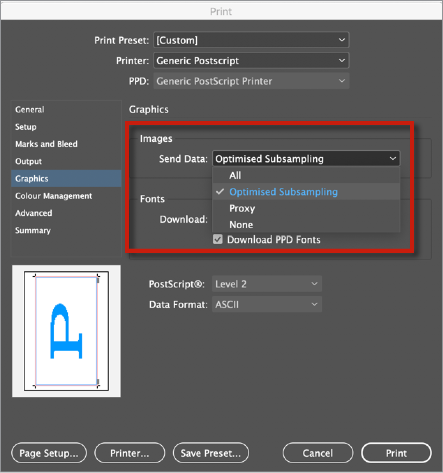
Figure 13. Printing usually involves a tradeoff of speed vs. quality. Optimized Subsampling gives you a good compromise between the two.
As for Fonts, subsetting is usually the way to go. You are, after all, printing and not saving a file you might need to edit.
Color management is a big topic, but it’s good to know that you have the option to choose the Document profile, which will optimize colors for the selected printer, or Proof, which will simulate another device. For example, I sometimes want to check that I have enough contrast on a newsprint ad by simulating newsprint on my office printer.
In the Advanced area, Print as Bitmap may offer a useful workaround if you have complex art that fails to print normally (Figure 14). Basically, it will turn your pages into the equivalent of flattened Photoshop files before printing.

Figure 14. Print as Bitmap provides a fail-safe option when the complexity of your content overwhelms your printer.
Yes, it is tedious to check all these settings, but that is exactly why you should use presets! There are so many ways to miss one of the checkboxes if you do it manually. And think of how much better you’ll sleep knowing that a correctly configured preset will always print the job right.
Don’t Forget the Description
Whenever you create or modify a PDF preset, remember that you can add notes in the Description field found in General settings.
Orderly Output: Adobe PDF Presets
To round out our discussion of presets, let’s consider the uses of PDF presets. PDF Presets are managed in much the same way the other presets are, except that you can save them one at a time only, and exported PDF presets (JOBOPTIONS files) can be used by other Adobe applications, including Acrobat, Illustrator, and Photoshop.
Creating PDF presets
To create a new PDF preset, choose File > Adobe PDF Presets > Define. Select one of the existing presets in the dialog box as your starting point, and click New. Many of the options for PDF presets are similar to those for print presets. Here are a few key settings.
In the General settings of the New PDF Export Preset dialog box, you can use the Viewing options to determine how the PDF pages are displayed in Adobe Acrobat or Reader. If you are sending a magazine or book for proofing, for example, choosing the Two-Up Continuous (Cover Page) Layout will allow your client to view the pages as spreads with a cover page and better understand your magazine layout choices (Figure 15).

Figure 15. The Two-Up Continuous (Cover Page) layout is good for magazine and book proofs because it will display spreads correctly.
Color Management and Compression settings are hotly debated, but with presets you can have a number of formats clearly named so that each printer will receive a file tailored to their needs. On the color management side, some folks want everything converted to device CMYK, so there will be no further color changes, while others will want a “late binding” workflow that leaves colors untouched so they’re not tailored to a specific device or substrate. The compression debate has on the one side, purists who are paranoid about any kind of compression and fear simplification of the raw data through downsampling. On the other side are the more relaxed folks who think that the screening process and substrate are more destructive than most digital compression. And the truth is probably that we will have to compromise, depending on the requirements of our service providers and the wishes of our clients.
Preset Panorama
For more tips on harnessing the power of presets, check out these articles at InDesignSecrets.
Share Your InDesign Print Presets
Save Print Presets in InDesign for Each Printer in Your Office
Standards suggestions
In my opinion, it’s best to start with one of the PDF/X formats, because they are based on the International Standards for Print and Packaging (Figure 16).

Figure 16. When in doubt start with PDF/X-4, the modern standard for many professional print jobs.
Sticking to a PDF/X-compatible standard will also ensure clear communication with all parties involved as to the output intent, and allow you to more accurately proof colors in Adobe Acrobat. Steve Werner discusses the different Standards in this article. And the Ghent Work Group is a great resource for industry tried-and-tested settings, including InDesign preflight profiles as well.
If your print service provider offers you a JOBOPTIONS file, take the time to familiarize yourself with all the settings it contains. It may reveal their assumptions about how you are expected to work with regard to color management, including whether they want you to convert all your images to CMYK before creating a PDF.
Presets for Proofing
At some point in your workflow, you will probably want to send a PDF proof to your client or colleague. If the proof just needs to show the content, the [Smallest File Size] preset that ships with InDesign may be perfect for you. Using a PDF preset will also help to prevent problems if you plan to use the Import PDF Comments feature in InDesign. For the commenting workflow to go smoothly, you need to output single pages (not spreads), and Bleed needs to be turned off for comments to appear in the right places.
Presets for Packaging
When you use InDesign’s Package command, you can also create a PDF to include with the packaged files. Consider making a preset for this use.
Perfecting Presets
It’s not overstating things to say that every InDesign user should be using presets. They give you more time to be creative and make you less likely to miss some checkbox while rushing to meet a deadline. If you are a scripter, then you can leverage presets in your scripts to make them even more versatile. If you are a service provider, then providing your clients with good presets can make your workflow more efficient, with fewer errors and increased customer satisfaction. So any time you find yourself repeatedly filling all the right settings in a dialog box, see if you can save them as a preset. You’ll be glad you did.