
This article was last modified on May 2, 2017
This article was first published on
Commenting is easier and faster when you're logged in!
Loading comments...

Recommended for you

Article
How to Digitize a Film Archive with Adobe Lightroom or Adobe Camera Raw
Digitizing an archive of film images can be a time-consuming process. Instead of...

Article
P22 Releases Underground Pro
P22 Type Foundry is proud to announce Underground Pro, an extensive font set bas...
Article
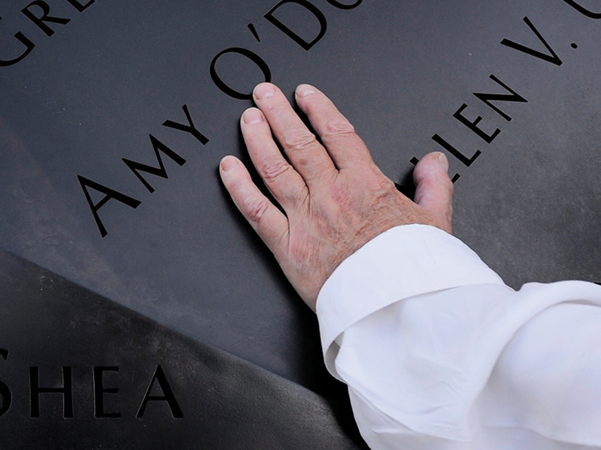
Before&After: Optima: The Typeface of 9/11
How Optima brings dignity and humanity to the National September 11th Memorial.