


TypeTalk is a regular blog on typography. Post your questions and comments by clicking on the Comments icon above. If Ilene answers your question in the blog, you’ll receive one Official Creativepro.com T-Shirt!
Q. I occasionally letterspace type, but some people tell me it’s a type crime. Why is that?
A. Letterspacing is the practice of adding additional space between a range of characters to produce a very open look (as opposed to adding space to compensate for tight spacing). Most people letterspace by using the tracking feature in design software.
The upper example is much more readable than the lower one, which has been letterspaced. Set in Gill Sans.

When letterspacing is applied to lowercase characters, it’s considered a poor typographic practice because it greatly reduces readability. When we read running text, we recognize a word by its shape, which to a large degree is created by the word’s ascenders and descenders. When the overall letterspacing is increased beyond normal, the eye and brain take longer to recognize the word shape, thus reducing readability. (Many type traditionalists, myself included, also think letterspacing is plain ugly, but that in itself is not enough of an explanation.)
This example, set in Adobe Caslon Pro, also shows reduced readability after letterspacing.

It’s more acceptable to letterspace all-cap settings. They’re less affected by readability issues because they’re less readable than upper and lowercase to begin with. In addition, all-cap settings have a certain geometry that’s not affected when spaced out.
We recognize words by the shapes that they make. Upper/lowercase settings with normal spacing (top example) are inherently more readable than all cap settings (lower example). Set in ITC Franklin Gothic.

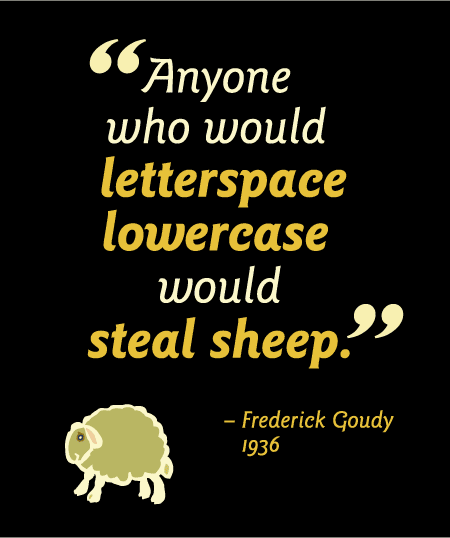
“Anyone who would letterspace lower case would steal sheep.” This quote is attributed to Frederic Goudy, the well-known American type designer of the 20th century. Erik Spiekermann and E.M. Ginger referenced the quote in the title of their clever typographic guidebook, Stop Stealing Sheep. But for the record, it has been said Goudy was not referring to lowercase, but to blackletter, and the verb he used was not “stealing” but a British slang term that would be in poor taste to repeat here. ;)
This quote, attributed to Fredrick Goudy, is set in ITC Goudy Sans Pro.
Love type? Want to know more? Ilene Strizver conducts her acclaimed Gourmet Typography workshops internationally. For more information on attending one or bringing it to your company, organization, or school, go to her site, call The Type Studio at 203-227-5929, or email Ilene at info@thetypestudio.com. Sign up for her e-newsletter at www.thetypestudio.com. You can also follow Ilene on Facebook and Twitter.
This article was last modified on May 15, 2023
This article was first published on May 20, 2009
Commenting is easier and faster when you're logged in!

Recommended for you

Scanning Around With Gene: Best in the West Graphics, 1970
In 1970 I was a freshman in high school. Although I wasn’t aware of graphi...

A Designer’s Font Playground
Hoefler & Co. recently launched a font playground of sorts: Discover.typogra...

dot-font Book Free to Download
Back in 2007, longtime CreativePro.com author John D. Berry gathered a selection...