

Zalman wrote:
What is your recommended hyphenation settings in setting paragraph styles? I am working on a 300+ page book and it hyphenates in weird places( two letters to the end; several lines in a row). I know we can clamp that down, but not sure what’s the best practice regarding good settings.
Great question, but unfortunately, it’s sort of like asking “what’s the best practice on which font to choose?” Different projects and different aesthetics require different settings. However, here’s what I usually start out with when I’m defining H&Js (hyphenation and justification settings) for body text:
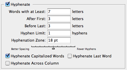

That is, I like to:
- Only hyphenate longer words
- Only have a single hyphen in a row
- Don’t hyphenate the last word in a paragraph or at the end of a column
- Allow a tiny bit of letter spacing (space between character) and glyph scaling (horizontal scaling of characters) to give InDesign some wiggle room setting text, especially in tighter columns.
There are certainly some people who refuse to allow letter spacing or glyph scaling, but I’m a pragmatist not a purist, and I don’t believe anyone can tell the difference with these tiny amounts.
Sometimes I’ll find a typeface that just seems too open, too loose. Some folks are tempted to apply tracking to the text. I don’t like that. Instead, I just lower the Desired values in the Justification field. For example:
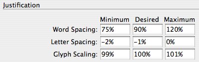
Note that even though the dialog box (or in this case, the pane inside the Paragraph Style Options dialog box) says “Justification,” this works both for Justified and ragged (such Left Aligned) text! This is a great technique for handling paragraph styles for headings that are often bigger and typically “tighter.”
How about you? What H&J settings do you prefer, and why?
This article was last modified on December 18, 2021
This article was first published on July 19, 2007
Commenting is easier and faster when you're logged in!

Recommended for you

Setting Vertical Text in InDesign
Renee wrote: As our crossword magazines are moving from QuarkXPress to InDesign,...

Moving your Find-Change Queries to InDesign CC
How to move find/change queries to InDesign CC.
Why Red Squiggly Underlines When Words are Not Spelled Wrong
InDesign's Dynamic Spelling feature is great for quickly identifying misspelled...