
Working with Vector Paths in InDesign
A guide to understanding how vector paths work in Adobe InDesign

This article appears in Issue 81 of InDesign Magazine.
Good and Evil. Darkness and Light. Chocolate and Vanilla. To these classic rivalries, let’s add another: Pixels and Vectors. Pixels—what you get when you use Photoshop’s brushes (for example)—now feel, somehow, more “natural,” or “intuitive,” because they can simulate traditional fine art tools and media. Vectors—what you get when you use InDesign’s drawing tools (the Pen, Rectangle, or Line tool, for example)—on the other hand, are often viewed as geometry. That’s mathematics—a field that many visual artists view as Evil. My background is in illustration—I always wanted to grow up to be a children’s book or fantasy illustrator. I ended up working in various flavors of technical illustration (veterinary, medical, electronics, archaeological). My tools weren’t charcoal and brushes on canvas (remember that this is before the days of personal computers); they were Rapidograph pens on Mylar film. Being able to maintain a consistent stroke width while drawing with rules and French curves was a mark of superior skill. It’s shouldn’t be surprising, then, that I lean toward the vector-drawing side of the argument. It’s the path that I’ve been following.
Vector Paths and Points
The world of vector drawing is made up of paths. A path is something like a connect-the-dots puzzle. Connect all the dots together in the right order, and you’ve made a picture. But paths are far more than a series of straight lines connecting dots—they also include curves of any complexity. More than that, paths also include formatting, such as stroke weight, color, or stroke styles. Just as you can use paragraph styles to improve your typesetting productivity, you can use object styles to streamline the process of formatting paths. The paths you draw in InDesign are made up of points, and the points are joined to each other by line segments. Paths have a direction,
so points along a path have an order (or “winding”). Each point has an “anchor,” which defines the location of the point on the page. In addition, each point can have an incoming control handle and an outgoing control handle. These user interface gadgets determine the curvature of the preceding and following line segments, respectively. Apart from geometric perfection, what’s so great about paths? If you’re drawing objects in a pixel-based program (such as Photoshop), changing a shape means erasing part of what you’ve drawn, and then drawing it again. In a vector-based program (like Illustrator or InDesign), you don’t have to start over every time you want to change a shape. Instead, you change the properties of the path, adjusting the position of the points on the path or their control handles. Or you can leave the path alone and simply change the formatting (such as stroke or fill) to alter its appearance. All of the shapes that you can draw in InDesign, including text frames and text wrap boundaries, are paths. The shapes that you draw with the Rectangle, Ellipse, Polygon, and Line tools are specific arrangements of path points and control handles—there’s nothing special about them. At any time, you can use the Pen tool, the Direct Selection tool, or the Scissors tool to change one of the basic shapes into an entirely arbitrary path. It pains me when I see people reflexively switching over to Illustrator whenever they need to draw anything more complicated than a box. I think this is just crazy—and not only because I hate Illustrator with a white-hot passion. You have the tools, right here in InDesign, to draw anything that doesn’t require Illustrator’s “fancy” brush effects, gradient mesh, or patterned fills. I’ve often heard people say that Illustrator is “the right tool for the job” when it comes to drawing, but that’s like saying that the hammer in the toolbox across the room is better than the hammer in your hand. When it comes to basic path drawing, the two programs are functionally identical. In fact, my main point in writing this piece is to try to get InDesign users to notice the tools that are right in front of them. Next, I want to cover some simple things about paths that are often forgotten. Here’s a more-or-less random collection of thoughts about path drawing in InDesign. Some of these will probably seem very basic, but believe me, they’re based on real questions I’ve heard or behaviors I’ve observed. Some of them rely on scripting, which seems very advanced to many InDesign users. I’m hoping that one or more of them is of some use to you.
There’s a reason Illustrator’s Outline view exists
For more precise drawing, skip the stroke/fill until your path is perfect. When I’m drawing in InDesign, I always set my document default stroke to 0 and default fill to None, and set the document view to Normal (so that I can see the paths). I do this because InDesign often moves the path itself—actually changes the location of the path points—based on the stroke weight. When I’m doing any type of technical illustration, I want to work with the geometry of the paths. I don’t care about their appearance until their path points are in the right places. Drawing without the stroke makes it easier to see when path points and line segments join and abut each other. This approach helps me avoid small errors that I can’t easily see on screen (strokes that don’t quite overlap, points that aren’t perfectly coincident, etc.). These kinds of drawing mistakes are the ones that jump out and bite you when you print your layout.
The Direct Selection tool is your friend
Unless you’re working with very simple paths, and doing very simple things, the Direct Selection tool (Press A when the cursor is not in text) is the tool to use. With the Direct Selection tool, you can select individual points by clicking on them, or select multiple points by dragging a selection around them. To select all of the path points in a path, hold down Option/Alt as you click a line segment on the path. If the path is inside a compound path, a group, or pasted inside another page item, hold down Option/Alt as you drag. Non-selected path points are hollow; selected path points are filled in (Figures 1 and 2).
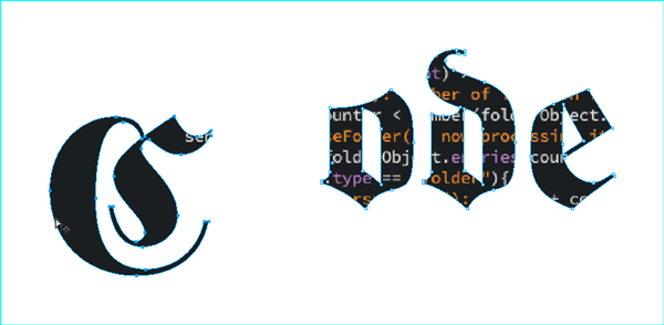
Figure 1: All of the characters in this example are part of a compound path, and a graphic has been placed inside the compound path to make it a little bit more interesting. To move a subpath within a compound path (in this example, a single character), select the Direct Selection tool, hold down Option/Alt, click the subpath, release the key, and then drag the subpath to a new location.
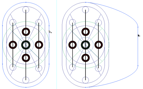
Figure 2: Point at a line segment with the Direct Selection tool and drag. InDesign will move the line segment.
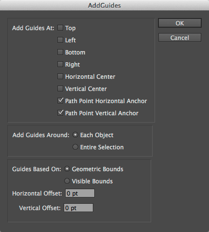
Figure 3: AddGuides dialog box. Select the circled options to draw a pair of guides through every path point in a path.
Theory and practice: path direction
Remember that I said that paths have a direction? It turns out that this fact can help you in both large and small ways. When you apply arrowheads (and/or “tailfeathers”) to a path, InDesign puts one arrowhead at the start of the path and, optionally, another at the end of the path. Given that these locations (“start” and “end”) are based on the path direction, you can easily end up with something other than what you expect. At this point, many people go to the Stroke panel and re-specify the arrowheads, but there’s a quicker way: select the path, and then choose Object > Paths > Reverse Path. Another effect of path direction relates to the way that InDesign fills self-intersecting or compound paths. If you’re familiar with Illustrator, you know that there are two options: the Non-Zero Winding fill rule and the Even-Odd fill rule. These rules control the way in which the application fills—or doesn’t fill—the intersecting parts of the path. InDesign supports the Even-Odd fill rule, but not the Non-Zero Winding fill rule. Does this mean that you have to go to Illustrator to get the effect of the missing fill rule? Nope—you can do the same thing right here in InDesign. To do this, select the path, and then copy it. Choose Edit > Paste In Place to create a duplicate of the object exactly on top of the original. Select both objects, and then choose Object > Pathfinder > Add (or click the Add button in the Pathfinder panel) (Figure 4).
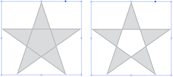
Figure 4: Even/Odd fill in InDesign: Here you see InDesign’s default “Zero Winding” fill rule on the left. Copy the path, and then Paste in Place. Select both paths (the original and the duplicate), and then apply the Add Pathfinder operation. The new compound path (right) simulates the appearance of the Even/Odd fill rule.
Non-obvious uses for path text
The text on a path feature can be used (abused?) in conjunction with inline/anchored graphics to create ornamental borders, dimension lines, and other nifty things (Figures 5 and 6).
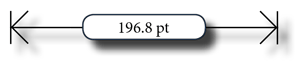
Figure 5: Dimension lines with text on a path.

Figure 6: Graphics pasted into a text path on the text frame containing the title create a decorative border.
Repairing Basic Shapes With Convert Shape
When you’re working with the Direct Selection tool, it’s pretty easy to accidentally move path points. It’s also easy to fail to notice this change until it’s too late to undo. What this means, in practice, is that some basic shapes (rectangles, ovals, and polygons) get distorted—their path points are out of position ever so slightly. Instead of redrawing the shape, or laboriously moving the path points back into the correct position, select the path, and use the options on the Object > Convert Shape menu to turn the shape back into whatever it is supposed to be. Note: This comes in very handy when you’ve accidentally dragged one corner of a text frame. When InDesign sees that a text frame is non-rectangular, some text frame options disappear. And InDesign defines “rectangular” in a very precise way—having a corner point out of position by .0001 point is all it takes. If you’re not seeing the text frame insets you expect, for example, you should suspect a misplaced corner point (Figure 7). 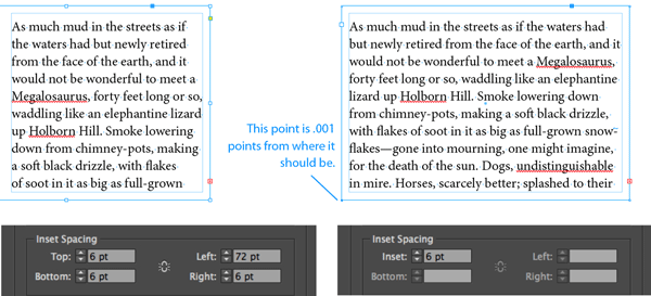
Two Things About Stroke Styles
InDesign’s stroke styles provide a way for you to incorporate dashed, dotted, or striped strokes in your layouts. That’s nice, but nothing too exciting. There’s at least one tip, however, that can really improve your technical illustrations, maps, and so forth: when you’re using a callout rule (a line that points from a piece of text to part of an image), it’s easy for the rule to get lost in the detail of the image behind it. To make the rule stand out, create a striped stroke style with a white background—the background will enhance the visibility of the line by knocking out the image behind it (Figure 8).
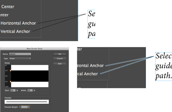
Figure 8: It’s easy—especially in printed pieces—for callout rules to get lost in background images (top).
To solve this problem, create a Stripe stroke style that includes a white (or similarly high-contrast) background color (bottom).
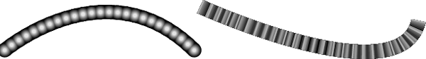
Figure 9: Examples of using stacked strokes to create beads (left) and ribbons (right).
Use my path utilities scripts
Every now and then, I’ll find that I need a path-drawing feature that InDesign doesn’t have. When this happens, I’ll usually write a script to provide the feature. I’ve written scripts that allow me to save a selection (so that I can come back to it later), or outline a path, or connect the center points of a series of selected page items. Back in July 2014, I wrote a piece for InDesignSecrets on one set of tools that I often use. It’s gotten a whopping two (2!) comments. This disappoints me greatly, because I think that everyone who draws anything in InDesign could use some of these features. And they’re free! So what are you waiting for? Give ‘em a try! (Figure 10)
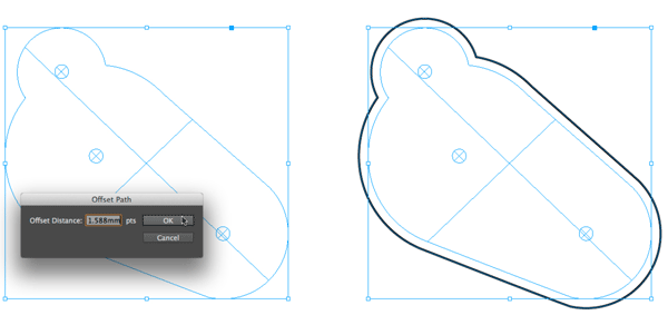
Figure 10: Select a path, and run the OffsetPath.jsx script. The script will present a dialog box where you can enter the offset value you want. Note that you can enter measurement values using standard InDesign measurement overrides. The basic unit for the InDesign dialog box object is points, but I can enter the value I want in millimeters. Click OK, and InDesign creates a new path, offset from the selected path by the distance you specified.
Using Scripts for Creative Drawing Effects
We generally think of scripting as a tool for automating repetitive tasks, but scripting can be a creative tool as well (see this post on spirograph patterns to learn how), making it easy to experiment with design effects that would be difficult or impossible to realize in any other way. At several points in this article, I’ve talked about using scripts. If you’re new to InDesign scripting—and perhaps a little scared of the whole topic—I’ve got you covered. Take a look at this blog post that I wrote.
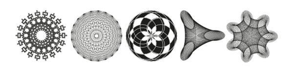
Fractalize, Mystic Rose, and NINA images, all realized through a script.
Thinking About Path Operations
InDesign’s path operations (aka the “Pathfinder” feature) give you a way to merge two or more shapes into a single shape. The difference among the path operations has to do with the way that they deal with the area of intersection between objects. Add, for example, merges overlapping objects into a single path, removing the area of intersection as it does so. Intersect, by contrast, creates a new shape from the area of intersection, and discards the remainder of the overlapping paths. One usually thinks of path operations in an additive way—building up complex shapes from basic shapes. A feature of path operations that’s often missed is the ability to use them in a “cookie cutter” fashion—using shapes to knock out the area of intersection in a background shape (Figure 11).
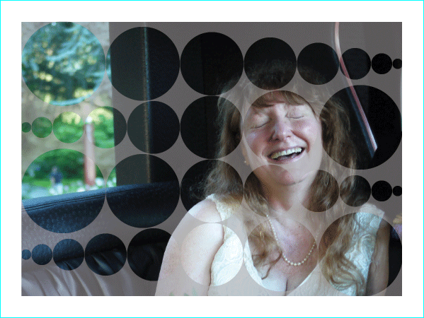
Figure 11: Cut a shape out of a page item to show an image beneath. Here’s a compound path (the circles) cut out of a shape using the Subtract path operation. Place the shape over a background image to let the image show through. I’ve added a transparent fill, just for fun.
Convert point operations
The award for the most-ignored feature related to path drawing has to go to the Convert Point operations (Object > Convert Point). You can use these to convert the point type of a selected point (or series of points) to some other type of point. What’s the use of this? Like the Convert Shape features, it’s mostly for cleaning up mistakes you’ve made while you’re madly selecting and moving points. It’s pretty easy to accidentally apply a curve to a line segment that should be straight. Rather than drag the offending control handle into the point (a process that can be hard to do perfectly at some magnifications), just select the point and choose Object > Convert Point > Corner. This will retract the control handles associated with the point, which gives you straight line segments on either side of the point. My favorite use of this feature, however, is to draw paths using corner points and then convert some or all of the points on the path to smooth points (Object > Convert Point > Smooth). Once you get the hang of what will happen when you do this, you might find it’s easier to create precise curves this way (it is, at least compared to drawing the path with the Pen tool). Also, it can be a lot of fun.
Thinking About Paths
How we think about our tools sometimes causes us to miss better ways to work. It’s easy to fall into a rut, to put off learning new approaches to tasks we have at hand. I often find that the largest mental barrier to working more efficiently or creatively has to do with the unexamined assumptions I bring to the process. I need to remind myself to try new things. I’m hoping that something in this piece might have helped you look at some part of InDesign path drawing in a new light, and made your work a little easier or more enjoyable. We’re walking this path together, after all.
Commenting is easier and faster when you're logged in!

Recommended for you

Eco-Friendly CD Cover Wins American Packaging Design Award
For four decades, Graphic Design USA has sponsored national design competitions...

GREP for Editors
If you’re like most people, you just got done reading the headline of this...

InDesign How-to Video: How to Align Auto Numbering on a Decimal
In this week’s InDesignSecrets video, Mike Rankin explains how easy it actually...