


This article is excerpted from the August/September 2008 issue of InDesign Magazine (#25). Buy the issue or subscribe to the magazine at www.indesignmag.com. See the PDF below for a special discount!
There’s nothing more fundamental to InDesign than text in a frame. Nothing occupies more space on your page or more time in your day than text work. The following five tips can help you work faster, get better results, and maybe even have more fun along the way. I’ll show you how to quickly re-frame text, fine-tune tracking, toggle smart quotes, push the limits of highlighting, and see selected text in its true colors.
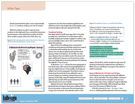
Click here or on the image below to download the PDF with all the tips.
To open the PDF, you’ll need Adobe Acrobat or Adobe Reader. We highly recommend Adobe Reader 7.0 or above to view this PDF. Download the latest Acrobat Reader here.
To learn how to configure your browser for viewing PDF files, see the Adobe Reader tech support page.
This article was last modified on December 17, 2022
This article was first published on December 8, 2008
Commenting is easier and faster when you're logged in!

Recommended for you

TypeTalk: The Creative World of Gail Anderson
Anderson's bold and innovative type work has graced the covers of book covers, B...


Don’t Commit the Type Crime of Applying Faux Italic in Microsoft Word
In an earlier essay on Typographic Discipline I discussed apostrophes and quotat...