


[This article was written by a guest contributor Sandee Cohen, author of the wonderful InDesign CS5: Visual Quick Start Guide, now available at a store near you!]
Sandee writes…
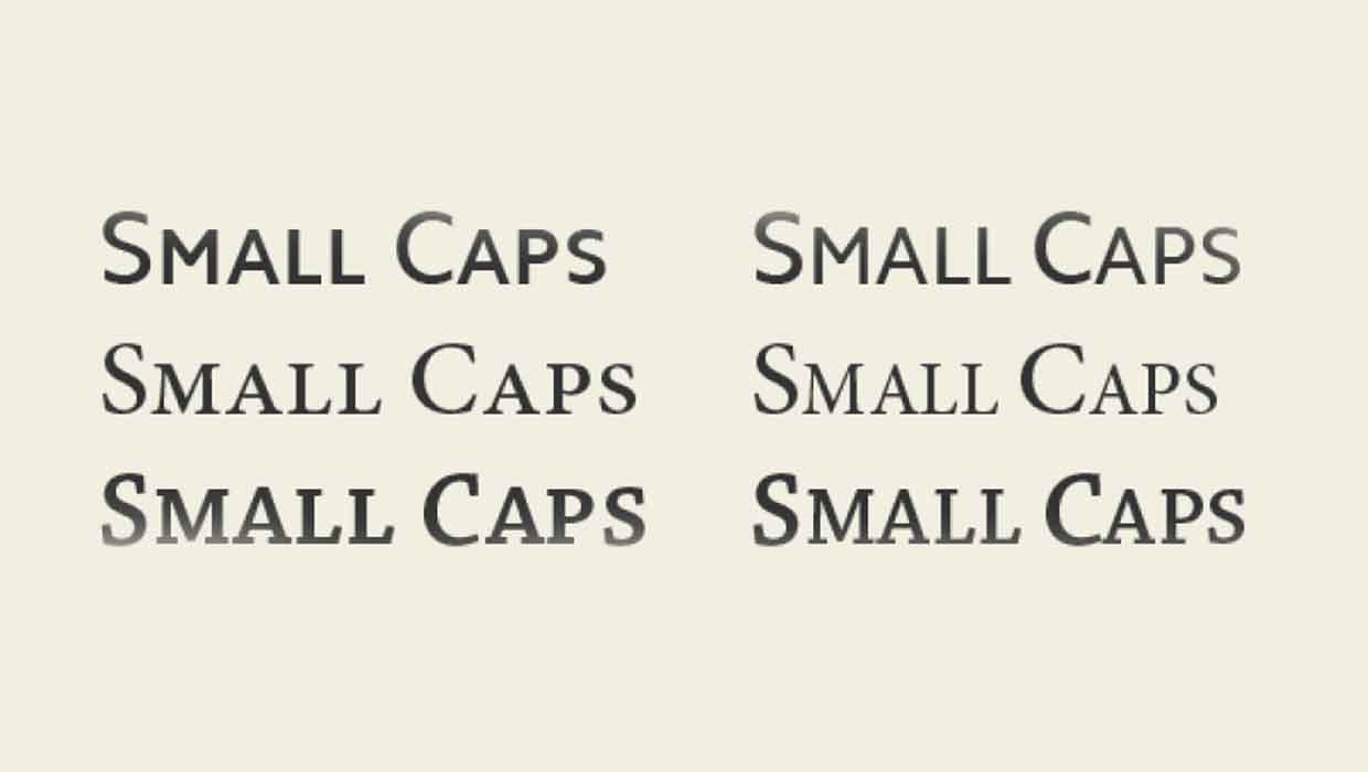
As a computer graphics author, I type a lot of acronyms in my books and articles: PDF, PSD, CMYK, RGB, JPG, GIF, TIFF, INDD, and so on. Strictly speaking, all of these acronyms should be laid out in small caps as shown in the following illustration.

Using the Small Caps styles, not OpenType All Small Caps
Now, it’s easy to apply the small caps attribute to text by highlighting and applying a character style. And as Anne-Marie wrote in her InDesign Secrets article, (https://creativepro.com/small-caps-vs-opentype-all-small-caps.php) you usually want to apply the Small Caps style, not the OpenType All Small Caps style. And she’s right because the Small Caps style works for both OpenType fonts that have true small caps as well as for fonts that use the electronic scaling to fake small caps.
But I need something more automatic than applying Small Caps to a few words. Almost all the acronyms I type start out as all uppercase letters in my documents. Or I type them myself in uppercase. So I need a way to continue to type the text in uppercase and then have them automatically convert to small caps. Keeping them uppercase becomes an electronic ‘tag’ that identifies them as acronyms.
I’ve basically decided that, in my work, any words that have two or more uppercase letters in a row should be set in small caps. That works for the acronyms in computer graphics as well as generals ones such as USA, IRS, UN, AM and PM.
Switching from Minion Pro to Myriad Pro
For years, when my book was laid out using the font Minion Pro, I used a GREP Find/Change to search for \u\u\u* which translated means find any two uppercase letters that may or may not have another upercase letter after them. Then I applied the OT All Small Caps character style to convert them to small caps.
When InDesign added GREP styles, it was even easier. I created a GREP style that automatically looked for \u\u\u* and applied the OpenType All Small Caps style. This style forces uppercase letters into small caps. It was thrilling as I typed a capital P and then added the capital D and capital F to watch the text automatically jump to small caps.

But for my most recent book project, the body text is Myriad Pro which doesn’t have a true small cap font. So the OT All Small Caps style doesn’t work on the Myriad Pro text. The Small Caps style does work in Myriad Pro, but only on lowercase letters. This was a real problem. It would be far too much work for me to stop typing the acronyms as uppercase letters and switch to lowercase.
I needed a way to convert uppercase acronyms into electronic small caps.
So I thought about what other ways, beside electronic small caps, I could scale text. A smaller point size wouldn’t work as I needed something that would work at many different point sizes. Then I realized that the pedestrian Horizontal and Vertical Scale commands in Advanced Character formatting would do everything I needed. It would apply a scale to the uppercase letters so they resembled small caps. Of course, I know that simply scaling the text down wouldn’t look as elegant as real small caps.
Expanding the Horizontal scale
Then I remembered an old trick from my days of QuarkXPress 3.1 when OpenType didn’t exist. In those ancient times we changed the small caps scaling so that the horizontal scale for small caps was slightly wider than the vertical scale. This could be something as simple as 85% H and 80% V. That extra little scaling was all that was needed to make the fake electronic small caps look a little better.
So I created a character style called Small Caps Myriad. I set the horizontal scaling to 85% and the vertical scaling to 80%. The result is a much better approximation of a true small caps.


Applying the Character Style via a GREP style
I used the Small Caps Myriad character style as the GREP style for the same code as before: \u\u\u*. Once again it is thrilling to watch the uppercase letters magically change size as soon as the second uppercase letter is typed.
Overriding the GREP style
There have been a few times that I’ve had to manually fix this automatic style change. One obvious problem was typing the X and P in QuarkXPress. So I created a character style which consisted of 100% horizontal scale and 100% vertical scale. I could, when needed, apply this style manually to whatever text I didn’t want in small caps. But in the case of XPress, there were too many times I needed to fix the text. And I don’t like stopping as I type to fix the text.
So I created another GREP style for the name QuarkXPress and applied the 100% character style. This GREP style is then positioned below the GREP style for the small caps. InDesign applies the GREP styles in the bottom to top order. Whichever GREP style comes first from the bottom of the list gets applied to the text and doesn’t apply any new GREP styles. So this fixed the XPress text.

Of course I could have created an individual GREP style for every acronym I use. But that list would be endless. There are just too many acronyms. That’s why I like the \u\u\u* code. I don’t have to worry if I have missed an acronym.
Working with this electronic scaling and GREP styles has saved my hours of work proofing to make sure I covered all the acronyms in my book.
This article was last modified on December 20, 2021
This article was first published on September 14, 2010
Commenting is easier and faster when you're logged in!

Recommended for you

Understanding and Applying Small Caps
Small caps are a handy feature for type design, but make sure you're using real...

The Incredible Shrinking Italic Small Caps
When everything in a project proceeds according to plan, that’s great. It...
InType: Know Your Small Caps
Add sophistication and polish to your type by understanding the different kinds...