

Pardon me for waxing enthusiastic. Some things are just too cool to stay calm about.
An article that appeared recently on Wired starts like this:
IMAGINE IF, DUE to some fluke, The Empire Strikes Back had only been shown in a couple of movie theaters. Imagine it fading into obscurity and existing for decades as nothing more than a cult film, a historical footnote, an object of fascination among serious movie buffs.
That’s the story of Haas Unica.
I recommend reading the rest of the article, and the background history of Neue Haas Unica on the Linotype website, because from a typographic point of view this news is on par with hearing that Amelia Earhart’s plane had been discovered, but that’s not the only reason this is good news.
Why It’s a Big Deal
Univers and Helvetica are classics, but if you’ve worked with them you’ll know they’re not so readable in smaller sizes, and they really, really don’t translate well to your average computer screen. (Try OS X Yosemite on a non-Retina display. ‘Nuff said.) Unica is designed for both display work and text, and it works on screen and on paper.
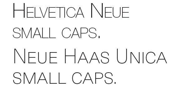
But there are other reasons to get excited. For one thing, Unica has true small caps! — Still a rarity among sans serif typefaces, and missing entirely from almost all versions of Helvetica and Univers. Even Myriad Pro, conceived and drawn in the digital age, doesn’t have real small caps. Here’s a comparison of Helvetica Neue and Unica, both set at 30/30, with InDesign’s optical kerning turned on. Notice the ugly weight difference between the caps and faux “small caps” in the Helvetica. Ouch. But doesn’t the Unica look fantastic?
There are even small caps figures in each font, drawn to work in an all small caps or lowercase setting where regular figures would tower over the text. You’ll find numerator, denominators, lining and proportional figures, support for every European language, and a raft of other OpenType features that InDesign and other OpenType-savvy applications can use.
And it’s a beautiful face, besides, that’s going to see plenty of use in my own work.

Why It’s an Even Bigger Deal Right Now
As if all that weren’t sweet enough, Linotype is marketing the complete family with a 75%-off introductory offer until May 7, 2015, for the desktop fonts. All 9 weights and their corresponding italics are going for a bargain-basement $99 US. You can purchase directly from Linotype or from Fonts.com.
This article was last modified on April 16, 2015
This article was first published on April 16, 2015
Commenting is easier and faster when you're logged in!

Recommended for you

A Different Kind of Body Type: Typographic Tattoos
I was on a crosstown bus in Manhattan in 2003 when I spotted a typographic tatto...

TypeTalk: 10 Ways to Increase Readability and Create Inviting Text
Use these techniques to make text-heavy material more attractive and easily dige...
