
If you’ve been part of the CreativePro community for a while, you may remember my TypeTalk column, where I spent years exploring typography—how to use it, how it’s made, and how it shapes the way we see and communicate. From the outside, it might look like I left that world behind. What I actually did was change mediums.
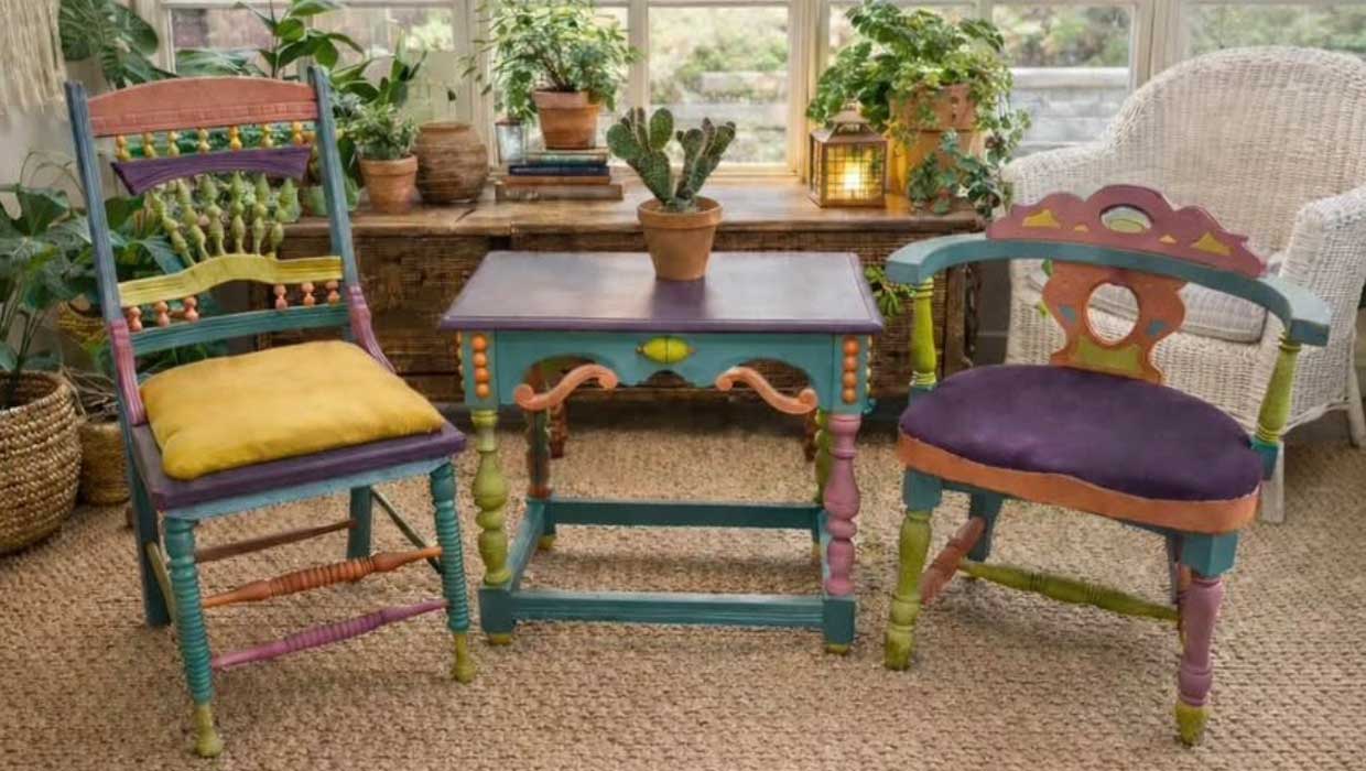
Over the past several years, I’ve been sourcing vintage furniture through tag sales, thrift shops, and the occasional curbside find, and then reworking each piece by hand—painting, refining, adjusting, and presenting it in a way that helps someone else see its potential. At first glance, it couldn’t seem further from typography, but I quickly realized the underlying process felt surprisingly familiar.
What surprised me most was how quickly my design instincts kicked in. Before I ever pick up a brush, I’m already making many of the same decisions I used to make on screen: where the eye should go first, what deserves emphasis, what should quietly recede into the background, and how all the parts work together to create a feeling. The materials are different, but the thinking is not.
Focal Point: Where the Eye Lands First
In typography, everything begins with where you want the reader to look. That instinct never left me. With furniture, the focal point might be the top, the hardware, the curve of a leg, or even the negative space around the piece itself. Sometimes it’s already there, hidden beneath years of wear. Other times, it has to be gently revealed through color, tone, or contrast.
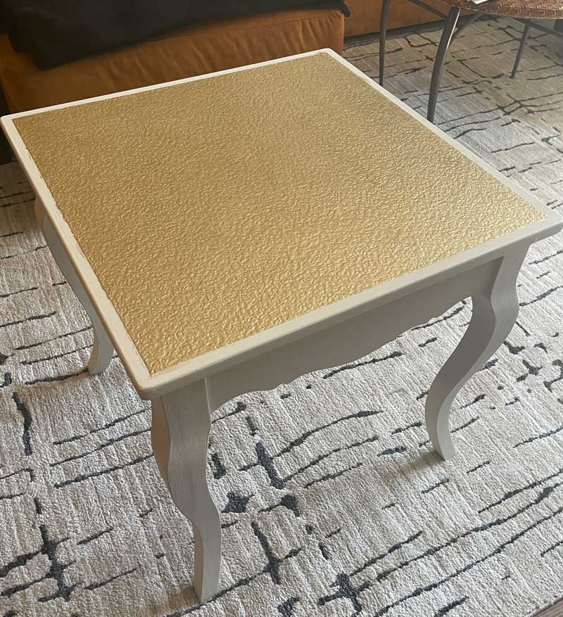
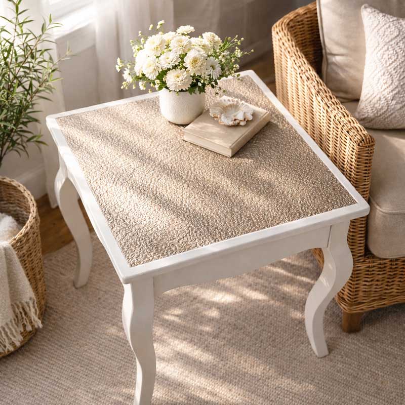
From Gold to Champagne
This simple wooden table had beautiful legs but needed a stronger focal point. I added textured, paintable wallpaper to the top and painted it gold—I’ve always loved metallics. But once finished, the effect felt too strong for such a small piece. Repainting it in a softer champagne metallic calmed everything down and created a better balance.
One thing typography taught me is that if everything tries to speak at once, nothing is heard.
Hierarchy: What Matters Most (and What Doesn’t)
Good design isn’t just about what you add; it’s often about what you hold back. In typography, hierarchy guides the reader through information. In furniture, it guides the eye in a similarly deliberate way.
A surface may carry the piece while the base quietly supports it. Hardware can either reinforce the form or compete with it. Sometimes the most important design decision is knowing when not to overwork something. That restraint—the ability to edit rather than decorate—is something I carried directly from typography into this work.
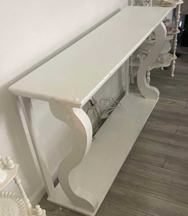
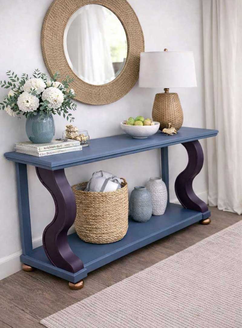
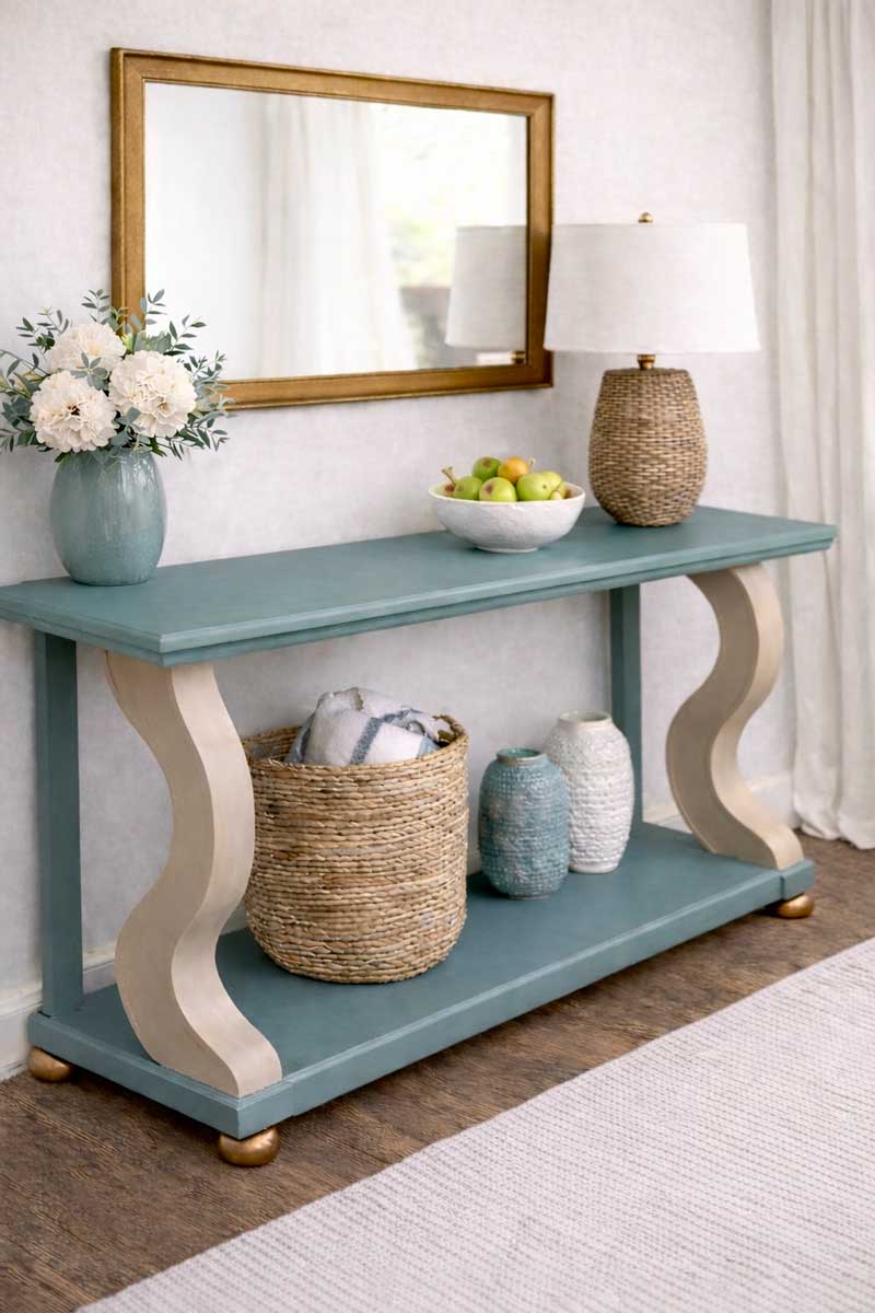
Console
I saw potential in this bland white console immediately. To emphasize the curvy front legs, I painted them purple and loved the result. Unfortunately, buyers didn’t agree! I eventually repainted the legs in a distressed neutral finish that appealed to a broader audience.
Texture and Contrast: The Quiet Workhorses
Typography relies on contrast, weight, spacing, scale, and density to create rhythm and clarity. Furniture has its own version of that language.
A matte finish beside a subtle sheen. Smooth surfaces balanced with areas that still show age and texture. A piece starts to feel believable when there’s enough variation to create depth, but not so much that it feels forced or overdesigned.
Ironically, working with old furniture has made me appreciate imperfection more than I did earlier in my design career. Sometimes a worn edge, a softened corner, or an uneven patina is exactly what gives a piece its character and presence.
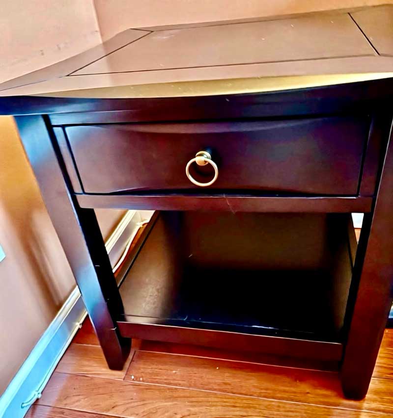
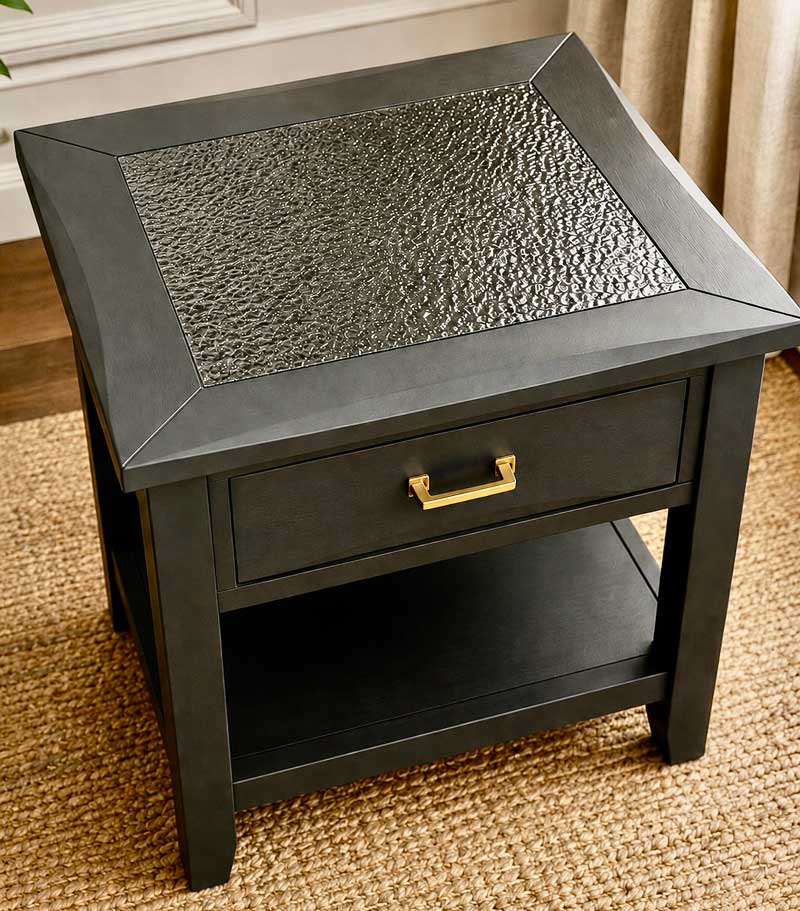
Black on Black
Nightstand pairs tend to sell well, and I was drawn to the understated angles of these pieces. But once painted a single dark color, they felt flat and mass-produced. I added textured, paintable wallpaper to the center sections, then used a glossy finish to create more contrast, depth, and personality.
Audience: Who You’re Really Designing For
Understanding your audience may be one of the most transferable skills in all of design. That was true throughout my career, and it remains true now, though it plays out in a more immediate and personal way.
A piece that resonates in one environment may feel completely out of place in another. What works in a coastal Connecticut interior may not speak to someone furnishing a rustic upstate home. Even when I’m working alone in the studio, I’m thinking about where a piece might eventually live, and how someone wants to feel around it.
You’re not just designing the object. You’re designing the emotional response to it.
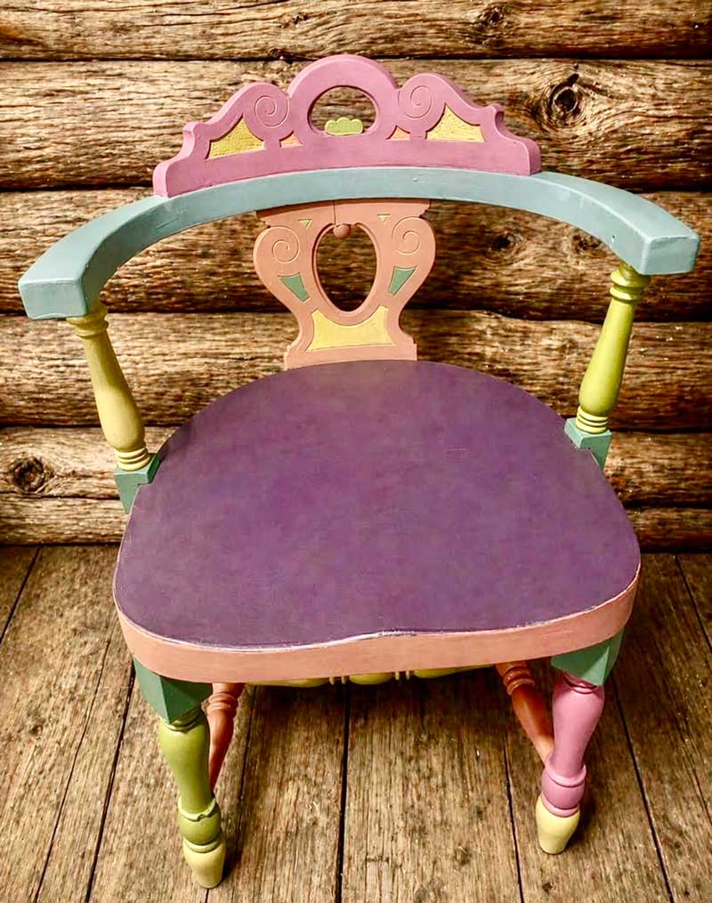
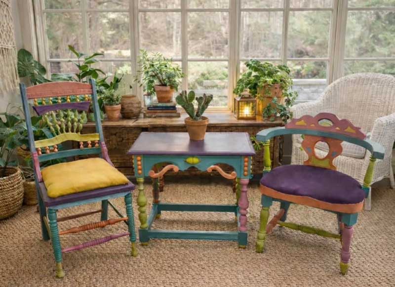
Boho Chair
Wanting to experiment with color, I gave this captain’s chair a muted but playful finish. It was so much fun to do that I ended up using the same treatment on two other pieces afterward.
Presentation: Helping People See
In typography, context shapes perception. The exact same content can feel elegant, confusing, inviting, or forgettable depending on how it’s presented. Furniture works much the same way.
How a piece is staged, photographed, lit, and surrounded often determines whether someone pauses long enough to really see it. A carefully chosen rug, a quiet wall color, or the right amount of shadow—those things aren’t decoration to me. They’re part of the communication.
In many ways, I’ve come to realize that my job now is less about “painting furniture” and more about helping people notice what was already there.
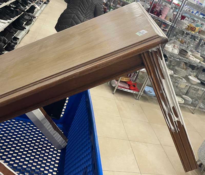
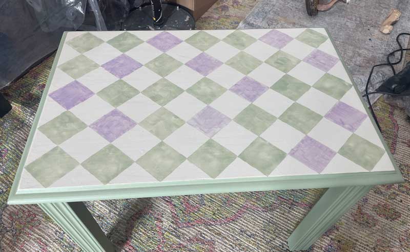
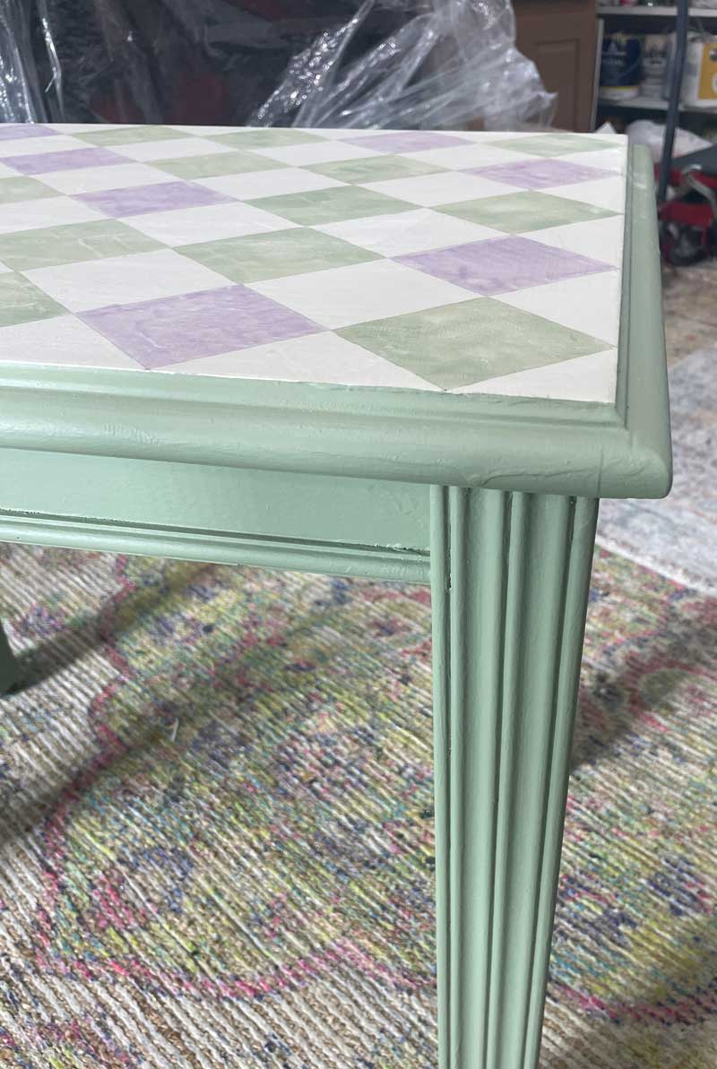
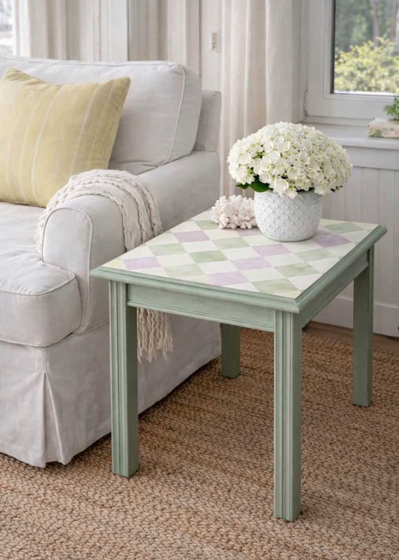
Check table
This discarded table felt like a blank canvas waiting for a new story. I wanted the soft, watercolor-style pattern on the top to feel light and transparent while still respecting the strong linear rhythm of the fluted legs.
Staging becomes especially important with a piece like this because buyers may not immediately imagine where something playful or unusual could work in their own homes. The right setting helps them see it as an artistic accent piece rather than just a discarded thrift-store table.
Different Canvas, Same Eye
I didn’t expect this work to feel so familiar. I started in fine art, moved into typography and design, and now spend my days working in a much more physical, hands-on medium. Yet the underlying way of seeing has remained remarkably consistent.
Typography trained me to notice proportion, rhythm, hierarchy, tension, and restraint. Furniture simply gave those instincts another place to live.
What changed most wasn’t the eye itself. It was the medium through which that eye now works.
What Carries Over
If this shift has reinforced anything for me, it’s that creative skills rarely disappear when you change direction. They evolve. They adapt. Sometimes they even become clearer with time.
The tools may change. The canvas may change. But the deeper way you observe, edit, shape, and respond to the world tends to follow you wherever you go.
And occasionally, if you’re lucky, an unexpected new medium helps you see your original one more clearly too.
This article was last modified on May 23, 2026
This article was first published on May 18, 2026
Commenting is easier and faster when you're logged in!

Recommended for you
Visual Orchestration
Republished with permission from frederickyocum.com Editorial design?—?the compo...

Can You Read Me Now? Testing the Limits of Readability in Design
I’ve long been obsessed with how things work. Sometimes I think maybe desi...