


Before&After: Design a Showroom-Style Presentation
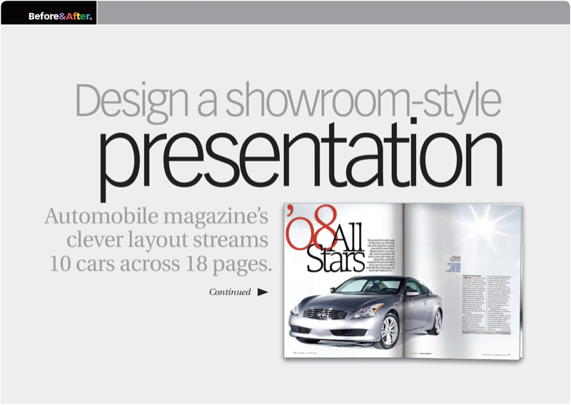
This auto magazine feature layout is a fair illusion of walking page by page through a big showroom.

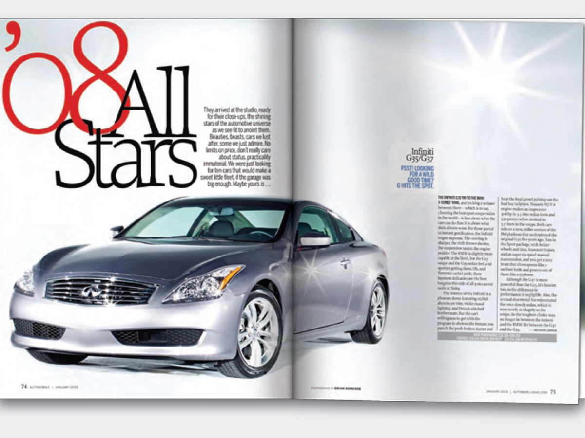
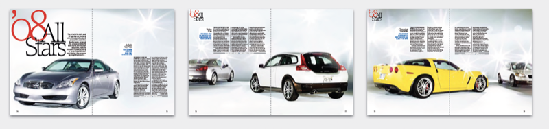
The cars are photographed like you’d experience them in person—from different angles, distances and slightly different heights. The constantly shifting vantage point conveys an active sense of walking about, looking closely. This 7-page article from issue 47 of Before&After Magazine shows you how Automobile magazine once found a clever way to feature 10 cars individually but with continuity: Each vehicle has its own spread, but visible in the distance is the previous vehicle. The result is a fair illusion of walking page by page through a big showroom..
The text is set in compact blocks, which keeps the layout spacious and ensures the cars get all the attention! Each block has several typographic “voices.”
© John McWade/Before&After Magazine, courtesy of Gaye Anne McWade.
Commenting is easier and faster when you're logged in!

Recommended for you

Before&After: Design Without Rulers
Put away your ruler; here’s how to design the way you see!
Before&After Design Tip: Signify Hierarchy With Color
Here’s a quick tip on color usage in web design from issue 42 of Before&After Ma...

Before&After: Make a Theme to Tie Your Design Together
A butterfly graphic creates a focal point, color, and continuity and turns a gra...