
Here’s a quick tip on web advertising design from issue 44 of Before&After Magazine.
In a small web ad, text and photos must work together, not separately. In fact, the two must form virtually one message. Like a photo, type is graphical, so you can use its style, case, shape, weight and color to complement and strengthen the image.
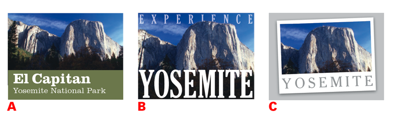
A. Panorama: Definitely not simple, incomparable El Capitan is a case where an entire mountain of granite is the focal point. We could crop, but this image benefits from its distant vantage point, scale and surrounding detail. Adding the green bar separates image from text, limiting the complexity.
B. Monument: With tighter cropping, the mountain becomes more vertical than horizontal, an effect heightened by its deep shadows. Extremely con-densed typeface in mighty uppercase amplifies the effect, welding words and image into a single, powerful message readable at a glance.
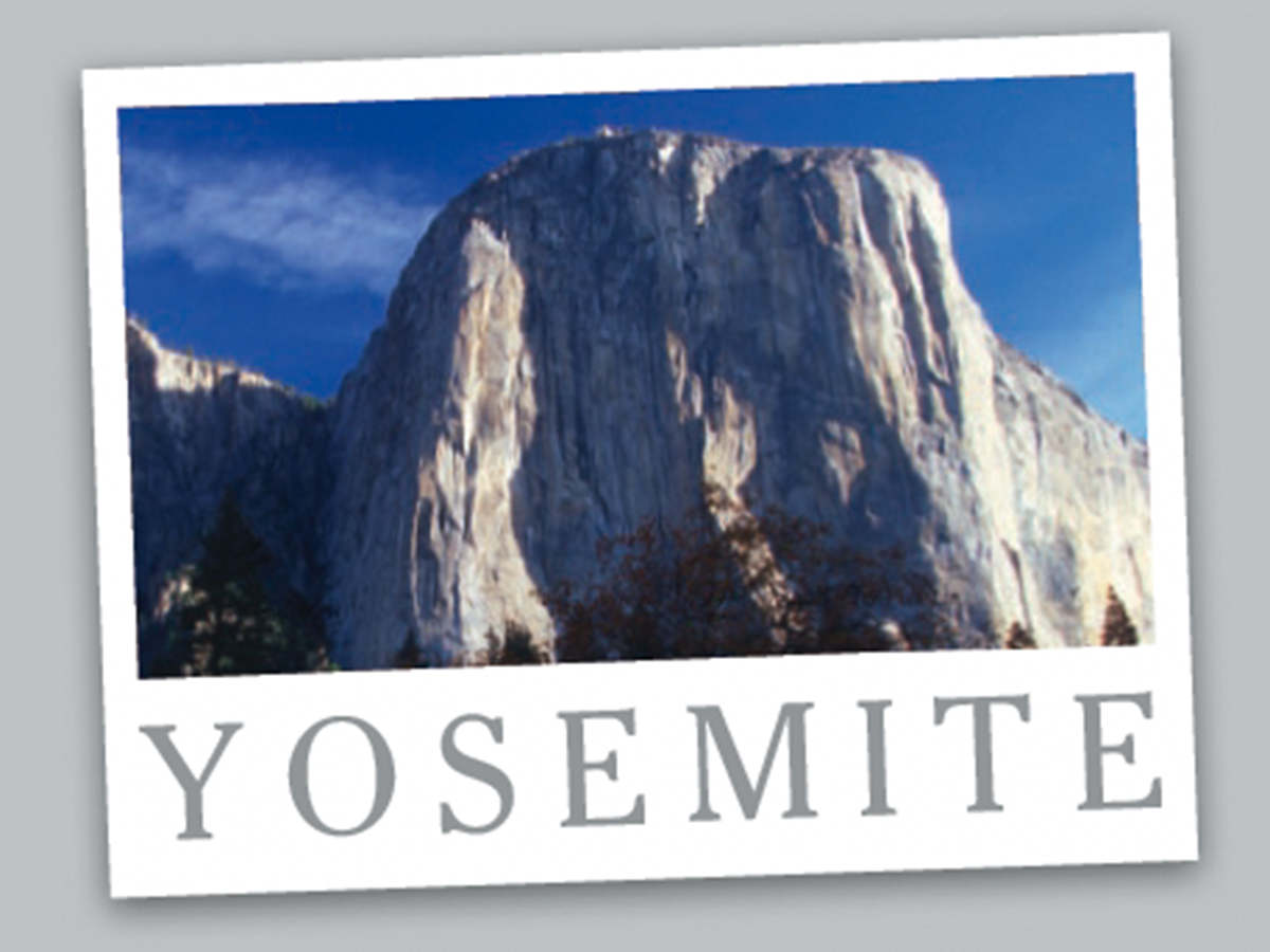
C. Postcard style: Designed in the style of an Ansel Adams print, this treatment is quieter, more gallery-like—although the photo hasn’t changed! Gray type on white recedes yet is readable at a glance. Wide spacing makes the space appear horizontal. White “”page”” floats above the gray field as a single unit.
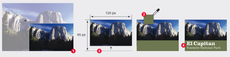
Use the full image: Reduce (1) a standard-size image to 120 pixels wide, which leaves it shallower than 90 pixels (2). Fill the remaining space—plus a little—with a solid field of color eyedroppered from the image (3), then add your type (4). This photo-above-field technique simplifies the space; it is an excellent choice when your image is complex or detailed.
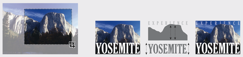
Use part of the image: Crop the image to emphasize (or create) a focal point. Then find a typeface that complements or amplifies an attribute of the image. Here, a tall, condensed typeface spanning the page amplifies the mountain’s monumental presence. A slight overlap of mountain and the type above it adds depth, pushing the granite wall forward.
CreativePro members can download original content from Before&After Magazine, a beloved resource that taught a generation of newly minted digital designers how to design and communicate effectively with the written word. See our archive here.
© John McWade/Before&After Magazine, courtesy of Gaye Anne McWade.
This article was last modified on January 4, 2026
This article was first published on December 6, 2024
Commenting is easier and faster when you're logged in!

Recommended for you

Before&After: Design From a Creative Brief
To know if you’ve reached a design goal, you must first know what the goal is. T...

Before&After: Make a Theme to Tie Your Design Together
A butterfly graphic creates a focal point, color, and continuity and turns a gra...
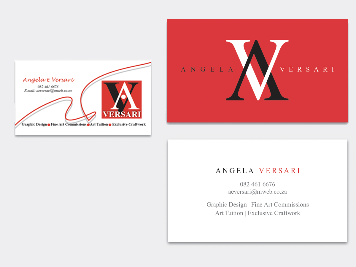
Before&After: Simplify a Business Card in Three Steps
How to redesign a business card that has too much going on.