



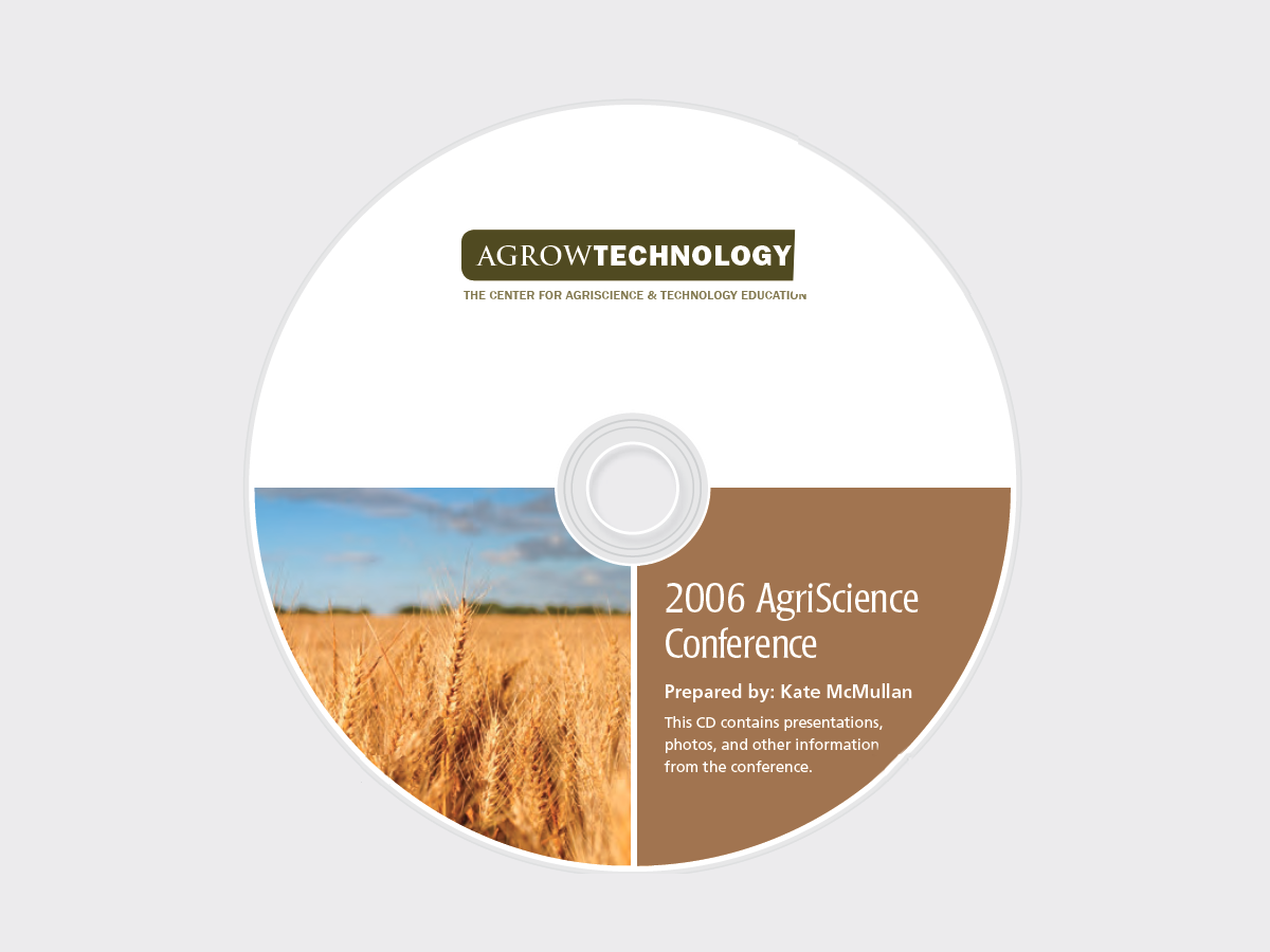
Here’s a quick design tip on design from issue 44 of Before&After Magazine.
The circular shape of CDs or DVDs can make them tricky to design. This quarter-pie format is an easy solution that will have you turning out great labels in a hurry.
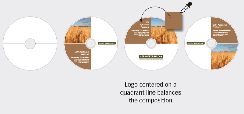
Dividing the space into quarters imposes a grid on the circle that makes your design decisions easier—image goes in one quarter, text in another, logo in a third. The quickest way to color-coordinate the text field is to sample it from the image.
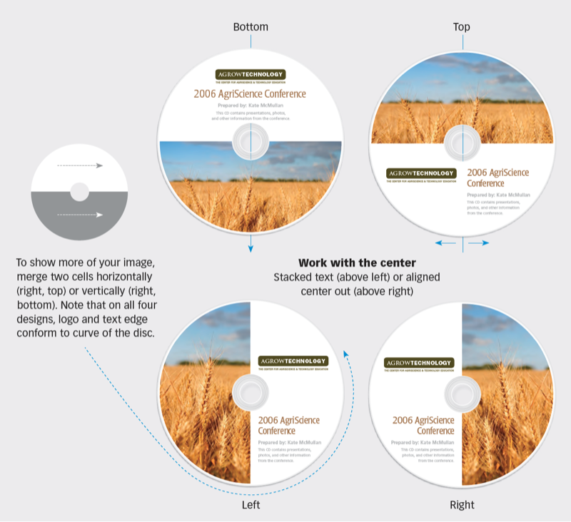
Avoid awkward shapes: An image that fills three cells creates a Pac-Man look that will generally overpower any object in the fourth cell, and it’s unbalanced. Similarly, a checkerboard look is too complex (it lacks a focal point).

CreativePro members can download original content from Before&After Magazine, a beloved resource that taught a generation of newly minted digital designers how to design and communicate effectively with the written word. See our archive here.
© John McWade/Before&After Magazine, courtesy of Gaye Anne McWade.
This article was last modified on January 4, 2026
This article was first published on August 16, 2024
Commenting is easier and faster when you're logged in!

Recommended for you

TypeTalk: A Blizzard of White-Space Characters
Q. I understand nonbreaking spaces after reading your post last week about them,...

Choosing Type for Digital Documents
Nigel French shares his best advice for using type effectively in PDF, DPS, and...
TypeTalk: It's Fontariffic!
TypeTalk is a monthly question-and-answer column on typography. Send your questi...