
How to Be a Better Graphic Designer: Keep It Simple
In a world that shouts, the voice we truly hear is the one that speaks with calm, deliberate clarity.


This article appears in Issue 47 of CreativePro Magazine.
If I’ve learned anything in my years as a designer, it’s that I keep having to learn the same thing repeatedly: Keep it simple. Simplicity sounds easy, but it’s a surprisingly elusive goal. It takes effort to strip something back to its essence. Complexity is easy—just keep adding stuff. Simplicity, on the other hand, is hard-earned.
The paradox is this: When you get it right, it looks effortless.
“Design is so simple, that’s why it’s so complicated.”
—Paul Rand
This quote encapsulates the essence of this installment of “How to Be a Better Designer:” While good design should appear effortless, it is anything but. Achieving that clarity takes skill, thought, and restraint. Let’s look at a few examples.
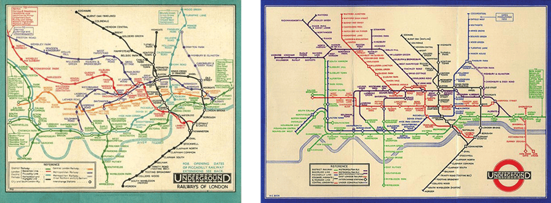
The iconic designs in Figure 1 each rely on one clear, compelling idea and deliver it with maximum clarity and minimum clutter. That’s the thread that connects them. Each expresses a single concept, well executed and instantly graspable: The prism and spectrum. The radio waves—a single motif, a data visualization from an astronomy journal, that communicates volumes through its mystery and restraint. The stylized underground railway lines. The heart replacing a word. There’s a clarity to them that’s as much about what was left out as what was included.
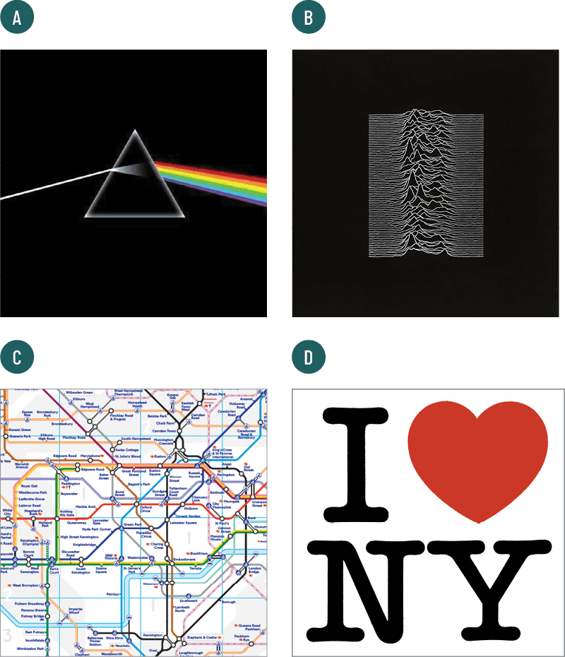
(A) Dark Side of the Moon by Storm Thorgerson for Pink Floyd (1972)
(B) Unknown Pleasures by Peter Saville for Joy Division (1979)
(C) detail of the London Underground map, based on Harry Beck’s original (1933)
(D) Milton Glaser’s I ? NY logo (1977)
Prioritize Communication
Simplicity means making choices—sometimes ruthless ones. It means you must justify every element of your design. If you can’t explain why something is on the page or screen, then it probably shouldn’t be there. This doesn’t mean everything should look austere or minimal for its own sake. It means prioritizing clarity and communication. Graphic design is first and foremost about communication, which makes simplicity essential, rather than a nice-to-have. It is the hallmark of design movements that more than a century later continue to influence graphic design of the present day. The Bauhaus, founded in 1919 by Walter Gropius, emphasized function, geometry, and visual economy. Look at the reductive elegance of László Moholy-Nagy’s poster designs (Figure 2). They weren’t just creating style—they were solving communication problems with clarity and logic.
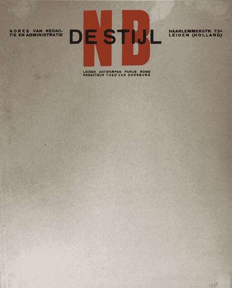
De Stijl (“the style” in Dutch; think Piet Mondrian’s iconic grids of black lines with red, blue, and yellow planes) had an influence that extended beyond painting into typography and layout, especially through the work of Theo van Doesburg, who applied the same clarity and reductionism to early modernist graphic design (Figure 3).
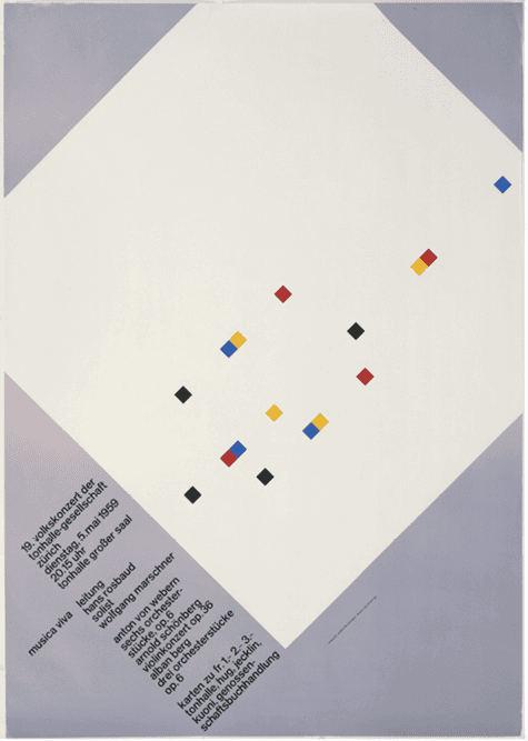
Swiss Modernism, or the International Typographic Style, brought an even greater rigor to simplicity. Designers like Josef Müller-Brockmann (Figure 4), Armin Hofmann, and Emil Ruder (Figure 5) embraced the grid as a tool for order and legibility. Müller-Brockmann’s famous Musica Viva concert posters are exemplars of this approach—mathematically precise, typographically disciplined, and visually arresting through their restraint.
In the related field of industrial design, Dieter Rams, with his “less but better” approach, inspired a generation of products and countless examples of restrained, user-focused visual communication (Figure 6). His Ten Principles of Good Design, written in the late 1970s, are as relevant today as ever. Chief among them: Good design is unobtrusive, honest, and as little design as possible. (For the complete list of principles, see the sidebar.)

Part of the appeal of a simple aesthetic is how it can draw in a designer with a promise of “You can do this, too.” It’s inviting, inclusive, democratic. Of course, when you try to emulate these looks, you soon realize that it’s not as easy as it seems. But by that time, you’re hooked.
So why is it so important?
Because simplicity leads to better communication. Simple designs remove unnecessary elements, making it easier for people to grasp the intended message quickly. Cluttered layouts cause confusion and misinterpretation. A simple, focused message nearly always wins.
It also leads to better user experiences. Clean, intuitive designs—in signage and digital interfaces—help users navigate without friction. Less visual noise means more clarity, more comfort, and less cognitive strain.
And simple designs are more memorable. Think of the Nike swoosh, the Apple logo, the Target bull’s-eye. They stick because they’re distilled to their essence.
Simplicity also brings practical benefits: lower production costs, greater adaptability across formats and languages, and stronger brand consistency. A well-constructed simple system can scale across media without falling apart.
Avoid the Trap of “More”
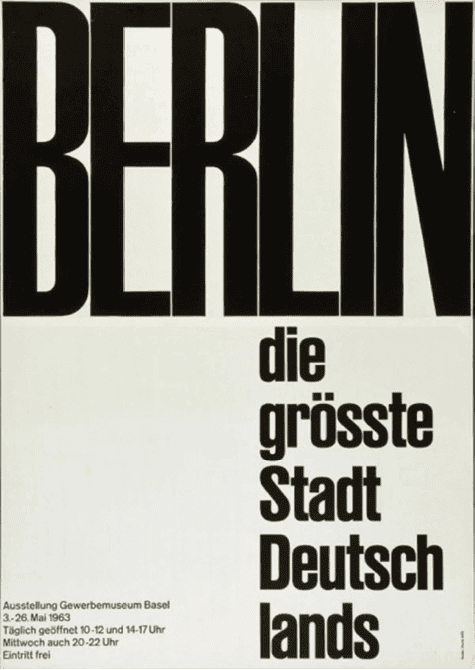
There’s a temptation—especially early in a designer’s journey or after learning a new technique—to add more. More fonts, more effects, more tricks. I’ve done it. I still do it, if I’m not careful. It’s a human instinct. But it’s something we need to unlearn and to constantly guard against. Design isn’t about impressing other designers. It’s about reaching people (Figure 7). And people are busy. They’re distracted. They’re bombarded by information. Just because the tools exist doesn’t mean you need to use them all. Today’s eye candy might become tomorrow’s visual cringe.
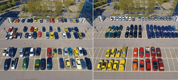
Part of keeping it simple means not filling every square inch. Space—or more precisely, the intelligent use of space—is what gives your design room to breathe. White space is not empty. It’s active. It creates emphasis, helps establish hierarchy, and gives the eye a place to rest (Figures 8–10).
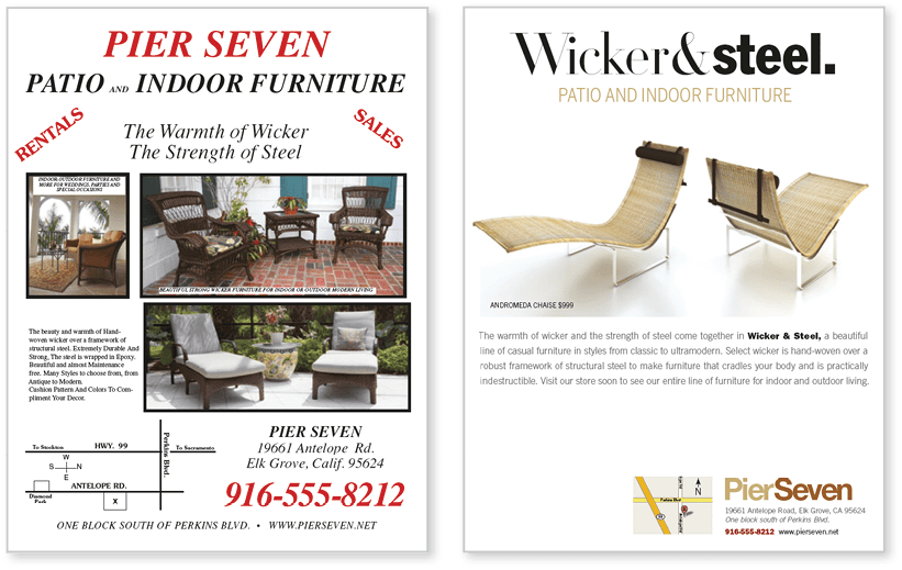

use of white space, and clear call to action.
Clarity Over Cleverness
So how do we keep it simple? Start by prioritizing white space—not as emptiness, but as structure. Use it to separate, group, and breathe life into your layout. Build a clear visual hierarchy that leads the eye with size, contrast, color, and alignment. Embrace minimalism by stripping away anything that doesn’t serve the message. If it doesn’t add, it subtracts. Clarity should always outrank cleverness—clever is fine, but only if it’s also clear.
And remember, simplicity isn’t a one-shot solution; it’s a process. Test, trim, ask, refine. In a world that shouts, the voice we truly hear is the one that speaks with calm, deliberate clarity.
Dieter Rams’ Ten Principles for Good Design
- Good design is innovative.
- Good design makes a product useful.
- Good design is aesthetic.
- Good design makes a product understandable.
- Good design is unobtrusive.
- Good design is honest.
- Good design is long-lasting.
- Good design is thorough down to the last detail.
- Good design is environmentally friendly.
- Good design is as little design as possible.
Commenting is easier and faster when you're logged in!

Recommended for you

How to Be a Better Graphic Designer: Do It Yourself
Doing it yourself pushes you to move beyond your usual tools and deepen your und...

InDesign Magazine Issue 121: Big Design
We’re happy to announce that InDesign Magazine Issue #121 (May 2019) is now...
Be Creative with Initial Letters
An initial letter is the first character of a sentence that is enlarged, positio...