

The allure of the common, throwaway flier can be deceptive. Why? Because it’s so easy to think cheap and miss what’s obvious to others—that on that rickety, 10-cent page is nothing less than your company’s precious, irreplacable image. This 15-page article from issue 49 of Before&After Magazine points out how the key to an advertisement that sells is simple: Keep all eyes on the product.
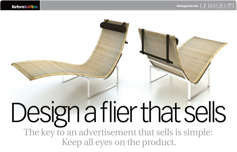
If you think of your paper or screen as a stage—like a theater stage—you’ll be in the right frame of mind. Why? Because a good advertising page is a stage, not a spreadsheet, on which you’ll craft drama, tension, impact, interest.
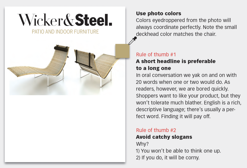
© John McWade/Before&After Magazine, courtesy of Gaye Anne McWade.
Commenting is easier and faster when you're logged in!

Recommended for you
Before&After Design Tip: To Fit a Space, Crop to an Extreme
Need to fit your design in an extremely shallow space? Cut an extreme slice!
Before&After: One-Line Design
How to make expressive designs easily and quickly with just a line.

Before&After: Design Your Own Christmas Cards
This 16-page article from issue 42 of Before&After Magazine shows you how easy i...