Before&After: How to Set a Text-Only Logotype
The key to a great logotype is to find a typeface that makes the name look good and conveys the appropriate meaning.

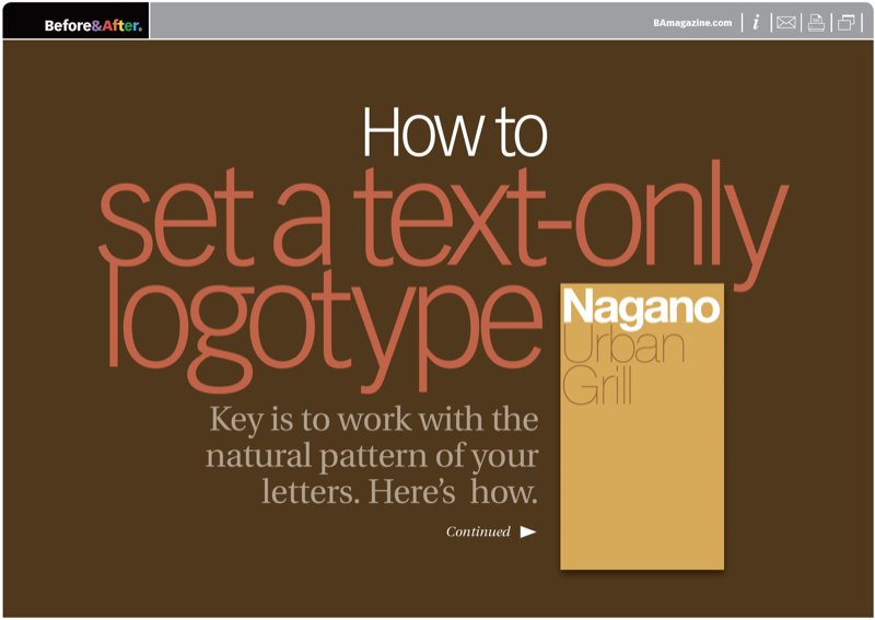
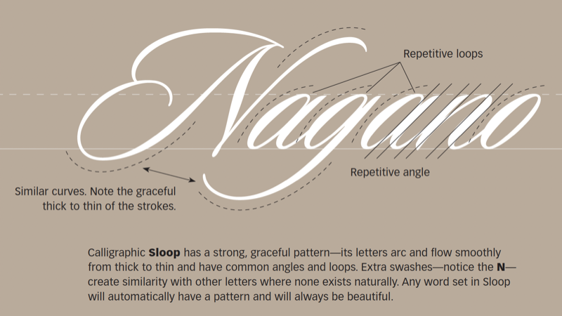
A good text-only logo is bold, clear, and attractive, and it conveys an appropriate sense of the company. These qualities can be difficult to combine in one word. The place to start is with the natural pattern of its letters. This 23-page article from issue 46 of Before&After Magazine shows you how to work with the natural pattern of your letters to select fonts effectively.

The typeface can make or break the pattern. The typeface can impose a pattern of its own. In every case, the typeface also adds meaning. The key to a great logotype is to find a typeface that makes the name look good and conveys the appropriate meaning.

© John McWade/Before&After Magazine, courtesy of Gaye Anne McWade.
Commenting is easier and faster when you're logged in!
Recommended for you

Before&After: Gestalt Theory: Isomorphism
We humans interpret visual objects based on our own experience and memories.

Before&After: Big, Bold, Beautiful
This magazine is a quick read for the busy traveler. Here are the techniques tha...

Before&After: How to Design a Small Poster
How can you use a small poster to make a big impression at close range? The answ...


