
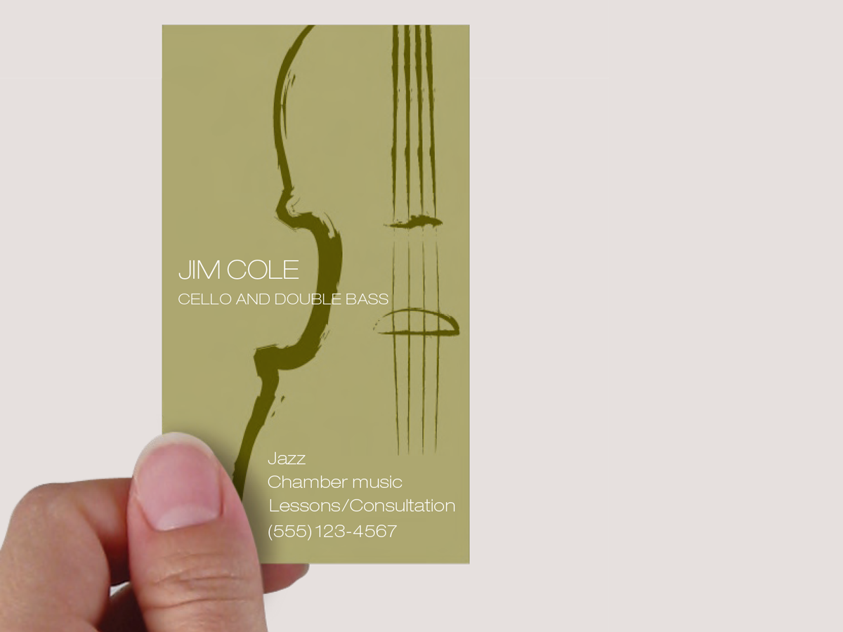
This musician’s business card gets a lot of visual atmosphere out of just a few elements. Set in faint tonal contrasts, the illustration dominates the space but does not overpower the card. It conveys the air of classical musicianship without being stuffy; it’s simple and masculine. To achieve all this, the designer had many decisions to make. This 18-page article from issue 44 of Before&After Magazine shows you how to turn a one-color business card into a visual statement.

One ink on white paper yields three levels of tonal depth: dark, medium, and light.
© John McWade/Before&After Magazine, courtesy of Gaye Anne McWade.
Commenting is easier and faster when you're logged in!

Recommended for you

Before&After: Design a Wrap-Around Brochure
A skillfully worded flap on this brochure folds over that appealing face and bec...

Before&After Design Tip: Infuse Life Into Your Charts
Learn how combining photographs with data can enliven your charts.

Before&After: Gestalt Theory: Continuation
Learn how to use Gestalt theory to explain visual connections.