
InDesigner: Chronicle Books
Terri Stone talks to the company’s publishing design director.


This article appears in Issue 19 of InDesign Magazine.
How would you like to work for a publishing company that encourages designers’ involvement in projects before they’re even written? And sends design directors to France for a culinary photo shoot?
Not surprisingly, some of today’s most attractive books are coming out this paradise, otherwise known as Chronicle Books. I got publishing design director Sara Schneider’s take on what makes her company great.
So many places use editorial to establish direction,” she explains, “and it’s not until a manuscript lands on a designer’s desk that he or she connects to the project. At Chronicle, designers are alongside editorial and production and marketing for all stages. Even before a project is born, we’re all thinking about what we want to publish and how.”
Sara describes an atmosphere that sounds a bit like art school. “We have active and frequent in-house critiques,” she says. “There’s no hierarchy; it’s not like my voice is louder because I’m a director or have been here longer. Junior designers have as much weight in terms of their visceral reactions as anyone else.”
The critiques are guided by practical concerns. “Each direction needs to work with product specifics, such as the page count and how translated text will fit.”
She continues, “We hash through designs and pick a direction and finesse it. When it’s in a substantial place, we share it with the editors and eventually the author. Then there’s usually more finessing because of all of that input. Covers are the only things we formally present in-house to people not involved in projects.”
Sara learned QuarkXPress as a student and used it for years. “I was a devoted Quark person. I said, ‘Nothing else, no way.’ Then, about four years ago, I tried InDesign. Now I’m a complete convert. But we still have Quark, and the in-house designers can choose which application they want to use. Most of us choose InDesign, and the majority of what we get from outside designers is in InDesign.“
Chronicle produces an astonishing 300 to 400 titles a year. About a third of that list is designed in-house, and the rest is art-directed by staff but designed by freelancers. Sara says, “We have a bank of tried and true superstars. We also try to find fresh talent for about half of the projects. We find these freelancers everywhere: design annuals, AIGA conferences, word of mouth, and a monthly portfolio review.”

A unique project: Sara remembers, “To get the photos for The Country Cooking of France, I traveled though France with a photographer. We were living out of a van, and we had to do it fast fast fast. But it was a perfect dialogue between text and image.”
“The borders in the book are from a variety of places,” Sara continues. “Some of them are ephemera from the flea market, like a bunch of single-bound plays that have so much patina. That was the inspiration for the typographic direction. I also looked at Dover clip art books, and some details are from Bickham Script.
“We seek out authentic inspiration. That’s why Chronicle’s titles look so good. We curate content and present it in a brand new way. You want it to speak of its origin, but with a twist.
“For so many other projects, it’s impossible to go to photo shoots. So we need to have a clear vision of what we’re going for and talk with the possible artists about it. Then we usually have them create sample pieces of art to make sure they’ve got it and then let them go and do their thing.
“There’s a lot of art direction, but we’re not heavy-handed. We don’t want to squash the magic out of it. We want them to bring that unexpected magic to the project.”

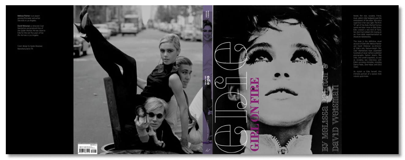
Edie: Girl on Fire is a biography of Edie Sedgwick. “When we started to see the art for this book,” says Sara, “we realized that not all of it was of highest quality. We talked about whether that was a detriment, and should we touch it up. Ultimately, we decided to take the archival approach and leave it as is. Editorial, design, and production had that conversation together.”

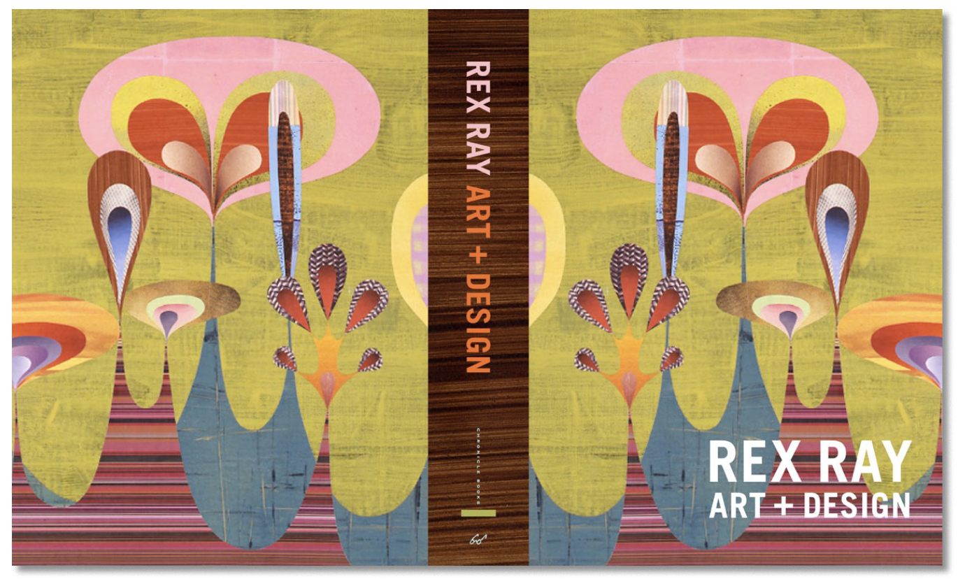
A perfect match: Despite the retro, mid-century vibe to his work, Rex Ray is a currently practicing artist. When Sara, who is a fan, brought in his artwork , the staff talked about how to create a publishing line around what Rex Ray does. “He’s a fine artist but his art also has mass appeal,” Sara explains. “It crosses all those audiences that we like to talk to—highbrow, lowbrow. It’s a perfect match.” Rex Ray: Art + Design is the first result of that line.
Commenting is easier and faster when you're logged in!

Recommended for you
InDesigner: Izzy Poirier
This Ottawa-based designer splits her time between creating thoughtful brand des...

Interview with Melissa Piccone, Multi-Disciplinary Trainer and Certified Expert
Q&A with Melissa Piccone, who is presenting at the 2026 Design + AI Summit for C...