
InDesigner: Andrew Faulkner
Anne-Marie Praetzel interviews the owner of afstudios.

This article appears in Issue 36 of InDesign Magazine.
Having fun is a must. That’s one thing you need to be clear on when dealing with designer Andrew Faulkner. Faulkner takes fun so seriously that his Craigslist ad for new hires lists a sense of humor as a required qualification, right up there with excellent typography skills and “being able to work with iTunes going 24/7.”
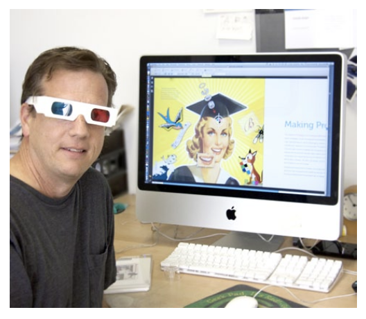
“There’s a lot of nose-to-the grindstone studios that are like sweatshops, but we all have lives outside of the studio,” Faulkner says of the playful atmosphere at afstudio, his small northern California design business.
Andrew started afstudio about 18 years ago after several years as a magazine designer, first at Macworld and then as art director for Electronic Musician magazine. Afstudio does both print and web design, including a substantial amount of work for Adobe Systems. Adobe expects the studio to use the latest software, often beta versions, which keeps Andrew further ahead of the technological curve than most designers. “Adobe asks for a very simple, clear product, which mirrors my design philosophy,” he says.
He describes afstudio’s motto as “complexly simple. One of my key goals is to distill a message to its simplest form to create the most impact.” To this end, Faulkner values “strong, bold typography and a less-is-more approach—it’s a cliché, but it works nine out of ten times,” he says.
Faulkner’s magazine background also informs his design sensibility. “I have the magazine approach where you enter the design through the front ‘cover,’” he explains. “The cover of a magazine is a poster for your design piece—it has to suck you in right away. If it doesn’t, nothing will.”
Faulkner takes the same approach to Web design, treating the home page as the magazine cover. “Especially with the Web, you have about five to ten seconds to pull them in. I have lots of respect for designers who specialize in subtlety and refinement, but my strength is to go after the impact.”
In turn, his ten years of Web design experience has affected Faulkner’s print work, because today’s print audience is what he calls “the short attention span theater: when it comes in the mail, if it doesn’t grab the viewer within ten seconds, they toss it in the trash.”
To help him keep up with trends in new media, Faulkner hires young students just out of art school. “A good design studio has to have its hand on the pulse of that area. And students bring a fresh eye. The designs and font choices the young interns come up with may be fresher than what we might come up with,” he explains.
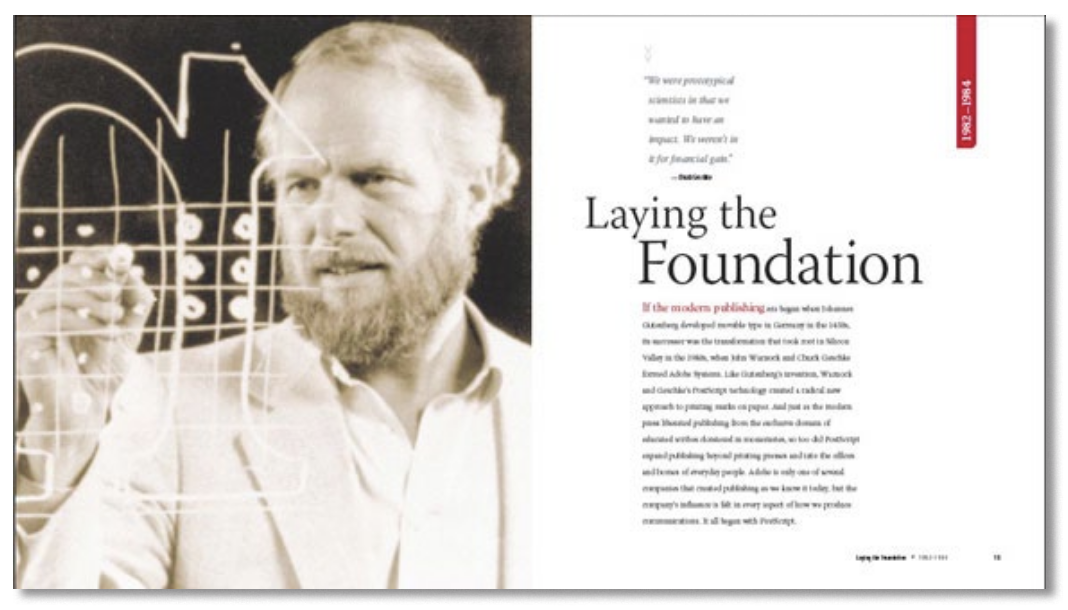
One notable recent project was a coffee table book for Adobe celebrating 10 years of InDesign. Working on it, Faulkner was struck by the fact that “InDesign is the gold standard around the world, not just in the U.S. It’s a very mature program, and a universally liked program, which wasn’t the case for years in the era of QuarkXPress and Pagemaker. It used to be you had to take sides, but now there’s no longer a choice: there’s just one program.“
Faulkner’s favorite InDesign features include the drop shadow feature; the pen tool’s masking abilities; the ability to use layered PSDs; the excellent typography tools; and how the program handles tables. “Tables used to be such a pain in earlier programs. Plus, I love that I can draw icons in Illustrator and copy and paste them into InDesign files,“ he says.
Working closely with Adobe, Faulkner has become more familiar with ID CS5 than most designers. What does he look forward to using? “All the Flash interactive stuff will save a lot of time and money, especially with crossover projects that go from print to Web.“
And how about a wish list for ID CS6? “My number one priority would be better export to HTML, that you could press Export and retain a lot of the design,” he says. Also, “It’d be neat if there were more automated reconfiguration.” Faulkner complains that on Adobe projects he often has to create a U.S. and European version, and there’s no way to convert easily say, an A4 size without having to redo all of your design and guides.
And wouldn’t it be great if the program had a built-in sense of humor? For now, Faulkner will just have to make do with his own. “If people want a prankster, I’m all theirs,” he says.
As the designer of Page By Page: 10 Years of Designing with Adobe InDesign, Faulkner featured work from some of the best designers in the world. “It was really fun for me to reach out to all my heroes of design and have this common tool that we all use.” The book was written by Pamela Pfiffner and commissioned by Adobe. While Adobe usually asks that Adobe products use Adobe software and feature Adobe typefaces (“their motto is, ‘We want to eat our own cooking’”), Faulkner requested an exception for the book and used Museo, one of his favorite typeface families. The flexible layout’s variable column lengths accommodated varying amounts of copy. That allowed him to work on the design before the author provided him with text and he could fit whatever amount came in without having to redo the layout.


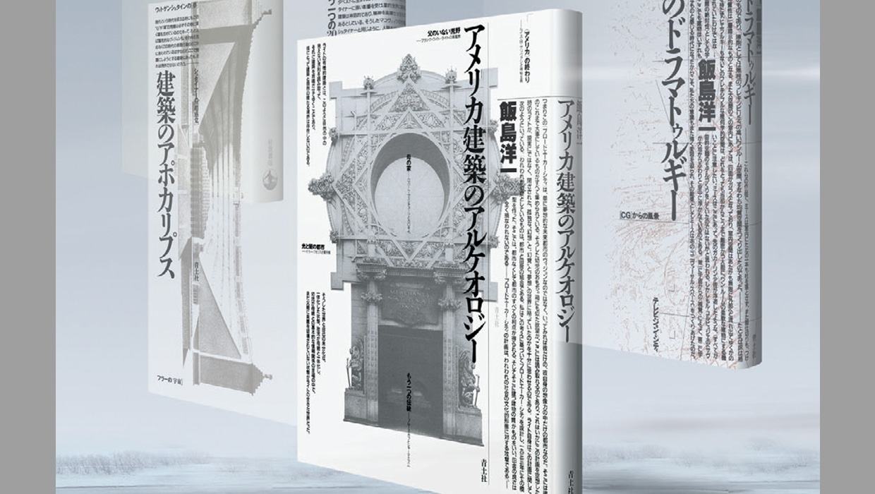
Faulkners’s magazine roots frequently show up in his work. “A lot of designers’ approach is that a piece has to be aesthetically pleasing. But I go for high impact, even if some of the subtlety’s lost. Otherwise, you might end up with a nice piece, but if it doesn’t jump off the ‘newsstand,’ what good is it?“ This coffee table book on photographer Ruth Bernhard uses strong images and clean typography to pull the reader in.


Commenting is easier and faster when you're logged in!

Recommended for you

You Can Tell a Lot About These Books By Their Covers
Two UK publishers rely on on standout covers in order to sell publications. Terr...
InDesigner: Report from Tokyo
The first InDesign Conference in Japan brings a different look at design and InD...

InDesigner: Jacek Utko
Diane Burns interviews one of Europe’s most successful newspaper designers.