
InDesigner: Seattle Met Magazine
Pam Pfiffner takes a look behind the scenes at Seattle Met magazine.

This article appears in Issue 52 of InDesign Magazine.
Forget all the clichés about Seattle, the rain and the flannel and that tired ’90s grunge aesthetic or boring ’00 hipster chic. Instead envision the clean design and inspired typography found in the pages of Seattle Met magazine.

This 7-year-old monthly covers the Seattle scene of highly-rated restaurants, cultural and music events, and city life, as well as features on current topics, all in a sleek package that marries classic magazine design with contemporary elements made possible by InDesign. The magazine’s Design Director André Mora says the goal is to keep the design as clutter-free as possible. He adds, “Our aesthetic is one that strives for clarity.”
Clarity doesn’t mean staid or unimaginative, however. One of Seattle Met’s hallmarks is the integration of type with image in a harmonious and visually stunning way. While Mora believes that type and image each work with the other, he declares that each element must pull its own weight, too. “The type has its own role and the art another,” he says. “I like it when our photos and illustration can speak for themselves. They should complement each other and not compete for attention.”
As an example, the only image in an opening spread about red wines is a wave of ruby-red wine that curls around a moon-like circle overlaid with off-center type. The image is beautiful—even without type, there’d be no doubt about the subject of the story. But together, the type and image are a powerful combination that draws the reader into the piece.
InDesign’s tools help Mora achieve this interplay of elements. “Usually I only use Type on a Path with circles, and I find that it’s pretty easy to handle within InDesign,” he says, pointing to a recent instance in which he needed to manipulate lines of type to follow the curve of a wall. “I’m proficient in Illustrator and would prefer to use it for Pathfinder needs, but if I can pull something off within InDesign, I’ll do it there.”
One reason Mora says he works with tools within InDesign is the nature of the magazine beast. “With editorial design, the text can change at a moment’s notice, so I try to keep the workflow simple,” he says.
Keeping the workflow simple yet open points to InDesign’s most important feature, according to Mora. “Style sheets, style sheets, style sheets. That’s where it begins (and ends) for me,” he says. “I like to get everything imported and linked to styles as fast as possible. These may be styles that already exist or styles I create on the fly and edit later.”

A guide to Seattle’s iconic Mount Rainier encloses type in a diamond shape that echoes the peaks and valleys in the photograph of mountainous terrain. Just over the tip of the diamond flies a single bird, a subtle punctuation mark.
How these style sheets are built is a key factor in simplifying the design process. “The important thing for many of our stories, which are service-based, is to get as many semantic naming systems in place as possible, to control the relationships between the many tiers of hierarchy,” he says. “Once text is linked to paragraph and character styles, it becomes incredibly easy to make universal adjustments during the design process.”
He continues, “Many of our stories feature lists, and repeated headlines and information. So it’s easy to look at a whole spread and make slight adjustments in the style window and watch the layout change.”
Another design consistency that Mora relies on is baseline grid. “I keep most everything locked to baselines,” he says. “Our listings section uses custom baselines in its text frames because we use a specific listings font and I want it to work with our primary grid as best as possible. This is also one of the only places where I rely on insets to control the height of the boxes. Since they use their own baselines (in the frames) they can’t, for example, align to the bottom. So I adjust the column heights by using insets (based on the custom baseline increments) and this keeps everything tidy.”

For a story about a new era in craft beer, André Mora designed an opening spread that depicts a shaggy-haired brewmaster as a high-school student (complete with a starry look in his eyes) while opposite is a graphic with typography that resembles a vintage high-school yearbook.
Mora offers these words of advice: “I’m obsessed with this type of alignment,” he says. “Graphically, I’m entirely OK with asymmetrical designs and breaking grids, but I think you have to get your type as sound as possible. If you’re not using baselines (document-wide or custom object styles) and style sheets, you’re just making life harder for yourself.”
Good typography runs throughout Seattle Met, thanks largely to Mora’s expansive font vocabulary. “I’ve always been focused on choosing the right combinations of typefaces, and working with the range of those faces to the fullest extent,” Mora says. “Getting to know them as well as possible—practice, practice—helps maintain a sense of confidence in quick decisions, almost like an instinct.”
Mora believes that too often designers resort to gimmickry or literal interpretations to package a story, resulting in confusing messages and editorial distractions.
“A magazine should look consistent and speak to its readers in one language,” he says. “This doesn’t mean you have to use just one or two fonts, though. I go for subtle cues: using shapes, ratios, and principles that relate to a story’s subject. If the layout, be it a cover or feature opener, becomes too affected, trying its hardest to look like something, then it becomes a poster. I guess that’s the long way of saying that illustrations and photography play one role and strong typography plays another. You won’t see a page in Seattle Met that looks likes it’s been letter-pressed just because we’re designing a story about the 19th century.“

The 2012 Restaurant Guide opens with type set as a circle to mimic a dinner plate. While such a setting might seem too obvious or gimmicky, under Mora’s direction, it feels fresh. The fonts used—Process Type Foundry’s Lingua and Fig—give the design a decidedly contemporary feel.
While Mora designs the magazine’s freeform covers and some features, he finds himself at home in the more regimented sections of the magazine. That’s not surprising, given his laser-like focus on consistency and clarity.
“To be honest, I’m probably one of the few design directors who really enjoys working with departments and listings sections,” he says. “That has a lot to do with how much I enjoy perfecting our typography and templates. Every month I take a close look at our primary template (which has several master pages for section and loose page elements) and I try to improve it.”
To see additional pages from Seattle Met magazine, go to its Flickr page.

An article about erecting a barricade on a bridge known for suicides is a perfect example of Mora’s belief that type and image should complement each other yet stand alone as well. The bridge seems to embrace the headline that shows a word raised above a rule as if perched on a bridge railing.

The swirl of red wine encompassing a circle overlaid with type gives this spread fluidity and cohesion. Take away the type, and the image speaks for itself. By itself, the type element tells its own story. Together, they communicate in one voice.

André Mora is a stickler for baseline alignment. That’s one reason why he prefers to work on Seattle Met’s Departments, where he can fine- tune settings in InDesign. Here you can see the established baseline grid used in the On the Town listings section. Mora explains how it works: “Every page of the magazine uses a 5pt baseline grid because our main serif body type is 8/10. The listings are 7.5/8.5, so we have an Object Style called Listings Frame that uses a custom Baseline Grid that starts at p5 with p8.5 increments. The main typeface used for both our entertainment and dining listings is called Capucine, from Process Type Foundry. Its original intent was for newspaper listings.

When asked about the InDesign feature that Mora relies upon the most, the answer is “Style sheets, style sheets, style sheets.” These screenshots show Mora’s Paragraph and Character Styles panels. The template styles range from general styles, like those for body copy, to specific styles, for captions or department-specific headlines and credits. Though Mora prefers style sheets that are named by what they are rather than what they do, many styles target exact instances, due to the large number of sections in the magazine. For features, tailored paragraph and character styles are created each month rather than reused. These often use HTML naming conventions in an attempt to delineate the many levels of hierarchy that can exist in a 10+-page package. Mora believes that “…InDesign style sheets can be a good place for print designers to practice their understanding of CSS.” Note, too, the shortcuts applied to certain styles. Mora says, “I try to use the mouse as little as possible, jumping through sentences, paragraphs, and columns using shortcuts and applying styles fast or removing them with Quick Apply ([none]).
Commenting is easier and faster when you're logged in!

Recommended for you
Interview with Nicte Cuevas, Brand Strategist and Designer
An award-winning strategist shares how personal resilience, cultural heritage, a...

InDesigner: Oriflame
Can you imagine having to create 40 different versions of a catalog every three...
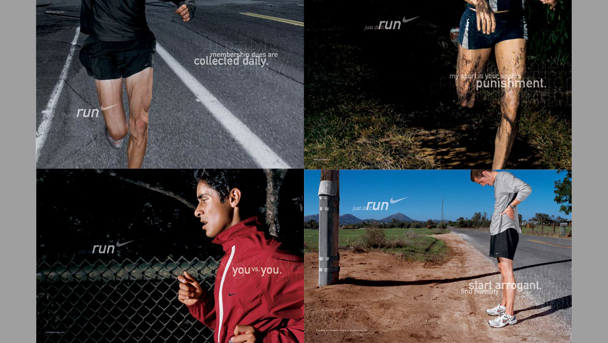
InDesigner: Wieden+Kennedy
When this ad agency switched to InDesign, their creative concept- ing process go...