Members Only

Fixing Widows, Orphans, and Runts in InDesign

Widows, orphans, and runts may have funny names, but their effect on your layout is anything but a laugh.

This article appears in Issue 38 of InDesign Magazine.

Typography has a rich and colorful language—ligatures and dingbats, bowls and crotches, baselines and x-heights—with which to describe the way our words and letters look on page or screen. Few terms arouse as much curiosity as widows, orphans, and runts ( Figure 1). Exact definitions vary, but I define them as follows: A widow is the last line of a paragraph, stranded at the top of a column or page. Widows should always be avoided. An orphan is the first line of a paragraph that occurs at the bottom of a column or page. While not as bad as widows, orphans are best avoided where possible. A runt is the last line of a paragraph that ends with a short word or, worse, a single syllable of a hyphenated word (which you can prevent by turning off the Hyphenate Last Word checkbox in your Hyphenation Settings). A single word on the last line may not be a problem if it’s a long word. Ideally, the last line of a paragraph should be about one­-fifth of the column measure.

Figure 1: From left to right, a widow, an orphan, and a runt.

InDesign’s composition tools work in concert with each other, and if you’re work­ing with an appropriate column measure (type size to column width ratio) and have your Justification and Hyphenation settings set up correctly, then widows, orphans, and runts do not occur frequently. When they do, there are several approaches to fixing them. The easiest is use the Keep Lines Together feature in the Keep Options dialog box. Keep Options is the umbrella term for different methods of controlling how para­graphs break—or don’t break. The various options are Keep with Previous; Keep with Next (useful for preventing

heads and sub­heads from being divorced from the text that follows them); and Start Paragraph, which can force a page, frame, or column break. If you don’t need your columns to bottom out (i.e., share the same last base­line), you can use Keep with Next to specify a number of lines at the end of the para­graph to be kept together. However, this approach won’t work when you have text across multiple columns or facing pages that you want to share the same last base­line. Keep with Next carries the widow or orphan to the next column or page, leaving you with a visual hole at the bottom of the previous one. That leaves us with two approaches that both adjust the letterfit of your text. The first is to apply a modest amount of tracking (the adjustment of space between the words and characters) to the problem line or paragraph. While this can be either negative tracking (tighter) or positive track­ing (looser), in practice it is almost always negative tracking. To do this, select a range of text within the problem paragraph, pos­sibly the last line or perhaps the whole paragraph, and apply tighter tracking with the keyboard shortcut (Option-Left Arrow or Alt-Left Arrow). So that you can apply a light touch, make sure your Kerning/ Tracking increment is set to a low number, preferably 1/1000 em, in your Units & Incre­ments Preferences. Tracking is a flexible and fast way of improving the look of type, but it is a com­promise: It goes against the golden rule of consistency, and consistency is all-impor­tant when it comes to achieving a good type color or even density of your type on the page. Your reader shouldn’t notice that the spacing between the words gets a lit­tle tighter here and there. The aim is to pull back a line by (imperceptibly) tightening the letter spacing across the range of words (Figure 2).

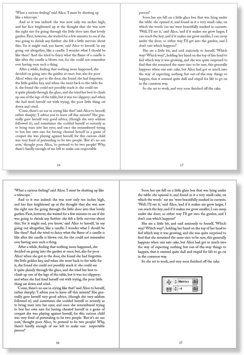
Figure 2: See the widow at the top of the right-hand spread (left)? I fixed it by applying -4/1000 em tracking to the last paragraph on the left-hand page of the spread (below).

Choose your battles wisely—cer­tain paragraphs may be resistant to track­ing. Forcing them too much will result in a cure worse than the original problem. Different publications have different stand­ards of what’s acceptable, but I’d suggest applying no more than 15/1000 em. More tracking than this and the reader may notice a concertina effect on the type. An alternative to tracking the text is to adjust the Letterspacing setting in the Justification dialog box. To do this, insert your cursor into the paragraph, press Cmd-­Opt-Shift-J (Ctrl-Alt-Shift-J), then reduce both the minimum and desired letterspac­ing values. The key difference between this process and tracking the paragraph is that (assuming you have the Adobe Para­graph Composer chosen) the spacing will not be exactly the same between each character or word, but rather will be opti­mized according to the available space and potential line and hyphenation breaks within the paragraph. While not as convenient and fast as tracking, adjusting the letterspacing yields a better type color. A potential downside is that paragraphs adjusted in this way can­not be easily identified by a color highlight, the way those that have been tracked can. While it’s a good idea to develop an eagle eye for widows and orphans, fixing them should be one of the last stages in your workflow. There’s no point in address­ing these problems when the layout or the text itself isn’t yet finalized. Here are some other things to consider when tracking to fix widows and orphans: It’s an obvious point, but be sure to start at the beginning of your text flow and work methodically to the end. Don’t flip back and forth from one page to the next or you’ll find yourself fixing one problem only to create another. Be aware too that it’s sometimes easier to tighten up a para­graph that precedes the composition problem, rather than the problem paragraph itself, in the hope that this will have a posi­tive knock on effect. InDesign’s Custom Tracking/Kerning Composition preference highlights in green any ranges of text that have been custom tracked or kerned (Figure 3).

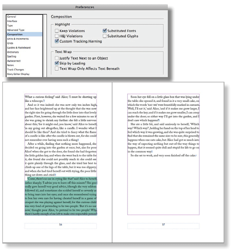
Figure 3: When you turn on Custom Tracking/Kerning in Composition Preferences (above), InDesign highlight where custom tracking or kerning has been applied (left).

Any orange lines appearing within the overall green tracking areas show where single spaces have been customized further. This is helpful if you have inherited a document and want to make sure that the text hasn’t been overzealously tracked, or if the layout or text of a document is revised so that the tracking in certain areas is no longer neces­sary. This preference is the reason you don’t want to apply tracking as part of a Para­graph Style definition: if it’s been applied everywhere, you can’t distinguish the exceptions. If you want a tighter or looser letter fit applied more globally, you’re bet­ter off adjusting the Word Spacing and Letter Spacing values in the Justification setting of your Style Options. The lines of paragraphs composed with the Adobe Paragraph Composer (InDesign’s default composition method) don’t always break as expected when tracked. This is because the lines are recomposed on a paragraph basis rather than line by line—every change you make to a paragraph causes InDesign to reconsider the line breaks of the whole paragraph, not just the line you are working on. While this can be frustrating for editors and proofread­ers, using the Adobe Paragraph Composer rather than the Single Line Composer will result in better type color. When adjusting tracking or letterspac­ing, keep an eye on the color of the whole paragraph, not just the line, watching out for rivers—another composition problem that can spoil an even type color. In typo­graphic terms, a river is a line or crack that runs vertically through your paragraph caused by a random and unfortunate posi­tioning of word spaces on successive lines (Figure 4).

Figure 4: The text on the left has horrible word spacing and rivers caused by justified text set in a narrow column. Applying a modest amount of tracking (-5/1000 em) to lines 4 and 5 does at least fixes the rivers (right).

Rivers are most common in narrow col­umns of justified text but can also occur when letters are spaced too tightly. The best way to spot them is to print a proof and turn your page upside-down so that the negative space between the letters is abstracted. Any scars on the page will be more noticeable. If you’re using an appropriate column measure and appropriate hyphenation and justification settings, rivers are unlikely to occur. Sometimes, however, you’re unlucky and applying tracking with a light touch may fix the problem. Tracking or letterspacing isn’t the only way to address widows, orphans, and runts, and if the line or paragraph is impervious to their charms, don’t force it. Try one of the fol­lowing options instead. Adjust the word spac­ing. You can tighten or expand word spacing across characters without affecting the character spacing (Figure 5).

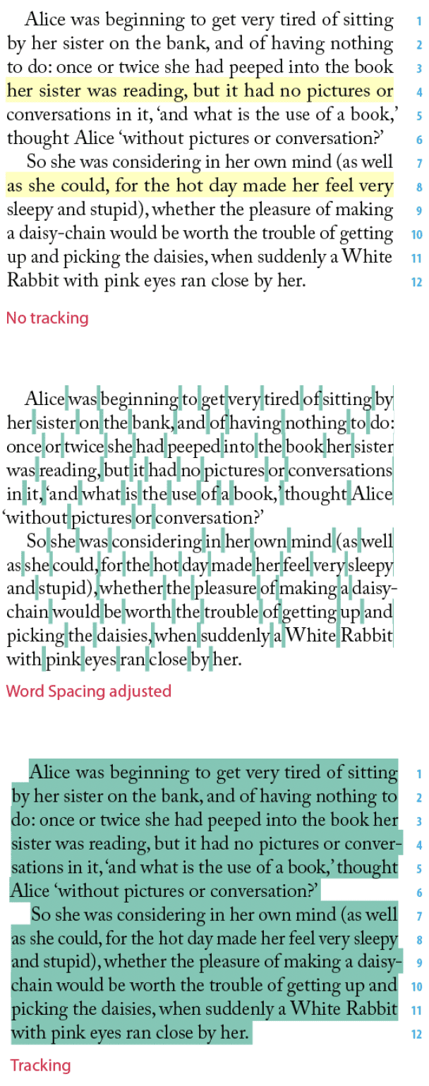
Figure 5: These examples show the effect of adjusting word spacing. The paragraph to the left has no tracking applied—the yellow highlighting shows H&J Violations. The paragraph below left shows the result of decreasing the space between the words only—subtly different from adjusting the tracking as, I did to the paragraph directly below this caption. The green highlighting shows where I applied custom tracking/kerning.

Cmd/Ctrl+Option/Alt+Delete tightens the word spaces; Cmd/Ctrl+Alt/Option+Shift­Backslash increases the word spaces. Use No Break. You can prevent runts by applying a No Break to the last two words of the paragraph. If you do this a lot, it’s worth making a No Break Character Style. For a more automated approach, create a GREP Style to apply a No Break Character Style to the last two words of a paragraph. This ensures that there are at least two words on the last line of every paragraph with a particular Paragraph Style applied to it (Figure 6).

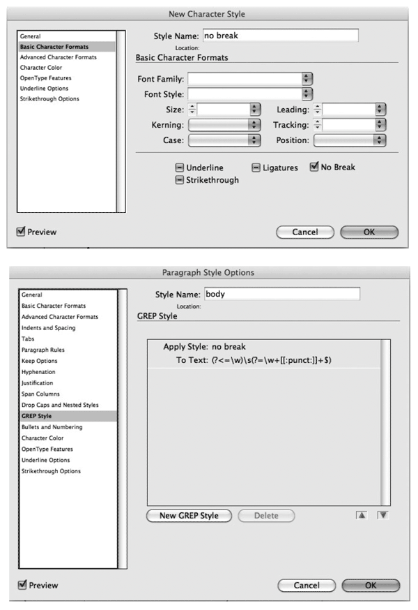
Figure 6: You can apply No Break manually to keep two or more words together. Alternatively, you can use a GREP Style to apply a No Break Character style to the space between the last two words in a paragraph-automatically preventing the possibility of a runt line.

You can make a char­acter style that incorporates the No Break attribute. Edit the Paragraph Style defini­tion for paragraphs where you want to avoid runt lines. In the GREP Style section of Paragraph Style Options, choose the No Break Character Style from the Apply Style menu. Type the following GREP expres­sion into the To Text: field: (?<=\w)(?=\ w+[[:punct:]]+$). Note that this applies the Character Style to just the space between the last two words. Revise the copy. This may not be an option, depending on the kind of docu­ment you’re working with, but if you have license to rewrite, then go for it—often a subtle rewording will do the trick. While they may not quite live up to the drama of their names, widows, orphans, runts, and rivers can nevertheless scar a page. Thankfully all it takes is a light touch with InDesign’s flexible composition tools to fix these problems on a global and local scale and significantly improve the look of your type.

Bookmark
Please login to bookmark Close

Not a member yet?

Get unlimited access to articles and member-only resources with a CreativePro membership.

Become a Member

Comments (6)

Leave a Reply

Your email address will not be published. Required fields are marked *

Loading comments...