
What Good Are Free Fonts?
How to tell if a font is trash or treasure, regardless of its cost.


This article appears in Issue 63 of InDesign Magazine.
How can you tell whether a free font is worth using? Judging a free font is just like judging any other font, except that price isn’t part of the equation.
There’s Free, And Then There’s Free
First of all, what does “free” actually mean when it comes to fonts? When I say “free fonts,” I mean digital fonts that have been made available by their developers free of charge, whether directly or bundled with software such as Microsoft Office or Adobe InDesign. I do not mean commercial fonts that you can find posted as free downloads from an unauthorized website without permission from the developers of the fonts. That is font piracy, plain and simple. “In fact, the first thing to think about, even with a supposedly ‘free’ font, is the end user license agreement, or EULA,” says Thomas Phinney, Vice President of FontLab, the company that makes font creation tools like Fontographer and FontLab Studio. “The ones that are bundled with your operating system or apps are only free in the sense that you didn’t pay for them separately. Their licenses generally allow most common uses, including commercial use. But that doesn’t necessarily mean you can stick them on a web server for your website.” Phinney points out that some free fonts, most commonly older ones, are either unclear about their license terms, or are only free for “personal use”—which may or may not be clearly defined. Newer free fonts often have an explicit open source or “libre” license that allows a very wide range of uses, generally much more than even most commercial fonts. “There are as many free fonts as there are commercial fonts,” says Jean François Porchez, well-known French type designer and former president of ATypI. “A font that’s
shipped with an operating system is seen by its users as free, since it’s available with the computer without any particular effort on the user’s part.” He cites the example of the Microsoft ClearType fonts Calibri, Corbel, etc., which are extremely well designed yet are “free” because they’re shipped with Windows and Microsoft Office (Figure 1). “Here, as in many other cases, when a company like Microsoft or Adobe (to take a couple of historical actors) decides to invest in the creation of high-quality typographic characters, the goal is to ship, with their tools, fonts that will be good ambassadors for the new technologies that they are putting in their users’ hands: OpenType functions, language support, good rendering onscreen, etc.”
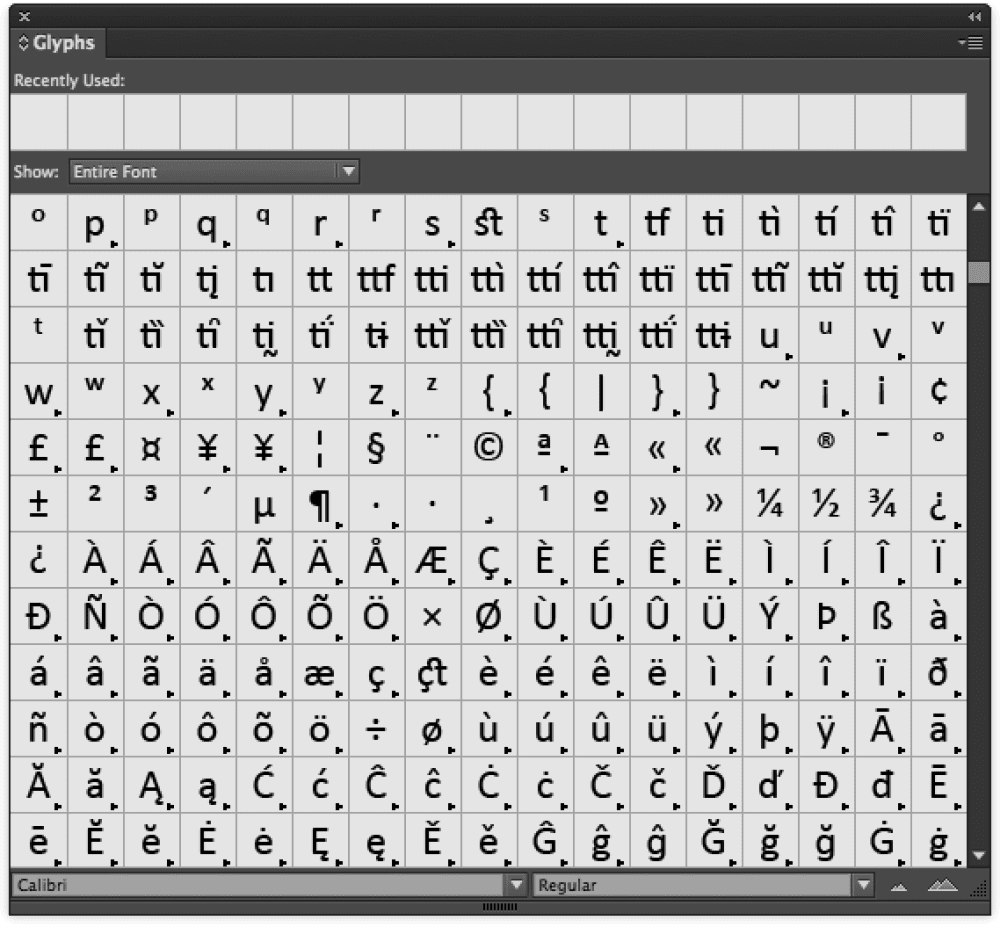
Figure 1: Some “free” fonts like Microsoft’s Calibri, are well-crafted and contain extensive sets of ligatures, symbols, alternates, and accented characters.
Evaluating the Font
So how do you figure out whether a free font is any good or not? There are a few basic questions to ask before you pick a font or font family. First, is it suitable for your purpose, whatever that may be? Does it have the character set your project needs (Figure 2)? Is it readable? Assuming you’re planning on using it for text, is it comfortably readable in large blocks, in the format it will ultimately be read in? For example, if you’re designing a printed newsletter, how does this font look printed on paper? If you’re designing a website, how does it look onscreen? And you have to think about not just how it looks at first glance, but how it looks and feels when you’re trying to read quite a lot of text set in it (Figure 3).
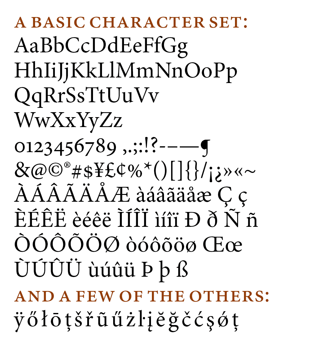
Figure 2: An example of the range of characters included in a typical character set for the Latin alphabet (by no means exhaustive). Be sure that the font you choose has all the characters that you need. (The typeface shown is Minion Pro Regular.)
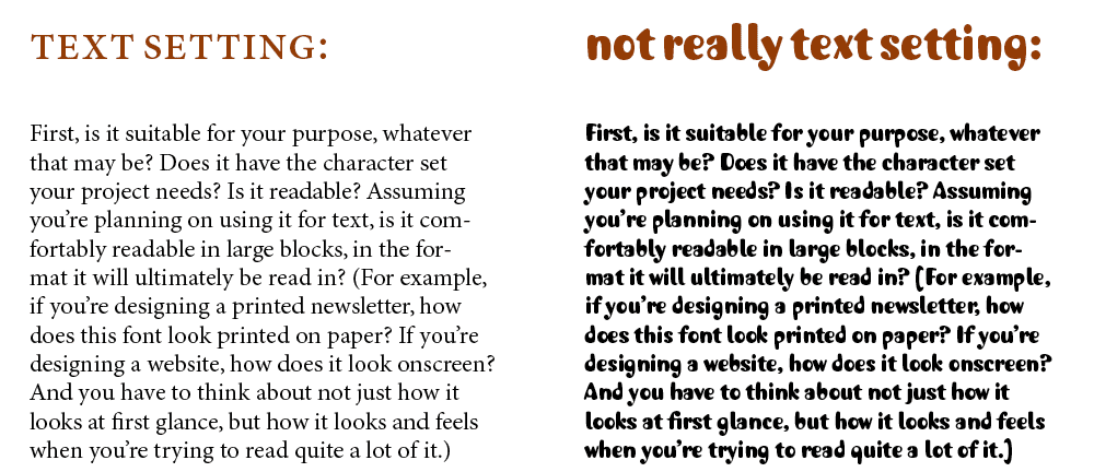
Figure 3: Choose the right kind of font for the job. Regardless of its price, a quirky display font is not meant for setting a lot of text.
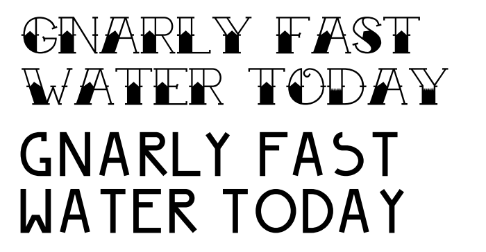
Figure 4: With free fonts like Tattoo Ink and Peyo you’d have a hard time setting anything longer than a few words, since they have very small glyph sets and inconsistent spacing. And while InDesign’s Optical Kerning feature could help somewhat with the spacing problems, you’d be out of luck if you needed something as simple as an apostrophe (which doesn’t exist in either font).
Look at the Details
Jean François Porchez suggests a number of factors to look for in evaluating a font.
The quality of the outlines. “It’s best to find a PDF and zoom in on certain details, looking at the smoothness of the curves, the intersections of details, the coherence of the thicks and thins, serifs, alignments.”
The quality of the spacing. “Harder to be certain, since the spacing of the sample phrases composed by a designer is not necessarily what’s really in the font. But it’s possible to compare typical words, phrases, and pairs of letters: ooononnn, OOOHOHHH, VAT, n-no-o, L’A, n’s …”—common particular combinations that type designers use to help assess spacing (Figure 5).
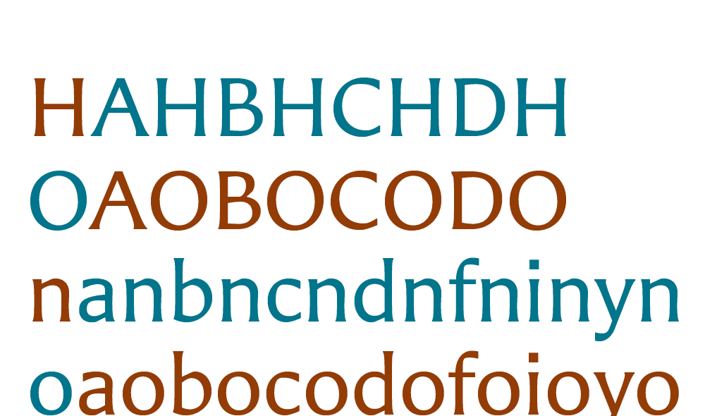
Figure 5: One way of judging how well a font is spaced is to alternate its alphabet with rounded and flat-sided characters—usually H and O in capitals, n and o in lowercase. (The typeface shown is Carters Sans Pro Regular.)
The quality of screen display at different sizes. “If the sizes of letters appear inconsistent with the body size, it’s because the basics of hinting have not been implemented.”
The character set. “Are all the 26 letters, numbers, punctuation marks present? Accented letters? All the elements that you use on a daily basis?” Thomas Phinney went into many of the details of well-made fonts in a recent column in Communication Arts, entitled “Know if a Font Sucks.” In addition to consistency of letter-fit and kerning, he talked about the importance of subtle design features like “overshoot,” where the curve of a round character like an “O” needs to extend slightly below the baseline (and above the x-height or cap height) in order to appear evenly aligned. (A quick way to see this is to look at these letters together: HOE.) (Figure 6) Phinney goes into quite a lot of specific detail about how a digital font is constructed, from the placement of the digital “points” that define the shape of a curve to the care with which a type designer crafts the transitions from round to straight strokes within the shape of a letter.

Figure 6: The overshoot of a rounded character is important to make it optically align with the other characters.
(The typeface shown is ITC Modern No. 216 Bold.)

Figure 7: Capital M from the calligraphic typeface Brush Script, showing PostScript points that define the shape of the character. (This is from the PostScript-flavored OpenType font BrushScriptStd.otf, shown in Fontographer 5.)
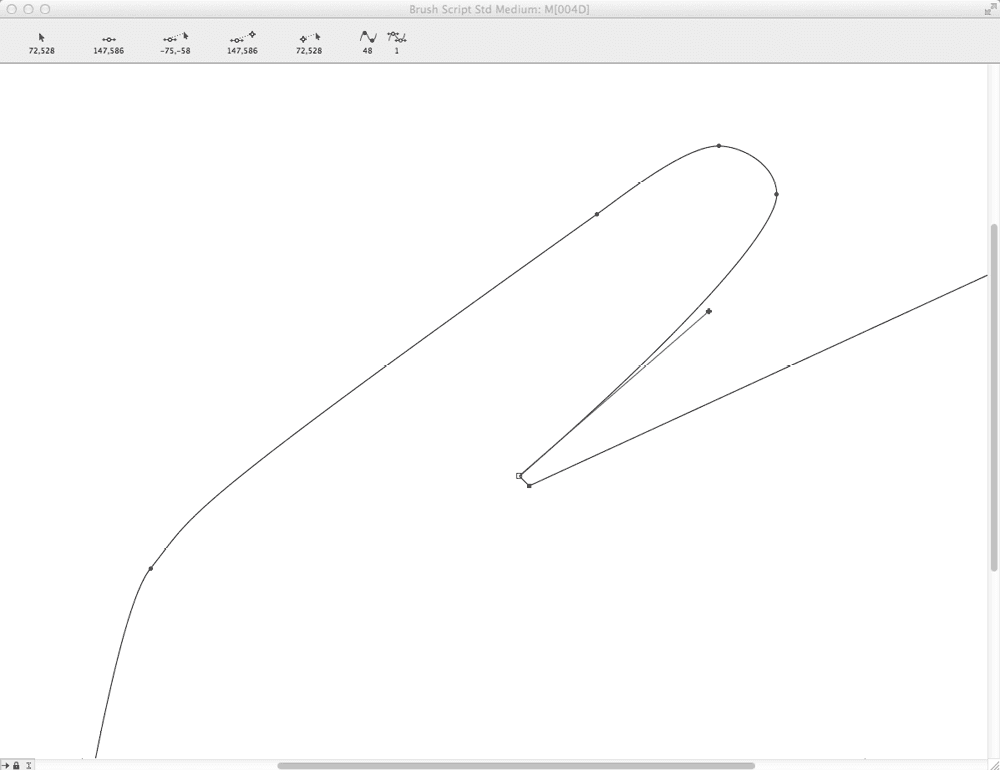
Figure 8: A detail of the same capital M from Brush Script, with one of the points selected to show its handle.
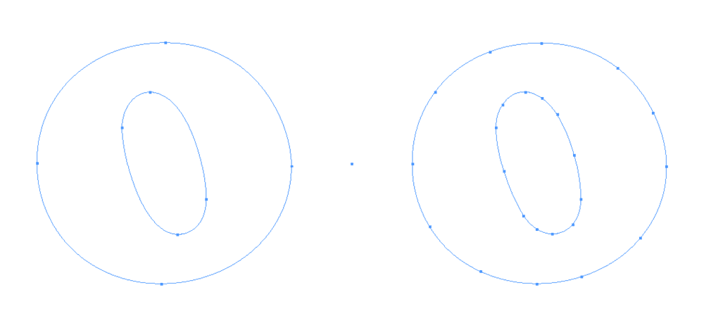
Figure 9: Capital O converted to outlines from Cooper Black Std (left) and Cooper Black Regular (right). Notice how the OpenType font with PostScript outlines creates far fewer points (8 vs. 24).
Feel the Material
“In the past 20 years,” says Jean François Porchez, “the difference between a high-quality character and a low-quality one has evolved. Once upon a time, the difference was clear. But since then, we’ve had numerous characters, both free and commercial, that are of average if not mediocre quality but that are well enough made to charm you and make you download them or buy them. It’s only when you use them that you find out about the constant problems I’ve been talking about… and by then it’s too late. “The best parallel may be fabrics, since in fashion, ever since H&M, Zara, Gap, and the rest, nothing is expensive and everything is right there, easily accessible to anyone. But rarely is the quality there. The font market suffers the same phenomenon: lots of fonts are available, it’s magic, immediate, either free or not very expensive. But very few of them are of excellent quality. It’s up to the users to learn how to tell the difference.” There might be one surprising advantage to the explosion of free fonts. Porchez maintains that the existence of high-quality free fonts has lessened the incentive for using pirated fonts. “The advantage of free,” he says, “is that they make it easier to respect the rights of designers, to reduce piracy, and to learn how to search.” Porchez heads up the master’s program in typographic design at ECV Paris, where, he says, “We have put in place a total interdiction of pirated letterforms. Our students don’t get a grade if we have any doubt about the provenance of their characters. The result is astonishing: they search more, they discover new things, they become curious, they get better, because they stop simply copying characters from the next table.”
Commenting is easier and faster when you're logged in!

Recommended for you

Tip of the Week: Scotch Tape FX
This InDesign tip how to create scotch tape FX was sent to Tip of the Week email...

Photoshop, Illustrator, and InDesign New Features Guides Updated for 2023
These free reference guides are a unique resource for understanding the evolutio...

Photographic Frames and Mattes
David goes crazy with putting frames around pictures... and comes up with some i...