
Understanding Overprints
Overprinting lets you stretch your print budget by combining inks on press. Here's how InDesign makes it easy to create and preview overprints.


This article appears in Issue 3 of InDesign Magazine.
Hang around a print shop long enough and you’ll hear the term “overprint.” In the world of prepress, overprinting is a way to control how color-separated plates interact with each other. Specifically, in a four-color process job, all of the colors that you use on a page are broken down into percentages of four colors: cyan, magenta, yellow, and black. A printing press imprints each color on a piece of paper, one after the other, as it runs through the press. Because of this process, certain considerations need to be made when color separations are made.
Technical Knock Out
Take an example where you design some cyan text over a yellow background. When those colors are separated and printed on press, the cyan and yellow would mix, resulting in green text over a yellow background. Therefore, under normal conditions, when pages are separated, color that appears underneath other objects is removed so that the color on top is unaffected (Figure 1). In this example, the yellow color that appears behind the cyan text is removed or “knocked out,” allowing the cyan to appear correctly when printed.

Figure 1: Normal separations for this example result in blue text on a yellow background because the text “knocks out” on the yellow plate. With an overprint specified on the cyan text, the result is green text as the yellow and cyan inks mix on press.
Round One
Why overprint? You’d want to apply an overprint when you specifically want to mix colors on press. Some designers who work with low-budget jobs that print in two or three spot colors can simulate
other colors by mixing those spot colors. InDesign does allow you to create multi-colored inks (called Mixed Ink Swatch on the Swatch palette), and internally, InDesign simply overprints the colors that make up the mixed inks. Before transparency rolled around, designers would also specify overprints to simulate objects being transparent, and you could also simulate shadows or shading by overprinting with black over other elements. Overprinting is also essential when creating plates for custom dies and varnishes. For example, if you wanted to create a spot varnish for a particular photo, you’d create a color called “varnish” and set it to overprint, as this will allow the photo that appears beneath it to print (otherwise, the varnish would knock out the photo). You can easily specify overprinting directly within InDesign from the Attributes palette (Window > Attributes) (Figure 2). With an object selected, you can choose to force to overprint the fill, the stroke, or the gap (the spaces that appear between dashes in a dashed stroke). Remember that InDesign also allows you to specify whether a stroke is painted in the centerline, inside, or outside of a path, and you should be aware that if you overprint a stroke that’s on the inside or the centerline of a path, the stroke will also be overprinting the fill of that object.
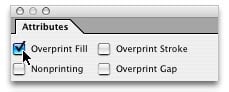
Figure 2: InDesign’s Attributes palette, where you can specify overprints for selected objects.
The Blow by Blow
Let’s get technical for a moment. There are some limitations when it comes to using overprints. First of all, while one color plate can overprint another, an overprint cannot overprint its own plate. For example, if you have a color that contains cyan, and you set it to overprint over a background that contains cyan, you won’t get an overprint on the cyan plate. Here’s another issue: Sometimes users specify overprinting for objects colored Paper. Usually, Paper is always a knockout (as it lets the white paper show through), and setting a Paper object to overprint would kind of defeat the purpose. However, these things do happen accidentally. You might have a logo that you created in Illustrator that’s colored black, and that you’ve set to overprint. Then you might come upon a situation where you need a reverse (white) version of the logo, so you might just open the file, color it white, and save it with a different name— forgetting that you had set the fill to overprint. This would most likely result in the file not printing properly, as either the “paper color” will overprint (making it entirely transparent) or the RIP won’t process the file correctly.
Up Against the Ropes
Because overprints are really PostScript commands that are used when printing color separations, there is always a problem with displaying overprints on screen or when printing composite proofs to show a client. The only real way to proof overprints in the past was by printing separations and creating a Matchprint proof or by investing in expensive prepress plug-ins. More often than not, a designer would show a proof to a client and say, “it won’t look like this when it’s actually printed.” If only there was a better way… InDesign offers that better way. By choosing View > Overprint Preview, you can actually see what the effects of overprint commands are, on your monitor (Figure 3).
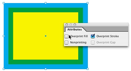
Figure 3: An object with a yellow fill and a cyan 20 pt. stroke set aligned to center. With the stroke set to overprint and Overprint Preview turned on, you can see the inside of the stroke mixing with the fill beneath it.
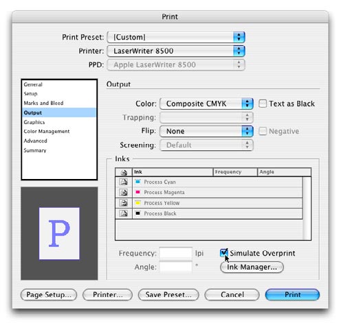
Figure 4: Turning on the Simulate Overprint option in the Print dialog when printing a composite proof from InDesign.

Figure 5: InDesign’s Separation Preview panel.
Float like a Butterfly, Sting like a Bee
While overprints are useful (and essential in some workflows), my advice is to talk to your printer before you use them, as some printers prefer to specify overprints themselves. In either case, be at ease knowing that your butterfly-InDesign-has all the tools necessary for you to be the king of the ring in professional design.
Commenting is easier and faster when you're logged in!

Recommended for you

dot-font: Type Tradition in a Digital Age
dot-font was a collection of short articles written by editor and typographer Jo...


Tip of the Week: Fast Edit Original
The fastest way to open a placed image in another application for the purpose of...