
RGB vs. CMYK
It’s time to close the case on this ancient debate that stretches back to the beginning of desktop publishing.


This article appears in Issue 129 of InDesign Magazine.
Let me tell you a little story about RGB vs. CMYK. A client invited me to their site to sharpen up the staff’s Photoshop and InDesign skills. The company’s print workflow is built to create labels for cleaning products, and they were in the midst of a campaign to inform their customers about their purchase of a new HP Indigo labeling press. They had created a gorgeous multicolor image with an impressive rainbow of paint splashes to show off their new color capabilities, and were preparing to send out the announcements. But before printing their first proofs, they’d converted the image to CMYK, since “that’s how we’ve always done it.” They could tell immediately that the result wasn’t going to be anywhere near as saturated and glorious as the original artwork.
I asked if they still had the original RGB composite image their artist had worked so hard to create, and if they were willing to send that image to the press, without converting to CMYK first. They were doubtful—after all, images have to be CMYK to print, right?—but they were willing to play my little game, allowing the Indigo RIP (Raster Image Processor) to do the conversion.
When the first copy came off the press, they were stunned at the vibrant result, which rendered their beautiful promotional piece in its full glory (well, fuller, anyway), now truly portraying the message they wished to impart to their customers: “Look what we can do with our new machine!” This was a revelation to them, and utterly changed how they subsequently handled their work. Now, with an RGB workflow, they love their Indigo even more!
So why did the RGB image render more vibrantly than the CMYK version? In simple terms, the Indigo RIP was allowed to perform
the RGB-to-CMYK conversion using its own native lookup tables (LUTs). It knew its own capabilities, its own ink gamuts, and could perform a far better conversion than generic conversions to CMYK in Photoshop.
This is a story that has played out thousands—perhaps even millions—of times before. And it will keep playing out until designers, printers, and production staff finally understand: it’s not just okay to keep your images in RGB, you’ll save time, money, heartache, and—best of all—you’ll almost always end up with better-looking documents.
But maybe you’re not convinced. Maybe you have questions. That’s normal. You’re right to be skeptical. So I’m going to lay it all out for you here, once and for all.
Don’t We Print in CMYK?
Of course, when we print, it’s always in CMYK (and sometimes additional inks such as orange, violet, light cyan, pink, or gray on large format digital presses). We can’t print directly in RGB—we can only represent RGB on monitors. RGB describes light, using an additive model (the more you add, the closer to white you get), which is the way our human eyeballs process it with our wonderful rods and cones, along with our visual cortex and a bunch of fancy cerebral wiring (Figure 1).

Figure 1. Here’s some fun visual math—R+G=yellow; B+G=cyan; R+B=magenta. Add them all together and you get white (think of it as turning up all the lights).
There aren’t any presses that “print” with light, and let’s face it—it just isn’t cost-effective to send out thousands of monitors instead of brochures. (Although some companies now distribute low-cost tablets to customers instead of creating expensive printed booklets.)
Printing inks operate on the subtractive principle—printed inks absorb certain wavelengths of light, reflecting the leftovers. For example, cyan ink absorbs red light (the “R” in “RGB”), and reflects only the remaining blue and green wavelengths, which combine to make your eye see “cyan.” The crude diagram in Figure 2 shows the workings of the subtractive method.

Figure 2. When light containing red, green, and blue (in other words, white light) hits cyan ink, the ink absorbs the red wavelengths, allowing only the blue and green wavelengths to be reflected.
Color vs. Sunlight
Have you ever noticed old signs in store windows that seem to be turning blue and pink? That’s because sunlight is blue in nature, and is absorbed most strongly by yellow ink, degrading it, leaving the cyan and magenta behind (Figure 3).

Figure 3. After several months in direct sunlight, yellow ink degrades, leaving the artwork with a washed-out, unappetizing pink/blue cast (right). UV coatings can help. So can awnings.
(Not so) Perfect Conversions
The reason we use cyan, magenta, and yellow inks are that they are technically the opposite of red, green, and blue light. For example, if you have no red (and all blue and green), then you get 100% cyan.
So, if these two color modes are so closely linked, then shouldn’t the conversion from RGB to CMYK be perfect? Well, your eyes have a wider color gamut than the inks used on commercial offset presses (that is, you can see more colors than the technology can print); that’s why in Figure 4 you see the precise opposite of the RGB swatches in the white squares when you change your focus.

Figure 4. Did the three bottom squares seem to be filled with cyan, magenta, and yellow?
However, in Figure 5, you can see that the image loses vibrance when converted to CMYK. It’s sad, but it’s a fact of printing life.

Figure 5. The vibrant hues of the rose and leaves are nicely rendered in the RGB image (left). But some of those lovely hues fall outside the CMYK gamut, so they’re truncated in the CMYK version (right).
RGB complements CMYK
Here’s a fun visual experiment. Stare at the small white dot in the middle of the green square in Figure 4 for 10 seconds (it’s OK to blink; the trick will still work). Then switch your focus to the black circle in the middle of the white square below. You might be in for a surprise.
But why? This shortfall is due to the limitations of pigments used in offset printing inks—the pigments and printing technology will never be as pure as light. This is something we just have to accept (though we’ll talk about the benefits of digital press inks later). And so combining cyan, magenta, and yellow will never provide a rich enough color. You can make it better by adding black (K) ink. But, even then, commercial CMYK inks on a printing press are still a far cry from what the eye can see and RGB can represent.
Figure 6 gives you a comparison of the RGB and CMYK gamuts, and how both compare to the full color spectrum.

Figure 6. The time-honored Color Toe gives you an idea of the relative gamuts of our visual capabilities, our RGB monitors, and CMYK. Notice that there are some areas in which the CMYK gamut actually renders some colors that your monitor can’t, such as cyan and some yellow hues.
How can you prepare yourself emotionally for how your lovely RGB image will be printed once it’s converted to CMYK? You can “soft proof”—that is, show an accurate on-screen proof of the final CMYK. Keep in mind that your monitor must be profiled and calibrated correctly, so the on-screen representation will be more realistic. Light coming from your RGB monitor will never perfectly match ink on paper, but profiling and calibration can put you in the ballpark.
Some expensive monitors offer self-calibration. For example, if you want to empty your pockets, Eizo’s ColorEdge series is fantastic. But the rest of us need to profile and calibrate with something like the SpyderX from Datacolor.
Once you’ve done that, you’ll need to choose an appropriate target for your RGB-to-CMYK conversion. In a perfect world, your printer would supply a color profile which you would invoke when creating a custom color setting. Lacking that, try to at least find out what kind of paper (coated or uncoated) and press (web or sheetfed) will be used for your job, and incorporate that in your color settings.
What to do with Vector Art?
The question of RGB vs CMYK is a little more complicated when working with vector art, such as graphics created in Illustrator. Like Photoshop, Illustrator documents are always set to either RGB or CMYK. Here’s how to choose: If your graphic has large areas of solid colors, or it’s important that you use specific CMYK numbers, choose CMYK. For example, if you want some text to be 50% cyan and 20% magenta, then you’ll need to set your Illustrator document as CMYK.
However, if you care more about the overall look of the art, then you might choose RGB instead. For example, when your image has a more “drawn” look, and you’ve used gradients and blends with bright, rich colors, RGB will often provide a better result.
Note that these instructions work in both Photoshop and InDesign. So you can soft proof an image in Photoshop while it’s in RGB to see what it will look like in CMYK. Or you can place the RGB image onto your InDesign page, and then soft-proof in InDesign to see what the whole page will look like when it comes off press.
Let’s say your job will be printing on an offset sheetfed press, on uncoated paper. To set up for approximate viewing of the CMYK results under these conditions, choose View > Proof Setup > Custom. Then, in the Device to Simulate popup menu, choose your output target—for example, you could choose U.S. Sheetfed Uncoated V2. (I have no idea what happened to V1.)
Then, when you click OK, your document will automatically switch to soft-proof mode—which is subtly indicated in the document name tab. You can then turn this mode off (or on again) by choosing View > Proof Colors. In Photoshop you can use a keyboard shortcut (Cmd/Ctrl+Y) so you can watch the image as you toggle between the color spaces in the preview.
Note that Proof Colors shows how the colors change, but not necessarily the color of the paper itself. If you want the best soft-proof, you can also turn on the Simulate Paper Color checkbox inside the Custom Proof Setup dialog box. But watch out: the results can be shockingly ugly—even if it’s more accurate.
Performing this preview doesn’t change the way your image will be converted to CMYK (regardless of whether you’re going to do that yourself, or leave it to the printer’s RIP). It just gives you a fairly good idea how the printed piece might look.
Digital vs. Offset Printing
If you’ve ever seen a movie about newspapers, such as All The President’s Men, you’ve seen a “big iron” offset press chugging away (Figure 7).
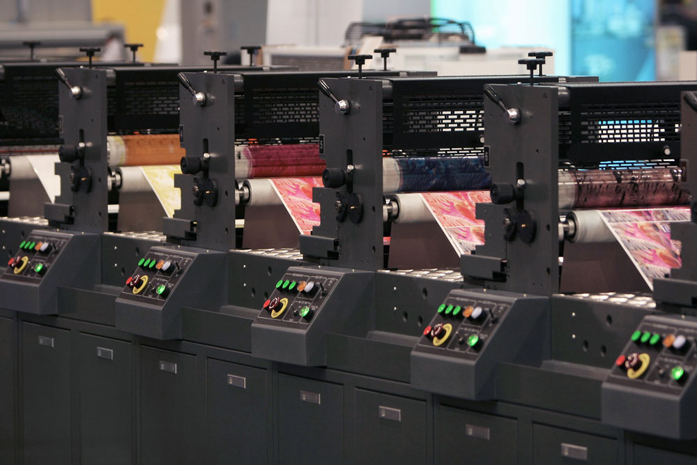
Figure 7. Web offset press in action
Newspapers, periodicals, books, and other high-volume projects are usually printed on web offset presses, which feed a continuous web of paper from a huge roll—hence the name. A sheetfed offset press feeds sheets (natch) of paper from a huge stack. Sheetfed presses are used for projects such as pocket folders, high-quality coffee-table books, brochures, and more.
It isn’t an overstatement to say that digital presses have revolutionized printing. From short-run economics to grand format output that decorates multi-story buildings, digital output has expanded the print world far beyond the capabilities of offset. For shorter runs, digital presses are the heroes. Xerox, Kodak, and HP are some of the big names in digital presses. Some—like Xerox—are toner-based, whereas the popular HP Indigo (Figure 8) uses “ElectroInk,” which is a liquid slurry of pigment in a carrier. Large format inkjet printers such as the Vutek (Figure 9) use liquid ink, much like that used by the little inkjet printer on the corner of your desk. They can print very wide and long banners and displays, and some can even print on solid substrates such as corrugated plastics, plywood, and metal.

Figure 8. HP’s Indigo presses are a popular solution for high-quality short-run projects.
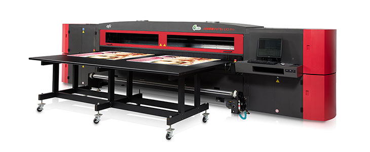
Figure 9. Vutek grand format printers can handle media up to 126 inches (3.2m) wide, and up to 2 inches (5.08cm) thick. So they’ve got you covered if you ever need to print on a door.
Although the inks and toners used by digital presses may share the names cyan, magenta, and yellow with the inks used on offset presses, their formulations and gamuts are quite different. In addition, as I mentioned earlier, some presses (such as large-format inkjet printers) incorporate orange, purple, green, gray and other inks to further extend their gamut. Consequently, digital presses are capable of rendering a wider gamut of colors than what’s possible on offset presses.
The upshot here is that prematurely converting a vibrant RGB image to CMYK might mean losing colors that actually could be printed.
Think back to the story at the beginning of this article; my client discovered that their output was much more vibrant when they fed RGB images to the press, allowing the RIP to do its magic, based on its look-up tables (LUTs) for the colorants used by that particular press. Yes, the colors have to get converted to CMYK, but by letting the printer’s software do it, you maximize your chance for success.
Submitting a job for digital printing
So…should you just start submitting nothing but RGB images for digital print jobs? I’ll say this more than once: Do what your printer tells you. Even if you know your job is destined for a digital press, if the printer insists you give them CMYK files, do what they ask. However, if this is the case, ask if they can provide you with a color profile for their output device, so you can at least perform an optimal conversion.
Seeing Spots
What about spot colors? Some toner-based digital presses can print a selection of spot colors (and some even offer opaque white and metallics), but not all have this capability. Does that mean you have to convert all of your spots to RGB or process builds before submitting your job? Actually, no.
Remember the Lookup Tables I mentioned earlier? These are internal references used by the RIP to translate incoming content to the best values for the press and its inks. They don’t just handle RGB-to-CMYK conversion, they also contain built-in recipes for spot color conversions. These recipes are not generic—they’re specific to that type of press and the colorants it uses. Consequently, you may discover that leaving your spot color content as spot color results in a closer match to the “real” spot color than you might be able to achieve on an offset press. So, as with RGB images, don’t convert prematurely—let the RIP do the heavy lifting.
Then, while you’re having this conversation, you might innocently ask if they have ever tried sending RGB images to the RIP. If they whip out the torches and pitchforks, drop it. But if they seem amenable, ask if they’d be willing to try a little science project. Create a nice, small, colorful piece to showcase the press’s capabilities, send it in, and cross your fingers.
Submitting a job for offset printing
What about submitting a job to run on an offset press? In the Olden Days, RIPs did a lousy job of converting RGB to CMYK, resulting in terribly distorted color rendering. While this is no longer true in modern workflows, some printers are still scarred by past experience, and regard RGB as evil. They may feel that forcing you to convert to CMYK first will avoid unpredictable results. As with digital jobs, (and I told you I’d say this more than once): Do what your printer tells you. But ask the printer for their device profile so you can perform a reasonable RGB-to-CMYK conversion.
That can be the conversation-starter that you need to ask to find out if they’d be willing to send RGB content to the RIP and show you a proof, just for grins. Again, if they shut you down, end of story…though you should think about finding a more enlightened printer, if you have the opportunity. But it’s worth a try, both for your convenience and for their enlightenment.
What if the printer absolutely insists on having CMYK content? Do you have to grudgingly convert all your images to CMYK, losing some of the benefits of RGB (such as the wonderfully tacky filters in Photoshop)? Nope. Keep your images in RGB, and place them into InDesign as RGB, but when you export to PDF from InDesign (or Illustrator), use a setting that converts RGB content to CMYK on the fly, resulting in CMYK image content in the PDF while leaving your original images unscathed. Any grayscale content stays grayscale, and spot colors are preserved; everybody goes home happy.
To convert RGB content to CMYK upon export, follow these steps.
- Choose File > Export.
- Choose PDF (Print) from the Format pop-up menu.
- Choose a PDF Preset (such as PDF/X-1a, PDF/X-4, or Press Quality).
- Set up the other options in the Export PDF dialog box (compression, marks and bleeds, etc.)
- Here’s the important part: In the Output pane of the Export PDF dialog box, you have three choices in the Color Conversion menu:
No Color Conversion: RGB content is not converted; everything stays the way it is.
Convert to Destination: RGB content is converted according to the recipe or “output target” you choose (in the Destination field). And CMYK content may also be converted, too. This sounds good, but it can be a huge problem—for example, your 100% black text may end up “four color” CMYK text. Not good!
Convert to Destination (Preserve Numbers): Converts RGB content to CMYK, but just passes through any existing CMYK content with values unchanged.
If your printer is okay with RGB data, then choose “No Color Conversion.” But if you need to make a CMYK PDF, then the correct answer is Convert to Destination (Preserve Numbers).
Then, in the Destination pop-up menu, choose which CMYK flavor you are targeting (Figure 10).

Figure 10. If your printer insists on CMYK content, use a PDF setting that converts RGB content to CMYK.
Ideally, you’ve been given a custom profile by the printer, and you would choose that here. Some printers, alas, are not that enlightened. If that’s the case, ask the customer service representative (CSR) who is your liaison for the job to tell you what kind of press (sheetfed or web) your job will be running on, as well as whether they’ll be printing on coated or uncoated stock. If that’s the only information you can eke out of them, then you’ll have to use a canned generic destination profile, such as Coated GRACol or Uncoated Fogra29.
Click Export.
Being able to convert your RGB content on the fly is the best of both worlds—your original images remain in their native habitat as long as possible, and your printer gets a nailed-down PDF with no scary RGB content to frighten their operators.
Changing gears
There’s an added benefit to keeping your working RGB images intact. What if, in the future, you decide to reprint that project on different stock? Suppose you just need a few samples of the piece—those would be printed on a digital press. If you lock in the color early in the game—converting your images to CMYK in Photoshop, for example—you lose the flexibility of letting the RIP for each device do the conversion. Late-stage conversion is the name of the game.
In a similar way, if you’ll be using those same images for online content, why keep two versions of your images—one set of RGB, and one set of CMYK? Two versions to keep track of means more files to manage, and almost twice as much disk space occupied.
Special Case: Screen Grabs
Look at the interface of any application on your monitor—panels and dialog boxes are a sea of gray, with little islands of black text and an occasional speck of color (Figure 11).
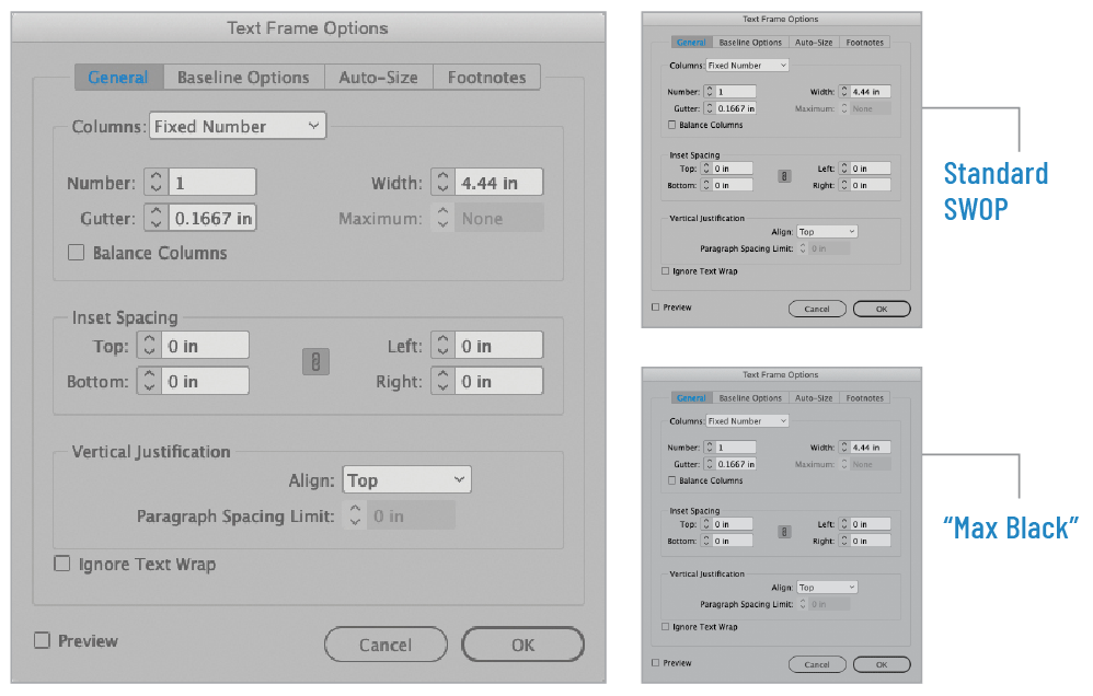
Figure 11. Two methods of converting an RGB screenshot (left) to CMYK (right). On screen, they all look the same. But under the hood, there’s an important difference.
Screen grabs are the only image types that I recommend converting to CMYK before you send to the printer. Why? To ensure that all that gray and black content prints only in black ink, rather than a combination of CMYK, in order to prevent any color shifting on press, or any loss of crispness if there’s slight misregistration on press.
Modern printing presses can attain considerably more precision than their ancestors. But occasionally, misregistration may take place. If the four process CMYK plates do not image in perfect registration, the results is a sort of rainbow effect as seen in Figure 12.
Figure 12. Using the standard SWOP RGB-to-CMYK conversion, everything is rendered in combinations of CMYK. If the press is out of register, this “rainbow” effect could result.
But here’s a clever solution to this potential problem: use a separation setup that renders all the gray and black equivalent only in process black, thus eliminating the rainbow effect (Figures 13, 14, and 15).

figure 13. Settings for creating a “Max Black” conversion recipe, which replaces all gray and black content with black, avoiding any color cast on press.

Figure 14. C+M+Y plates for standard SWOP conversion (left) version the C+M+Y plates using a Max Black conversion (right).
Figure 15. The Max Black conversion places all gray-equivalent content solely on the process black plate, eliminating any issues if there is misregistration on press.
To create a “Max Black” conversion recipe, follow these steps:
- In Photoshop, choose Edit > Color Settings
- Under “Working Spaces,” choose Custom CMYK from the CMYK pull-down menu.
- Under “Separation Options,” choose Black Generation > Maximum.
- Name the setting, and click OK. This will make the Max Black setting your default conversion setup.
- Click OK to exit the Color Settings dialog box.
Note: You’ll want to use this setting only for screen shots. Once you’ve finished converting your batch of screen shots, be sure to switch your Color Settings back to whatever standard setting you use; the Max Black setting isn’t appropriate for other types of images.
A Verdict is Rendered
OK, ladies and gentlemen of the jury, it’s time to cast our votes. In the case of RGB vs. CMYK, we’ve read the arguments and eyewitness testimony. We’ve heard from experts and seen the physical evidence. And we can declare beyond a reasonable doubt that staying in RGB for as long as possible will produce the best results in most print workflows. Case closed.
Commenting is easier and faster when you're logged in!

Recommended for you
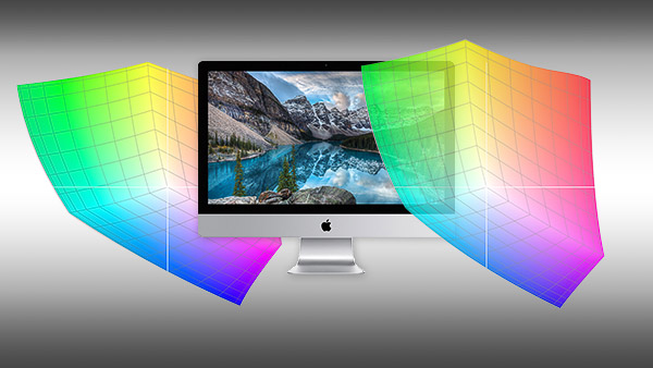
How Do P3 Displays Affect Your Workflow?
A P3 display is an upgrade from sRGB, but there are potential complications.

InDesign Magazine Issue 144: Stealing Great Design
Issue 144 has articles on stealing great design, designing with rules, borders,...

Stealing Great Design
See how to embrace your influences and borrow from them to make something totall...