
Variable Fonts in InDesign
A concise Q&A guide to navigating InDesign 2020’s newest tool for type.

This article appears in Issue 128 of InDesign Magazine.
Graphic design control freaks rejoice! While variable fonts have been supported in Illustrator and Photoshop for the past year, we now get to use them in InDesign 2020! In this article, I’ll explain what variable fonts are, what they’re not, and how to leverage this awesome and sometimes controversial new technology.
What Are Variable Fonts?
Variable fonts have been described by type designer John Hudson as “a single font that behaves like multiple fonts.” For example, a font called Acumin Variable Concept (part of Adobe’s Variable Concept collection of fonts) lets you control its weight, width, and slant angle using sliders. Each of these settings is called an “axis,” and making choices from each axis creates an “instance.” Traditional fonts usually have a handful of instances called italic, semibold, semibold italic, bold, and so on. But variable fonts can have as many as the type designer chooses, and you can set an instance using any points along those axes.
Most variable fonts offer only one or two axes (such as weight and slant). However, some font designers have really pushed the boundaries of the technology. For instance, font legend David Berlow created Decovar Alpha 24, which has 15 preset axes with names like Flared, Rounded, Worm Skeleton, Slab, and Bifurcated (Figure 1).
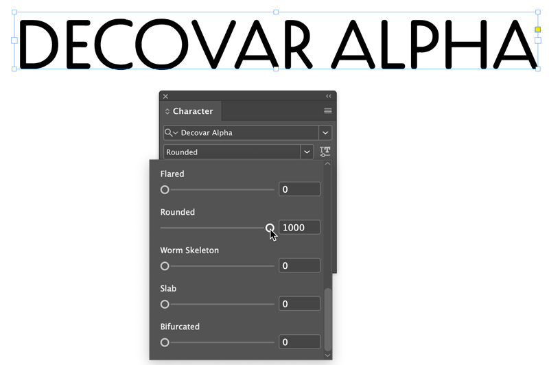
Figure 1. Decovar Alpha offers 15 axes you can adjust, including rounding.
Acumin Variable sports 90 preset variants (instances) yet in terms of file size, it weighs in at a fraction of the size of all individual styles combined (Figure 2).
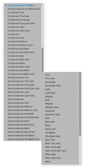
Figure 2. Take your pick from among 90 styles of Acumin Variable
Concept, some of which are shown here.
Here’s a great description of how variables fonts might be used: In September 2016, Tim Brown, then Head of Typography for Adobe Typekit (now known as Adobe Fonts), said “Imagine condensing or extending glyph widths ever so slightly, to accommodate narrow and wide viewports. Imagine raising your favorite font’s x-height just a touch at small sizes. Imagine sharpening or rounding your brand typeface in ways its type designer intended, for the purposes of art direction. Imagine shortening descenders imperceptibly so that headings can be set nice and tight with- out letters crashing into one another.”
Here are some questions I’ve recently been asked about variable fonts.
Back in the ’90s, Adobe sold what were called Multiple Master fonts. Variable fonts sound a lot like Multiple Masters. Is there a connection between the two?
Conceptually, the two are similar, but under the hood and in practice they’re very different. Unlike variable fonts, which are based on current OpenType standards, Multiple Masters (MM fonts) were first introduced in 1991 as an extension to PostScript Type 1. MM fonts forced you to generate instances for each variation of a font you wanted to try, so your hard drive quickly became littered with font files bearing cryptic names like “MinioMM_578 BD 465 CN 11 OP.” For six years Adobe tried valiantly to convince designers to adopt multiple masters. At around the same time, Apple unveiled GX Variations, which, like multiple masters, failed to win worldwide adoption. MM Fonts were basically shelved. (However, InDesign secretly still supports old MM instances that people created back then!)
Can variable fonts be used on the web, too?
Yes! Not only can variable fonts be used on the web, but because so many variants can be compressed into such a small file, web designers and developers are particularly excited by this new technology—because on the web, size matters. The smaller the file, the faster the download. Today, with mobile devices like smart phones and tablets in the pockets of millions of people, speed wins. So from that perspective, variable fonts couldn’t come at a more perfect time.
Type designers voice their opinions
Do type designers like variable fonts? It depends on whom you ask. According to Kel Troughton of Monotype, “Essentially, you’re designing the ends of the spectrum (thin and bold, for example), the masters, plus the middle of the spectrum (regular). Then you’re working with the math and the software, interpolating to make sure there aren’t any lumpy outlines. The placement of the (anchor) points in each master is super important so that they can all keep working together.”
Some type designers work this way already when developing a family of fonts, but they’ve always had to choose which instances to include when selling a package. Now, with variable fonts, they can let the users decide what they want.
Independent type designer Travis Kochel and his wife Lizy Gershenzon of Scribble Tone push the envelope of what can be done with variable fonts, as shown here in with their font WHOA.

WHOA, from Scribble Tone, has 4 axes exposed. This animation shows how type designers like Travis Kochel and Lizy Gershenzon are pushing the bounds of variable fonts.
Kochel embraces the way that his customers can bend and shape Scribble Tone fonts to their needs. “That’s the nice thing about [a] variable font… The user’s able to customize it in all these different ways, but it’s still within the scope of what the designer created,” he said.
However, type designer James Montalbano of Terminal Design in Brooklyn, NY, told me, “I’ve stayed away from variable fonts while the technology is working its kinks out. To me the whole variable font thing has come about to lower [the] bandwidth on serving multiple fonts to web pages. That is fine in and of itself, but what is the price? What might be good for the end user could be a financial disaster for the type designer.”
So what does all this variable font stuff have to do with InDesign users?
The size of font files is now inconsequential to print designers, of course. However, variable fonts open up a world of possibilities, both aesthetically and practically. According to variable font consultant and authority Jason Pamental, “The type designer has complete control over what axes are used, their ranges, and even the definition of new axes.” According to Jason, “There are currently 5 ‘registered’ axes (width, weight, slant, italics, and optical sizing), but the designer can vary any axis they choose. Some examples include the height of ascenders and descenders, text grade (which controls weight without affecting width), and serif shape. The possibilities are nearly limitless. By removing the performance barrier, we open the door for more interesting and dynamic design and far greater ability to express the true voice of the brand. All this while maintaining fidelity to the typeface itself: only axes exposed by the type designer can be varied. No artificial distortion allowed.”
How can I spot a variable font when I’m working in InDesign?
InDesign, Illustrator, and Photoshop share the same variable font interface and controls. From the Type menu, InDesign adds a small variable-font badge ahead of the font name, as seen in Figure 3.
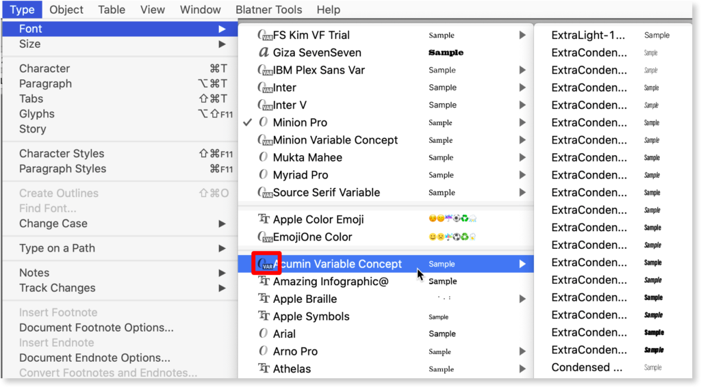
Figure 3. InDesign’s Type menu shows all available fonts. To the left of each font is a badge indicating the format of the font. In the highlighted example, we see the OpenType ‘O’ and the letters “VAR” to indicate that Acumin is a variable font. In the rightmost column we see some of the 90 preset instances found in this typeface.
When using the Character panel, you’ll see the OpenType variable type “VAR” badge placed in the far-right side of the column, as in Figure 4.
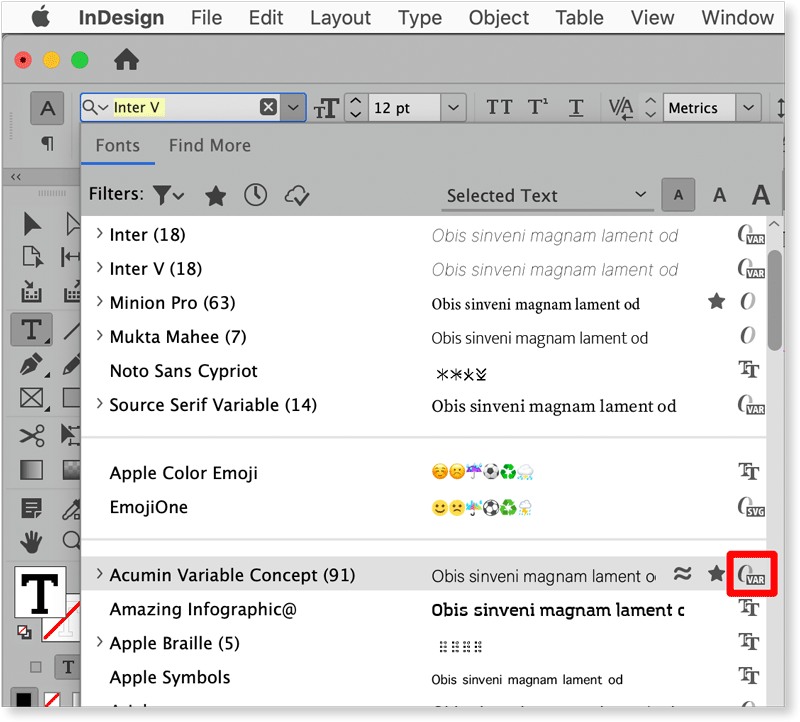
Figure 4. Here we see the Type menu when it’s accessed from the Character drop-down menu in InDesign’s Control panel. Notice that here the variable font badge has moved to the far right side of the menu.
Once I choose my variable font, how do I control its appearance?
When the font is selected, a tiny button appears (Figure 5).
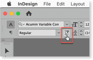
Figure 5. When a variable font is selected, the Character settings display the button highlighted in red.
When you click this button, a set of controls appears, with sliders that you drag to control the value of that axis. These sliders are accompanied by numerical values that change as you drag (Figure 6).

Figure 6. After clicking the button shown in Figure 5, a panel is revealed. The number of sliders that appear is a function of the number of variable axes exposed by the type designer.
As you explore variable fonts, you’ll discover that some fonts have only one slider (usually for Weight), while others display four or more. Again, how much the user can control the font is up to the type designer.
However, note that the next time you choose that font, the sliders will all go back their default settings.
Fortunately, that’s where styles come in. Simply create either a character or paragraph style after you’ve tweaked your variable font settings. Like any other text formatting, those settings will be saved with your style (Figure 7).
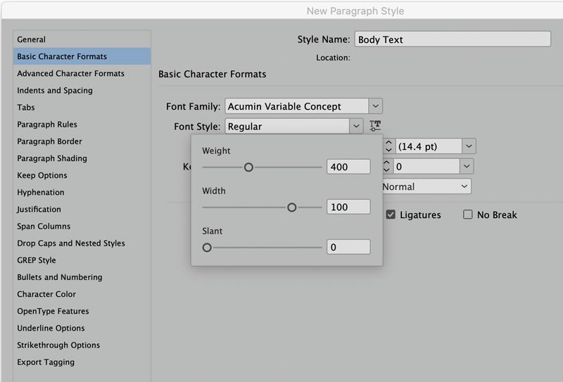
Figure 7. All user-facing variable font settings are saved in paragraph or character styles.
Anything else important to know about variable fonts?
Lots. Dan Rhatigan, Senior Manager of Adobe Type, tells me that they’re very excited about where this technology could go and urged users to be patient as it matures. “I think the one thing that’s often misunderstood about variable font technology is that it’s not a simple switch to flip.”
Currently six variable fonts are bundled with Illustrator, InDesign, and Photoshop. Those fonts are Myriad Variable Concept, Acumin Variable Concept, Minion Variable Concept, Source Sans Variable, Source Serif Variable, and Source Code Variable. (The three Source variable fonts are also available at Adobe’s Github page).
Although Rhatigan made clear, “We do not make variable fonts available through activation on Adobe Fonts at this time,” he stated that as the technology matures, activation will follow.
Dan also added that he hopes some of the current shortfalls with the InDesign user interface will be addressed in future versions of the software, paving the way for the use of things like optical sizes and improved justification via variable fonts. Adobe encourages users to experiment with variable fonts, and to report bugs, problems, and feature requests at Adobe UserVoice.
Pushing Variable to the Limits
Just as some “pi” fonts are filled with symbols or pictures, variable font technology can be extended in fun, graphical ways. For fun, have a look at this GIF animation I made using Zycon, a variable font you can play with yourself on the website Axis-Praxis.org.

A Vary Interesting Development
Variable fonts give designers unprecedented power for reshaping text quickly and easily to suit the needs of any layout. And while we’re still looking at a young technology, variable fonts may be on their way to becoming an essential tool in every InDesign user’s toolbox. As Dan Rhatigan says, “We look at variable fonts not as a gimmick, but really what is necessary for font technology to grow with the rest of the software that we use.”
Variable Font links
Want to know more about variable fonts? Check out these links.
Type Drawers Dry, but solid
Responsive Web Typography Jason Pamental’s personal website
An Introduction to Variable Fonts
Variable Fonts Nick Sherman’s excellent site for finding and trying variable fonts
AxisPraxis Great collection of variables to play with
Scribble Tone Worth a visit. Fonts and graphic design by Portland, OR, independent designers Lizy Gershenzon and Travis Kochel
Future Fonts Lots of cool stuff here
DSType Foundry Four variable fonts with some interesting attributes
The Evolution of Typography with Variable Fonts Good article by Jason Pamental for Monotype and in service to Monotype’s Meta variable font
Commenting is easier and faster when you're logged in!

Recommended for you

InDesign Magazine Issue 63: The Best Things in Life Are Free
Happy birthday to us! We’re happy to announce that InDesign Magazine Issue...

InDesign Magazine Issue 94: Special Characters
We’re happy to announce that InDesign Magazine Issue 94 (February, 2017) is now...
History and Usage of the Ampersand
Everything you need to know about one of the most beautiful symbols in Latin-bas...