
InQuestion: Space Before and After, Image Captions, Cascading Master Pages
Erica Gamet highlights the best Q&A from the incredible InDesignSecrets Facebook group.


This article appears in Issue 134 of InDesign Magazine.
Our online communities on Facebook and LinkedIn are full of passionate InDesign users, at all different levels of proficiency. But no matter how long we’ve been using the program, there are always those questions that stump us. Luckily, our groups are full of helpful InDesigners who always bring unique solutions to the table.
In this Q&A column, I’ve collected several excellent questions and responses, and distilled them for you. Note that the discussions have been edited for brevity and clarity.
Space Before and Space After
Connie Kubicek asked:
Q: “When should I use Space Before and when should I use Space After? Is there a rule?”
A: Many of us have heard—and hopefully heeded—the cautionary tale to not add space between paragraphs manually using Return/Enter. One obvious reason is that using a style is much more efficient, saving you from entering those spaces manually. Another, more subtle reason is that if the text breaks across a page or column, that space will travel along with the text to the top of the frame. Delete the space, and you run the risk of having your paragraphs crash into each other if the text flows back into the same column or frame—and creating even more manual work for you.
This is where Space Before and Space After come in handy. The space added before or after a paragraph is contextual, meaning that it occurs between paragraphs in the same text frame only. If a paragraph with a Space Before value sits at the top of a column, InDesign won’t add space. It’s pretty cool, actually.
But, you still need to be mindful when using Space Before and Space After. Most importantly, you
should choose an approach and apply it consistently within a document using paragraph styles. That will not only make it easy to update text globally, but also help you keep track of all that extra space being added.
That last part, about keeping track, is key. Especially as the different paragraph styles interact with each other. For instance, if body text with a Space Before value of 6 pt follows a header with a Space After value of 6 pt, the space in-between those two paragraphs would be 12 pt (Figure 1). That might be fine, until that body paragraph follows a subhead style and suddenly the gap between paragraphs is too large (Figure 2).
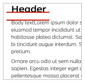
Figure 1. Header style with Space Below applied combined with a body style with Space Above applied

Figure 2. Too much space between body and subhead styles when body has Space Before applied
When to use Space After
My general preference—and the general consensus of our Facebook group hive mind—is to use Space After in most cases. Broadly speaking, I prefer Space After for body text and main headers (think H1, for instance). That’s because I consider H1-level styles “the boss,” in that they provide the foundation of the text. The headline is generally the start of a document (or a section) and often doesn’t have any text before it in the frame. Remember, if there is no need for the space, InDesign ignores it. But headlines—like a boss—tend to distance themselves from the worker bees, so a good amount of space following them is required. Because body text often comes in successive paragraphs, the space behind them just makes more sense to me. Think of it like the workers making a little room for themselves in their cubicles.
When to use Space Before
When it comes to styles for subheads, I usually employ Space Before. These styles are often single-line entries that act as little disruptors. They break up the text and need to make their presence known when they appear. Adding that Space Before alerts the reader that a new thought is starting. However, you can see where the Space After on body text and Space Before on subheads start to interact (Figure 3). Sometimes it works as expected, and other times, when those settings crash into each other, it makes for uneven spacing. Again, it’s styles to the rescue!
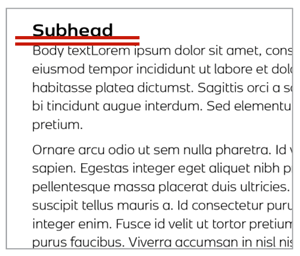
Figure 3. Body text with Space After applied and Space Before removed
Creating new styles for spacing
If our sample subhead always looks great when it follows our body text, we’re fine. But what if that subhead now comes after a bulleted list that doesn’t have extra space after it? The subhead might appear too close to the bulleted list (Figure 4).
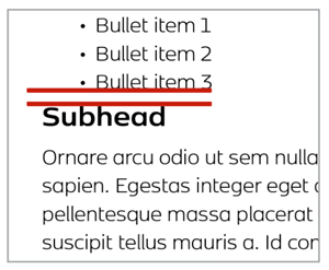
Figure 4. With no Space Before applied, the subhead style sits too close to the bulleted list (which has no Space After applied).
I don’t want to change my bulleted list style, so I need to make adjustments elsewhere. This is where using a style’s Based On setting comes in handy. In this situation, I would assign my normal subhead style—the one with the normal amount of Space Before—to the subhead and then add a little more Space Before from the Control panel. I now have a style override, which I can use to create a new style. With the overridden text selected, Option/Alt-click on the Create New Style button in the Paragraph Styles panel. In the dialog box, you’ll notice that this new style is now based on the subhead style. Give the new style a name like “Subhead after bulleted list,” and click OK (Figure 5). Now you’ll use that style only for subheads that follow a bulleted list.

Figure 5. Create a new style based on another style for specific circumstances.
The more special cases you have, the more styles you’ll end up with. As long as you’re organizing your styles and naming them based on their function, you’ll find it’s easier to keep track of the amount of spacing you have between paragraphs, and you’ll be able to achieve perfect spacing with maximum efficiency.
And just to be clear: You don’t have to do it the way I do it! Different InDesign users choose different strategies for Space Before and Space After. For example, I asked David Blatner, and he said, “I use Space Before for almost everything. The only time I use Space After is when I apply it to numbered or bullet lists—and then I make sure I also use the Space Between Paragraphs Using Same Style feature.”
Automate Image Captions
Jamie McKee asks:
Q: “I’m looking for possible solutions to easily add credit lines that run up the side of the image, with the least manual positioning. Credit lines come from a Word file. I’ve got about 100 of these. Thoughts?”
A: There are two distinct parts to automating this layout: creating the caption frames and then populating those frames with the information from the Word file (Figure 6).

Figure 6. Caption running up the side of an image frame
Set up the caption options
InDesign has two types of captions that you can create and auto-populate: live and static. Live captions take metadata from the corresponding image and place it in the caption text frame. When you update that metadata, InDesign automatically updates the captions. Static captions grab the same information, but they don’t update if the underlying metadata changes.
The initial set up is the same, no matter which type of captions you use. Set the caption options from the Object menu by choosing Object > Captions > Caption Setup. In the dialog box (Figure 7), select what metadata you want to appear in the caption frame. This information is embedded in the image file itself. If you don’t know what info is contained in your images, you can inspect them using Adobe Bridge. You can also create text to appear before or after the metadata.
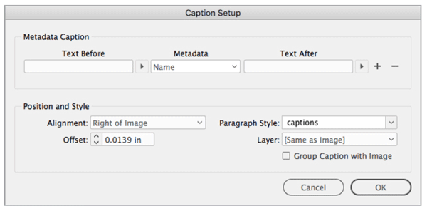
Figure 7. Choose metadata for the captions in the Caption Setup dialog box.
The next two options address the first part of Jamie’s question about running the caption up the side of the image with limited manual positioning. From the Alignment menu, choose where the frame sits in relation to the image. The Offset value gives the text some breathing room from the image side of the caption frame, which will butt up directly against the image frame.
Lastly, create a paragraph style to be used for captions, assign a layer if desired, and choose whether or not to group the caption with the image. If you’re going to create live captions, grouping them assures that the metadata remains current, even if you separate the caption frames from the image frame.
Create the caption frames
Select the images you want to assign caption frames to. If you want to select more than the images on the current spread, head to the one place you can select all the images in a document at once: the Links panel. Select all the images in the panel, go to the panel menu, and choose an option for creating your captions (Figure 8). Here’s where you need to make the decision to use live or static captions.

Figure 8. Set up and choose captions from the Links panel menu.
In the original question, the caption text will be flowed in from another document. So in this case, the chosen metadata should pull from a field that doesn’t have any information. The options way down the metadata list are often empty—my choice is usually the # of Notes option. In this case, you would also want to choose static captions, as using a live caption will generate a message of <No data from this link> in the frame that you would then have to manually delete.
The caption frames are generated on all selected images. Because you made static captions using empty metadata, you now need to fill the frames with content.
Link the text frames
If you want to flow in text from a Word file—as in Jamie’s original question—you will want to link the caption frames together. To do this, select the first caption frame with the Selection tool, then click in the text out port—the little hollow square at the lower right of a text frame (or near the end of a text frame, if the frame in question is rotated). The arrow will switch to a loaded text cursor with which you can then Option/Alt-click on the next frame in the sequence (Figure 9). You don’t have to hold the Option/Alt key the entire time, only when you click in the next frame in the sequence. (That is, when you Option/Alt-click, InDesign will link and reload the place cursor.) You can even navigate with the Pages panel without losing the ability to link.
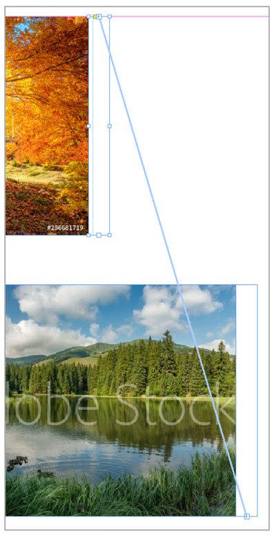
Figure 9. Caption text frames after linking
Once your frames are linked, you can flow your text file into the first frame and the text will flow through all the caption frames. If you need to, go to the Word file and insert any returns or frame breaks before placing the file.
Now you have meticulously placed caption frames with text that can easily be styled all at once, or have new text flowed in, if needed.
After the text is flowed in, you may want to unthread the frames—breaking them up so that text won’t accidentally reflow later. You can do that with a free script (see this article).
Use Cascading Master Pages
Torben Bjørgheim Abildgaard asks:
Q: “I am creating a template for a monthly magazine… using master pages for page number, title, and the theme of the individual pages. Theme of the individual pages is my challenge: I do not want to override all master page items on the spread/page using Override All Master Page Items.”
A: In this situation, there are elements that are common throughout all pages of the magazine: the header and footer info, as well as a “theme” for each page or set of pages. These theme pages might contain objects, such as sidebars or elements that appear only at the beginning of a magazine article.
To accomplish having a set of elements common to all pages and a variable set, take advantage of InDesign’s cascading, or hierarchical, master pages. That’s just a fancy way of saying you can base a master page on another master page. The bonus is that all common elements are connected down through the chain of masters. When you update an element at the top, that change ripples down through all the connected masters.
Start at the top
To start, think of the common elements throughout your document that appear in the headers (magazine title or issue number, for instance) and footers (page numbers, and so on). I like to include as many elements as possible that will appear throughout the document in this group, even if they don’t appear on every page. It’s an odd concept at first, but just keep that idea in the back of your mind for now. All of these common elements go on Master Page A (Figure 10).

Figure 10. Master Page A, with many of the elements that will appear on child master pages
It’s the boss that all other cascading masters will listen to. This king of the master pages never gets assigned to a document page. Its role is to tell other master pages what to do. (Technically, this “boss” doesn’t have to be Master Page A. You could choose some other master page or name it something else instead. I just find it convenient to use the Master Page A for this.)
I’m working in single pages in this example—perhaps to create a PDF publication with centered page numbers—but you can also create two-page master spreads if you’re working with facing pages. In that case, assign elements to the proper page in the master.
Start basing master pages on that “boss” page
Now we can start creating masters that will actually be assigned to document pages. From the Pages panel menu, choose New Master. In the New Master dialog box, choose Based on Master > Master Page A, keep the B prefix, and name the new master page Chapter Start. This master (Master Page B) will become the basis for the first page in each chapter or section of the publication.
If you included elements on Master Page A that don’t belong on Chapter Start (the publication title, for example), you’ll need to override that object on the Chapter Start master. To do that, Command/Ctrl+Shift-click the unwanted title and delete it. Do this for any other elements from Master Page A that you don’t want on the Chapter Start master.
Next, you’ll want to add in any unique items that belong on the Chapter Start master. For example, you could put the chapter number large in the top half of the page (Figure 11). You’ll override this number on the document pages for each chapter start, or you can use section numbering (which you can investigate on your own). At this point, you can start applying this master to pages to try it out.
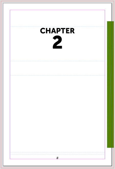
Figure 11. Master Page B, the chapter start page, with the title removed and a chapter number added
When the Chapter Start looks pretty good, move on to making Master Page C: the master for the text pages. Also base this one on A, delete the color bar on the right, and make any other adjustments from there (Figure 12).
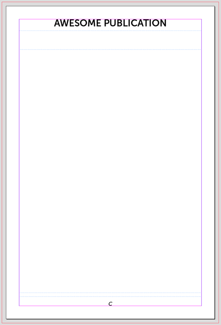
Figure 12. Master Page C, which is based on Master Page A, with the color bar removed
Base masters on similar masters
Not everything is directly based on Master Page A. In the case of the example publication, you might want a special page that doesn’t have text, but rather room for a graphic. In this case, you can make a Master Page D, basing it on C this time, because they are nearly identical. The difference on D is that instead of a text frame, you want a large image frame and maybe a caption. Again, add or subtract any elements specific to this page.
The deeper you go, the more intricate the relationship between master pages can become. Before making a new master page, think about how its elements and function relate to higher up masters—and how future changes might ripple through—then choose the appropriate one to base it on. I often draw out a sort of flowchart so that I know which masters are based on others and what elements belong to which masters (Figure 13). The magic becomes apparent when you make a change on Master Page A—say, by changing the header font—and all subsequent master and document pages are updated.
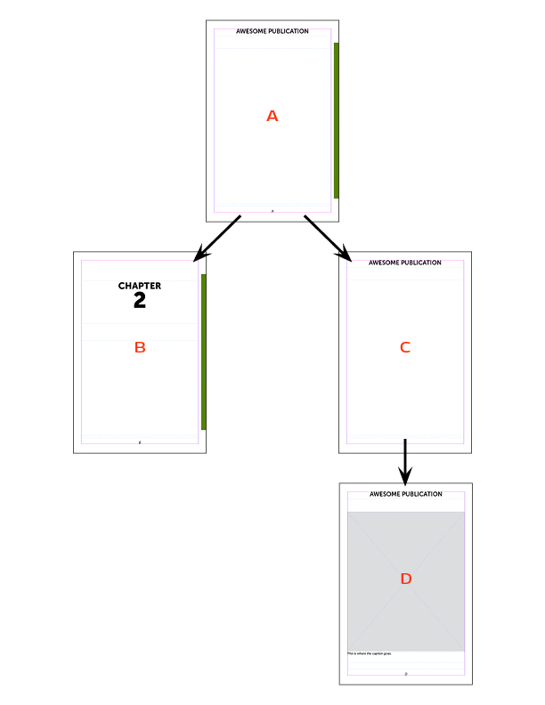
Figure 13. A flowchart of the hierarchy of master pages
Commenting is easier and faster when you're logged in!

Recommended for you

InQuestion: List Lines, Running Headers, and Table Cells
Erica Gamet highlights the best Q&A from the incredible InDesignSecrets Facebook...

InDesign Magazine Issue 115: Adobe Stock
Issue 115 of InDesign Magazine include articles on Adobe Stock, CC 2019, ID-Extr...
New Contest! Solve the Mystery of the Upside-Down Master Page
Hey folks, it’s contest time again! Last month, many of you unraveled the...