Reviving a Victorian-American Typeface

Today’s Fonts on Friday is a little bit different: we’re letting you know about a Kickstarter project for a typeface design. Kickstarter, for those of you who may not know, is a way to get money for product development through what’s called crowdfunding. Everyday people like you and me provide the funds to “kick start” an idea, product, service, and so on. The developer can only uses that money on the advertised project, and only when the financial goal is realized.
This project is the development of a typeface to be called “Cristoforo” by Thomas Phinney, type expert and “Guru of Fonts and Typography” at Extensis (perhaps you saw the case study we ran about his role in the redesign of the Extensis logo). Cristoforo, however, is an entirely personal project for Phinney, in which he combines his love of typography with his passion for the cult game Call of Cthulhu, a roleplaying game inspired by the horror writer H.P. Lovecraft.
Cristoforo is Victorian in style, with antecedents in the fonts Columbus and American Italic (the former is the font used in packaging for Cracker Jack popcorn candy).Phinney describes these fonts as “classic American-Victorian art nouveau metal types by Hermann Ihlenburg.”

Watch Thomas describe the project in this video.
His Kickstarter page has lots more illustrations, backstory, and project incentives. For example, if you pledge $48 you’ll receive: the full type package when finished, plus extras like wallpaer for your commuter screen. Another option gets you two days (or more) of personal, hands-on training in typeface design and development.
It looks like a fun project.
This article was last modified on August 2, 2021
This article was first published on April 27, 2012
Commenting is easier and faster when you're logged in!
Recommended for you

Paragraph Indents: Old Standby or Old Hat?
Indenting the first line of a paragraph is one of the most basic typographic con...

P22's Foxtrot Font Family Designed for Text & Display
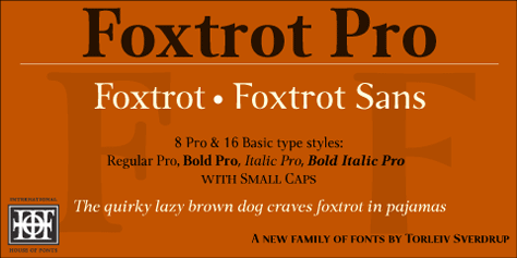
Press Release The P22 Foxtrot Pro family of fonts is the latest design by Norweg...

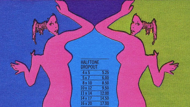
Scanning Around With Gene: Groovy Graphic Design from 1967
Strolling through the aisles of a giant used-book sale for the Marin Public Libr...


