
Strolling through the aisles of a giant used-book sale for the Marin Public Library recently resulted in me filling two big grocery bags with books. One of them was a small, mostly black-and-white volume published in 1967 by the Art Directors Club of Los Angeles, highlighting the winning entries from their 22nd annual “art in the west” competition.
The entries, which were judged by a distinguished panel of graphic designers and advertising executives, including Saul Bass, were also displayed in an exhibition at the California Museum of Science and Industry and seen by more than 175,000 attendees. Click on any image in this column for a larger view.


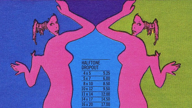
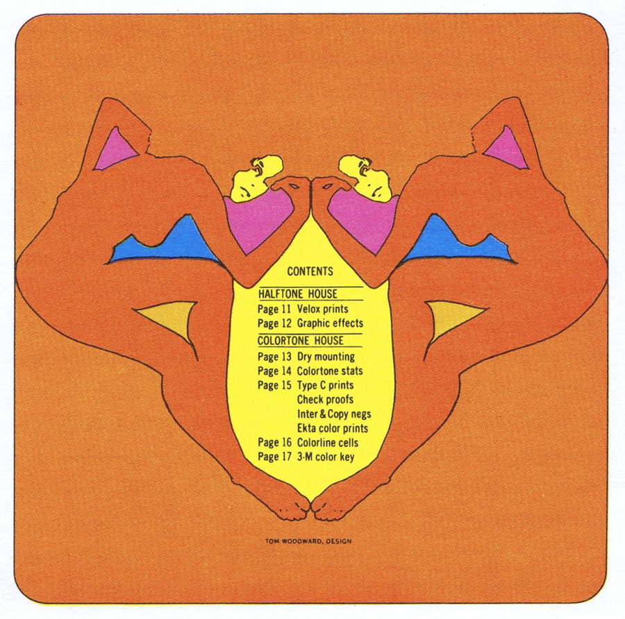
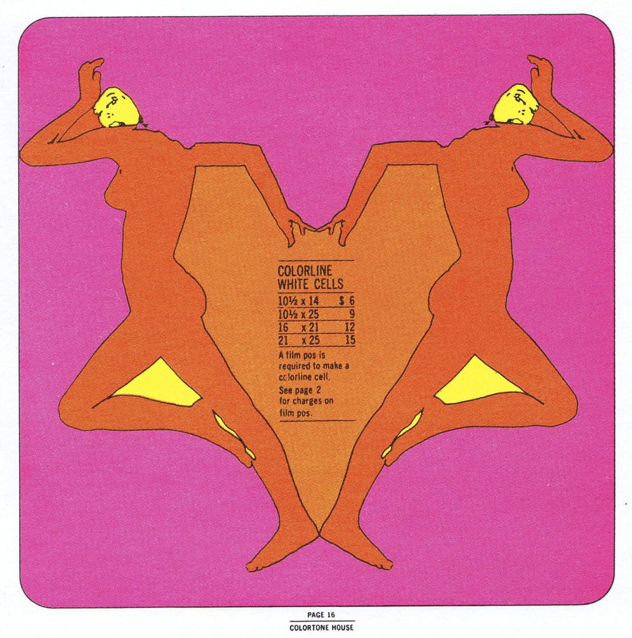
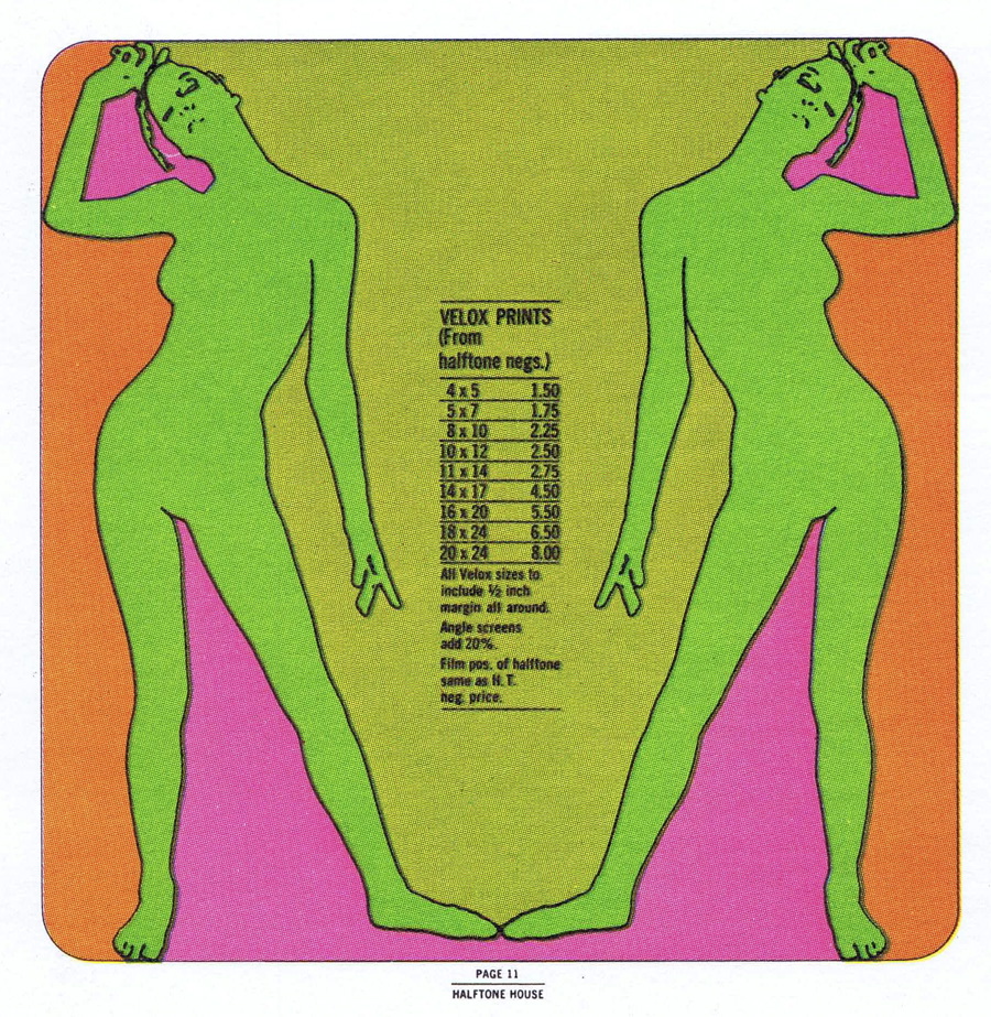
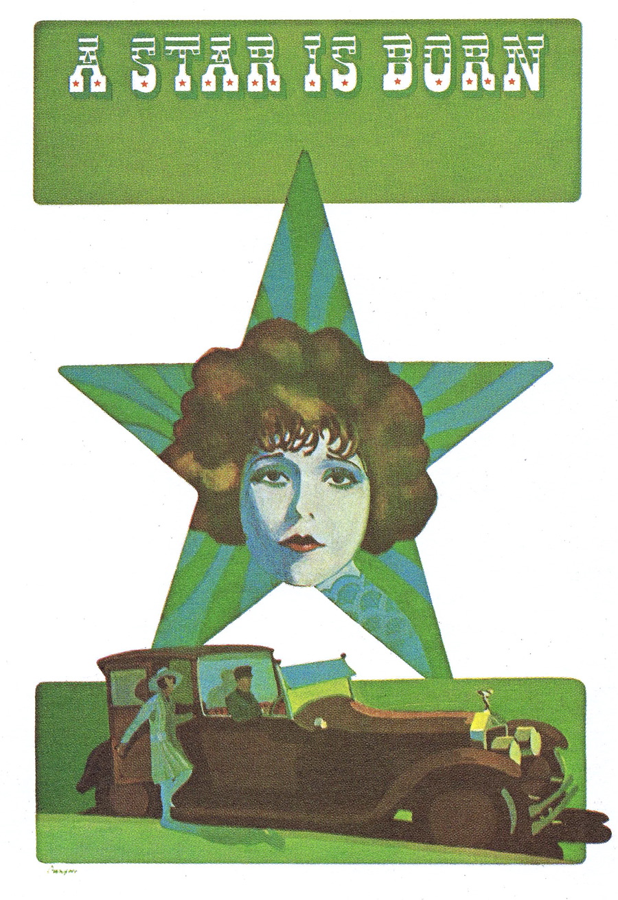
To say there was a theme is an understatement — the panel was obviously impressed by very colorful and what might be called trendy illustrations that seem, well, right out of the Sixties. Take these award-of-merit winners from a local stat house, aptly called The Stat House. Not only do they take you back in time from a design perspective, but also from a production one. Do you remember stats and Veloxes? And check out the cheap prices!

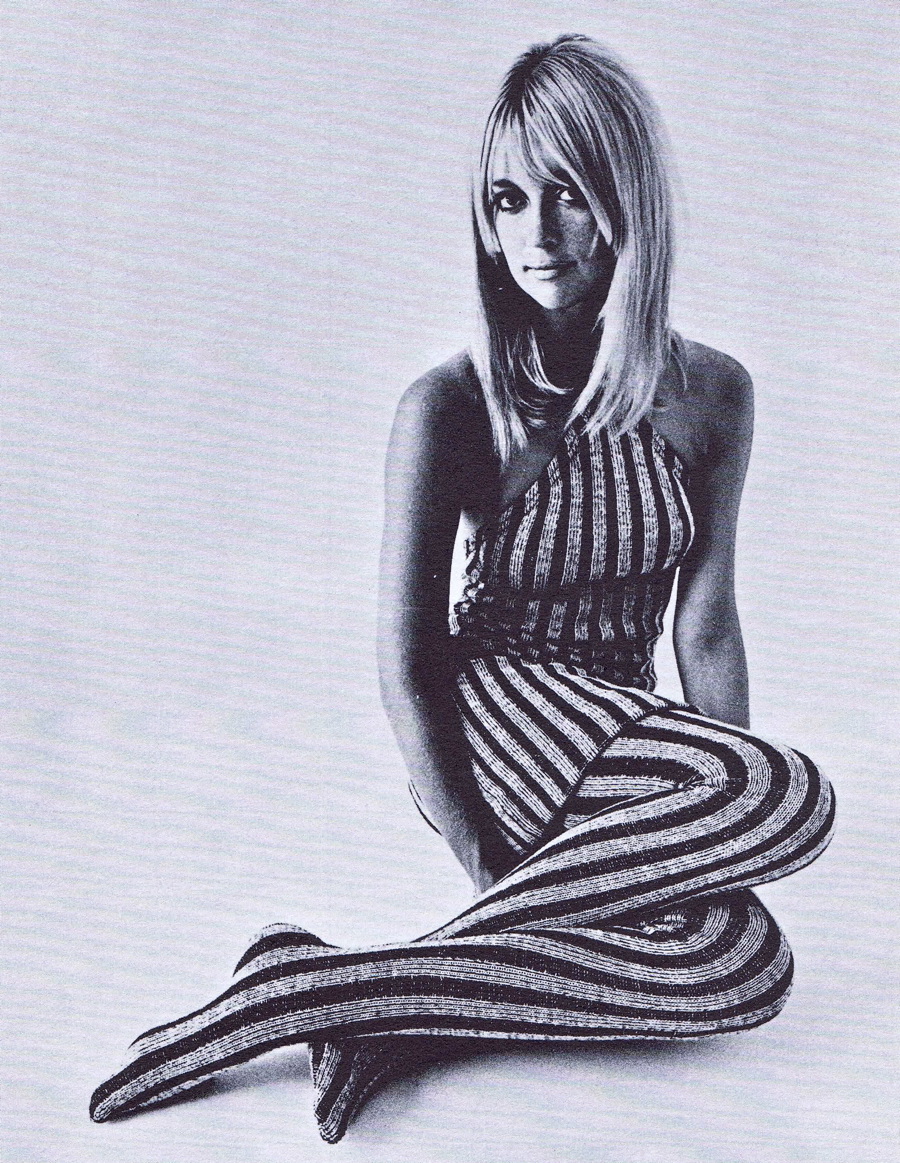
Or how about these groovy posters for a local clothing outlet called Cole of California? You don’t see type like that in use today.

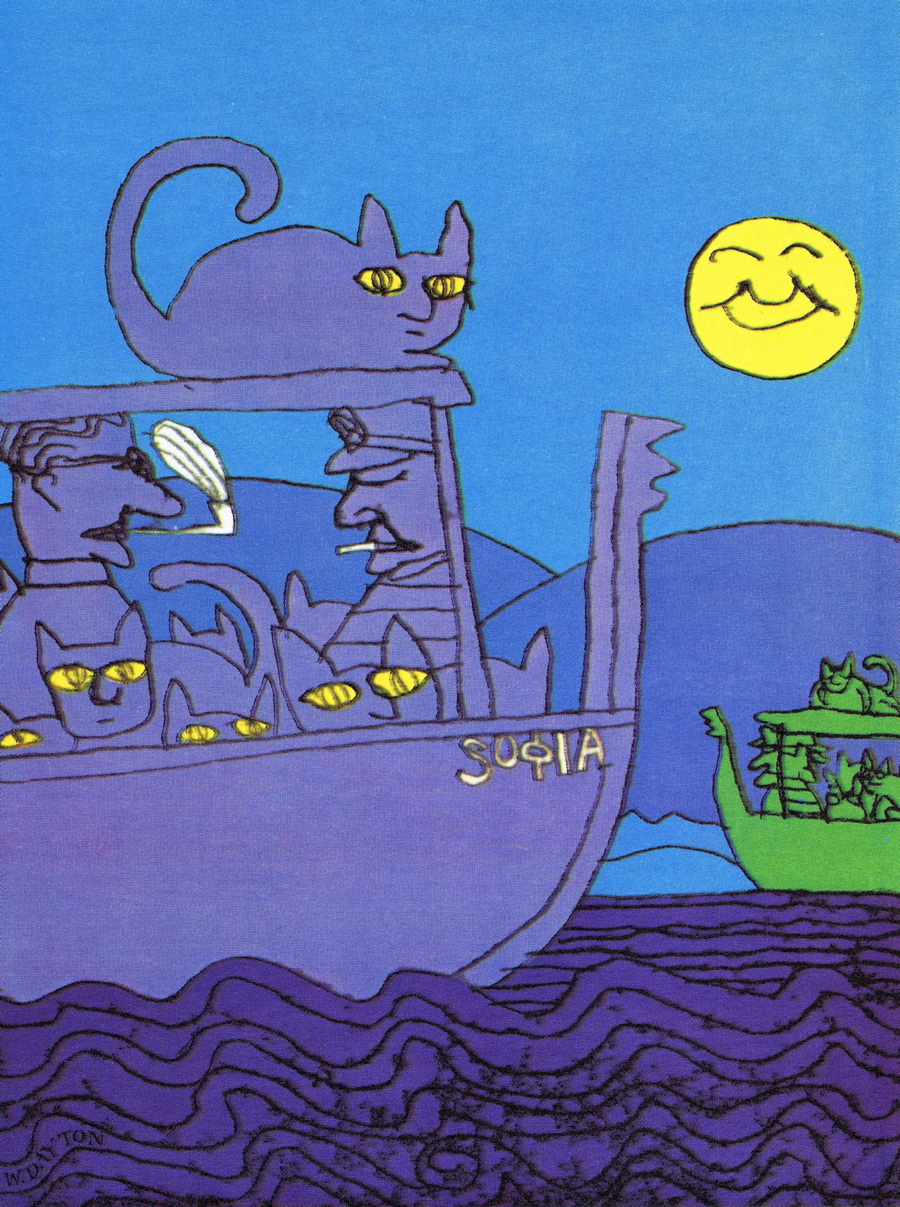
And here’s an illustration for the cover of Cat Fancy magazine, a Duke Ellington record album cover, an illustration for a local media firm called Westinghouse Broadcasting Company, and billboard ads for a popular local morning disc jockey.


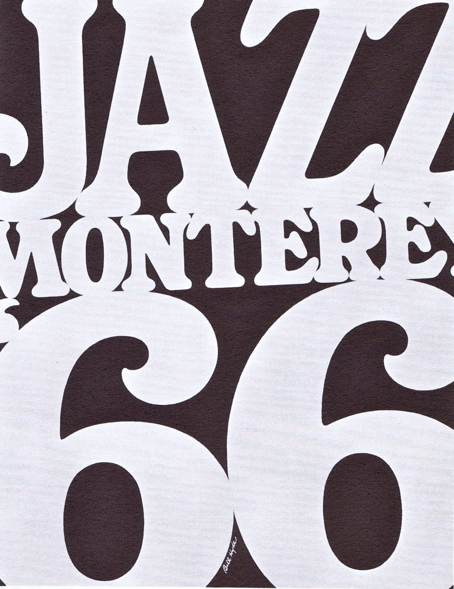
Even the black and white work is very Sixties. Here’s an ad for a local paper rep, a self-promotion photo for Compton Advertising, an ad for a local men’s clothing store called Dorfman’s, and a poster for the Monterey Jazz Festival.


Type was still being set in fairly unsophisticated methods in 1967, so seeing something like this type-as-art display for a local bookseller was unusual. Many of the ads in this volume included hand-lettered type, as seen below in what was a series of ads for Buenaventure Gardens.


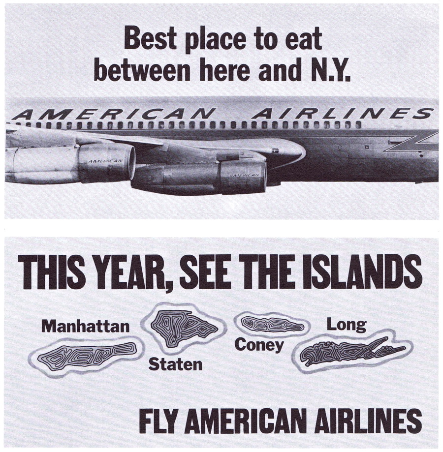
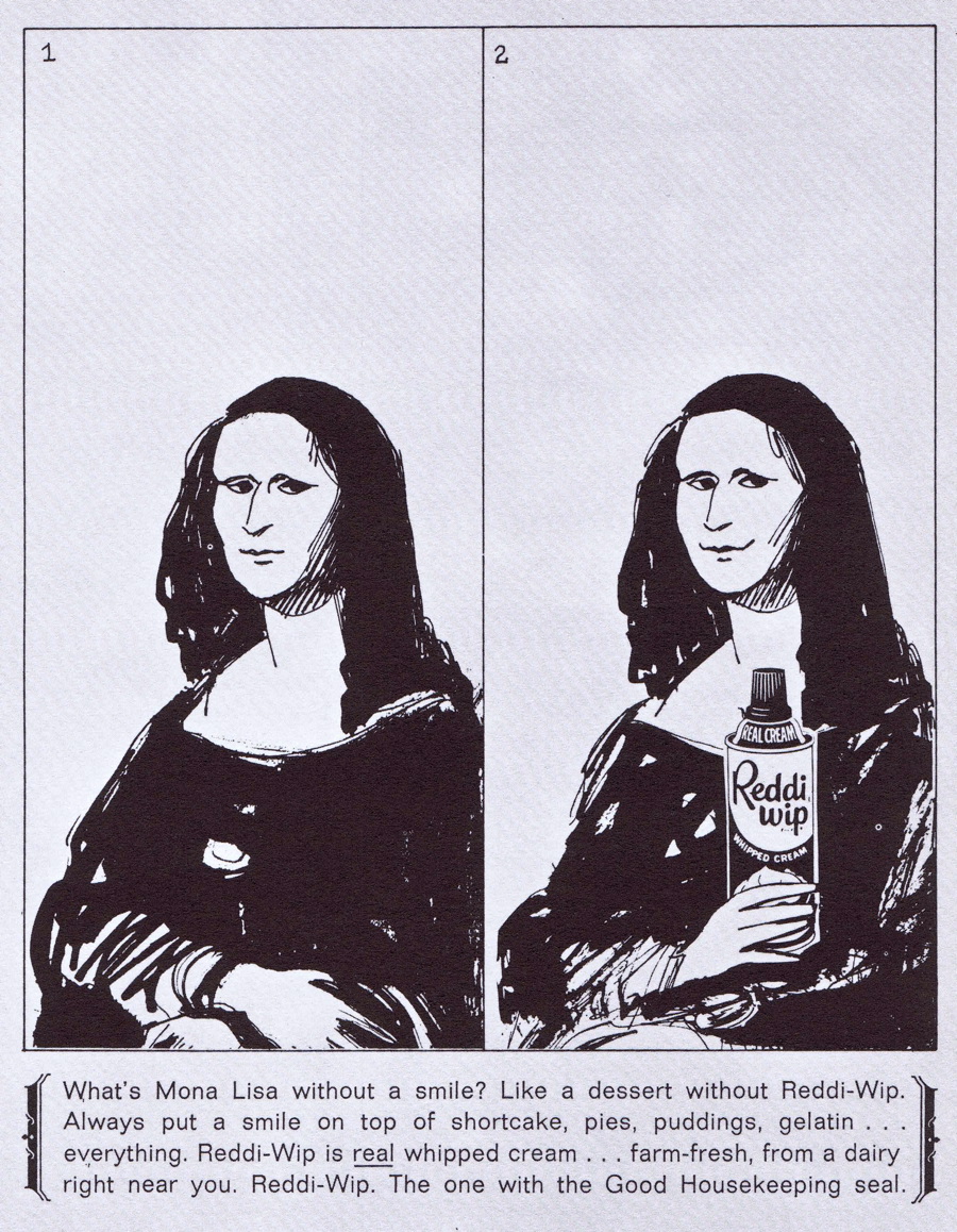
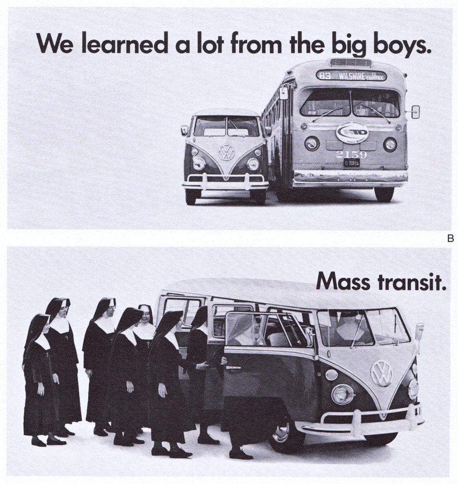
There were, of course, a few traditional style ads included in the exhibition, but even those have a Sixties flavor to them. Here are ads for American Airlines, Reddi Whip, and Volkswagen that made the cut.
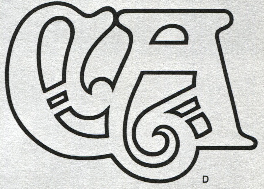
I particularly like the logo designs from that era, which tended to the bold. The first three below are for Glassflex, a glass insulation company, a company called Tape City, and the Bergelectric Corp electric company. Below that is a stark design for International Expositions, and an early logo design for Communication Arts magazine.


I was a teenager in Los Angeles at the time and I remember of few of these companies and ads from my daily fix of the Los Angeles Times. But then I remember eight track players, Nehru jackets, and waterbed stores, too.
This article was last modified on May 17, 2023
This article was first published on December 11, 2009
Commenting is easier and faster when you're logged in!

Recommended for you

Introducing the Ringside Family by Hoefler&Co.
Ringside is the latest typeface family from Hoefler&Co. Famous for creating...

P22 Gets Spooky
Spooky is a new font from designer Ted Staunton and is part of the Sherwood Type...
The History of Olympic Poster Design
In search of some world-class design inspiration? Check out the huge collection...