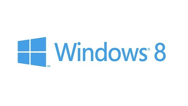
Pentagram Designs New Windows Logo

By now you’ve probably seen the new logo for Microsoft Windows. The blogosphere has been buzzing about it, and some of the commentary is less than flattering.
“The new Windows 8 logo is pretty ugly. It actually looks a lot like the Windows 1.0 logo, only slightly worse,” says Cult of Mac. “The Microsoft team has created a new logo for its upcoming Windows 8 operating system, and the results aren’t pretty. You might say this is Microsoft’s Gap moment, where a company has chosen a new logo that takes away from its history and chooses blandness over anything striking,” writes VentureBeat.
Whatever your opinion, a logo refresh was long overdue. Windows, the software, is nearly 30 years old. As the software evolved, its logo became less connected to its name. Now for Windows 8, the new logo directly recalls the product’s moniker.
The logo was designed by Pentagram’s Paula Scher, one of the most influential designers of the past 20 years. On Pentagram’s web site, Kurt Koepfle writes that Scher asked Microsoft why the wavy, multi-color logo looked like a flag. It’s a good question.
“The original Windows logo looked like a window,” Pentagram says. “As computing became more powerful, the logos for Windows began to get more complex, to show off the capabilities of Microsoft systems. The logo for Windows 1.0 resembled panes of glass. By Windows 3.1, this had been replaced with a waving effect for a sense of motion and the four colors that became a signature of the Windows brand.”

The Windows 1.0 logo
In a blog post on Microsoft’s website, Microsoft’s Principal Director of User Experience Sam Moreau wrote: “In some ways you can trace the evolution of the Windows logo in parallel with the advancements of the technology used to create logos. From the simple two-color version in Windows 1.0 to the intricate and detailed renderings in Windows Vista and Windows 7, each change makes sense in the context in which it was created. As computing capabilities increased, so did the use of that horsepower to render more colors, better fonts, and more detailed and life-like 3D visual effects like depth, shadows, and materiality.”
Scher stripped away the gratuitous effects. Her design is based on the Metro look of the new operating system as well as Swiss International Style that’s known for its clean, bold profile. The logo has two very nifty features: transparency that enables customers to actually see through the window in the logo and user-defined color that lets customers tune the logo’s hue to their personal preference.

The Windows 8 logo
This 7-second video on the Pentagram site shows the new logo in motion.
Windows 8 Transparency from Pentagram on Vimeo.
It’s worth checking out the story on Pentagram to read how the logo developed and how Scher and her team solved its design problems.
Here are just some of the blog posts about the new logo:
A flag no more: Microsoft unveils new Windows logo on ars technica
It’s a window, not a flag on LogoDesignLove
The Official Windows 8 Logo: It’s a Window, Not a Flag on Gizmodo
Microsoft reveals Windows 8’s new logo: ‘It’s a window… not a flag’ on Engadget
Microsoft Unveils Bland, Blue Windows 8 Logo on PC Mag.
What do you think of the new Windows logo? Post your thoughts in comments
This article was last modified on August 2, 2021
This article was first published on February 20, 2012
Commenting is easier and faster when you're logged in!
Recommended for you

The "Original" Helvetica
What we know as Helvetica is not really Helvetica. The font that was Helvetica b...

TypeTalk: Know Your Hyphens, En and Em Dashes
Hyphens, en and em dashes are three visually similar yet significantly different...

Typography Manual for iPhone and iPod touch
Are you a graphic designer? Do you know the difference between a font and a type...


