


Luke Hayman, Rami Moghadam, and Braulio Amado of the Pentagram design agency recently worked with Cosmopolitan‘s editor in chief and design director to give the magazine a makeover. The redesign debuts with the January 2012 issue, which just hit the newsstands.
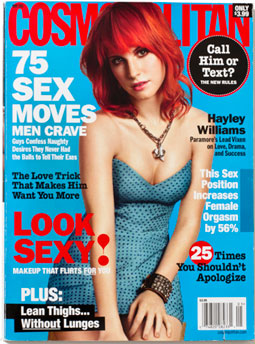
A cover before the redesign:
A proposed redesign:

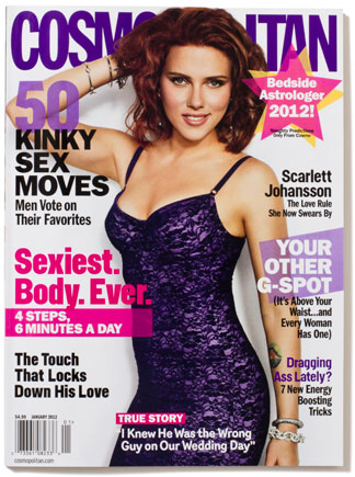
The actual, redesigned January 2012 cover:
Editor in chief Kate White says the aim of the redesign was to produce something that didn’t “look like a magazine”. To that end, you’ll find less text and more imagery. Pentagram also ditched justified text for left-aligned columns and introduced a dynamic quality with partial transparency, angled shapes, and layered elements.
An article before the redesign:

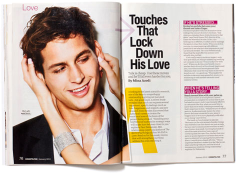
Examples of post-redesign articles:


Here’s a before-and-after comparison of the table of contents:


Pentagram used four new typefaces for the redesign:
Helsinki:

Parry:
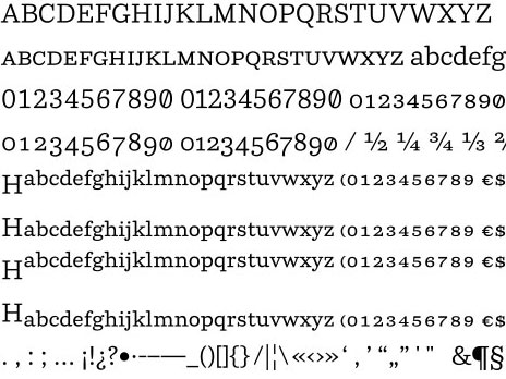
Router:

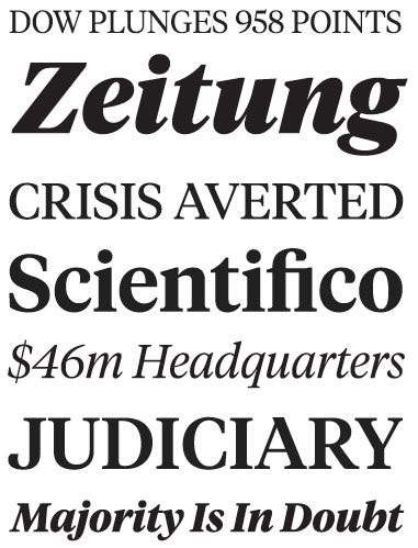
Tiempos:
What do you think of the redesign? Does it succeed in “not looking like a magazine”? Is that a good thing? Click the word “Comments” below this article to give it the thumbs up or down. To see more examples from the January 2012 issue of Cosmo, go to the blog post on the Pentagram website.
This article was last modified on June 19, 2020
This article was first published on December 8, 2011
Commenting is easier and faster when you're logged in!

Recommended for you

Design + Accessibility Summit 2023 Agenda Released
We’re thrilled to share the full agenda for The Design + Accessibility Summit, t...

TypeDNA Goes Far Beyond Font Management
TypeDNA is a standalone font manager and plug-in set that integrates with many c...
How to Draw a Curvy Line in InDesign
Learn how to create a curved line in InDesign, using the Pen tool then make adju...