
Advanced Layer Blending in Photoshop 6

![]()

Brought to you by Element K Journals
Creating illustrations or compositing images usually takes lots of layer manipulation to create the exact blends and effects you want. With Photoshop’s Layer Style dialog box, you get immense control and organization over applying blending and effects to your images and graphics. In this article, we’ll show you how changes in the blending options can enhance your ability to composite images. We’ll also give you a basic overview of the blending options and show you how they work using various examples as well as this month’s cover image.
About Blending
There are a few things you should keep in mind when you’re working with layer blending. First, even though you’re using the Layer Style dialog box to create the blending effects, no special icons will appear on the layers. Those only appear if you apply an actual style or effect. If you select a layer that uses layer blending, the only indication may be the blending mode on the Layers palette. There’s no sign at all that a blending range, fill opacity or some of the other settings have been defined for a layer unless you double-click on the layer and open the Layer Style dialog box to check.
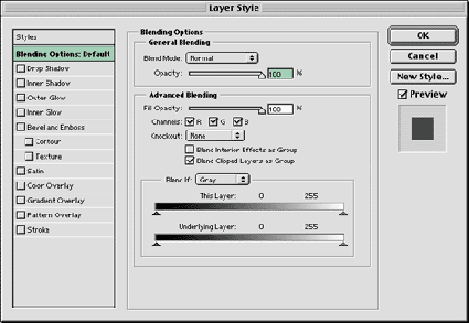
Second, most of the blending options in Photoshop 6 were available in version 5 and 5.5, but the Layer Options dialog box has been combined with layer effects to create the Layer Style dialog box. When you first look at the new Layer Style dialog box, shown in Figure A, you’ll see that it’s broken down into General Blending and Advanced Blending. General Blending is just the usual blending that you can apply to any layer without even opening the Layer Style dialog box. All you can do here is set the Blend Mode and the Opacity of the layer. Any settings you make here are reflected on the actual Layers palette.
The same is not true of the Advanced Blending options. There isn’t anything indicating that they’re applied to a layer. We’ll show you some of the different effects you can create with the help of the Advanced options.
Figure A: You can access the Blending Options in the Layer Style dialog box.
Using Fill Opacity
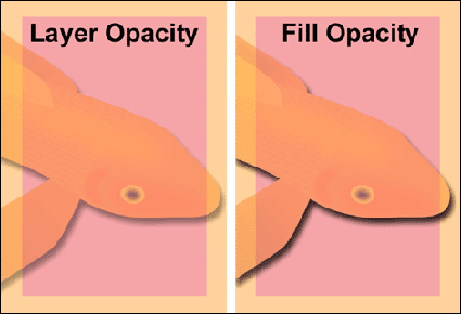
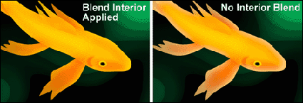
The first setting in the Advanced Blending section is Fill Opacity. You may wonder how this differs from the layer Opacity setting in the General Blending section because at a surface glance they seem to do the same thing. This setting changes the opacity of all the objects on the layer without changing the opacity of the actual layer. In most Photoshop situations, this makes no difference at all in the appearance. However, this setting is important for use specifically with the Layer Effects. If you have a layer with an opacity of 40 percent and you apply an effect to it, the resulting effect would also appear at 40 percent. If you want to control the opacity of your object separately from any applied effects, then you need to use Fill Opacity instead of layer Opacity to adjust the transparency of the objects on the layer. Doing so allows us to still have the fish set at 40 percent opacity with the applied drop shadow set at 75 percent as you can see in the comparison in Figure B. This works with interior effects as well as the exterior effects like glows and drop shadows. You’ll find the Fill Opacity setting useful for a number of creative graphic effects.
Figure B: Fill Opacity allows you to control the opacity of an object separately from any applied effects.
Working with Channels
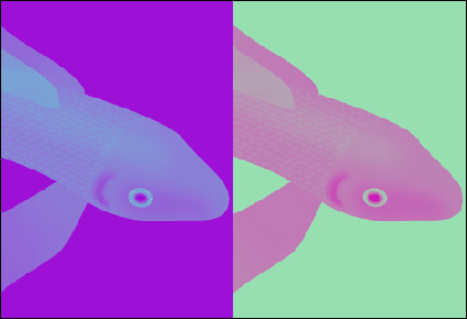
Below the Fill Opacity slider are the Channels check boxes. In earlier versions of Photoshop, turning off a channel affected the entire image, but now you can manipulate the channels on a layer-by-layer basis. You can also use the Channels settings in conjunction with the other blend settings on the Layer Style dialog box. The effects of turning on and off channels can be unpredictable, so you have to just experiment with each image you’re working on. For example, the color of the background affects how certain color channels will appear. In Figure C, we have a fish layer that only has the Green color channel enabled. On the purple background, the fish looks blue, but on a green background it looks more pink. So, as you can see it’s just something that you’ll have to experiment with as you’re blending your images.
Figure C: Working with layer color channels will give you different results depending on the color of the layers beneath it.
Knock out Knockout
If you design for print, you’re probably familiar with the concept of knockout. In most graphic applications, the knockout process occurs transparently allowing all the colors in your image to punch out their shape into any underlying colors, so that everything in the image prints directly on white paper. If this didn’t happen, everything you designed would look like mud, as ink colors would mix when printed on top of each other.
In the Advanced Blending options, the Knockout setting does about the same thing, but instead of happening transparently when a file is separated, you can see and control it for layer blending purposes. The Knockout setting is really only useful for layer blending when the Fill Opacity of the layer is lower than 100 percent or if the blending mode of the layer is set at something other than Normal.
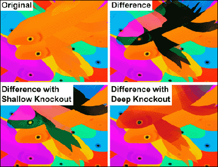
If you look at the Knockout pop-up menu, you’ll see that there are three settings: None, Shallow and Deep. A setting of None means just that, no knockout is applied. The Shallow and Deep settings have the same affect on a layer unless that layer is part of a layer set. In which case, the Shallow setting knocks out all the layers until it reaches the first layer outside the set. The Deep setting knocks out to the Background of the image whether the layer is part of a layer set or not. If there’s no Background layer, then it knocks out to transparency. In Figure D, you can see a visual demonstration of how these options affect layer blending. In the Original image, the two fish facing left are on separate layers but are part of the same layer set. All the other fish are on separate layers covering up the striped green background that you can see on the cover. In the Difference image, we set the blending mode of the top fish in the layer to Difference. As you’d expect, it affects every layer that’s directly beneath it in the layer set and out.
To change this, we applied the Shallow Knockout setting to the layer. This allowed the fish to skip the other fish layer within its layer set and just affect the layers below the set. If we change the Knockout setting to Deep, as shown in the lower right of Figure D, then the fish is blending with the Background of the image–which you can’t even see right now because it’s covered up with other fish layers. As you can see, the Knockout setting can significantly change how your layers blend together and is worth experimenting with as it can help you get just the right blend.
Figure D: If you use blending modes or fill opacity on a layer, then you can use Knockout as another tool to adjust blending effects.
Group Blending
Under the Knockout pop-up menu, there are two check boxes that affect groups of layers when enabled. The first is Blend Interior Effects As Group, which applies to any of the layer effects that affect the actual object fill, such as Interior Glow, Pattern, Color Overlay, etc. When this option is enabled for a layer, any blending mode set for the layer applies for all of the interior effects as well as the basic object fill. This doesn’t mean that any blending modes that you set for individual effects will be overridden. It just means that the way they’ll blend with the lower layers will change because the blending modes will be added together. On the left in Figure E, we duplicated the fish layer and applied an Interior Glow effect set to Screen. We then set the blending mode of the layer to Overlay and selected the Blend Interior Effects As Group check box. On the right, you can see the same setup but with the Blend Interior Effects As Group unselected. The original Interior Glow color is retained.
Figure E: The Blend Interior As Group option makes any interior layer effect match the blending mode of the layer.
Working with Clipping Groups
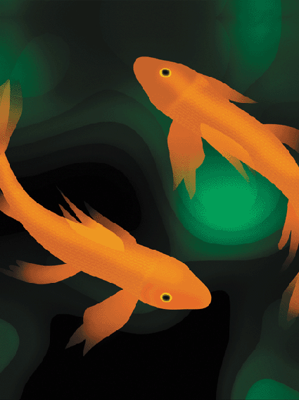
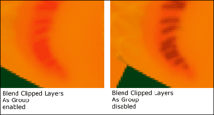
Clipping groups allow you to group layers together using the bottom layer as a mask to define the overall shape of the object. In our cover image, the fish’s skin texture is grouped to the fish shape, which masks out all the rest of the fish skin pattern that extends beyond the fish’s basic outline. The fish shape is the base layer of the clipping group and is therefore the mask.
The Blend Clipped Layers As Group option is selected by default. It causes the blending mode of the base layer to be applied to all other layers in the clipping group in addition to their own blending modes. If you deselect this option, then the base layer will be applied at the specified blending mode and the other layers in the group will remain just the same. You can see the difference this makes in Figure F. In this example, we’ve zoomed in closely on the fish’s gill. The base layer of the clipping group is the gill’s crescent shape. The second layer consists of the small lines. The small line layer is set to Multiply, while the gill layer is set to Overlay. As you can see, turning off and on the Blend Clipped Layers As Group option shows a profound difference between the two images. Depending on which blending modes you’ve selected, the results may be more subtle or more extreme than this example.
Figure F: Any choice you make when blending layers creates subtle differences in the results.
Setting a Blending Range
A blending range is a very powerful tool that gives you a lot of control over mixing colors in multiple layers. Essentially, blending ranges work by allowing you to control which pixels will blend on two layers, the active layer and the layer beneath it. The This Layer slider controls the active layer, while the Underlying Layer slider controls the layer beneath it. By adjusting one or both sliders, you can customize unique blending effects that act something like applying color specific masks. In fact, you may find that in certain situations you can use blending ranges to replace the process of creating masks altogether.
If you look underneath each slider, you’ll see two arrows. These actually break apart, creating four arrows that allow you to create smooth transitions of partially blended pixels. To separate the arrows, [option]-click ([Alt]-click in Windows) on half of the arrow and drag it to separate it from its partner.
In the fish cover image, we used the blending range sliders to shade and help add dimension to the fish. If you compare the fish in Figure G to the one on the cover, you can see how flat our fish was before we applied any blending. We’ll show you the details of how it was done.
Figure G: As you can see, our fish had a much more flat appearance before using the blending range.

Defining the Range
To create our shading, we wanted it to correlate to the tones of the background. To do so, duplicate the Background layer and move it to the top of the Layers palette so that it’s covering the fish. Now, choose Filter > Blur > Gaussian Blur. You can see our result on the left in Figure H. Next, set the blending mode of the Background Copy layer to Multiply. On the right in Figure H, you can see how this darkens the fish overall, more than we would like. Instead of creating a mask to block the fish from some of the layer’s shadow effects, we’ll use the blending range in the Layer Style dialog box.
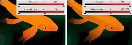
To do so, double-click on the Background Copy layer to open the Layer Style dialog box. As you know, any RGB image is made up of three color channels: red, green and blue. Since our fish are orange, the Red channel primarily defines their appearance. Because of this, choose Red from the Blend If pop-up menu. If you chose Gray, you’d be specifying blending for all the color channels that comprise the layer instead of just one. In this case, we’ll just be working with red.
We want everything red to show through the Background Copy layer, so click on the Underlying slider’s white arrow and drag it to the left until a fair portion of the fish shows through. You can see our result on the left in Figure I. As you can see, our slider is set at 150. This means that all pixels with a value of 150 or higher are showing through the active layer. However, you can see that the transition is harsh. The tips of the fish’s fins look clipped, so we need to create a smooth transition. To do this, you need to separate the white arrow into its component arrows. So, [option]-click ([Alt]-click in Windows) on the right half of the arrow and drag it back to the left until you get a smooth look. You can see our results on the right in Figure I. The smooth transition really improves the appearance of the fish, while still giving it a shaded look.
Figure H: Blur a copy of the Background layer to create the shading and then set its blending mode to Multiply.
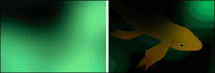
Figure I: Move the arrow to a point where most of the fish shows and then separate the arrows and move half of the arrow back to the beginning to create a smooth transition.
Super Blending Tricks
If you’re picky about blending, then you now have the background to refine your compositing techniques even more. The way layer blending has been integrated into the Layer Style dialog box makes blending effects easier to apply than ever. Also keep in mind that some of these blending options are available in ImageReady 3 as well.

Copyright © 2000, Element K Content LLC. All rights reserved. Reproduction in whole or in part in any form or medium without express written permission of Element K Content LLC is prohibited. Element K is a service mark of Element K LLC.
This article was last modified on March 13, 2022
This article was first published on August 22, 2001
Commenting is easier and faster when you're logged in!

Recommended for you

Dehazing an Image in Photoshop
Learn how to rescue images beset by fog and atmosphere with Photoshop's Camera R...
CreativePro Tip of the Week: Drawing Instant Abstract Art in Illustrator
This CreativePro Tip of the Week on creating instant abstract art in Illustrator...

A Review of the Adobe Post Mobile App
Recently Adobe released a new mobile application for iOS (iPhone), Adobe Post. L...