

dot-font was a collection of short articles written by editor and typographer John D. Barry (the former editor and publisher of the typographic journal U&lc) for CreativePro. If you’d like to read more from this series, click here.
Eventually, John gathered a selection of these articles into two books, dot-font: Talking About Design and dot-font: Talking About Fonts, which are available free to download here. You can find more from John at his website, https://johndberry.com.
Just arrived: “Typography 24: The Annual of the Type Directors Club,” the yearly volume that shows the winners of TDC’s design competition. “Typography 24” is a 320-page hardcover, published by HarperCollins’s imprint Harper Design International, and the design work shown within it was judged last winter in New York by a jury of practicing typographers (see Figure 1).
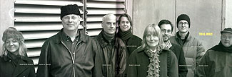
Figure 1: The jury of TDC49, the TDC typography competition (left to right): Marianne Besch, chair Alex W. White, Mark Geer, Brian Diecks, Nancy Skolos, Rodrigo Corral, Bob Aufuldish, and Guto Lacaz.
There are two competitions, actually: TDC49, the long-established typography competition—that is, where printed and other work is judged for its typography, not just for its art or its graphic beauty—which began in 1953 and is now in its 49th year (this year’s upcoming competition, to be judged later this month, will be the 50th), and the more recently established competition for typeface design, called “TDC2” (that’s a superscript “2,” though it may not appear that way onscreen). The two competitions have separate juries (see Figure 2), but they meet over the same wintry weekend in the same building, and come to their conclusions at the same time.

Figure 2: The jury of TDC2, the TDC type-design competition (left to right): Fiona Ross, Jim Parkinson, Ilene Strizver, chair James Montalbano, and Dave Farey.
The Book and the Competition
The TDC annual is designed by a different designer each year, so within a consistent basic format each volume may look quite different from the ones that came before. This year’s book is handsome and approachable, and it features something not usually seen on the TDC annuals (see Figure 3): a die-cut cover (and consequently no dustjacket). The front cover has a huge “2” cut out of it, and the back cover has a huge “4”; behind them both we can see the playful text of the call for entries, with its repetitions of “no no no no” interspersed with remarks like “nuh-uh” and “gotta be kidding.” In the front of the book, this litany continues from the endpapers to the second spread, where it ends on page iii with the TDC logo and a final, emphatic “YES.” Both the call for entries and the book itself were designed by Alexander Isley Inc.
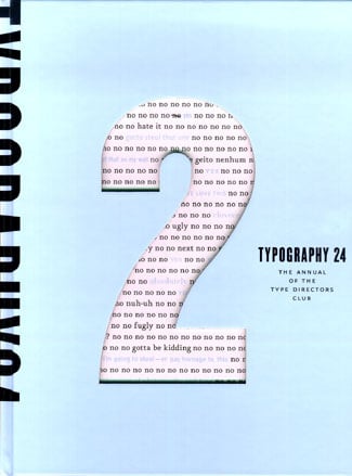
Figure 3: Cover of the Type Directors Club annual, “Typography 24,” is a playful die-cut.
The chairman of the typography competition was Alex W. White, and the chairman of the type-design competition was James Montalbano. Both of them wrote chairman’s statements (see Figure 4). These are always a chore to write, and too often they fall into a litany of truisms. Alex White gets at the heart of the matter when he says: “As you flip through the pages of this book, I encourage you to consider which of these outstanding samples will be fresh 49 years from now, which may become classics to be included in design history texts, and which are more of the moment and will shine brightly but briefly.” We all have opinions about this, but we can’t be sure until some time has passed. (A collection of TDC annuals is an excellent resource for looking back to see what lasted and what didn’t.)
James Montalbano, who was one of the founders of the type-design competition as a separate entity and has seen more than his share of typeface entries, had a few recommendations for people entering their work in such a competition: Vary the layout of the sample, if you’re submitting more than one typeface; be sure to show enough of the typeface so it can be judged fairly, in all its variations and—most importantly—in use; and let the judges see the typeface at the sizes it was intended to be used. (Having chaired a TDC2 competition myself once, I can attest that all of James’s suggestions are right on target.)
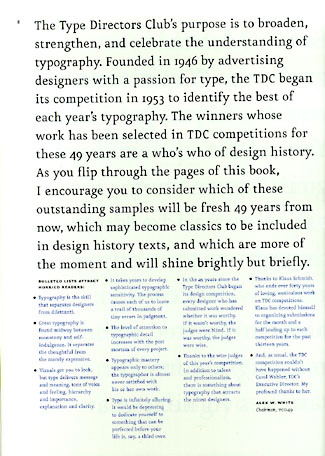
Figure 4: Last page of Alex White’s chairman’s statement for TDC49.
Presenting Design
Each year, the winning entries appear in two different formats: in the annual, and in the TDC traveling exhibit, which usually has its debut in New York City in June. Since I organized the setting up of last year’s exhibit at the ATypI conference in Vancouver, I’ve seen these examples now both in their original form and in print in the annual.
While nothing beats seeing books and posters and magazine spreads in the flesh, so to speak, there’s a lot to be said for the convenience of having their images in a book that you can browse and keep. As far as I can tell, without having done an exhaustive study of every page of the book, this year’s annual has worked out any bugs and glitches in the handling of digital images supplied by the winners; everything looks sharp and well-presented. And the page design does a good job of presenting the images and their ancillary information clearly and simply (see Figure 5); unlike some design annuals I’ve seen, the design here does not get in the way.
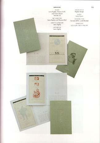
Figure 5: The annual sports simple, clean presentation of images and textual information about the winning designs.
The Shape of Things
Trends? Hard to say. Lots of wiry shapes and rough-hewn or hand-drawn imagery. Lots of flat colors, or four-color renderings of flat colors. Some intriguing mixtures of digital type and letterpress printing. Much clutter, but also a welcome amount of simplicity and clarity (see Figure 6). Lots and lots of exuberance and inventiveness.
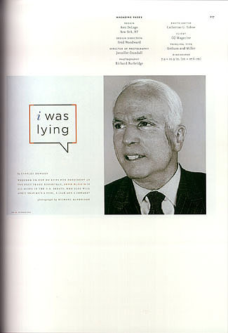
Figure 6: Bold simplicity and directness in a magazine layout.
In the type-design competition, it’s noteworthy that several of the winners were non-Latin faces: two Arabic and one Hebrew (see Figure 7). And one, Victor Gaultney’s Gentium, is a combination extended-Latin and Greek font that includes the characters needed to set a number of African languages that have greatly expanded from the standard Latin alphabet.
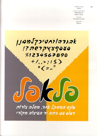
Figure 7: An unusual Hebrew alphabet called Falafel, by Habib Khoury.
Since this is the annual of a competition for type design and typography, I can’t avoid one criticism of a typographic detail. The principle typeface used in the book, Peter Bilak’s FF Eureka, possesses a full set of f-ligatures; so why were only the fi and fl ligatures used here? It’s a small but annoying point, for anyone paying attention to the text typography.
“Great typography,” as Alex White puts it, “is found midway between monotony and self-indulgence. It separates the thoughtful from the merely expressive.”
There’s still time—barely—if you want to enter this year’s TDC competitions: deadline Friday, Jan. 9.
This article was last modified on February 23, 2022
This article was first published on January 5, 2004
Commenting is easier and faster when you're logged in!

Recommended for you


dot-font: The Type Show Goes On
dot-font was a collection of short articles written by editor and typographer Jo...
dot-font: Typographic High in SF
dot-font was a collection of short articles written by editor and typographer Jo...